
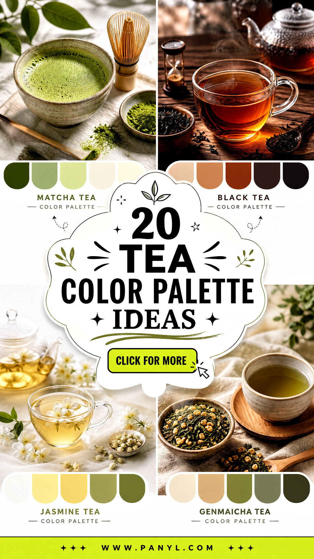
Tea-inspired colors bring warmth, calm, and natural character into a home. From creamy chamomile and earthy rooibos to fresh matcha and dramatic black tea, these shades can support many decorating moods. The key is to build a complete scheme rather than matching every surface to one drink color. Start with a dominant wall or cabinet tone, add a grounding neutral, and finish with one or two contrasting accents. Natural wood, stone, linen, ceramic, and aged metal make these gentle colors feel richer and more dimensional. The palettes below include practical color combinations, suggested materials, and complete room concepts you can adapt to modern, traditional, cottage, or minimalist interiors. Explore these 20 tea color palette ideas to find a soothing combination for your next project.
1. Matcha Tea Color Palette
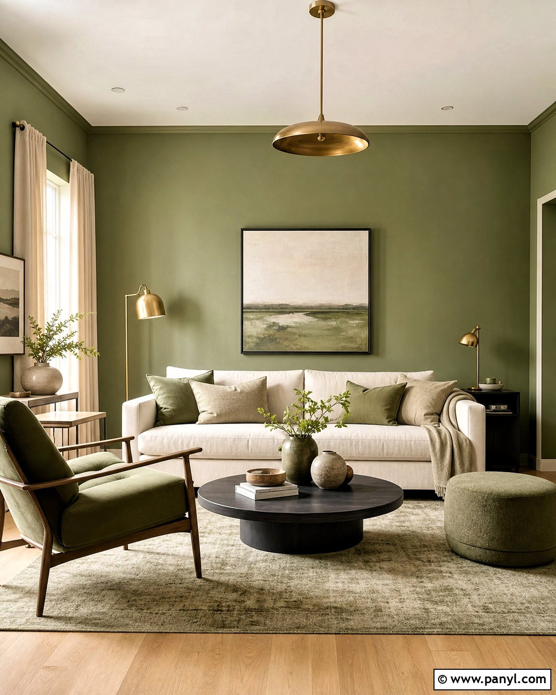
A matcha-inspired living room feels fresh without becoming overly bright. Begin with soft matcha green walls, then add a warm ivory sofa and light oak flooring to keep the room airy. Deeper olive green works well on a reading chair or built-in shelving, while charcoal creates definition through slim window frames and table legs. Choose oatmeal linen curtains, a cream-and-sage rug, and matte ceramic lamps for soft texture. Small accents of brushed brass can warm the greens without making the space formal. A balanced palette might include matcha green #A8B878, warm ivory #F3EBDD, olive #667249, pale oak #C9A97D, and charcoal #3F413B. Use the lightest colors generously so the green remains calm and livable.
2. Chai Tea Color Palette
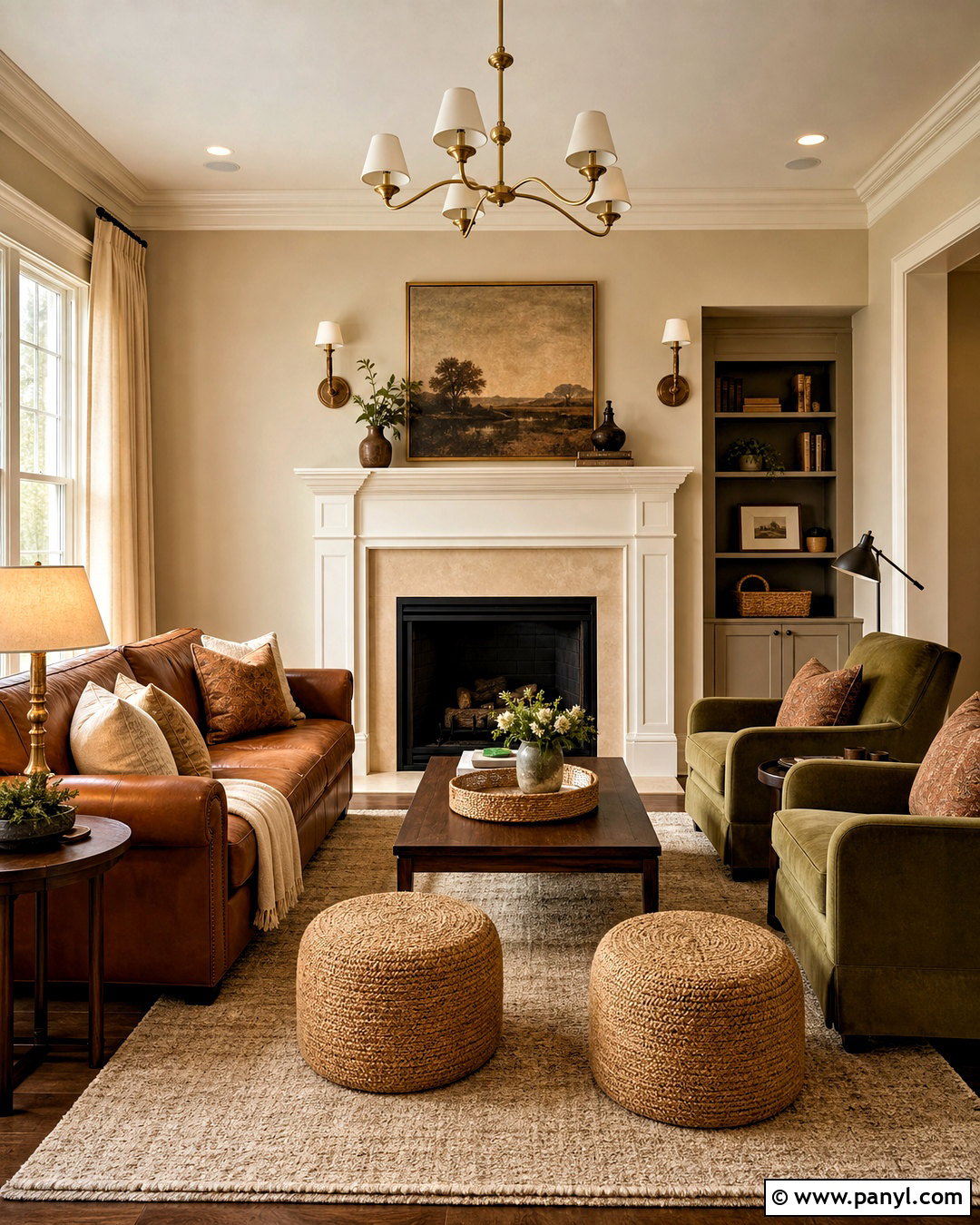
Can a neutral room feel cozy without looking dark? A chai palette achieves that balance through cinnamon brown, milky beige, cardamom green, and creamy white. Use milky beige across the walls of a relaxed family room, then anchor the seating area with a caramel leather sofa. Add two cardamom green armchairs, cinnamon-striped pillows, and a warm ivory wool rug. Walnut tables and woven baskets deepen the natural theme, while antique brass lighting adds a subtle glow. Try chai beige #D8BE9D, cinnamon #A66743, cardamom #87906A, cream #F5EAD8, and walnut #594336. Keep the ceiling and trim creamy white. This prevents the layered browns from feeling heavy and gives the room a comforting, collected appearance.
3. Earl Grey Tea Color Palette
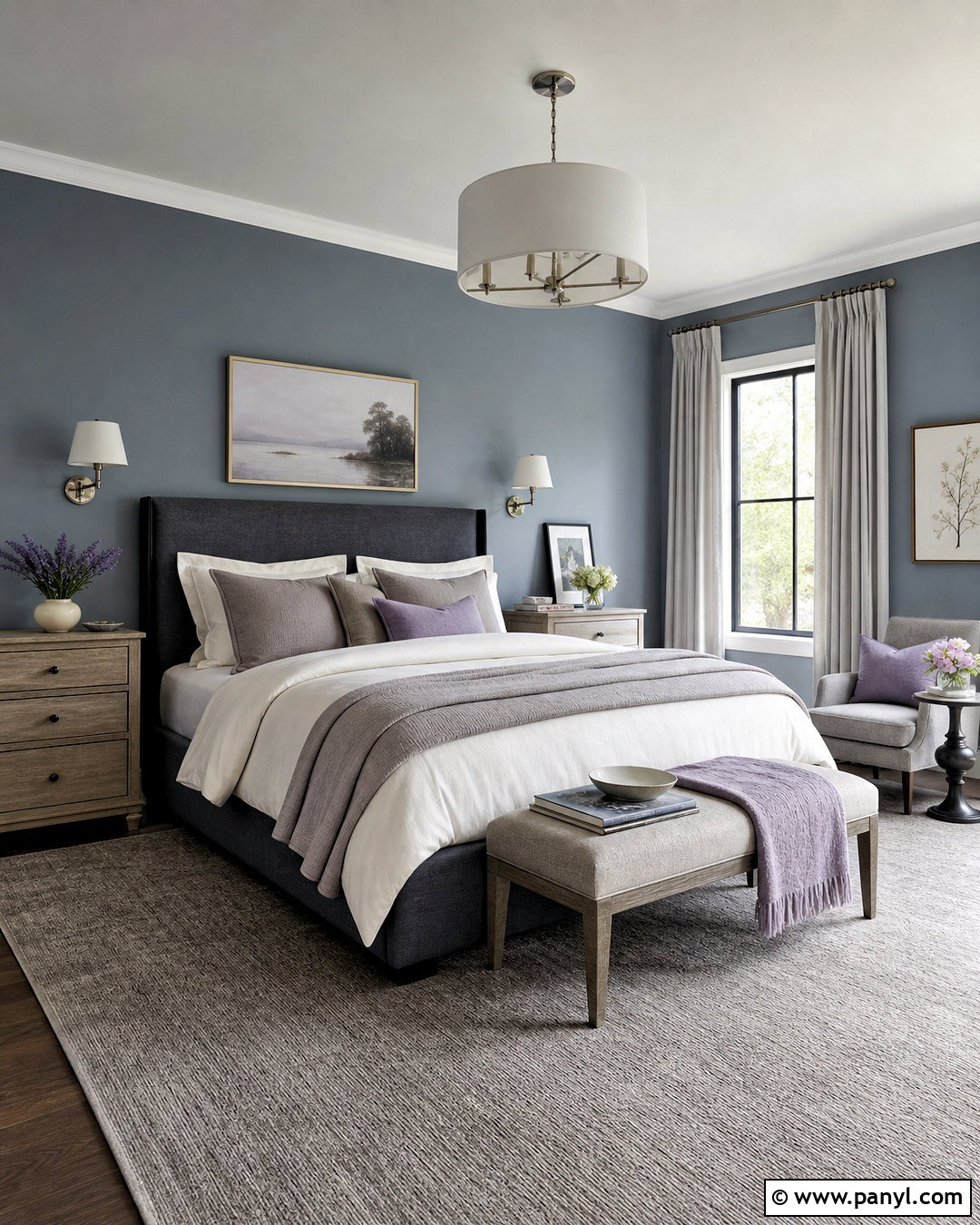
Cool gray does not have to feel cold when it is paired with misty blue and warm wood. For an Earl Grey bedroom, paint the walls a soft blue-gray and choose an upholstered bed in medium slate. Crisp ivory bedding brightens the scheme, while taupe throws and weathered oak nightstands introduce warmth. Use muted lavender sparingly in pillows, artwork, or a small bench to reference Earl Grey’s floral character. Brushed nickel sconces and pale gray curtains maintain the quiet finish. A useful combination is blue-gray #AEB8BA, slate #647277, ivory #F4F0E7, taupe #A49787, and lavender gray #9B94A6. Finish with a textured wool rug that blends ivory and slate, creating a restful foundation without sharp contrast.
4. Chamomile Tea Color Palette
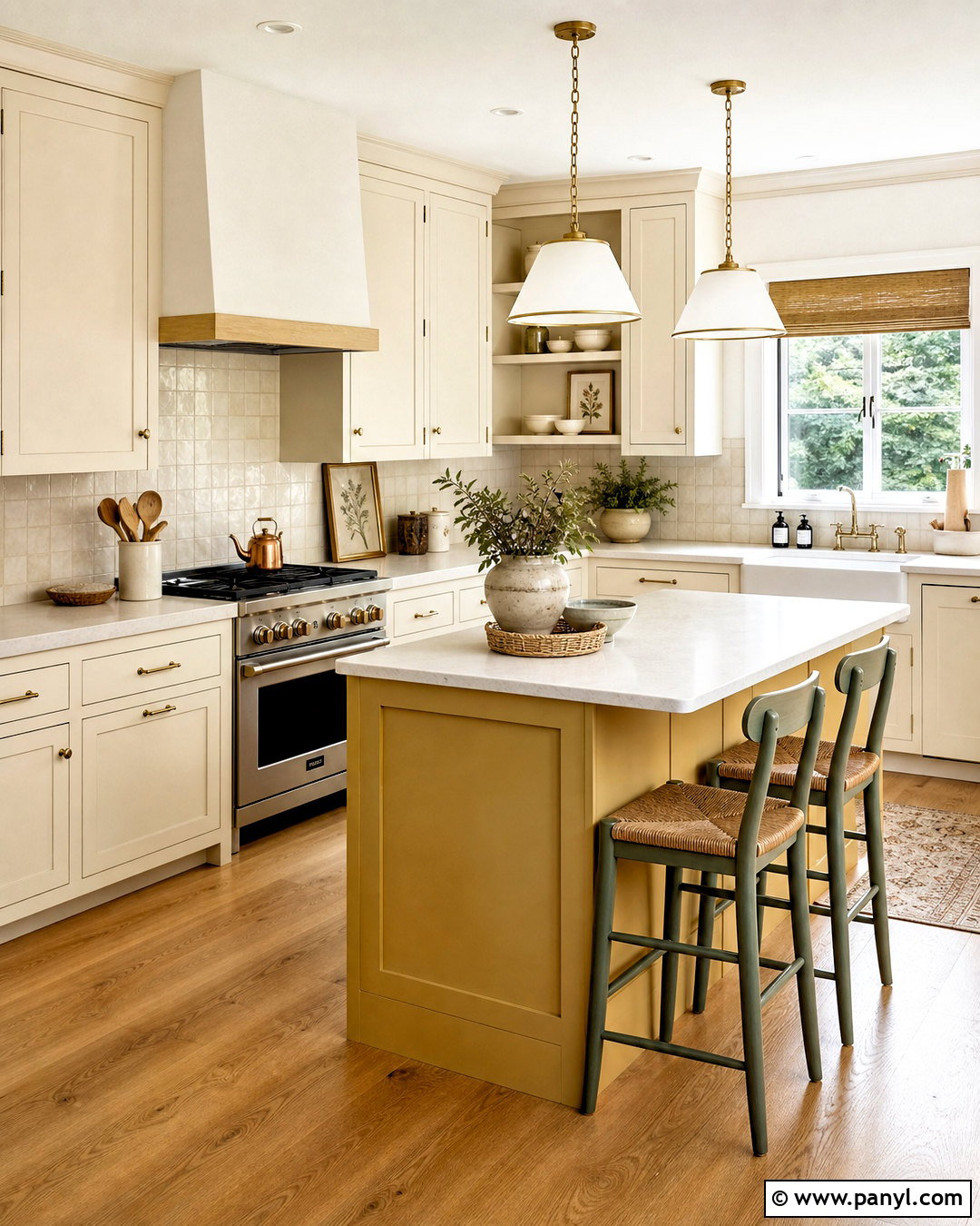
Soft sunlight seems to fill a chamomile kitchen, even on an overcast morning. Choose buttery cream cabinets, warm white walls, and pale honey oak flooring for a cheerful foundation. A muted chamomile yellow can appear on the island, breakfast bench, or pantry door without covering every surface. Add small sage green details through counter stools, pottery, and a simple Roman shade. Cream quartz counters and a handmade ivory backsplash keep the palette practical and bright. Consider chamomile yellow #E6CD79, buttery cream #F3E5BC, warm white #FAF6EC, sage #9AA27B, and honey oak #C99B61. Matte brass hardware completes the warm look. Avoid harsh black accents; soft bronze or medium brown will create gentler definition.
5. Rooibos Tea Color Palette
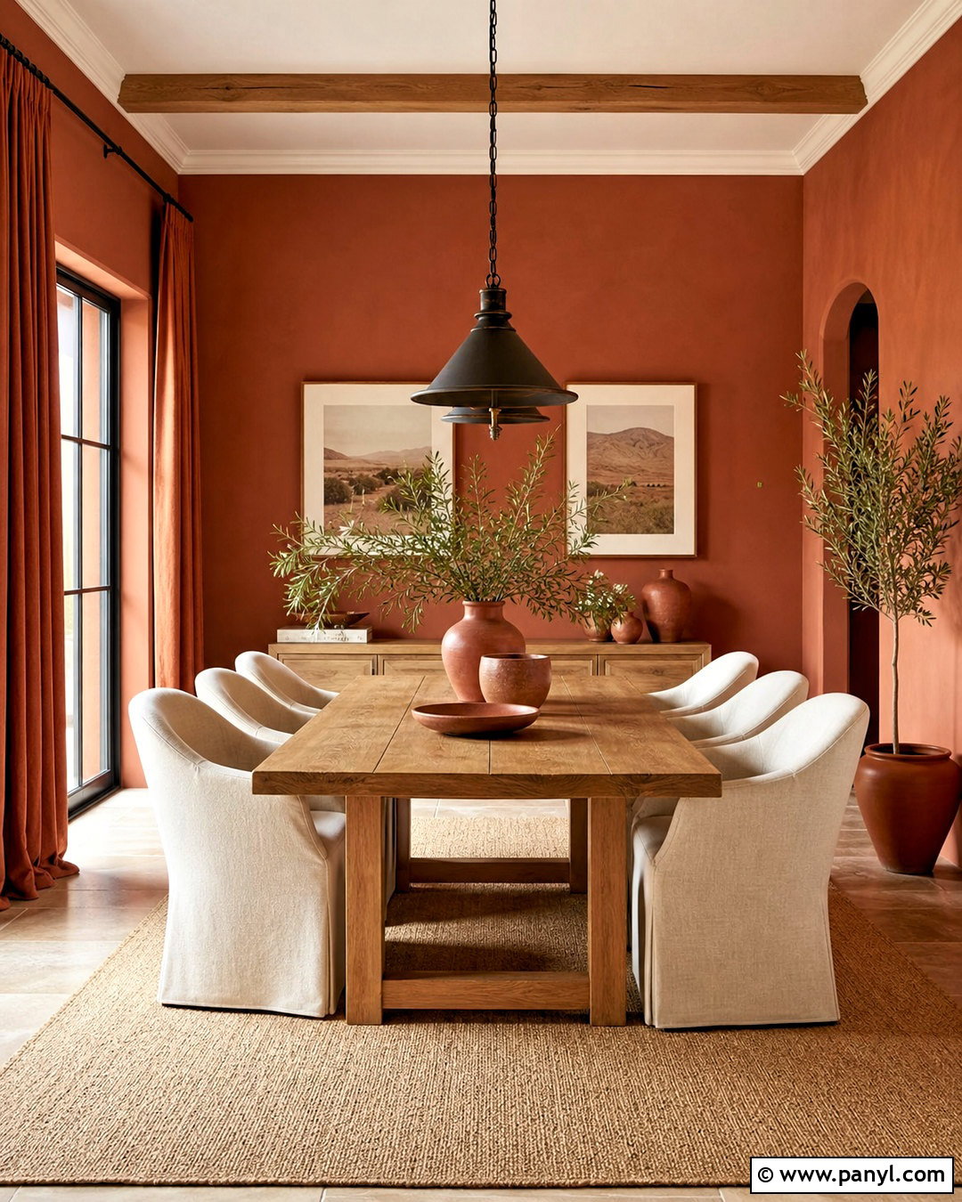
Rich rooibos colors can turn a dining room into a warm, welcoming gathering space. Cover the walls in muted red clay, then soften the intensity with a natural oak table and creamy upholstered chairs. Rust-colored linen curtains create depth, while a sand-toned rug gives the furniture visual breathing room. Add dark bronze lighting, handmade terracotta pottery, and a few dusty green branches for contrast. The complete palette can include rooibos red #A95E45, terracotta #C47A58, sand #D8C3A5, cream #F3E8D8, and deep bronze #4C4038. Keep the ceiling pale and use cream along the baseboards. This lighter boundary makes the earthy walls feel intentional rather than enclosed, especially in a modest room with limited natural light.
6. Green Tea Color Palette
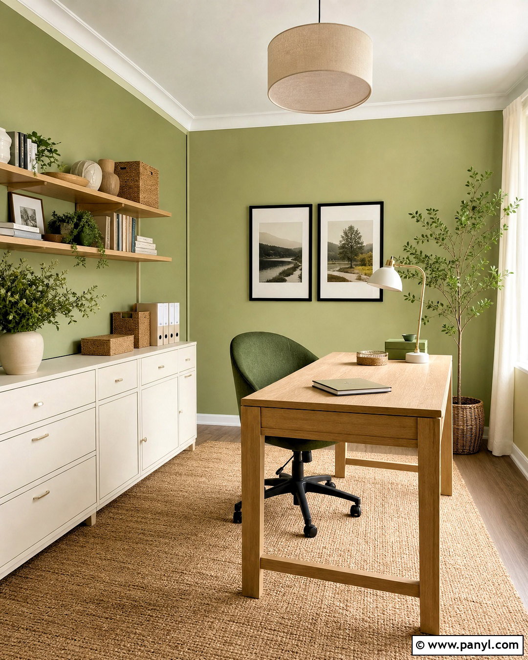
A gentle green tea palette works beautifully in a light, uncluttered home office. Paint the walls pale tea green and select a clean-lined desk in natural ash wood. Off-white storage cabinets can blend into the background, while a moss green desk chair provides a stronger focal point. Add a woven jute rug, cream linen shade, and matte white task lamp for practical softness. A few black details, such as picture frames and drawer pulls, keep the room from appearing washed out. Use tea green #B7C89E, moss #6F8060, off-white #F6F4E9, ash wood #C8B18D, and soft black #343832. Organize supplies in matching cream and green containers so the functional pieces reinforce the complete color scheme.
7. Black Tea Color Palette
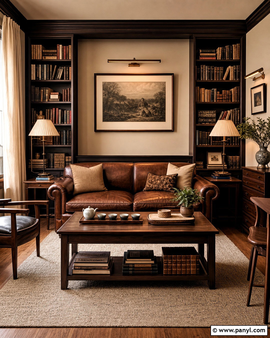
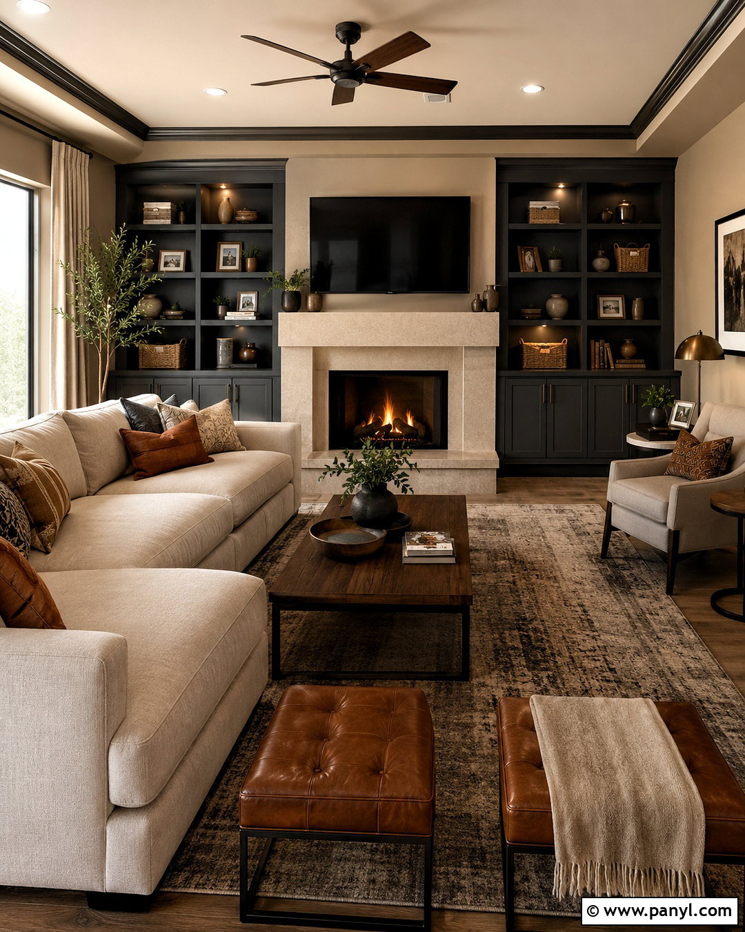
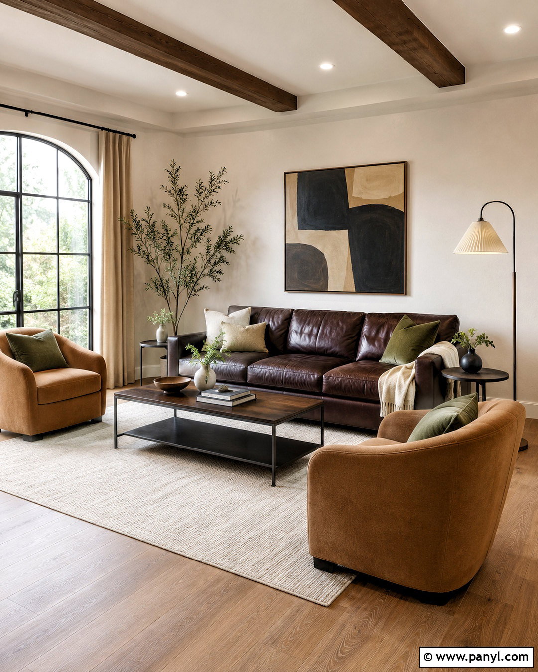
Deep black tea brown gives a library or reading room a sophisticated, cocooning quality. Use espresso brown on built-in bookcases and a warm mushroom shade across the remaining walls. A tobacco leather sofa adds another brown layer, but its warm undertone prevents the combination from looking flat. Balance the darkness with a large oatmeal rug, parchment lampshades, and linen curtains in warm ivory. Antique brass picture lights can highlight books and framed artwork. Combine black tea #332A24, espresso #46362C, mushroom #A99B8C, tobacco #9A6244, and parchment #E8DDC8. Leave the ceiling pale to retain openness. Texture is especially important here, so mix smooth leather, nubby wool, aged wood, and woven linen throughout the room.
8. Oolong Tea Color Palette
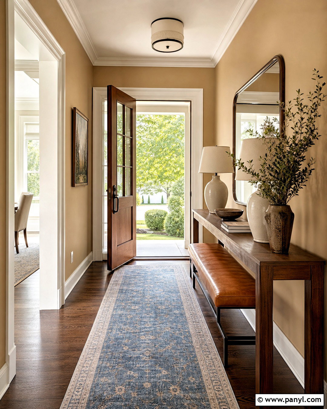
Oolong-inspired neutrals create a polished entryway that feels warm from the moment the door opens. Paint the walls a muted tan with subtle gray undertones and use creamy white on the trim. A medium walnut console provides depth, while a faded blue runner adds a quiet complementary note. Place a large bronze-framed mirror above the console and use stoneware lamps in a soft almond finish. A cognac bench or woven stool can supply extra seating without crowding the walkway. Build the palette around oolong tan #B89C78, almond #E8D9C3, walnut #69503C, faded blue #879CA0, and bronze #625044. Keep decorative objects limited and substantial. One ceramic bowl, leafy branch, and small stack of books will make the entrance feel finished.
9. Peppermint Tea Color Palette
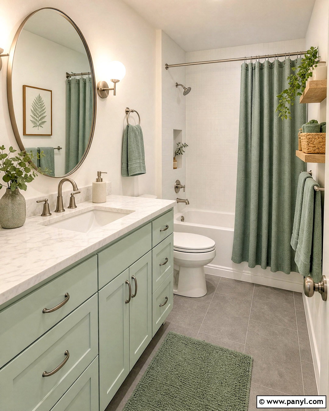
Peppermint colors can refresh a bathroom while still feeling soft and grown-up. Choose pale mint green for the vanity and clean warm white for the walls. White marble-look counters introduce delicate gray movement, while brushed nickel fixtures keep the cooler tones consistent. Ground the room with medium gray floor tile rather than stark black. Add eucalyptus-colored towels, a white waffle shower curtain, and light oak shelves to prevent the palette from feeling clinical. Use peppermint #C4DCCB, eucalyptus #789987, warm white #F7F5EF, stone gray #979A95, and light oak #C5A77C. A frameless mirror and simple globe sconces maintain the open appearance. Limit decorative patterns so the subtle green cabinetry remains the room’s clear focal point.
10. Jasmine Tea Color Palette
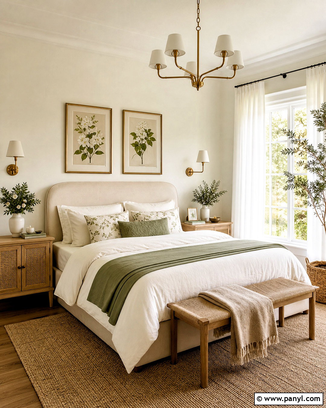
Delicate jasmine shades suit a serene guest bedroom with an airy, welcoming mood. Start with creamy white walls carrying a faint yellow undertone. Place an ivory upholstered bed against the main wall, then layer pale jasmine, muted green, and soft tan across the bedding. A light wood dresser and woven cane nightstands bring warmth and casual texture. Use faded botanical prints rather than strongly colored artwork, and select sheer ivory curtains beneath natural woven shades. The palette can include jasmine cream #F3EBCB, ivory #F7F3E9, leaf green #9DA581, soft tan #C9AE88, and cane brown #9A7955. Add a small antique brass lamp or mirror for contrast. The result should feel luminous, comfortable, and gently botanical rather than overly floral.
11. Hibiscus Tea Color Palette
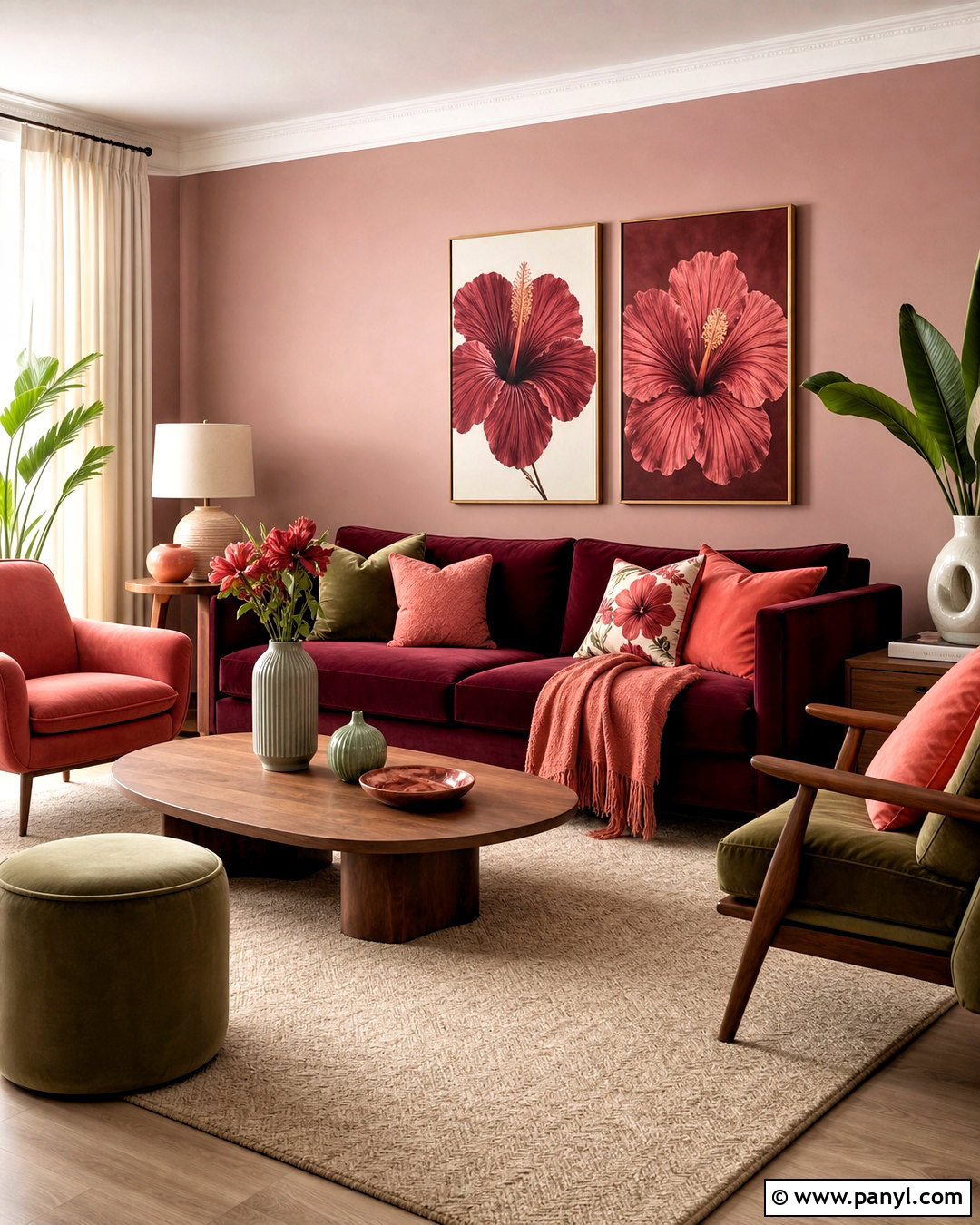
A hibiscus palette brings lively color into a living room while remaining balanced and usable. Choose dusty blush walls as the soft backdrop, then introduce a deep hibiscus sofa or pair of berry-colored chairs. Warm white curtains and a pale beige rug provide relief from the stronger pink-red tones. Add walnut tables, muted olive pillows, and artwork containing coral, cream, and burgundy. A strong combination is hibiscus #A73E5C, dusty blush #D7A5A8, coral #D9796C, warm beige #D8C8B4, and olive #747554. Use burgundy only on one major element so the room does not become visually heavy. Curved furniture, linen upholstery, and ceramic accessories will make the bold palette feel approachable instead of formal or theatrical.
12. Lavender Tea Color Palette
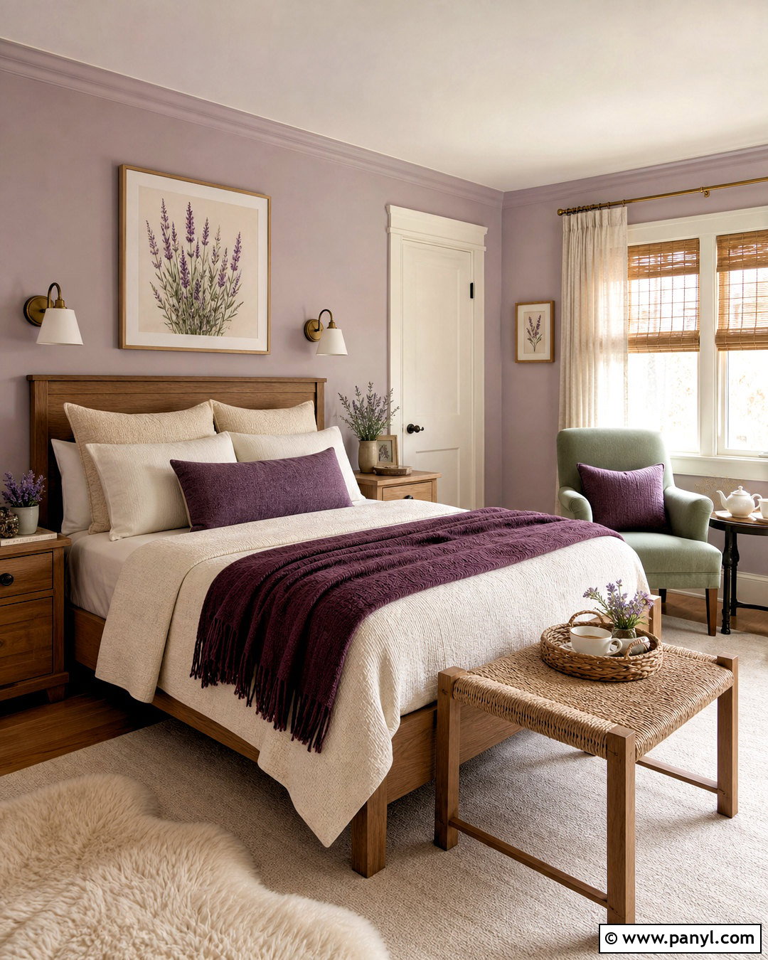
Imagine a quiet bedroom where lavender appears soft and earthy rather than sweet. Paint the walls a muted lavender-gray and use warm white on the trim and ceiling. Choose a natural oak bed, oatmeal bedding, and a plum throw folded neatly across the foot. Sage green can appear in two pillows or a small upholstered chair, connecting the floral tones to nature. Add antique brass sconces and a cream wool rug to warm the cooler walls. Use lavender gray #AAA0B4, plum #6F526D, sage #949C7D, oatmeal #D8CAB5, and warm white #F6F1E8. Avoid bright purple accessories. Dusty, grayed shades combined with visible wood grain create a much calmer and more adaptable lavender tea color scheme.
13. Rose Tea Color Palette
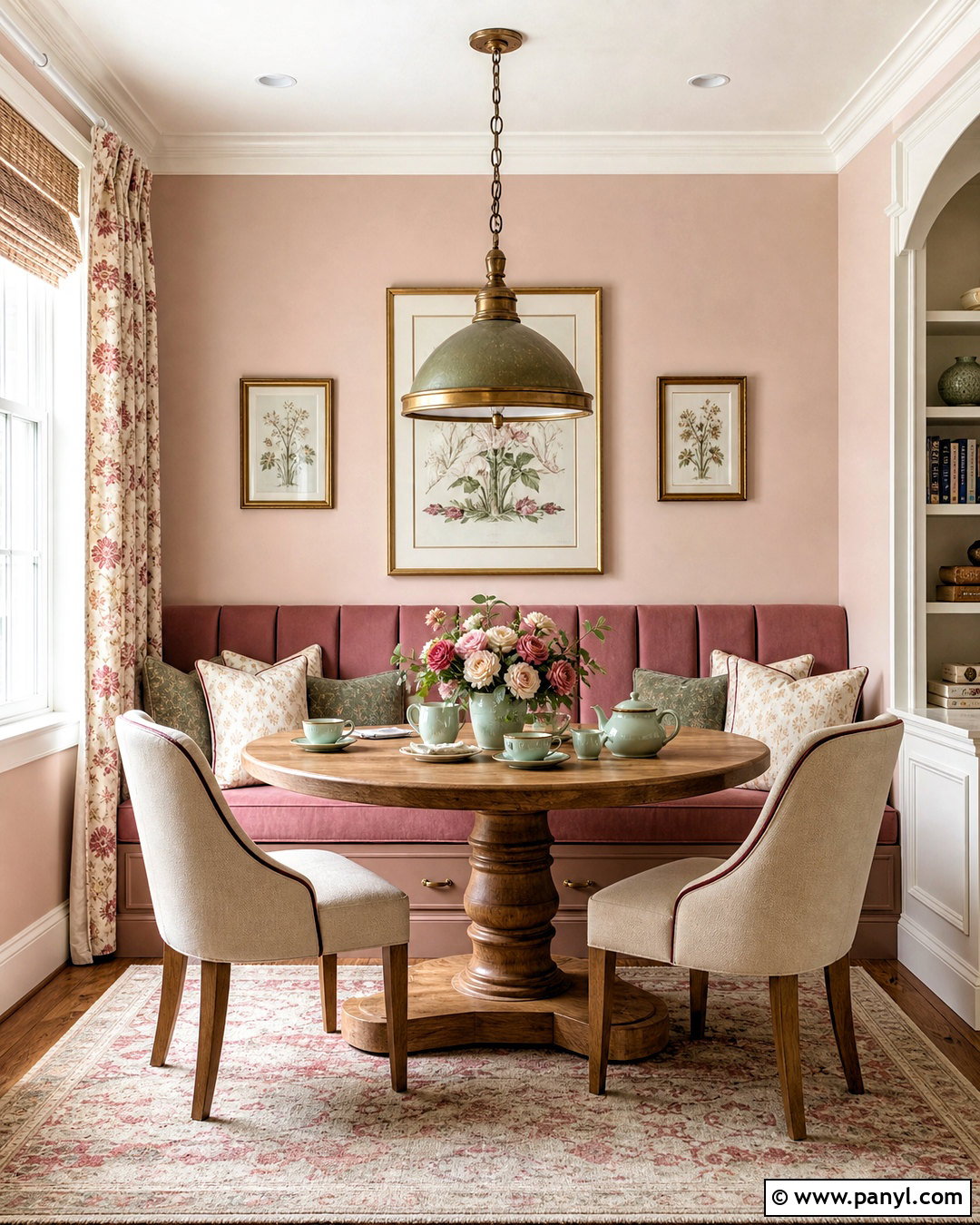
Rose tea colors create a graceful dining nook that feels comfortable enough for daily use. Cover the walls in pale rose beige, then add a round pedestal table in medium oak. Upholster the chairs in warm cream fabric and introduce dusty rose through a cushioned banquette or linen curtains. Muted burgundy piping can outline the seating and give the pastel tones needed structure. Complete the look with an aged brass pendant and small sage green accessories. A practical palette includes rose beige #D8B7AF, dusty rose #BE8585, cream #F3E9DB, burgundy #70434A, and sage #91977B. Choose washable, textured fabrics rather than shiny finishes. This makes the pink palette feel relaxed, layered, and suitable for a real family dining space.
14. Lemon Tea Color Palette
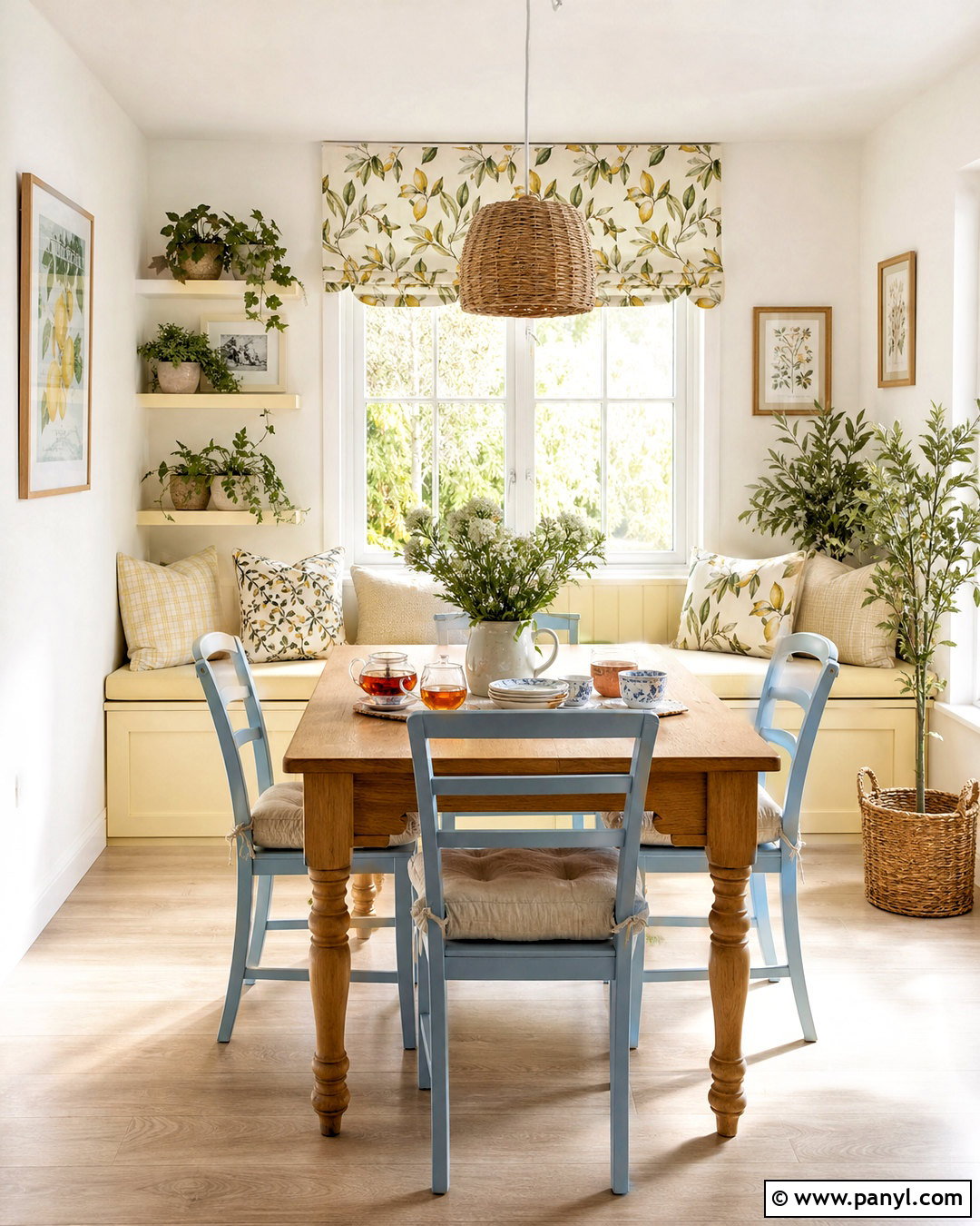
Bright but not overpowering, a lemon tea palette can energize a breakfast room or sunroom. Use warm white walls and pale natural flooring as the main foundation. Paint a freestanding cabinet or window seat muted lemon yellow, then add light blue dining chairs for gentle contrast. A woven pendant, oak table, and cream cushions make the brighter hues feel grounded. Introduce leafy green through plants and a small-scale botanical fabric. Try lemon #E5CE63, warm white #F8F3E6, powder blue #AFC6CE, leafy green #819267, and natural oak #C4A171. Avoid using saturated yellow on every wall. Keeping it to one architectural feature and several smaller accents allows the room to feel sunny, spacious, and easy to update later.
15. Peach Tea Color Palette
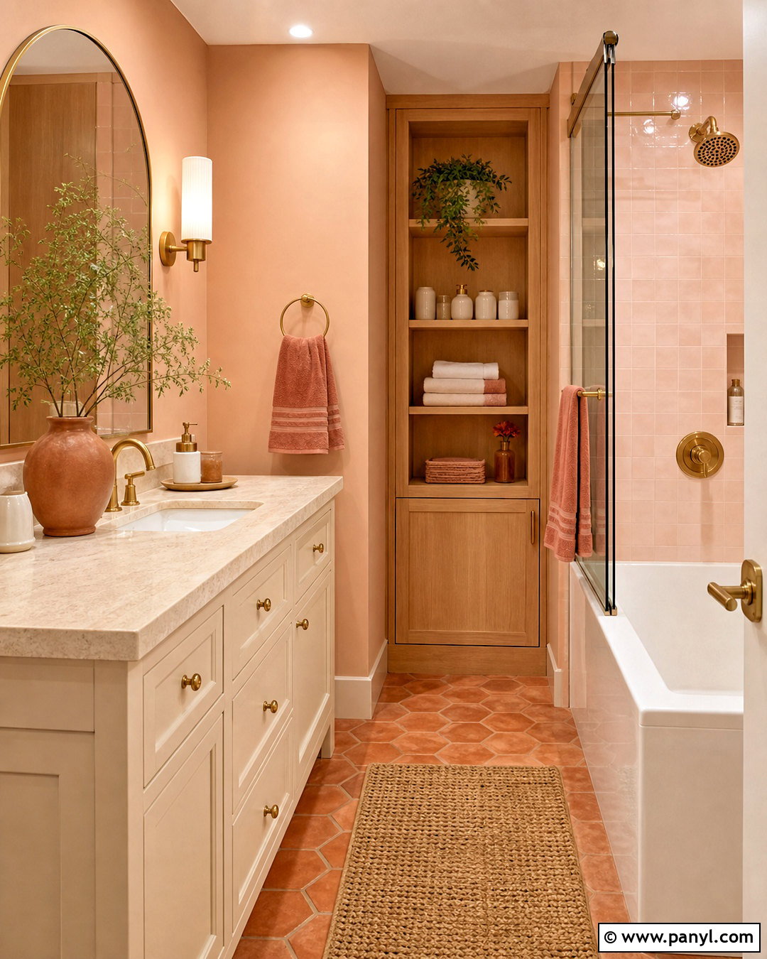
Peach tea colors are ideal for a warm bathroom that needs more personality than plain beige. Choose soft peach walls and a creamy white vanity with a light travertine counter. Terracotta floor tile adds earthy variation, while pale oak storage introduces a clean natural finish. Use brushed brass for the faucet, mirror, and sconces, but keep the shapes simple. Towels in warm ivory and muted coral can reinforce the palette without creating visual clutter. Combine peach #E3AD8F, muted coral #C77B68, ivory #F3E7D7, travertine #CBB797, and pale oak #C6A276. A large arched mirror will reflect light and soften the straight lines of the vanity. Finish with understated ceramic containers and a woven bath mat.
16. Butterfly Pea Tea Color Palette
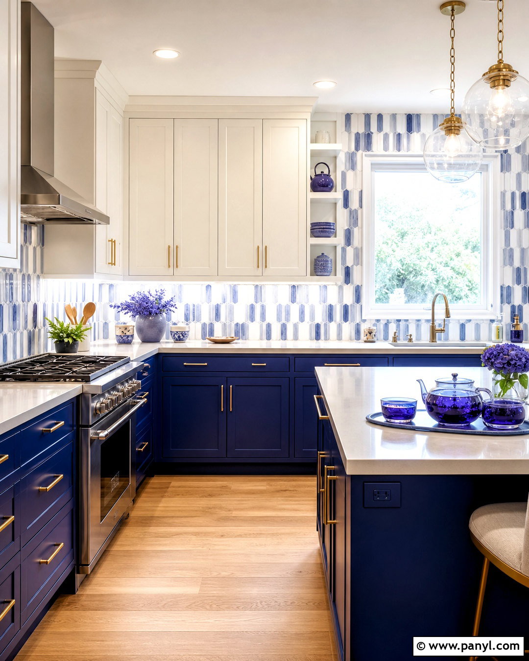
The vivid blue of butterfly pea tea can inspire a striking kitchen with plenty of balance. Use deep cobalt blue on the lower cabinets or island, while keeping upper cabinets and walls creamy white. Pale gray quartz counters create a quiet transition between the two tones. Add natural white oak flooring, brushed brass hardware, and a backsplash of glossy blue-and-white handmade tile. Small accents of violet can appear in artwork or pottery, referencing the tea’s shifting blue-purple color. Choose cobalt #315C9B, indigo #34476F, creamy white #F5F0E5, pale gray #C7C9C5, and violet #766A96. Limit the darkest blue to the lower half of the room so the kitchen remains bright, open, and visually grounded.
17. Genmaicha Tea Color Palette
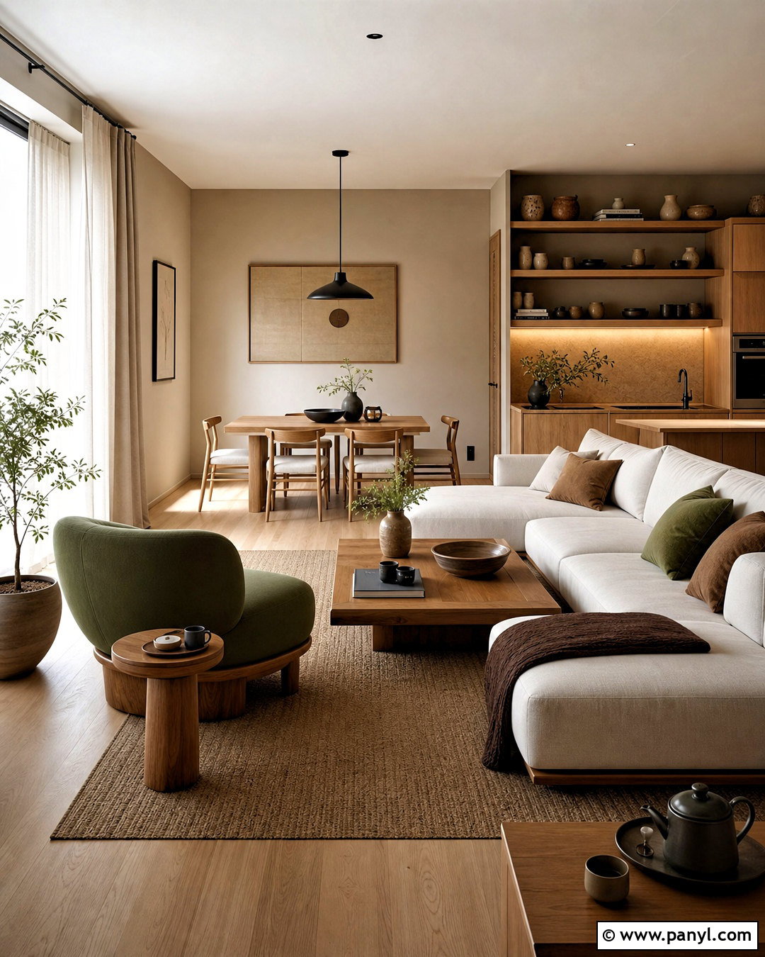
Toasted rice and green tea tones form a relaxed palette with natural Japanese and Scandinavian influences. Use warm greige walls, pale oak cabinetry, and soft rice white upholstery in a streamlined living-dining space. Muted leaf green can define a low lounge chair or built-in bench, while toasted brown appears in cushions and handmade ceramics. Keep window coverings simple with off-white linen panels. Matte black lighting and chair frames provide slim, controlled contrast. Build the scheme with greige #B8AC99, rice white #EFE8D8, leaf green #7F8C68, toasted brown #A27B54, and matte black #353632. Focus on low furniture, clean walkways, and visible natural grain. The finished room should feel warm and minimal, not bare or overly themed.
18. Thai Tea Color Palette
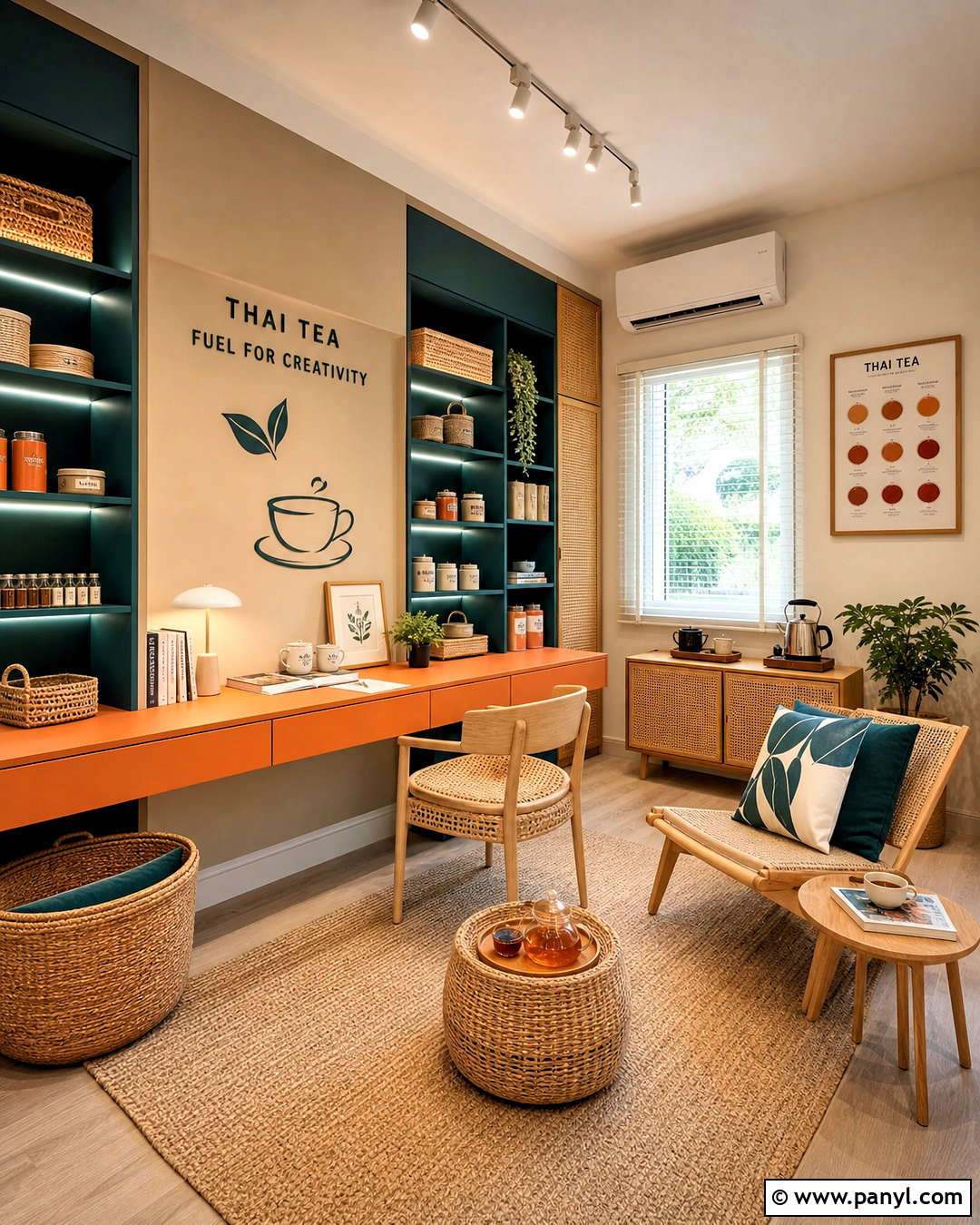
Thai tea orange makes a joyful accent for a creative studio, playroom, or casual sitting area. Begin with creamy beige walls and use rich tea orange on a built-in desk, storage cabinet, or compact sofa. Balance that warmth with deep teal shelving or a painted interior door. Light oak furniture and a sand-colored rug keep the saturated accents from competing. Add woven baskets, graphic cream-and-teal cushions, and matte white lighting. A strong palette includes Thai tea orange #C9783F, deep teal #356E70, creamy beige #E8D7BF, sand #CDB793, and light oak #C5A174. Repeat orange in only a few carefully chosen places. This creates a clear visual rhythm while keeping the room practical, bright, and organized.
19. Milk Tea Color Palette
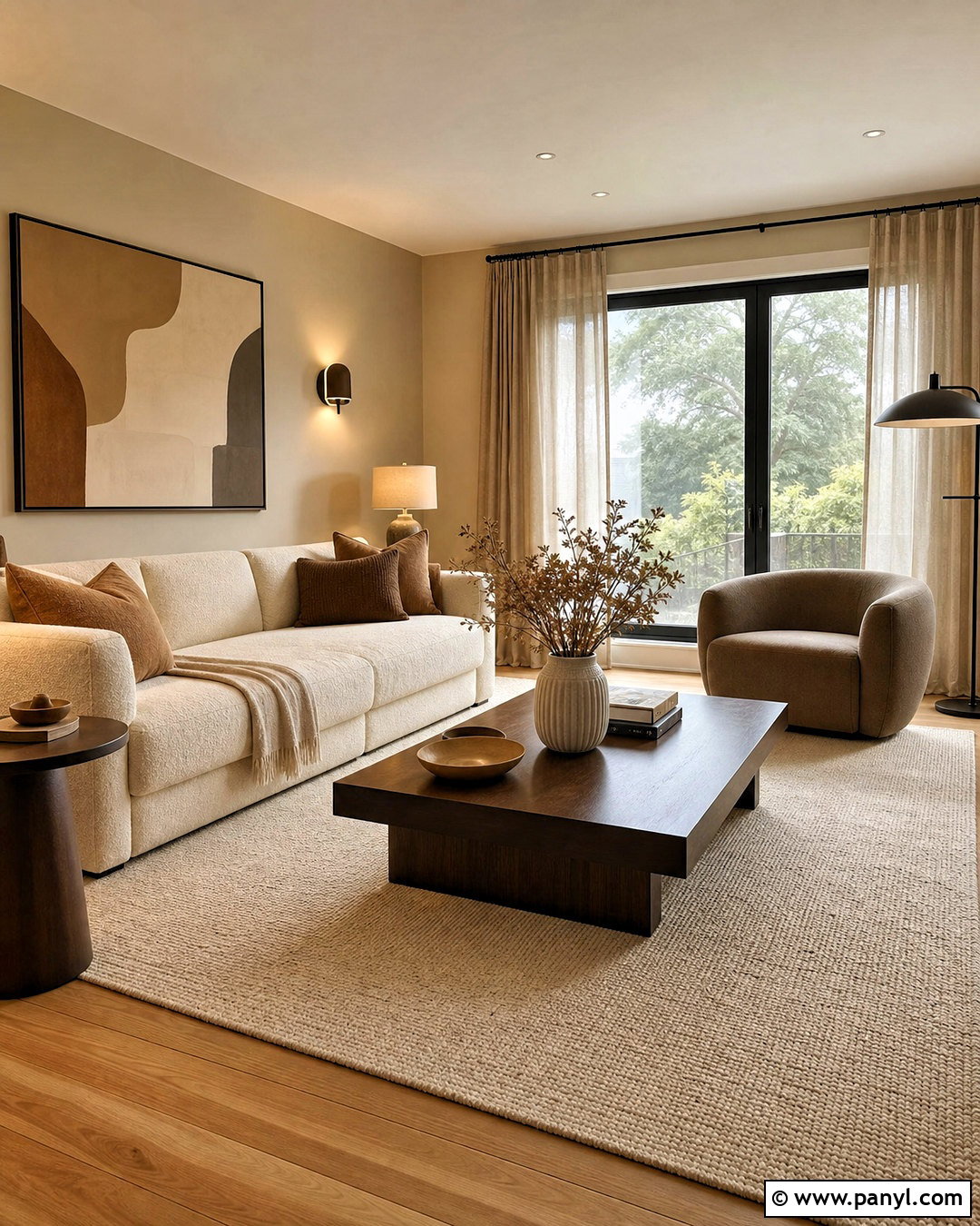
Layered beige shades make a milk tea living room feel calm, polished, and far from boring. Paint the walls a warm latte beige and choose a large sofa in creamy oatmeal. Add a taupe lounge chair, walnut coffee table, and caramel-colored cushions for gradual tonal contrast. A textured ivory rug prevents the darker wood from feeling heavy, while blackened bronze lighting adds a crisp outline. Use milk tea beige #C9AC8C, latte #B99572, oatmeal #DDD0BC, taupe #978675, and walnut #5F4938. The success of this palette depends on texture, so combine boucle, linen, wool, smooth wood, and ribbed ceramics. Keep patterns subtle and geometric. The finished room will feel cohesive, warm, and comfortable throughout every season.
20. Iced Tea Color Palette
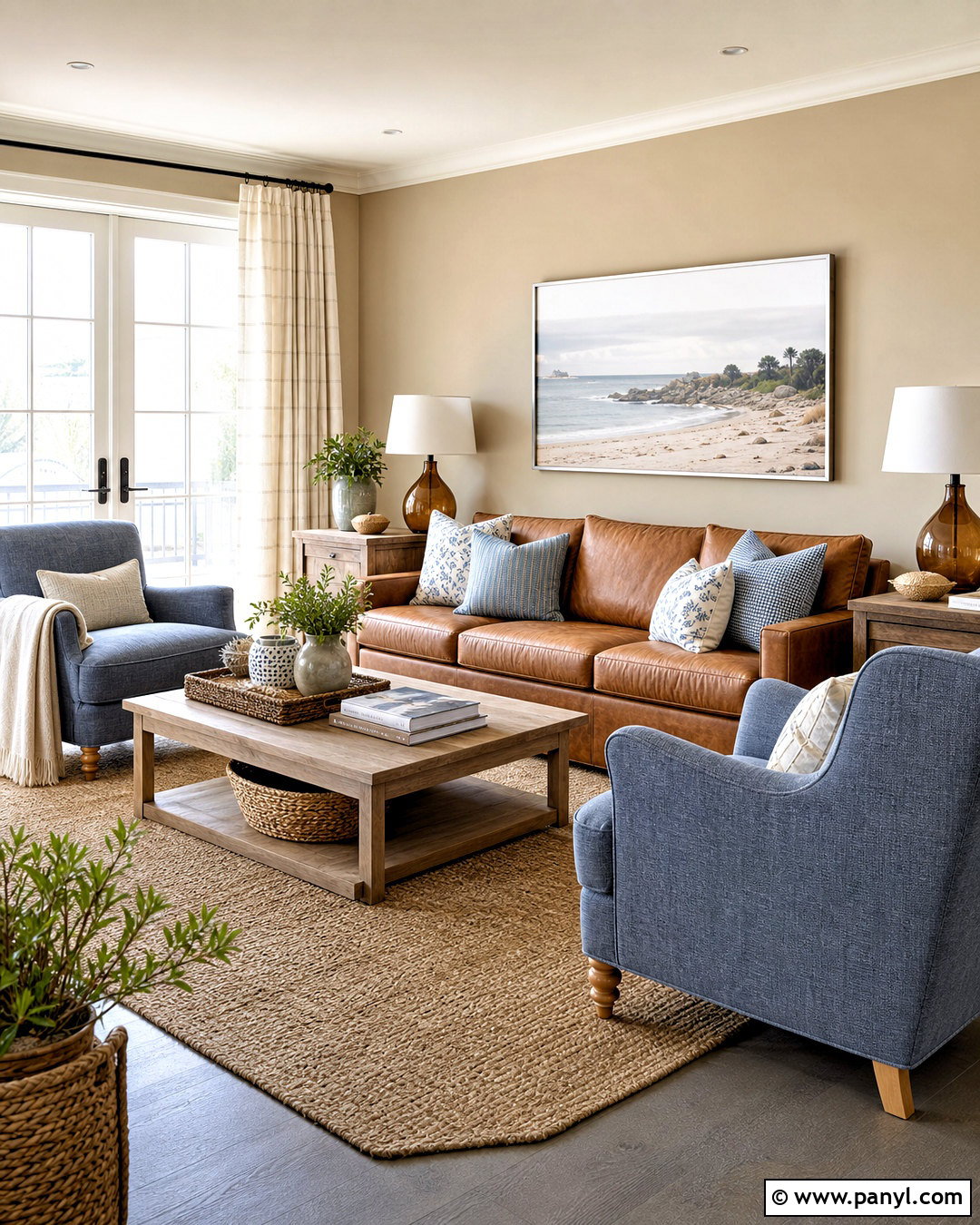
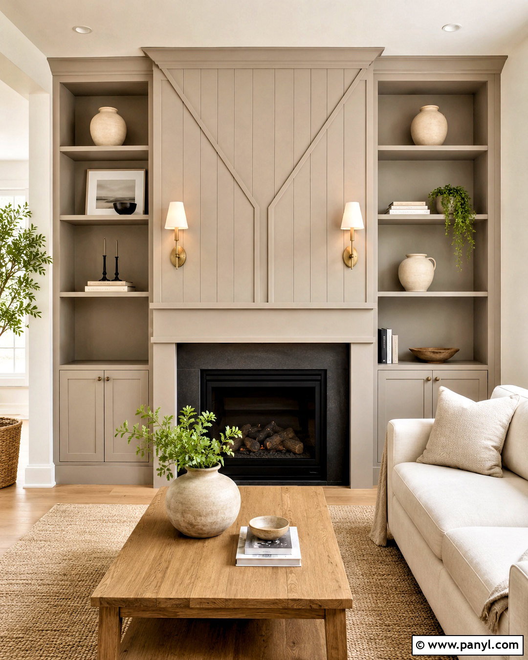
Golden amber and cool blue create an iced tea palette that feels relaxed and slightly coastal. Use pale sandy beige on the walls of a family room, then add a honey-colored leather sofa as the main warm element. Faded denim blue armchairs and striped ivory curtains provide cooler contrast. Choose a natural jute rug, weathered oak tables, and amber glass lamps to reinforce the casual theme. A complete palette might include iced tea amber #B9783E, honey #C99155, sandy beige #DCCBB4, faded denim #718C9B, and ivory #F2EBDD. Avoid obvious beach decorations. Instead, rely on breezy fabrics, simple ceramics, and woven materials. This produces a comfortable color story that works in coastal, farmhouse, and transitional homes.
Conclusion:
The most inviting tea color palette ideas combine drink-inspired shades with practical neutrals, natural materials, and thoughtful contrast. Matcha, peppermint, and green tea bring restorative freshness, while chai, rooibos, and Thai tea create warmth and energy. Earl Grey and butterfly pea tea introduce cooler sophistication, and milk tea delivers an easy layered-neutral look. Before decorating, test each main color in the room during morning and evening light. Then assign one dominant shade, one supporting neutral, and a limited number of accents. This simple approach prevents even colorful combinations from feeling busy. Whether you refresh one corner or redesign an entire room, these 20 tea color palette ideas offer a versatile starting point.

Related Ideas and Inspiration:
Leave a Reply