
Color can change how a room feels, define its layout, and make ordinary architecture look intentional. **20 Multi Color Room Walls** explores complete spaces where two or more wall colors work with the furniture, flooring, lighting, and decor. Today’s color blocking can include clean horizontal divisions, painted arches, geometric patterns, tonal layers, and contrasting ceilings rather than a single traditional accent wall. () The key is choosing shades with a shared undertone and repeating them through textiles or accessories. Whether you prefer warm earth tones, soft pastels, saturated jewel colors, or crisp neutrals, every look below offers a practical direction for creating balanced, expressive rooms. Use these **20 Multi Color Room Walls** to find a combination that suits your space.

1. Two Tone Living Room Walls
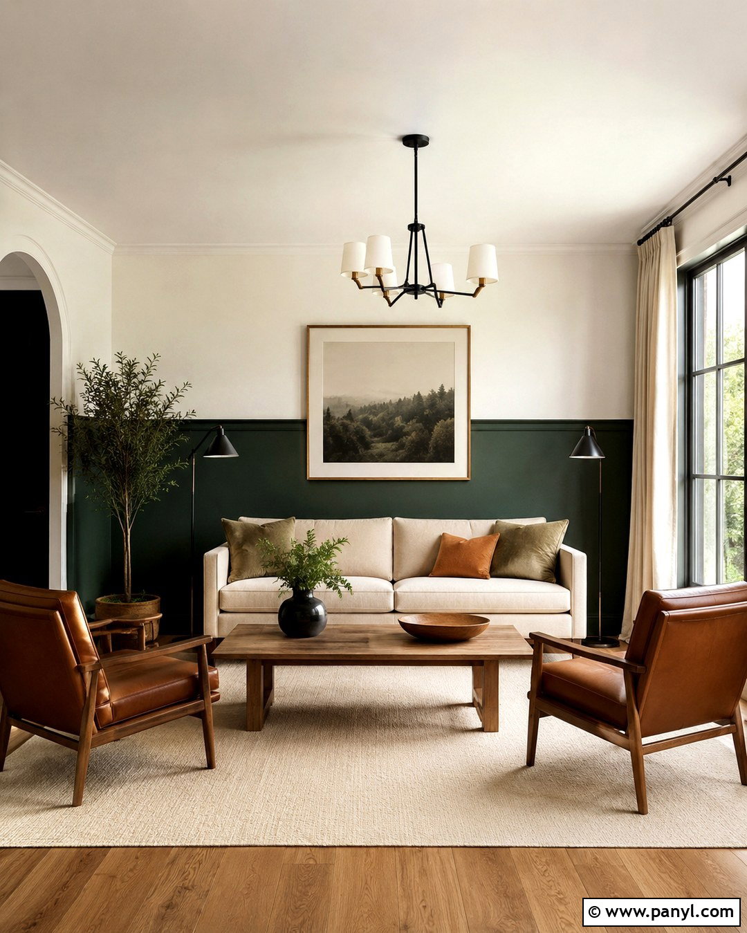
Create a grounded living room with deep forest green across the lower two-thirds of the walls and warm ivory above. Keep the dividing line crisp and level, without molding, for a clean contemporary finish. A light oatmeal sofa prevents the darker paint from feeling heavy, while cognac leather chairs introduce warmth. Choose an oak coffee table, cream wool rug, and linen curtains that blend into the upper wall color. Black floor lamps and simple framed art give the space definition. Repeat forest green in two sofa pillows and ivory in a textured throw. Medium-toned wood flooring connects the warm and cool elements, resulting in a comfortable multi color room that feels layered rather than busy.
2. Geometric Bedroom Walls
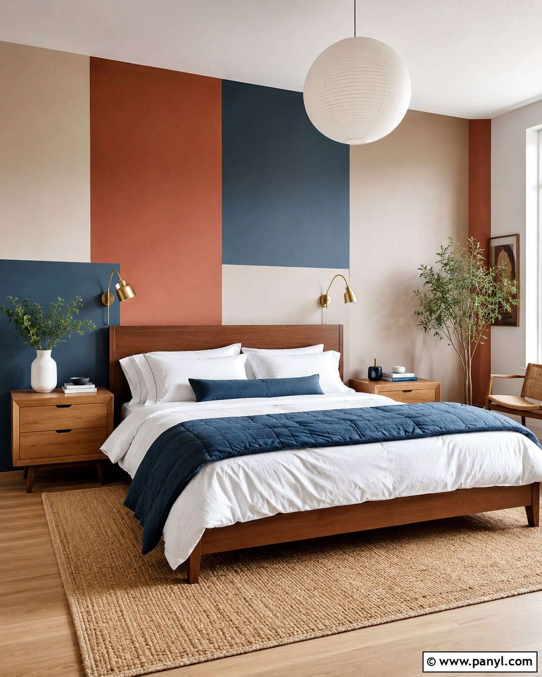
Turn the wall behind the bed into a balanced geometric composition using dusty blue, muted terracotta, warm beige, and soft cream. Paint large overlapping rectangles instead of many small shapes, allowing the design to frame the headboard. A low walnut bed adds natural contrast, while white bedding keeps the arrangement restful. Layer terracotta pillows, a blue quilt, and a beige upholstered bench to repeat the wall palette. Install simple brass sconces inside the two outer color blocks for symmetry. A woven rug and light oak nightstands soften the straight painted lines. Keep the remaining walls creamy white so the feature remains clear. This complete bedroom feels creative and colorful without sacrificing the calm atmosphere needed for sleep.
3. Rainbow Kids Room Walls
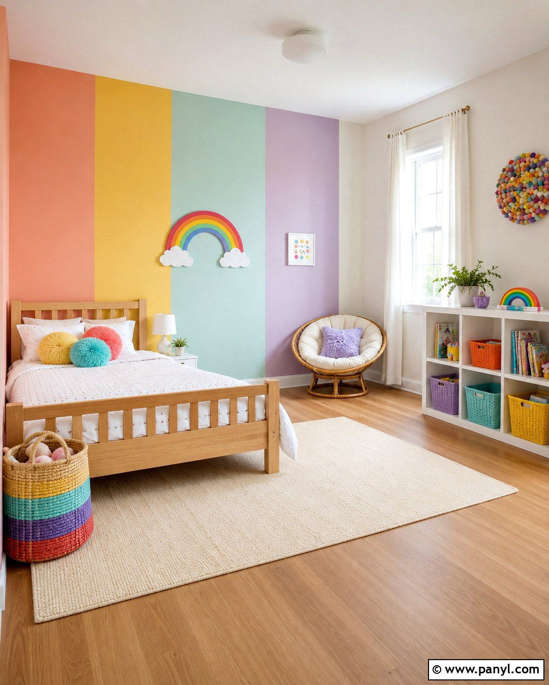
A softened rainbow palette can make a child’s room cheerful without becoming overwhelming. Divide the walls into wide vertical sections of peach, butter yellow, pale aqua, lavender, and warm white. Use muted versions of each color so toys and artwork can still stand out. Place a natural wood bed against the aqua section and a white bookcase along the lavender wall. A washable cream rug, yellow storage baskets, and peach curtains repeat the painted colors around the room. Keep furniture shapes simple and leave open floor space for play. White trim and a white ceiling give the palette breathing room. The result is a complete, adaptable room that can transition from early childhood into the elementary years.
4. Color Block Home Office Walls
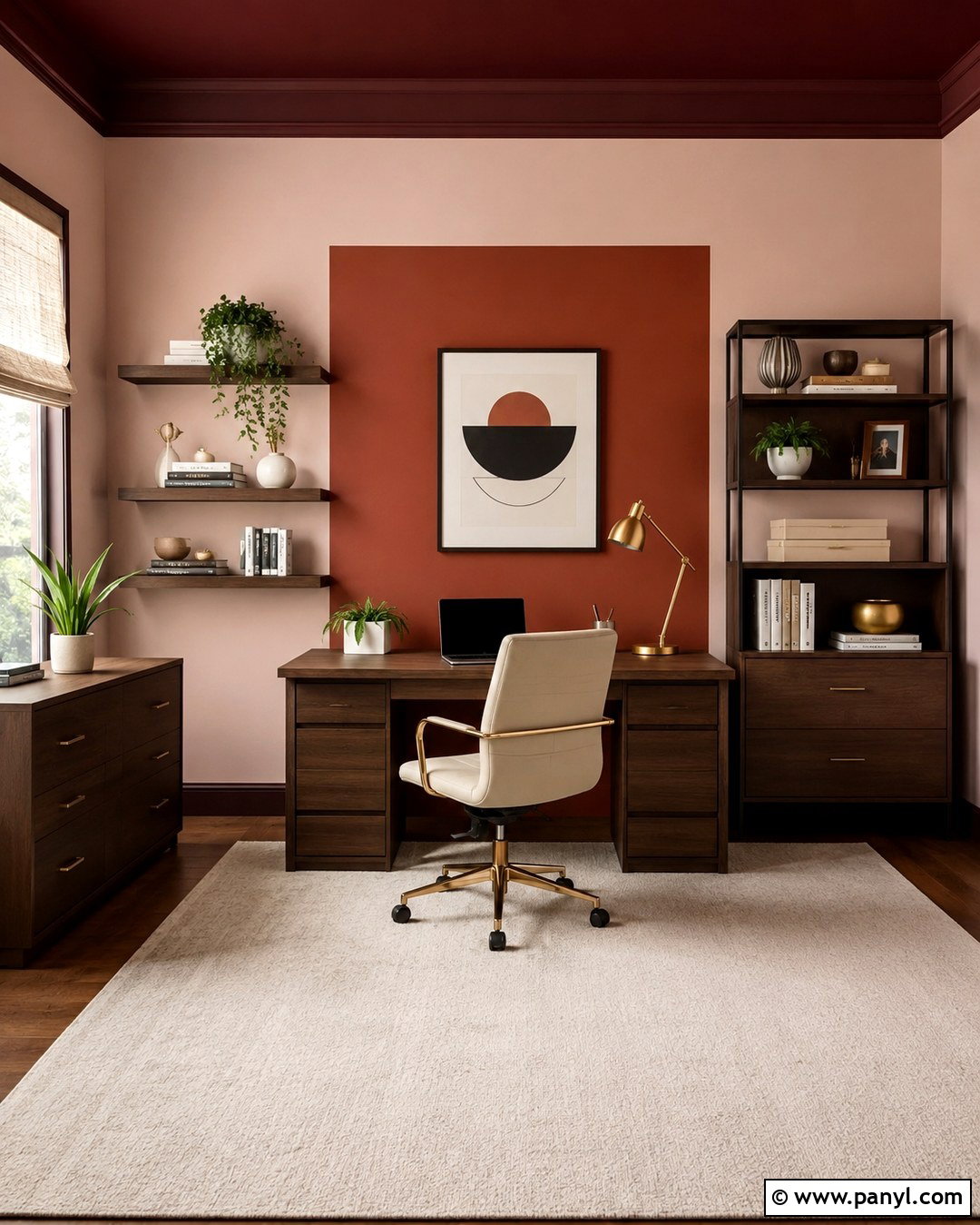
Give a compact home office visual structure with a large rust-colored rectangle painted behind the desk. Surround it with pale blush walls and add a narrow deep burgundy band near the ceiling. The central block defines the working zone, while the upper stripe draws attention upward. Choose a streamlined walnut desk, an ergonomic cream chair, and floating shelves that stay within the rust section. A brass task lamp brings a polished finish without adding another strong color. Use burgundy folders, blush storage boxes, and neutral pottery to connect the furniture to the walls. A flat-weave rug in cream and rust completes the arrangement. This palette feels focused, warm, and professional enough for video calls or daily creative work.
5. Three Color Dining Room Walls
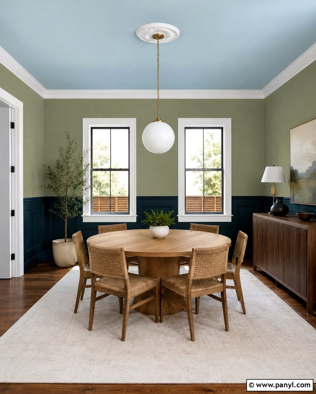
Build an inviting dining room with dark teal below the chair rail, muted sage above it, and a soft sky blue ceiling. This three-color arrangement surrounds the space without making every surface equally intense. Center a round oak table beneath a white globe pendant and add woven dining chairs for natural texture. Cream curtains brighten the windows, while an understated botanical rug repeats the green tones. Paint the baseboards and window trim dark teal to anchor the lower section. A walnut sideboard topped with ceramic lamps balances the room. Keep artwork limited to a few light-toned landscape prints. The colors create gentle transitions from dark to light, making everyday meals feel intimate while keeping the room fresh and open.
6. Pastel Nursery Walls
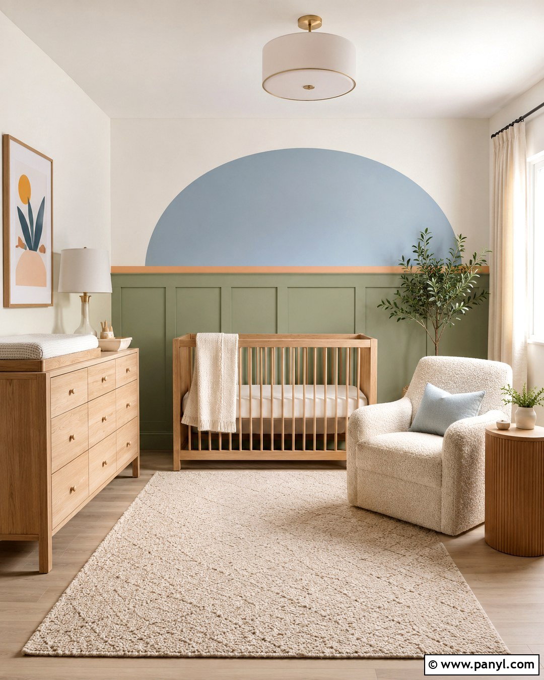
Use warm white, pale sage, powder blue, and a small amount of muted apricot for a soothing nursery with personality. Paint the walls warm white, then create a wide sage section around the crib and a soft blue arch behind a reading chair. Add a narrow apricot border along the bottom of the arch for definition. Choose a natural oak crib, cream boucle chair, and light wood dresser with rounded edges. White linen curtains diffuse daylight, while a washable beige rug keeps the room comfortable. Repeat the paint colors through a blue blanket, sage storage bins, and apricot cushions. The generous neutral areas prevent the pastel combination from becoming overly sweet, creating a calm room that can adapt as the child grows.
7. Terracotta And Pink Bedroom Walls
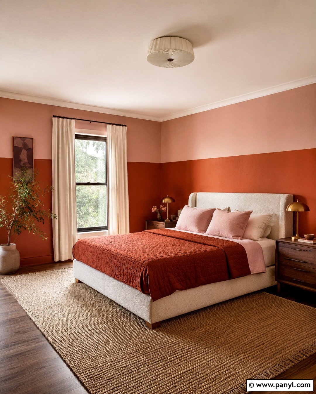
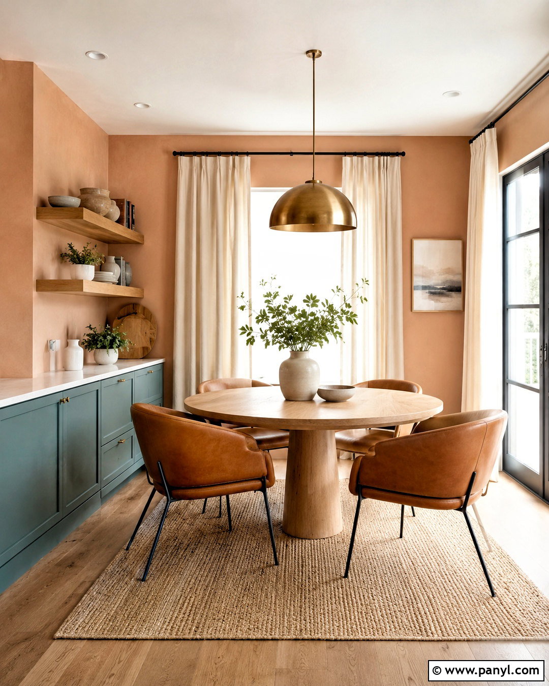
Warm terracotta and dusty pink produce a cocooning bedroom when balanced with pale plaster tones. Paint the lower half of every wall terracotta and the upper half muted pink, then continue a light cream shade across the ceiling. Position a tall oatmeal upholstered bed against the two-tone wall so both colors remain visible. Walnut nightstands, aged brass lamps, and linen bedding reinforce the warm palette. Add a rust quilt, blush pillows, and a cream rug with a subtle geometric pattern. Sheer ivory curtains soften direct sunlight. Avoid bright white furniture, which may look stark beside these earthy colors. The finished room feels enveloping and coordinated, with enough tonal variation to create depth without disrupting its restful character.
8. Blue And Green Bathroom Walls
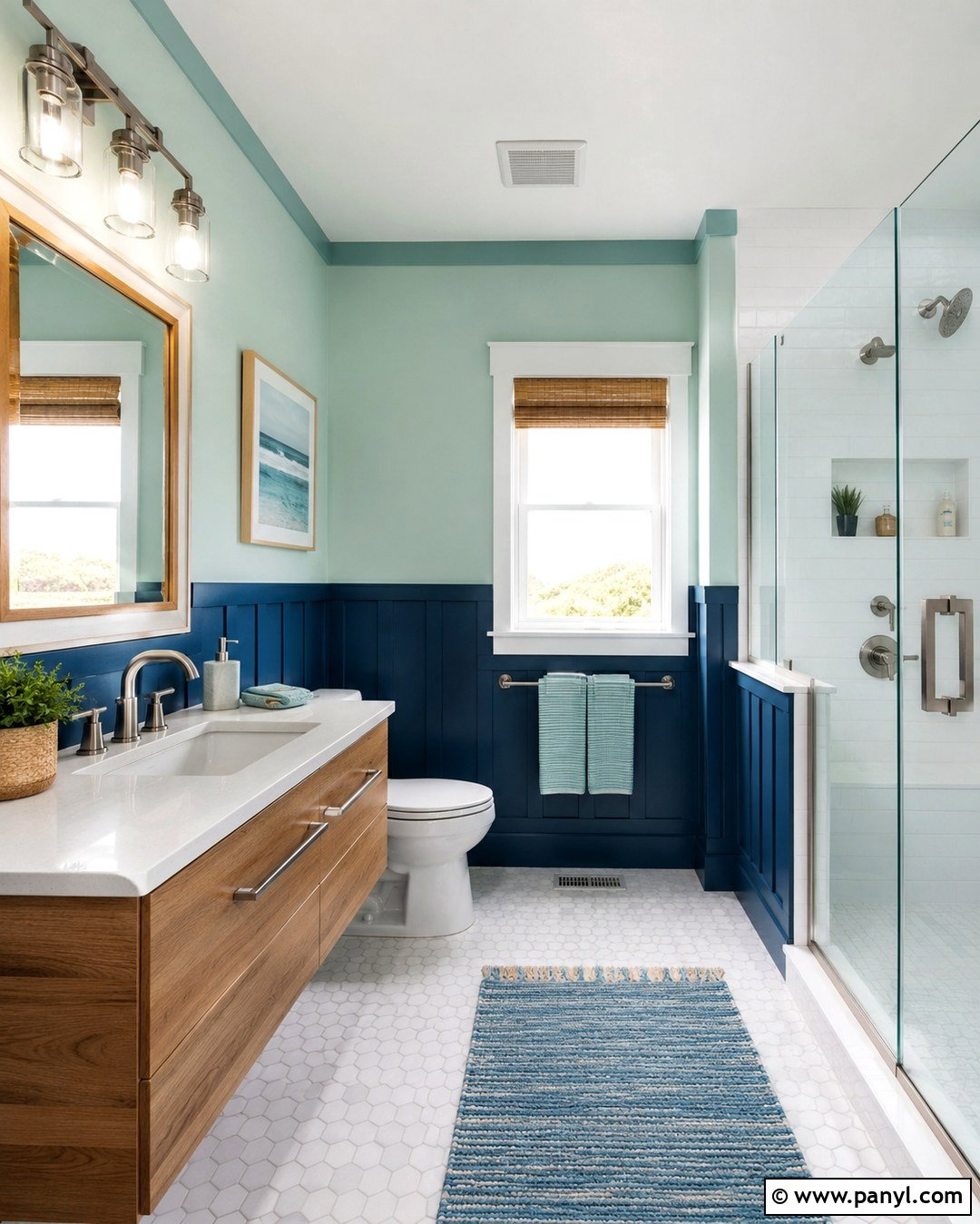
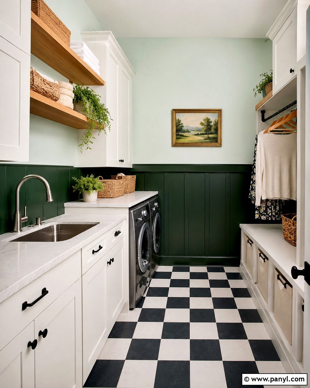
Refresh a bathroom with navy blue paneling on the lower walls, pale mint paint above, and a narrow seafoam stripe beneath the ceiling. White porcelain fixtures provide a crisp break between the cool colors. Choose a floating oak vanity, a white quartz counter, and brushed nickel hardware for a clean, natural finish. A frameless round mirror keeps the sink area visually light. Use small white floor tiles with navy grout to connect the surfaces without creating another competing pattern. Mint towels and a navy bath mat repeat the wall palette. Add one leafy plant near the window for texture. This coordinated bathroom feels bright, tailored, and relaxing while giving a standard-sized space noticeably more architectural character.
9. Colorful Kitchen Walls
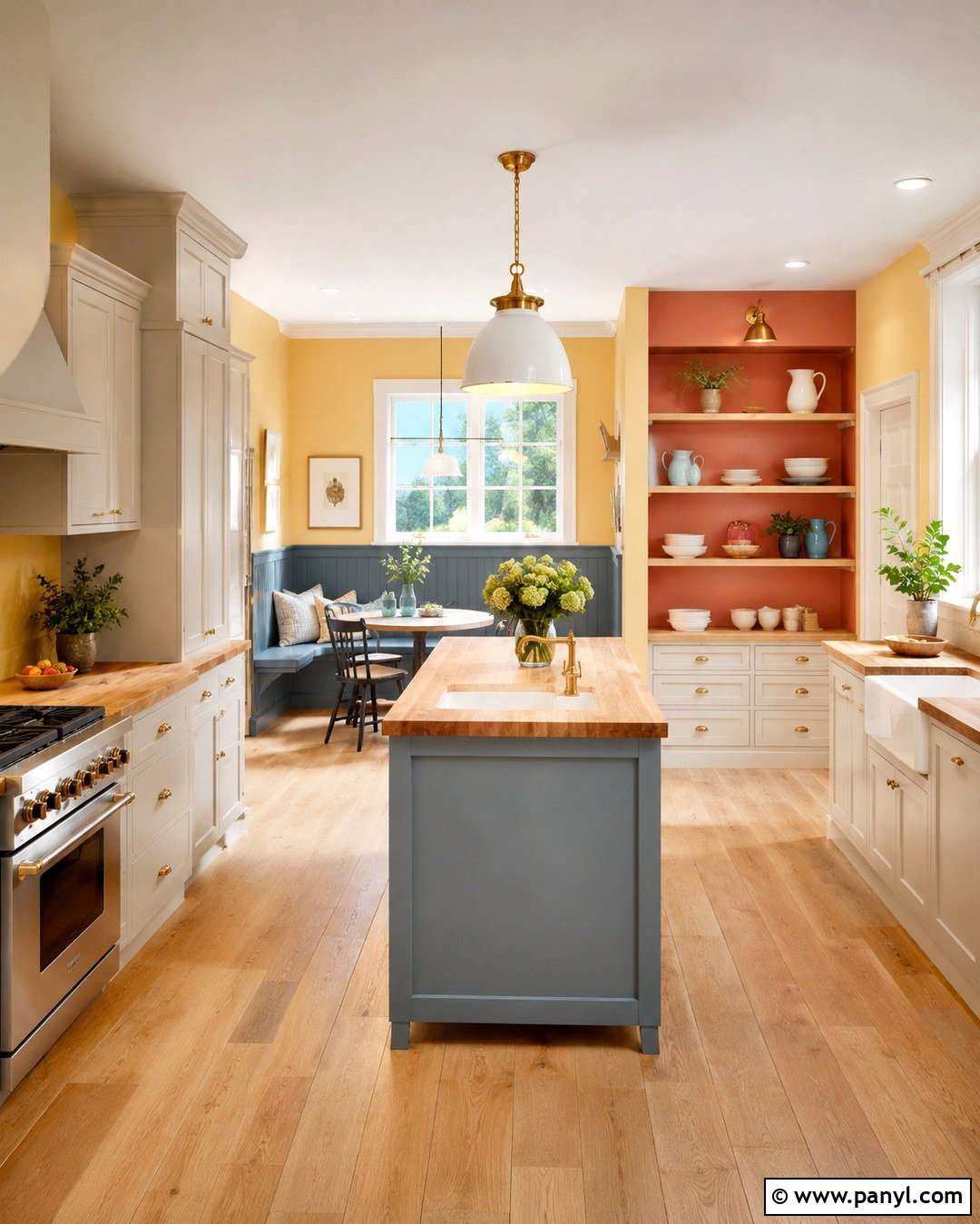
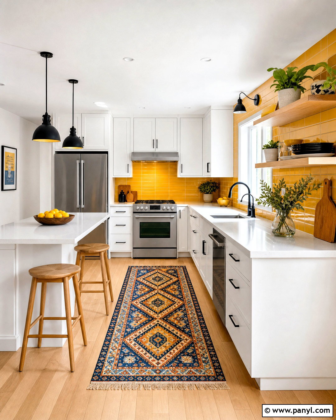
Create a lively kitchen by pairing soft yellow walls with a dusty blue breakfast nook and muted coral inside the open shelving. Keep the main cabinets warm white so the three paint colors remain easy to live with. Pale oak flooring and butcher-block counters add a consistent natural material throughout the space. In the nook, place a built-in blue bench around a small round table with simple spindle chairs. Use yellow cushions, coral ceramics, and blue-striped curtains to connect each zone. Brushed brass cabinet pulls bring warmth without competing with the palette. Limit decorative objects and keep countertops mostly clear. The finished kitchen feels sunny and cohesive, with color helping to define cooking, storage, and dining areas.
10. Neutral Multi Color Walls
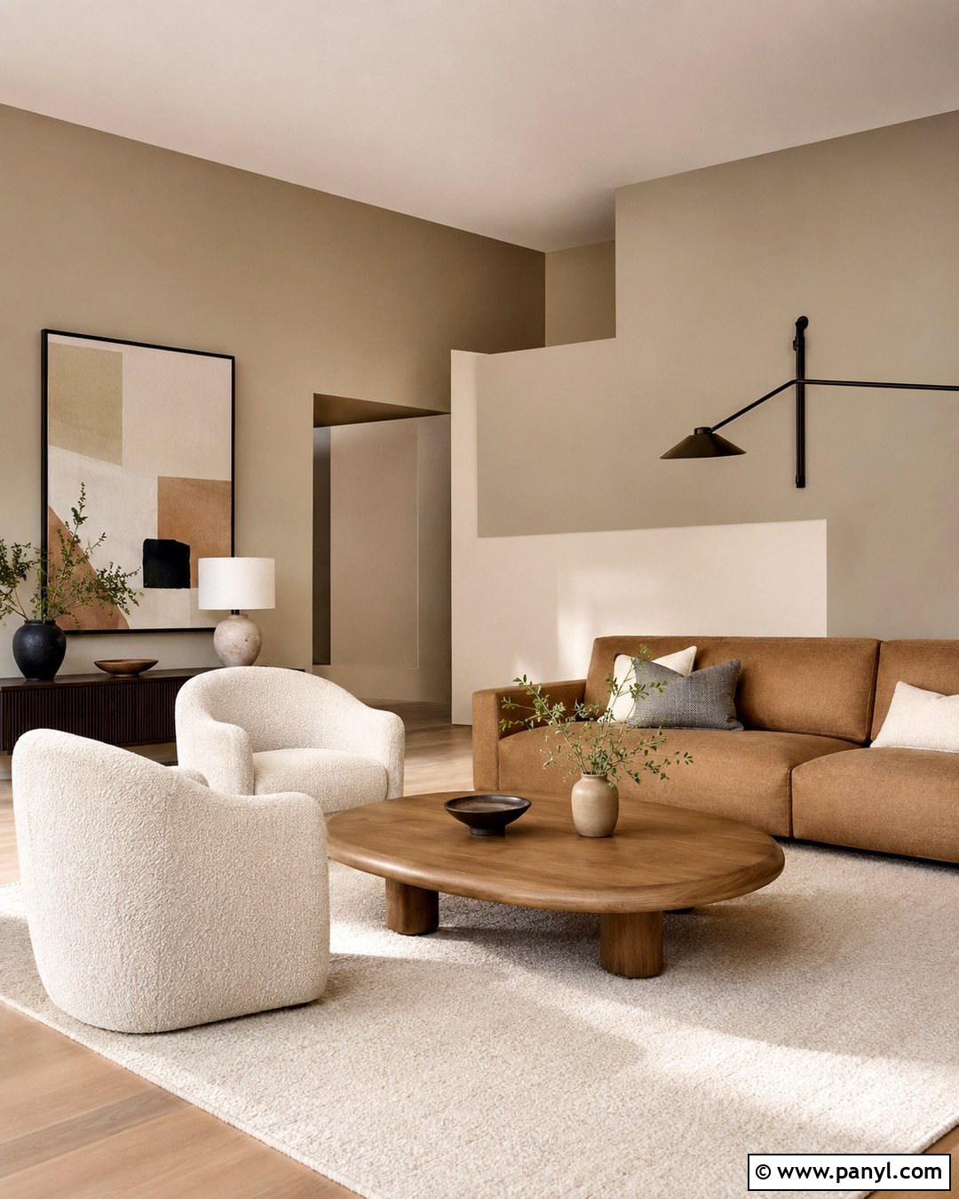
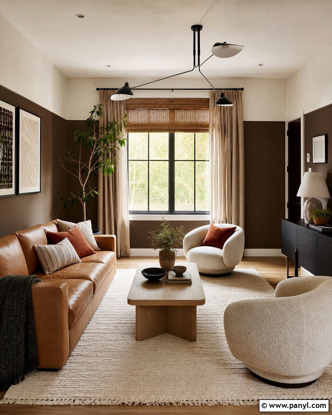
Multi color walls can feel quiet when the palette stays close to nature. Combine soft greige on the main walls, warm taupe behind the sofa, and creamy beige across the ceiling and upper trim. Use broad, asymmetrical blocks with subtle contrast rather than sharp, brightly colored shapes. Furnish the living room with a camel sofa, boucle armchairs, and a low oak coffee table. A large ivory rug creates a soft foundation, while dark bronze lighting adds needed definition. Repeat taupe in the curtains and greige in the cushions. Black-and-white artwork prevents the palette from appearing washed out. This layered neutral scheme suits open homes where bold color might interrupt the visual flow but one flat paint shade would feel unfinished.
11. Painted Arch Entryway Walls
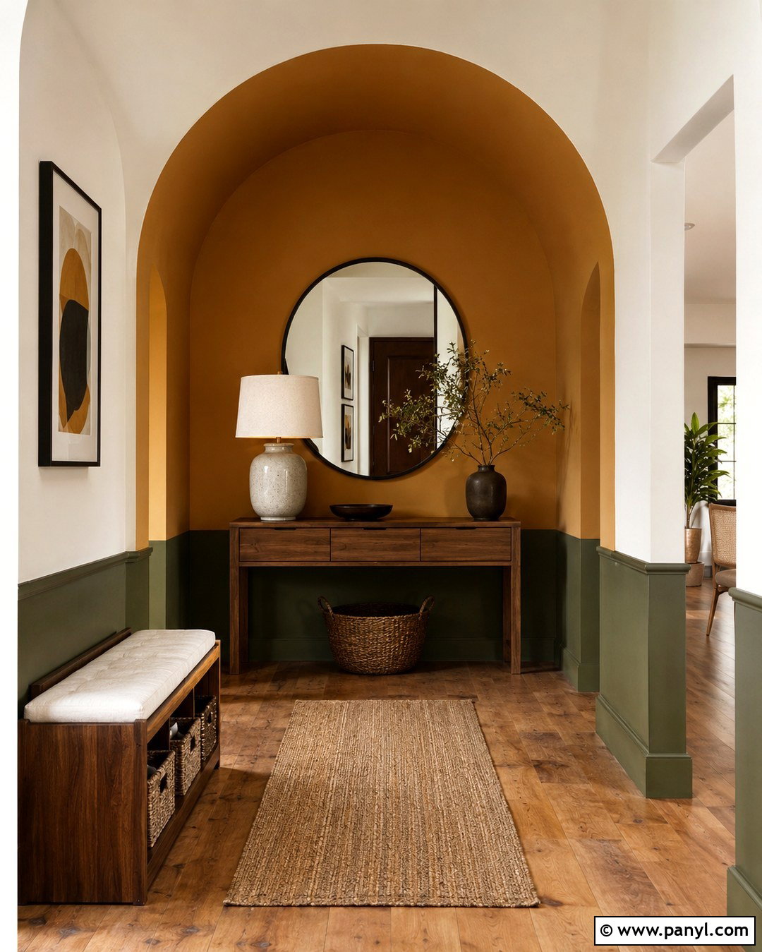
Make a small entryway feel purposeful by painting a large ochre arch around a slim console table. Use warm white on the surrounding walls, then add a narrow olive green strip along the lower portion of the hallway. The arch acts as a visual frame, while the green section protects the busiest wall area from visible scuffs. Choose a walnut console with closed storage, a round black mirror, and a woven runner containing ochre and olive threads. A ceramic table lamp gives the vignette practical light. Add wall hooks in matte black and one small wooden bench near the door. Repeating the three colors through simple, functional pieces creates an organized entrance that feels connected to the rest of the home.
12. Diagonal Color Block Walls
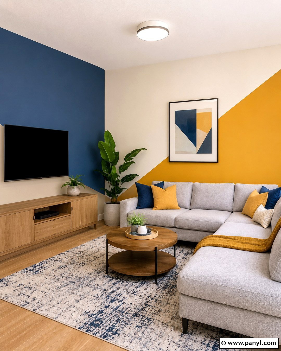
Diagonal paint lines can bring energy to a family room when the furniture remains simple. Start with a warm cream base, then paint a broad diagonal section of muted cobalt blue across the media wall. Add a smaller mustard yellow triangle in one lower corner for contrast. Anchor the design with a light gray sectional, an oak media cabinet, and a cream-and-blue rug. Mustard pillows connect the smallest painted section to the seating area. Keep the television fully within the blue block so it appears integrated rather than randomly mounted. White curtains and a pale ceiling balance the saturated wall. With only three clearly defined colors, the room looks playful and contemporary while remaining practical for everyday relaxing and entertainment.
13. Striped Bedroom Walls
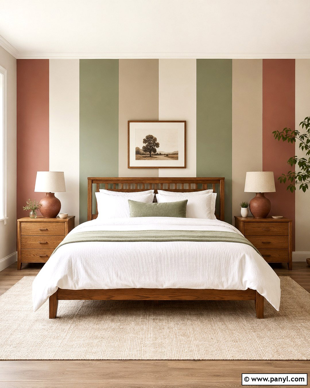
Wide vertical stripes can make a low-ceiling bedroom appear taller while introducing several colors in an orderly way. Alternate warm white, muted sage, dusty rose, and pale clay stripes across the wall behind the bed. Keep each stripe at least two feet wide for a modern, uncluttered appearance. Choose a simple oak bed and position it centrally so the stripes create a symmetrical background. Dress the bed in white linen with sage and rose accents. Clay-colored lamps on matching nightstands strengthen the palette. Use a solid cream rug and plain linen curtains instead of adding more patterns. Painting the remaining walls warm white keeps the striped feature prominent and gives the complete bedroom a comfortable sense of balance.
14. Ombre Living Room Walls
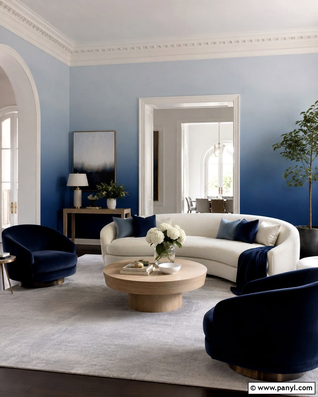
An ombre wall creates a softer transition than traditional color blocking. Begin with deep indigo near the floor, blend it into medium denim blue through the center, and finish with pale misty blue near the ceiling. Apply the gradient around the whole living room for an immersive effect. Furnish the space with a curved cream sofa, light oak tables, and navy velvet chairs. A pale gray rug prevents the darker lower walls from dominating. Add white linen curtains that visually merge with the lightest paint tone. Brushed silver lighting and clear glass accessories maintain the cool character of the palette. Keep artwork minimal because the blended walls already provide movement, depth, and a memorable focal point throughout the room.
15. Checkerboard Playroom Walls
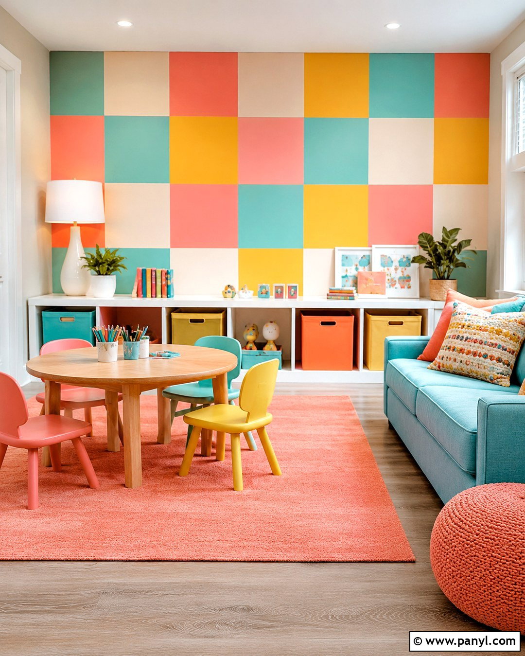
A large-scale checkerboard wall gives a playroom graphic character while keeping the layout organized. Use oversized squares in soft coral, pale turquoise, butter yellow, and warm cream on one main wall. Paint the other walls cream to avoid visual overload. Place low white storage cabinets beneath the pattern, with matching colored bins assigned to different toy categories. A turquoise sofa, round oak activity table, and washable coral rug create a complete seating and play arrangement. Choose a simple white ceiling light and natural woven window shades. Keep artwork and decorative accessories limited because the wall already supplies plenty of detail. Large blocks and softened shades make the design energetic, friendly, and easier on the eyes than tiny contrasting checks.
16. Color Block Studio Apartment Walls
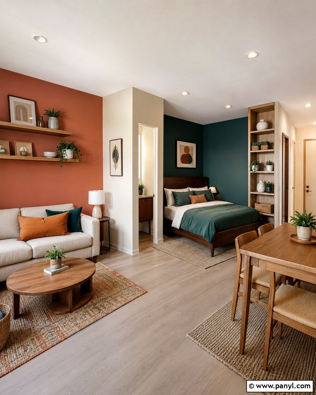
Use paint to create clear zones in a studio apartment without adding partitions. Apply muted terracotta behind the sofa, deep teal around the sleeping area, pale sand beside the dining table, and warm white through the central walkway. Keep the color blocks aligned with architectural features such as corners, windows, and ceiling beams. Select a compact beige sofa, a walnut platform bed, and a small round oak table so the furniture shares warm finishes. Teal bedding, rust cushions, and a sand-colored rug repeat the wall colors. Open shelving can sit along the white section to prevent the apartment from feeling crowded. This coordinated plan gives each activity a recognizable place while preserving light, movement, and an open overall layout.
17. Painted Wall Panels
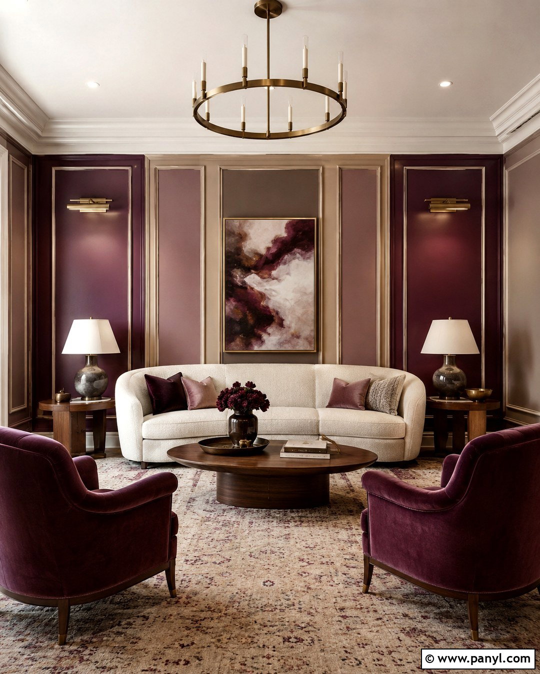
Painted wall panels bring traditional structure to a colorful modern sitting room. Install simple rectangular molding, then fill alternating panels with deep plum, muted mauve, and warm mushroom brown. Paint the molding and surrounding wall soft beige to unify the arrangement. Place a curved cream sofa against the panel wall, accompanied by walnut side tables and plum velvet chairs. A beige wool rug and mauve curtains soften the stronger blocks of color. Choose aged brass picture lights and abstract artwork with restrained earthy tones. Keep the ceiling and remaining walls cream for balance. The repeated panel shapes make three different colors feel orderly, while the rich palette gives a standard living room a tailored, architectural finish without requiring ornate furniture.
18. Multi Color Reading Nook Walls
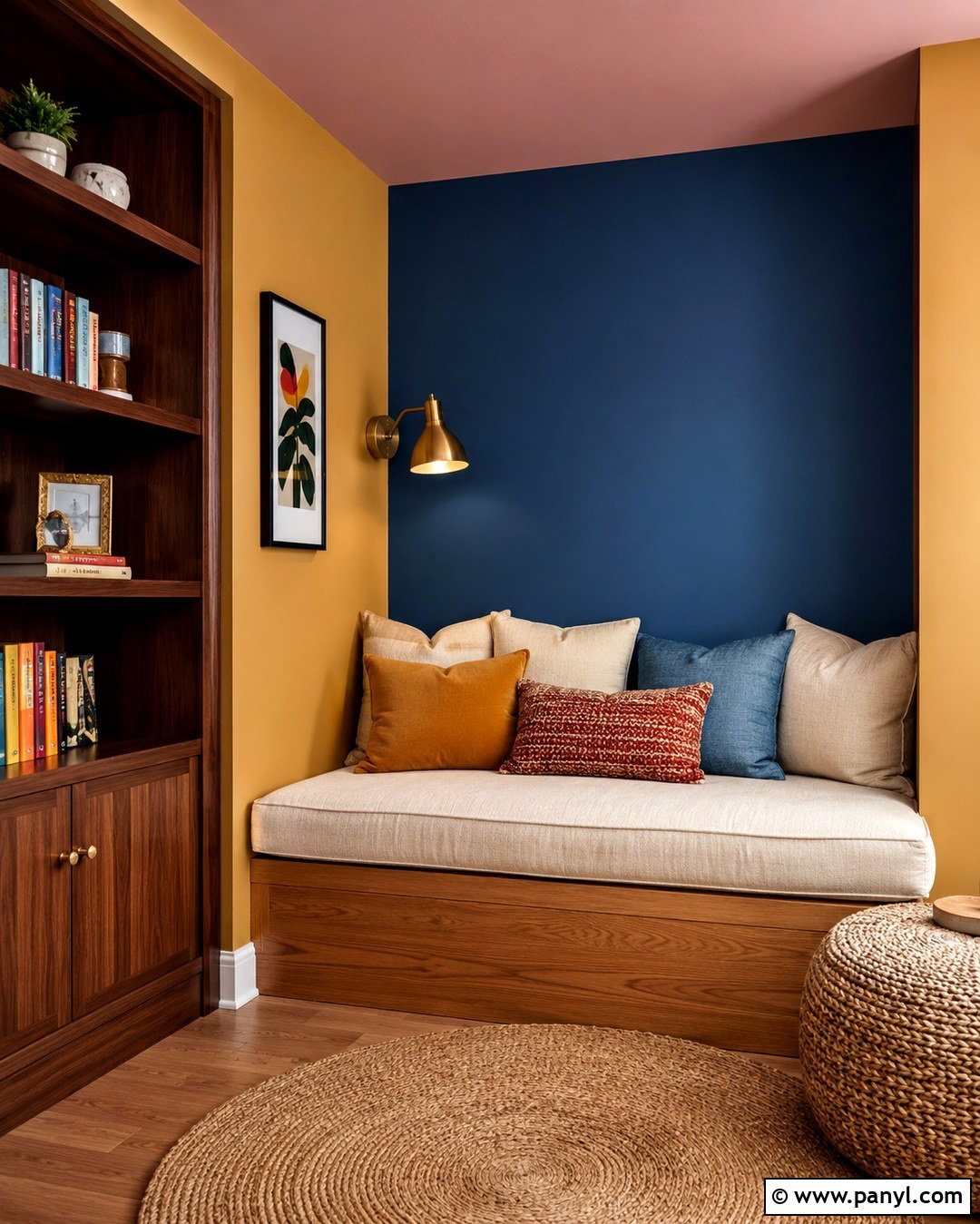
Transform an unused corner into a cozy reading nook with a deep blue painted section behind a built-in bench, muted mustard on the adjoining wall, and pale blush overhead. Follow the corner’s natural lines so each shade defines a separate plane. Add a cushioned oak bench with storage drawers, a cream seat cushion, and layered pillows in all three wall colors. Install slim walnut bookshelves on the mustard side and a small brass reading sconce against the blue wall. A woven round rug softens the floor and marks the nook as its own zone. Keep nearby walls warm white. The compact design feels complete because the paint, storage, seating, lighting, and textiles all serve the same quiet purpose.
19. Colorful Laundry Room Walls
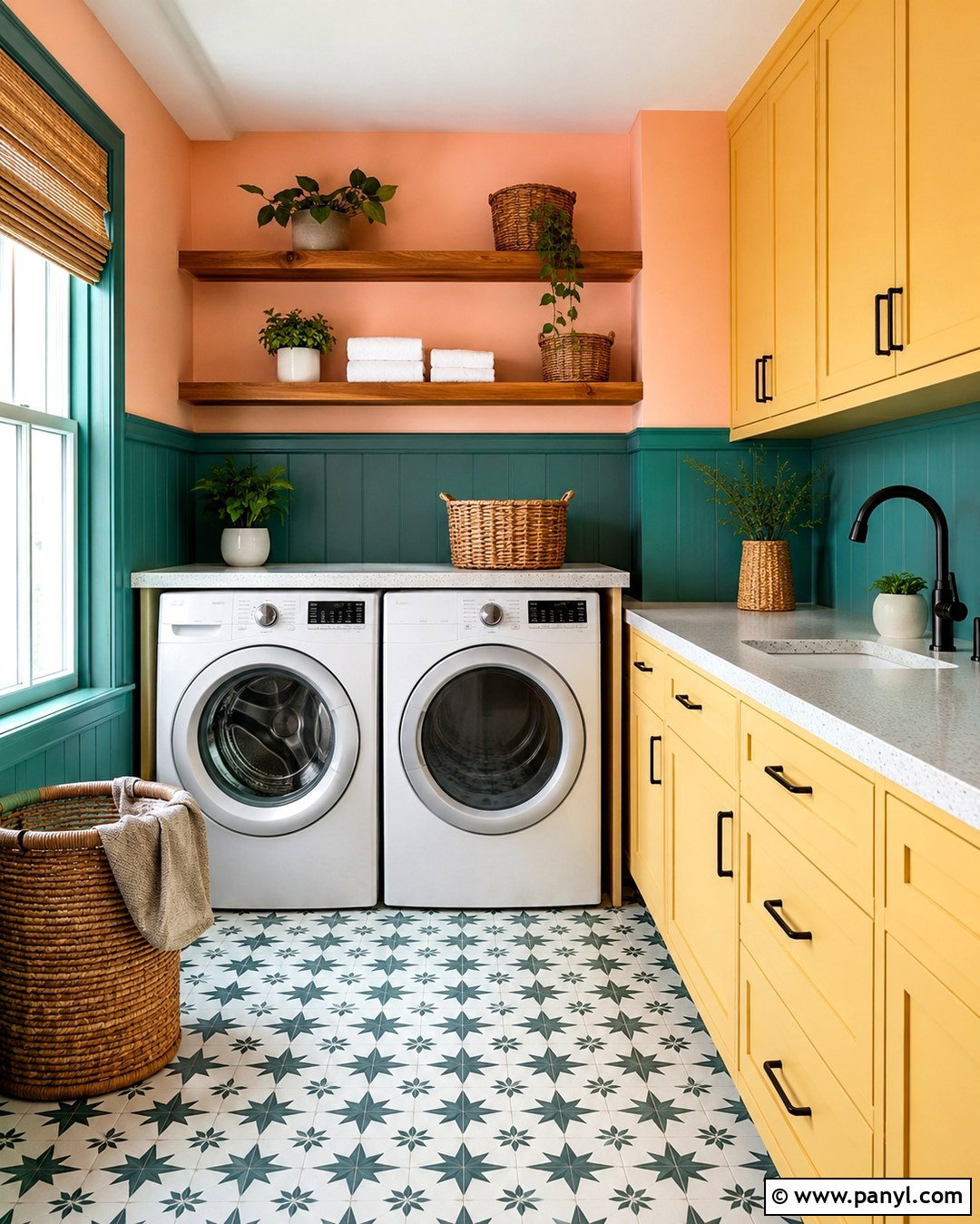
Bring personality to a hardworking laundry room with teal lower walls, pale peach upper walls, and butter yellow cabinetry. Separate the wall colors with a slim white rail that aligns with the countertop. Install white appliances beneath a light quartz work surface and use open oak shelves for baskets and everyday supplies. Matte black hardware sharpens the pastel palette, while a black-and-white patterned floor adds practical contrast. Repeat teal in labeled storage bins and peach in a small washable runner. Bright white trim, ceiling paint, and task lighting keep the room clean and clear. By coordinating the walls with organized storage and durable materials, the laundry area becomes cheerful and functional rather than feeling like a purely utility-focused space.
20. Ceiling And Wall Color Blocking
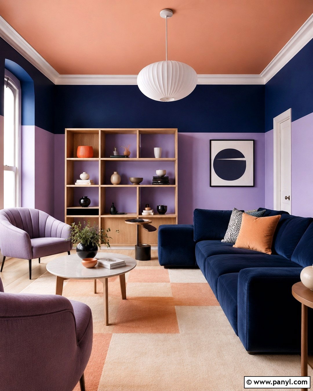
Look beyond vertical surfaces by connecting the walls and ceiling with bold color. Paint the lower walls soft lavender, the upper walls muted cobalt, and the ceiling warm peach. Carry the peach paint down approximately twelve inches to create a broad ceiling border that visually caps the room. Use this treatment in a creative lounge with a navy sofa, pale oak shelving, and lavender lounge chairs. A peach and cream rug repeats the overhead color at floor level, balancing the composition. White globe lights stand out cleanly against the painted ceiling. Keep curtains and larger storage pieces neutral. The finished room surrounds visitors with color while maintaining clear divisions that make the unconventional palette feel controlled and thoughtfully planned.
Conclusion:
Successful multi color walls depend on more than choosing several attractive paint shades. Each color needs a clear role, whether it anchors furniture, defines a functional zone, highlights architecture, or changes the perceived proportions of the room. Begin with two or three connected tones, test them under daytime and evening lighting, and repeat each shade through a few furnishings or textiles. Crisp lines suit graphic rooms, while arches, panels, and gradients create softer transitions. Neutral flooring and simple furniture can also keep strong walls balanced. These **20 Multi Color Room Walls** show how coordinated paint, decor, materials, and layout can work together to create rooms that feel colorful, polished, comfortable, and completely intentional.

Related Ideas and Inspiration:

Leave a Reply