
The best 60S Wall Color ideas capture the decade’s optimism without making a home feel like a movie set. Rich avocado green, mustard yellow, burnt orange, turquoise, and earthy brown can all look surprisingly current when balanced with warm wood, simple furniture, and clean architectural lines. Softer choices such as dusty pink, pale aqua, and creamy white offer a quieter interpretation. The key is creating a complete room where the wall color connects naturally with flooring, lighting, textiles, and decor. Use matte or eggshell paint for an updated finish, then layer in walnut, teak, leather, glass, and graphic patterns. Whether you prefer earthy midcentury warmth or playful mod energy, these complete 60S Wall Color ideas provide an inspiring place to begin.
1. Mustard Yellow 60s Wall Color
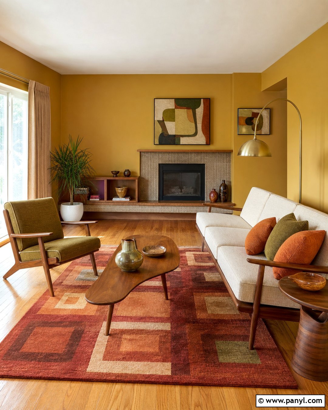
Mustard yellow walls create a warm, cheerful living room that feels unmistakably retro but still comfortable today. Choose a muted mustard with brown undertones rather than a sharp lemon shade. Pair it with a low-profile walnut sofa frame, cream upholstery, and an olive green lounge chair. A geometric area rug containing rust, ivory, and charcoal will connect the colors without making the room too busy. Add a simple brass floor lamp, abstract artwork, and textured oatmeal curtains. Medium-tone oak or terrazzo flooring keeps the palette grounded. Leave the ceiling warm white to preserve brightness. This complete scheme works especially well in rooms with generous daylight, where mustard becomes sunny and inviting instead of heavy or overly saturated.
2. Avocado Green 60s Wall Color
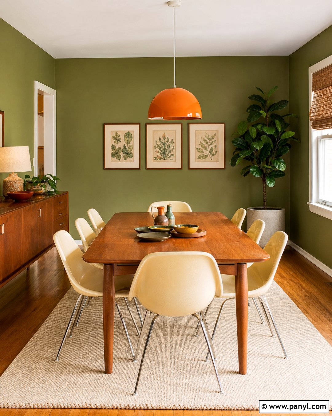
Avocado green can produce a relaxed dining room with a natural, collected character. Paint every wall in a softened avocado shade, then introduce a rectangular teak dining table with streamlined legs. Cream molded chairs keep the arrangement lighter, while a burnt orange pendant supplies a small burst of contrasting color. Hang simple botanical prints in narrow walnut frames and place a large leafy plant near the window. Woven shades, an ivory flat-weave rug, and matte ceramic tableware soften the room’s stronger midcentury features. Choose warm white trim rather than bright white, which can look harsh beside earthy green. The result feels nostalgic but livable, with enough neutral texture and natural wood to prevent the recognizable color from overwhelming the space.
3. Burnt Orange 60s Wall Color
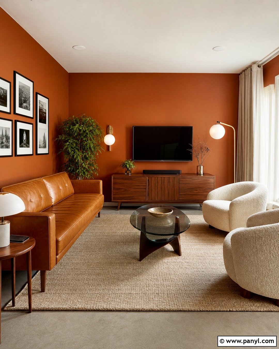
Imagine a cozy den wrapped in deep burnt orange, balanced by dark walnut and creamy upholstery. This bold wall color works best when the room contains clean shapes and limited decorative clutter. Place a camel leather sofa against the longest wall and add two ivory boucle chairs with tapered wooden legs. A low walnut media console, globe table lamp, and round smoked-glass coffee table reinforce the period influence. Use a large beige rug to brighten the floor and soften the orange. Black accents can appear in picture frames and a slender floor lamp, but keep them minimal. Off-white ceilings and linen curtains reflect light around the room. The finished look is warm, social, and dramatic without becoming visually exhausting.
4. Turquoise Blue 60s Wall Color
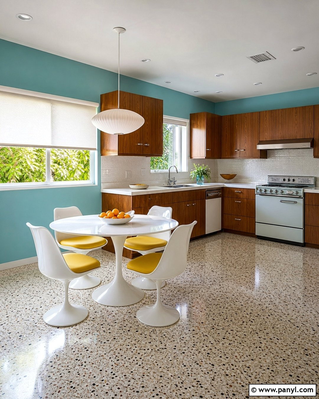
Turquoise walls bring playful Palm Springs energy into a breakfast room or compact kitchen. Select a slightly muted blue-green rather than an electric aqua, then combine it with flat-front walnut cabinets and clean white countertops. A small round pedestal table with white chairs creates an open, practical eating area. Introduce sunny yellow through seat cushions or one ceramic pendant, allowing turquoise to remain the dominant statement. Speckled terrazzo flooring brings subtle movement while connecting the blue, white, and warm wood tones. Keep window treatments simple with white roller shades. Chrome hardware and a starburst clock can add controlled retro detail. This complete scheme feels bright and optimistic, yet the streamlined layout prevents the colorful room from looking overly themed or crowded.
5. Olive Green 60s Wall Color
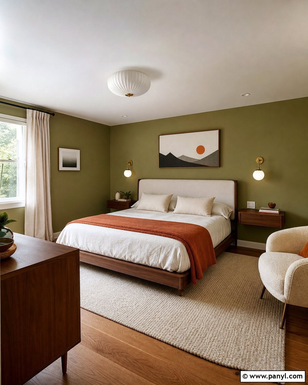
Olive green gives a bedroom depth while remaining restful enough for everyday use. Cover the walls in a medium olive with gray undertones, then anchor the room with a walnut platform bed and an upholstered cream headboard. Bedding in ivory, camel, and muted rust adds warmth without competing with the walls. Place matching globe sconces above slim floating nightstands to maintain a clean, symmetrical layout. A wool rug in beige and brown softens wood flooring, while full-length natural linen curtains filter daylight. Finish the room with one graphic print, a sculptural ceramic vase, and a small reading chair. The restrained materials make the green feel sophisticated. This look offers authentic 1960s earthiness while staying calm, practical, and easy to personalize.
6. Harvest Gold 60s Wall Color
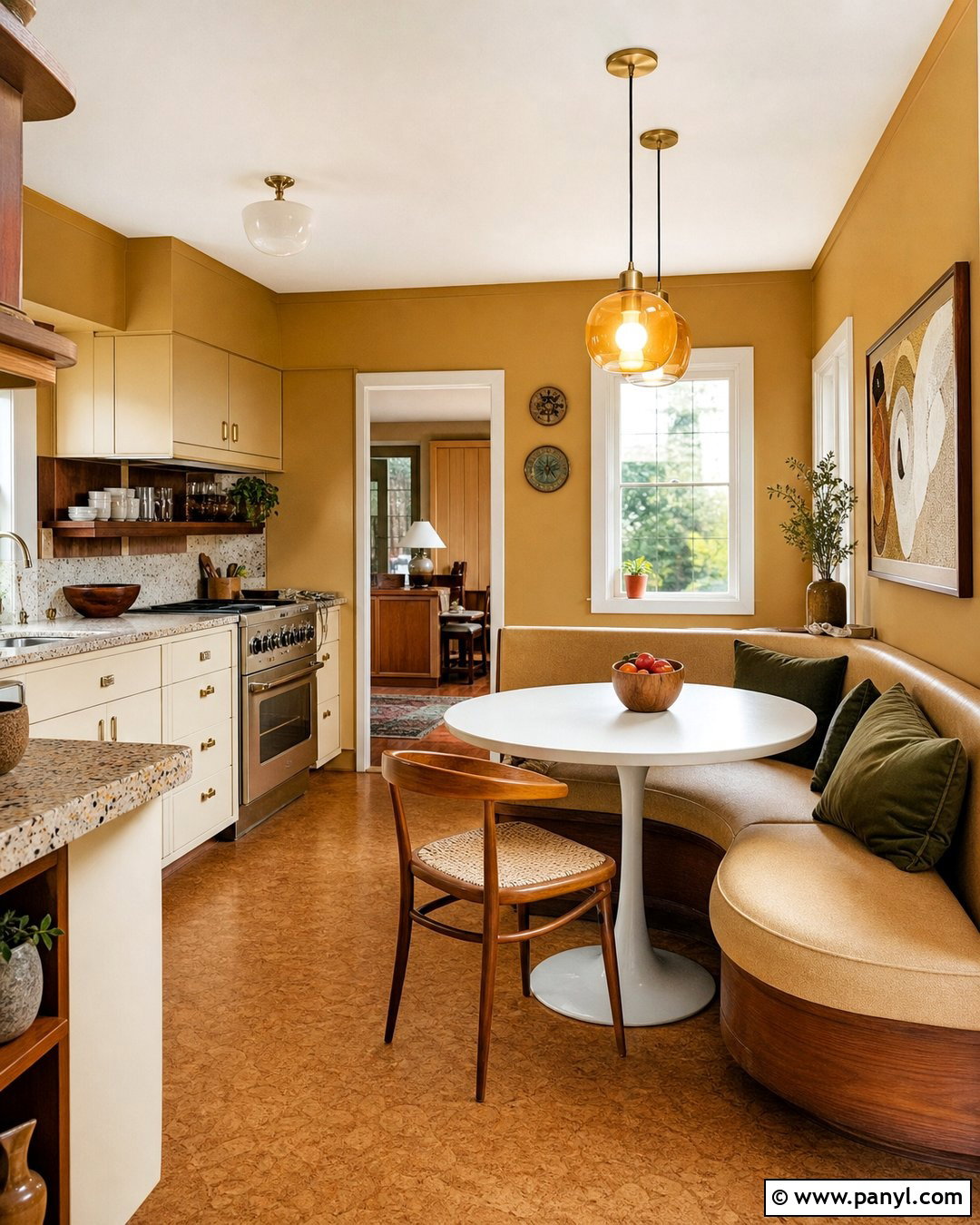
Harvest gold walls can make a kitchen feel sunny, welcoming, and full of vintage personality. To keep the color from appearing dated, surround it with matte cream cabinets, walnut open shelving, and pale terrazzo countertops. Use the gold on every visible wall for continuity, but leave the ceiling and trim a soft ivory. A compact dining nook with a built-in tan bench and round white table gives the room a practical family-friendly layout. Add olive green cushions, amber glass pendants, and brushed brass cabinet pulls. Warm cork flooring enhances the period character while remaining visually quiet. Small white appliances and simple ceramic accessories provide relief. Together, these elements transform harvest gold into an intentional backdrop rather than an overpowering novelty color.
7. Dusty Pink 60s Wall Color
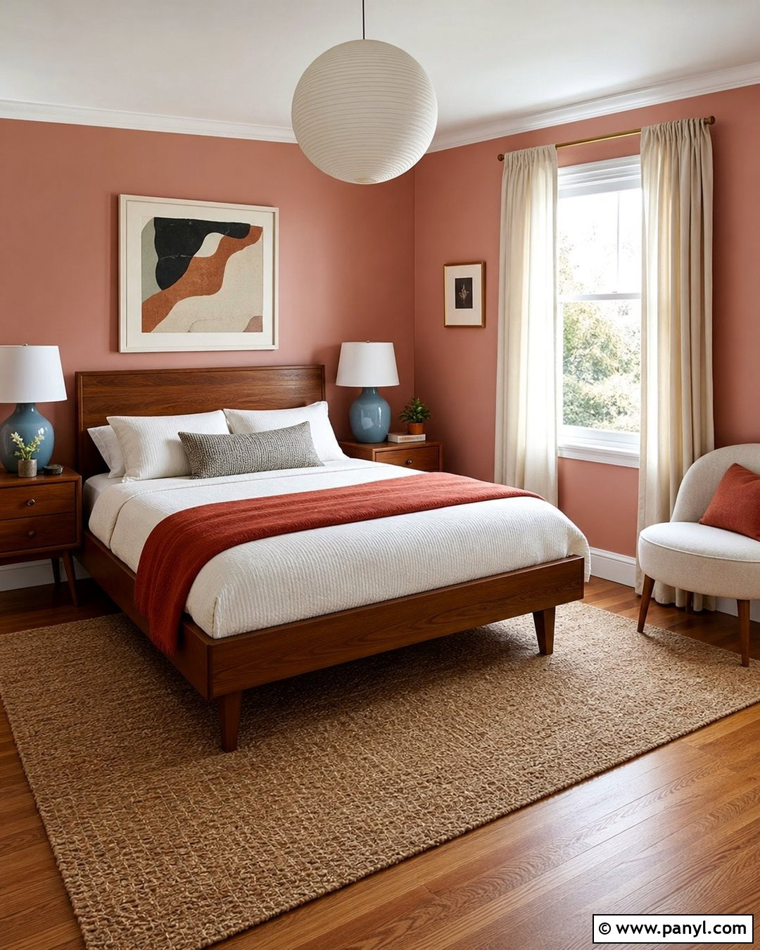
Dusty pink offers a softer version of 1960s color for a welcoming guest bedroom. Choose a muted pink with beige or clay undertones, avoiding sugary bubblegum shades. Pair the walls with a simple walnut bed, crisp ivory bedding, and a rust-colored wool blanket folded neatly across the foot. A pale blue bedside lamp introduces gentle contrast, while an abstract print adds mustard and olive accents in small amounts. Use cream curtains, a natural jute rug, and warm oak flooring to make the room feel relaxed. A curved upholstered chair can bring in the decade’s rounded forms without dominating the layout. This complete design feels warm and nostalgic, yet its earthy palette and uncluttered arrangement keep it suitable for a modern home.
8. Chocolate Brown 60s Wall Color
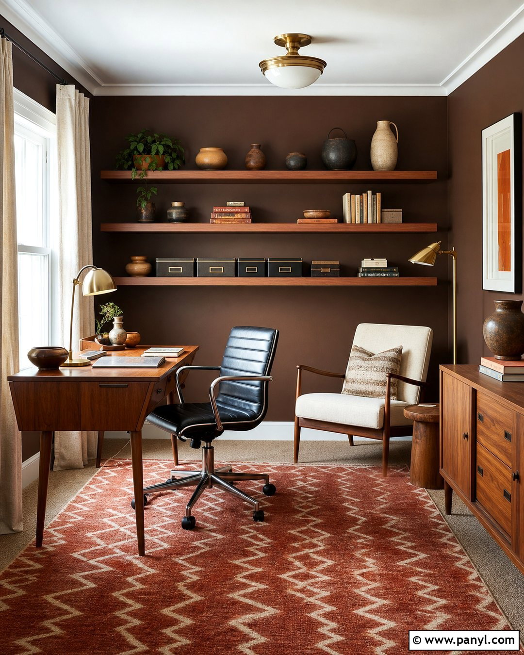
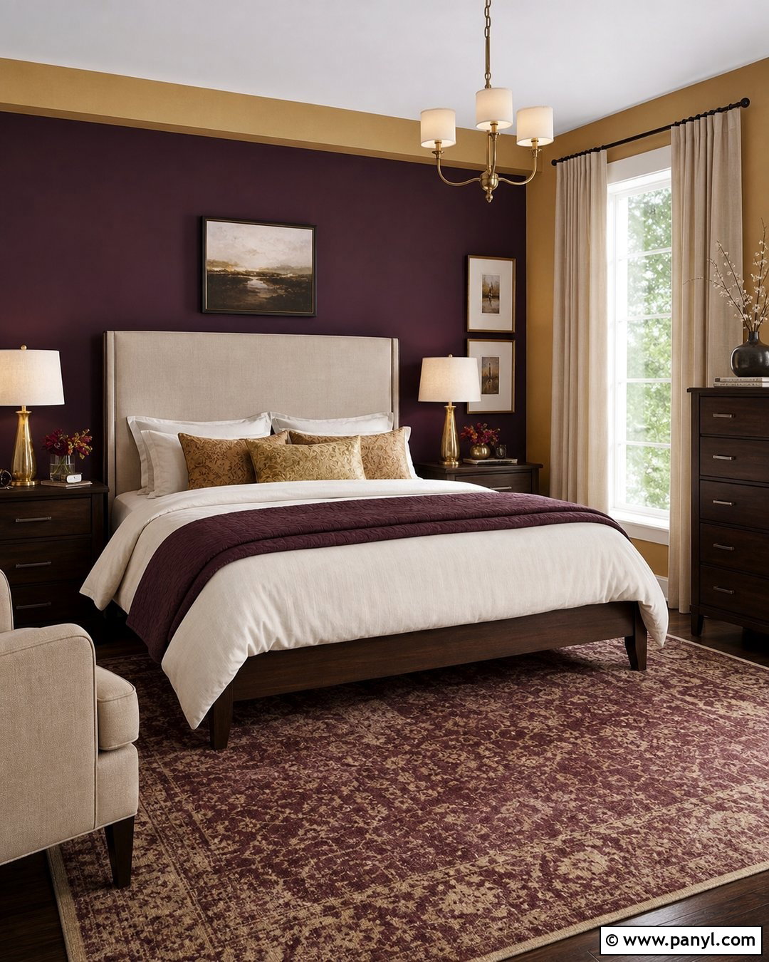
Chocolate brown walls turn a home office into an enveloping, focused space with handsome midcentury character. Use a rich cocoa shade on the walls, then keep the ceiling creamy white to prevent the room from feeling closed in. Position a slim teak desk near the window and add a black leather task chair with a curved wooden frame. A rust and tan geometric rug brightens the floor, while brass lighting provides a warm reflective finish. Install floating walnut shelves for books, pottery, and a few organized storage boxes. Pale oatmeal curtains and a cream reading chair create necessary visual relief. The combination of deep walls, warm timber, practical storage, and restrained accessories produces a polished workspace that feels cozy rather than dark or dated.
9. Cream 60s Wall Color
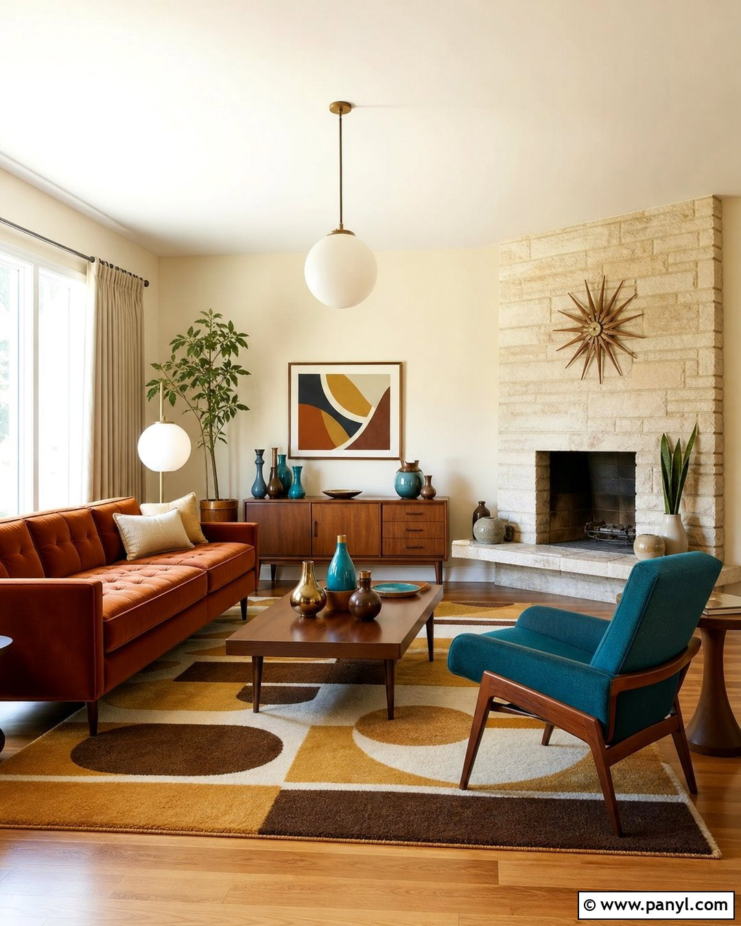
Cream walls are ideal when you want a lighter 1960s interior built around colorful furniture and natural materials. In a living room, choose a warm vanilla cream instead of a cool, stark white. Arrange a rust velvet sofa, teal lounge chair, and walnut coffee table in a comfortable conversation grouping. Add a large geometric rug with mustard, brown, and ivory sections to define the seating area. A stone fireplace or wood-paneled feature can provide architectural texture without changing the calm wall color. Use globe lighting, linen curtains, and a few bold ceramic pieces as finishing details. Cream gives every retro accent breathing room, making this scheme particularly useful in smaller homes. The overall room feels bright, balanced, and authentically midcentury without relying on saturated walls.
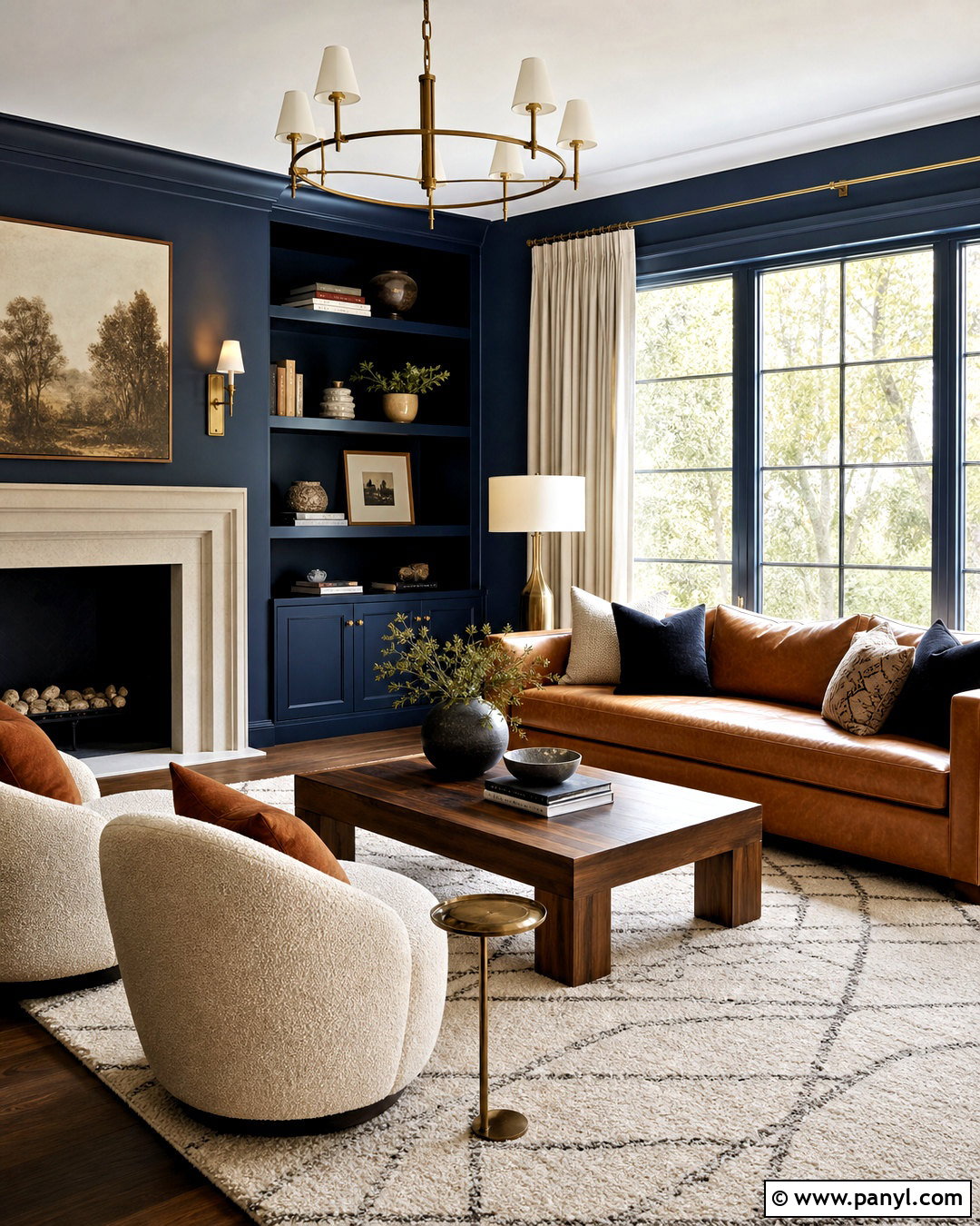
10. Teal 60s Wall Color
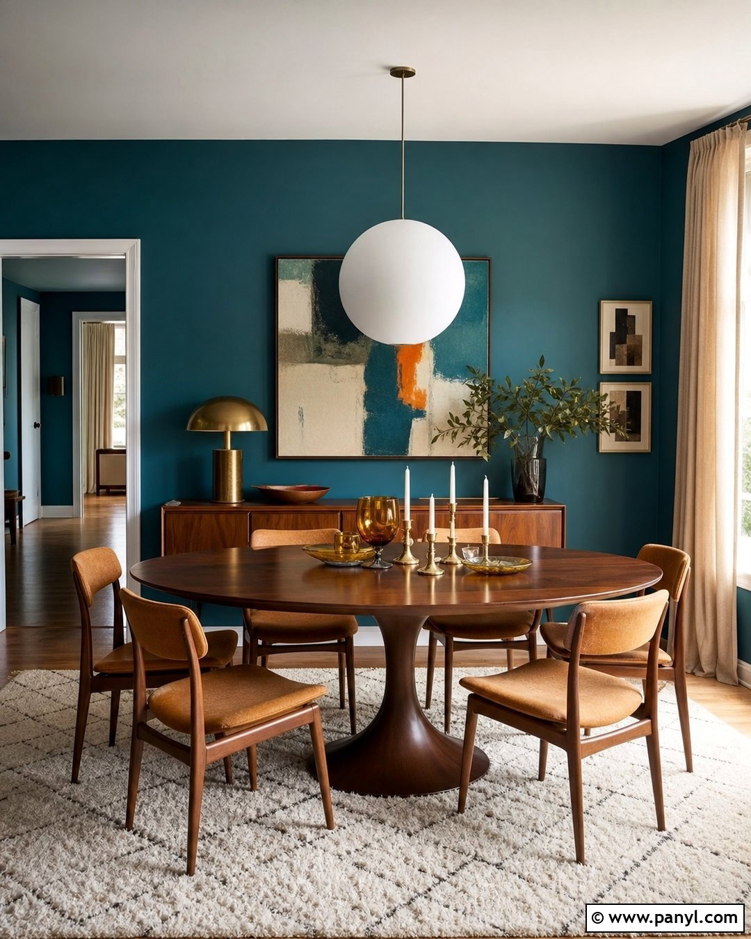
Deep teal creates a striking dining room that becomes especially inviting beside warm walnut furniture. Paint the walls in a saturated blue-green with a matte finish, then add a long oval dining table and chairs upholstered in caramel-colored fabric. A large white globe pendant provides contrast and spreads light evenly across the table. Choose a cream rug with a simple black geometric border to lighten the lower half of the room. Brass candleholders, amber glassware, and one oversized abstract artwork can complete the color story. Keep the trim and ceiling soft white, and use natural linen curtains instead of heavy drapes. This balanced design lets teal feel dramatic and period appropriate while maintaining enough brightness, simplicity, and neutral space for comfortable modern living.
11. Coral 60s Wall Color
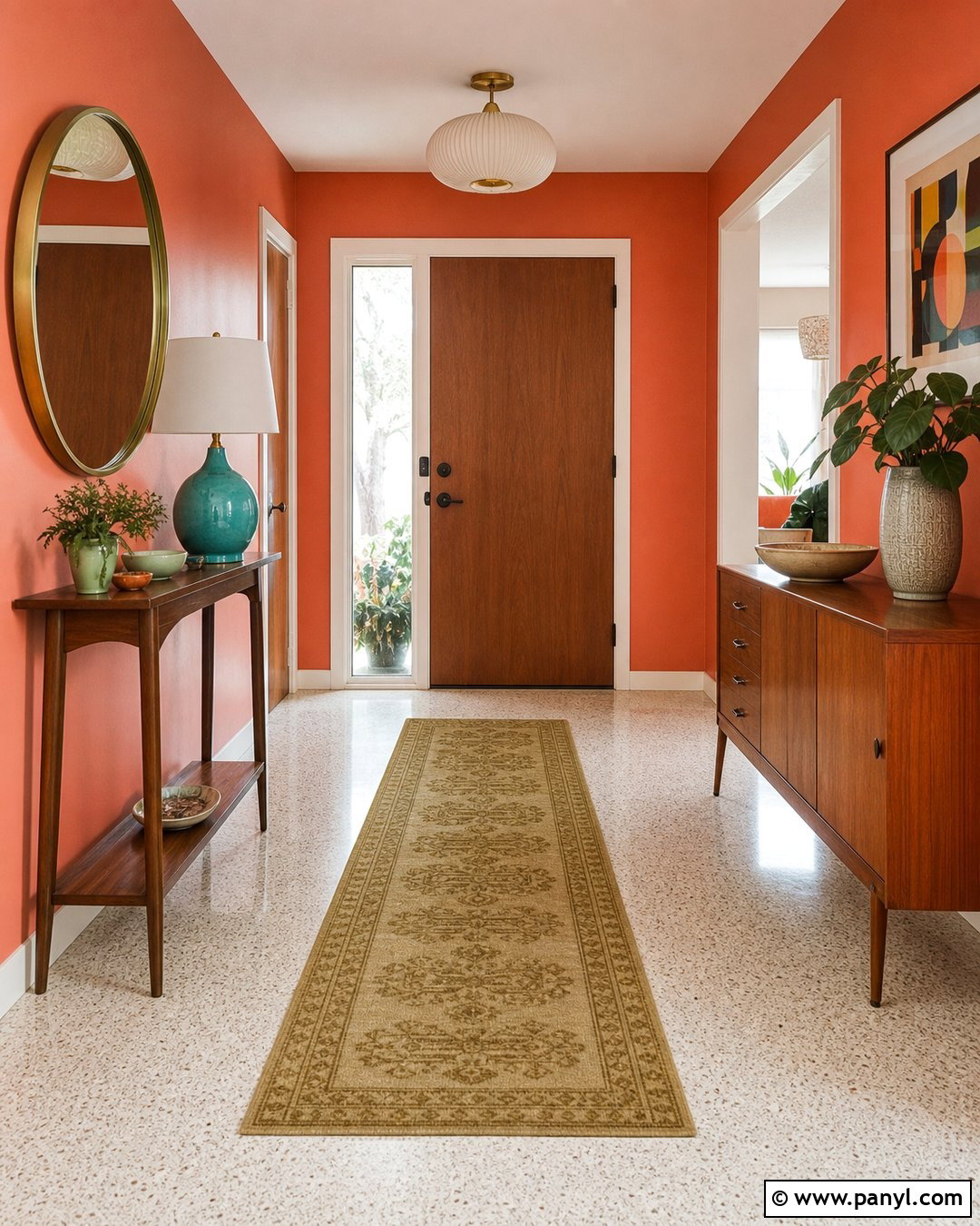
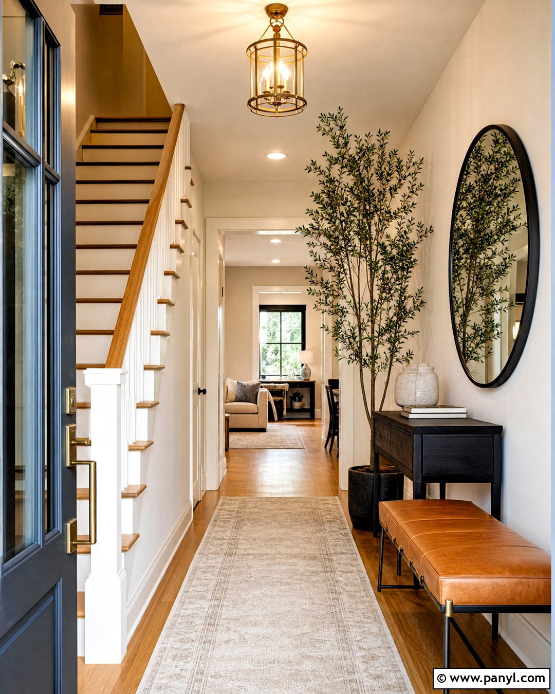
Coral walls bring warmth and personality to an entryway without requiring a large amount of furniture. Select an earthy coral that sits between pink and orange, then pair it with a narrow walnut console and a round brass-framed mirror. A cream terrazzo floor or light oak boards will prevent the compact space from becoming too intense. Add a small turquoise ceramic lamp, a graphic runner containing olive and beige, and one sculptural wooden bowl for keys. If storage is needed, place a low teak cabinet beside the doorway rather than introducing bulky hooks or shelving. Paint the trim warm white and keep interior doors natural wood. The finished entry feels cheerful and memorable, offering a controlled splash of 1960s color immediately upon arrival.
12. Pale Aqua 60s Wall Color
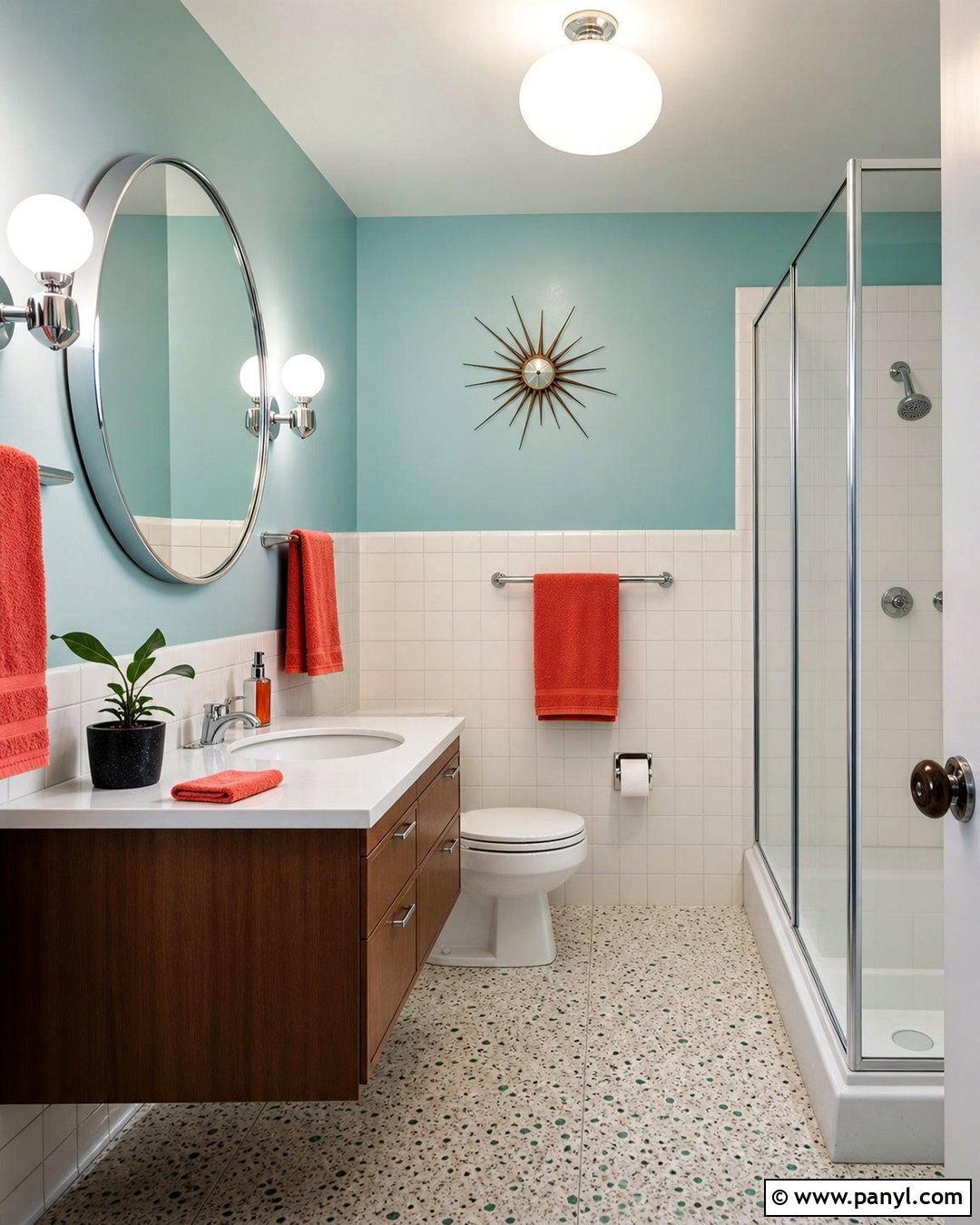
Pale aqua walls can turn a bathroom into a fresh retro retreat without sacrificing a clean appearance. Use soft blue-green paint above a lower section of glossy white square tile. Pair it with a floating walnut vanity, white countertop, and round mirror framed in brushed chrome. A globe wall sconce on each side gives the vanity a balanced midcentury look. Introduce small accents of coral through towels and one bath mat, but keep permanent surfaces neutral. Speckled terrazzo flooring adds period-inspired pattern while hiding everyday marks. Choose a clear glass shower screen so the room remains visually open. With its gentle color, warm wood, simple tile, and functional layout, this bathroom recalls the 1960s while still feeling bright, hygienic, and easy to maintain.
13. Brick Red 60s Wall Color
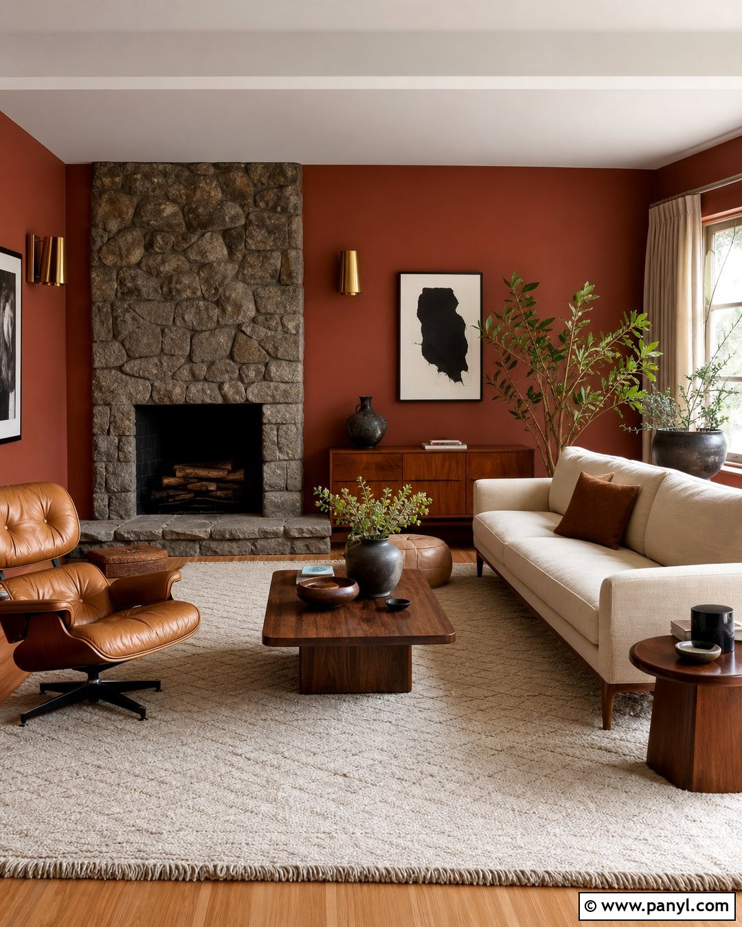
Brick red creates a grounded, sociable living room when used with pale neutrals and substantial natural materials. Paint the walls in a muted red with brown undertones, then place a cream sectional or straight-lined sofa at the center of the room. Add a walnut coffee table, tan leather lounge chair, and a large ivory wool rug to soften the strong backdrop. A rough stone fireplace makes an ideal focal point and reinforces the earthy palette. Choose brass sconces, abstract black-and-white artwork, and oatmeal drapes for understated contrast. Plants can introduce a controlled touch of green. Keeping the furniture low and the layout open allows the brick red to feel architectural. The complete room appears rich, welcoming, and connected to classic midcentury design.
14. Sky Blue 60s Wall Color
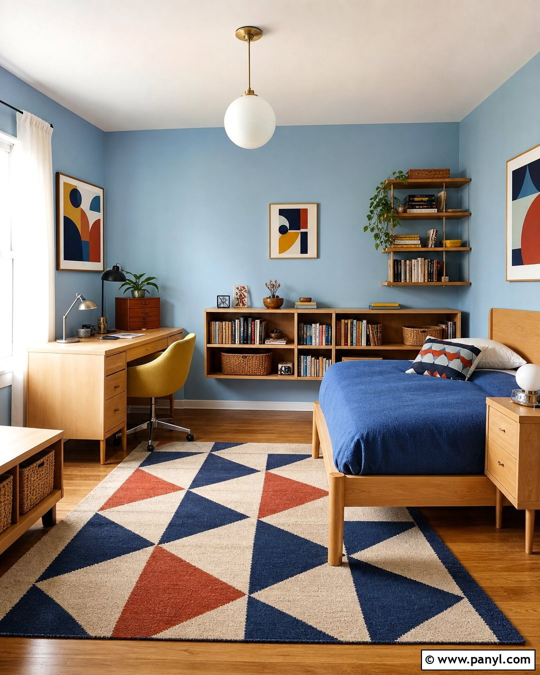
Sky blue walls provide a crisp, optimistic foundation for a child’s bedroom or cheerful home office. Choose a softened blue with a slight gray undertone so it remains comfortable across changing daylight. Pair it with light birch furniture, a white globe pendant, and a mustard yellow upholstered chair. A low bookcase keeps storage accessible, while woven baskets prevent visual clutter. Use a geometric rug containing navy, cream, rust, and blue to connect the brighter elements. Simple white curtains preserve the room’s airy quality, and colorful abstract prints add period-inspired movement. Avoid filling every surface with retro accessories. The clear layout, useful furniture, and limited accent palette make sky blue feel playful yet organized, creating a room that can adapt as needs and tastes change.
15. Plum Purple 60s Wall Color
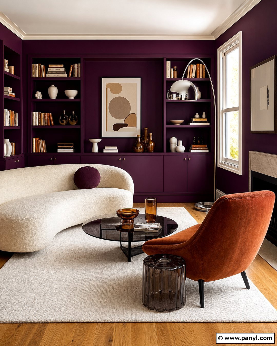
Plum purple can transform a reading room into a luxurious retreat inspired by the more expressive side of 1960s design. Choose a deep, slightly reddish plum and apply it to the walls, built-in shelves, and trim for a seamless color-drenched effect. Balance that intensity with a cream curved sofa, a rust velvet lounge chair, and a pale wool rug. A smoked-glass side table and chrome arc lamp introduce polished surfaces that reflect light. Display books, amber glass, and white ceramics sparingly across the shelving. Natural oak flooring keeps the foundation warm without adding another strong color. With layered lighting and an uncluttered furniture plan, plum appears artistic and sophisticated rather than theatrical. The room feels intimate while retaining clear, usable circulation.
16. Lime Green 60s Wall Color
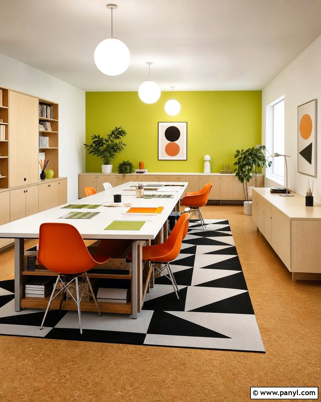
Lime green works beautifully in a creative studio when softened and paired with disciplined neutral furnishings. Use a warm, yellow-based lime on one broad wall, then paint the remaining walls creamy white for visual balance. Position a long white worktable against the colorful surface and add molded orange chairs for a controlled complementary accent. Pale wood shelving provides organized storage for supplies, while closed cabinets keep clutter out of sight. Choose a black-and-white geometric rug and simple globe pendant lights to reinforce the mod influence. Natural cork flooring adds warmth and practical comfort underfoot. This complete room feels energetic enough to encourage creativity, but the white surfaces, orderly layout, and limited accessories prevent the vibrant green from becoming distracting or difficult to live with.
17. Camel Tan 60s Wall Color
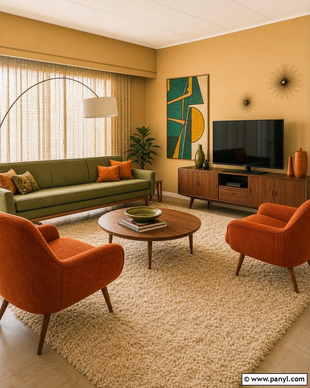
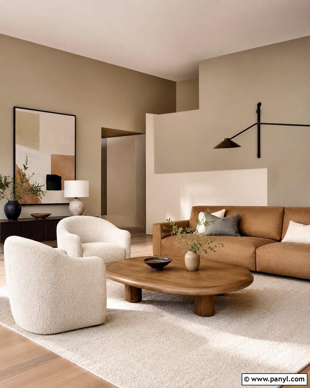
Camel tan walls create a warm neutral family room that highlights wood furniture and colorful textiles. Choose a medium tan with golden undertones, then add a low olive sofa, two burnt orange lounge chairs, and a long walnut media cabinet. A cream shag-style rug introduces softness while referencing the decade in a subtle, updated way. Hang one large abstract artwork containing teal, mustard, and brown above the sofa rather than arranging many small pieces. Woven curtains, an arc floor lamp, and a round wood coffee table complete the space. Keep the ceiling pale ivory to maintain brightness. Because camel acts as a flexible backdrop, the room can hold several recognizable 1960s colors while still feeling cohesive, comfortable, and suitable for daily family activities.
18. Black And White 60s Wall Color
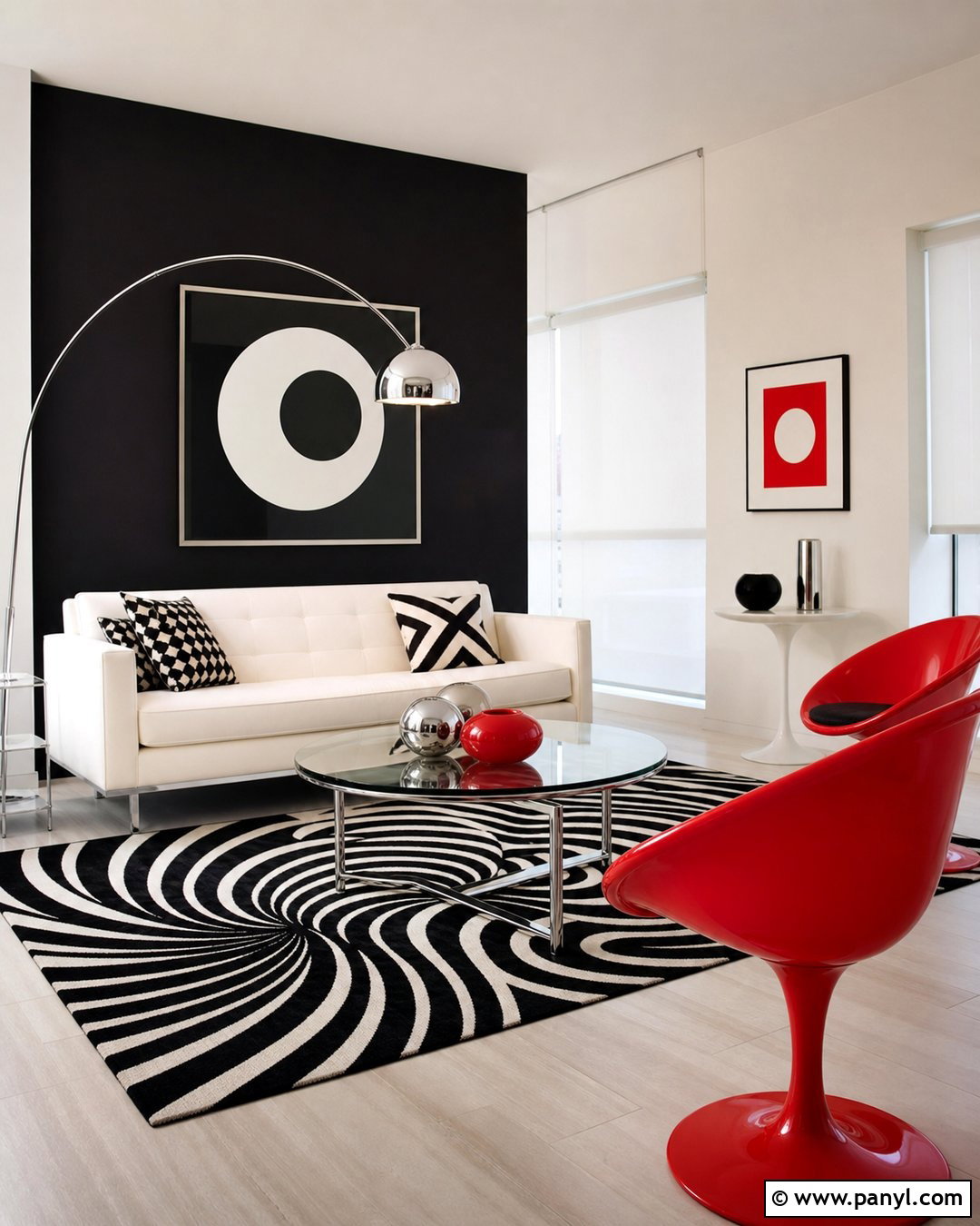
A black-and-white wall scheme captures the graphic mod side of the 1960s with bold contrast and minimal clutter. Paint most walls bright warm white, then use matte black on one focal wall behind a streamlined white sofa. Introduce a round glass coffee table, chrome floor lamp, and two red molded chairs for a sharp accent. A large op-art-inspired rug in black and white gives the seating arrangement energy while maintaining the limited palette. Use white roller shades and pale flooring so natural light can move through the room. One oversized geometric artwork is enough decoration. This complete look depends on clear shapes and careful spacing. When each piece has room around it, the strong contrast feels intentional, crisp, and visually exciting rather than chaotic.
19. Peach 60s Wall Color
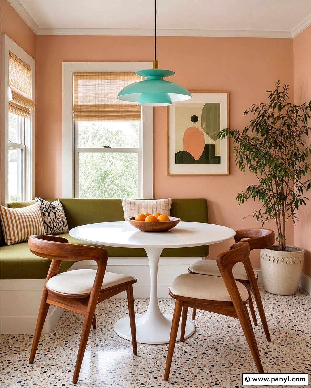
Soft peach walls make a breakfast nook feel warm and sunny throughout the day. Select a dusty peach with gentle orange undertones, then build the room around a white pedestal table and curved walnut chairs with cream seats. Use a pale aqua pendant above the table as a cool counterpoint. A small olive green bench beneath the window provides extra seating and introduces another recognizable period color. Terrazzo flooring, white trim, and simple linen shades keep the space bright. Add one framed abstract print and a small ceramic planter rather than crowding the walls. Peach offers more character than beige while remaining easy to coordinate. The finished nook feels friendly, practical, and colorful, with every feature contributing to a complete and balanced 1960s-inspired composition.
20. Warm White 60s Wall Color
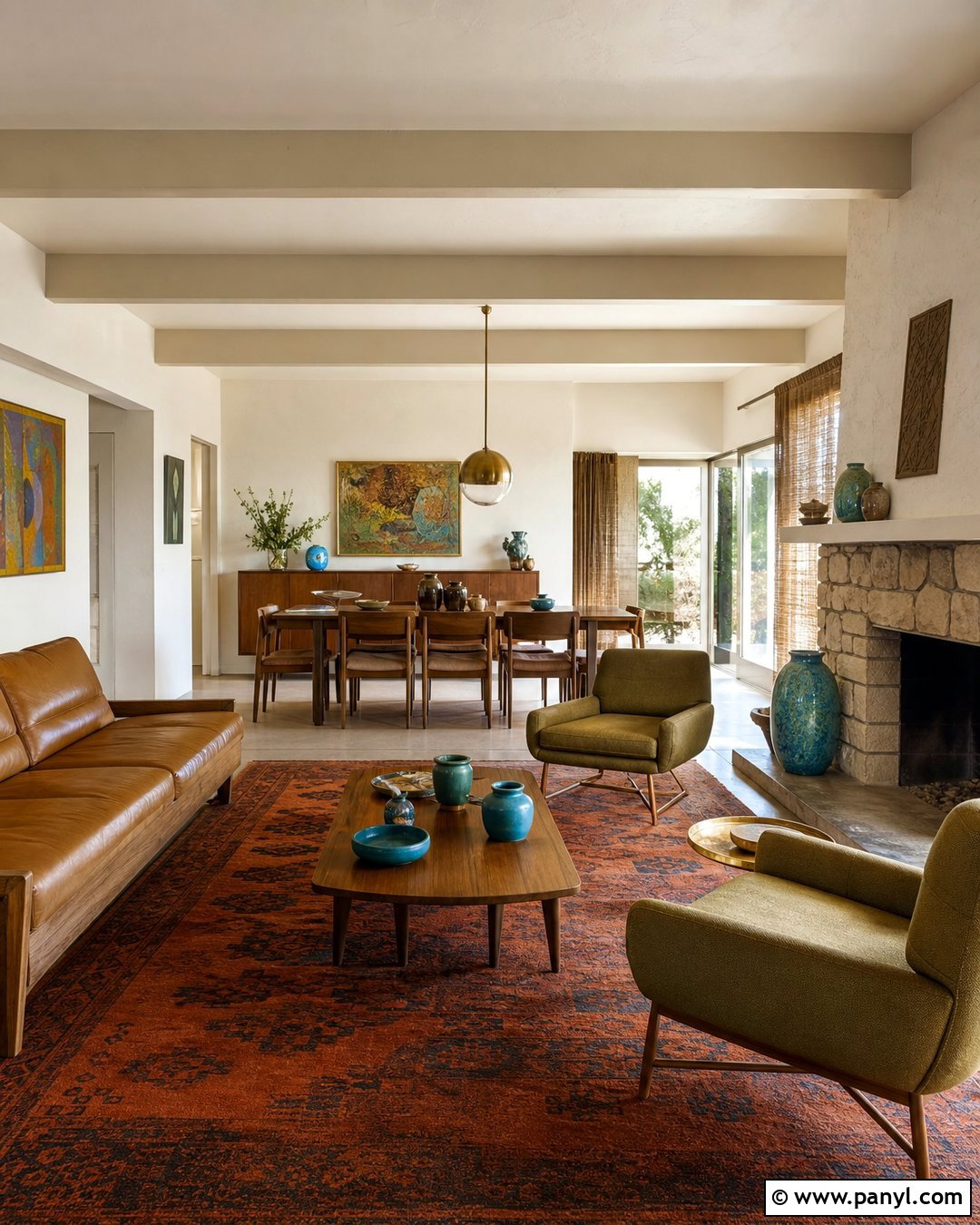
Warm white walls allow original architecture and iconic midcentury furniture to take center stage. This approach suits an open-plan living and dining area with exposed beams, large windows, or a stone fireplace. Paint the walls and ceiling a creamy off-white, then add a walnut dining set, caramel leather sofa, and olive lounge chairs. Use a burnt orange rug to define the living zone and a brass globe pendant to mark the dining area. Natural woven curtains soften the windows without hiding them. Ceramic planters, abstract art, and a few turquoise accents bring color to the neutral shell. The restrained backdrop makes the entire space feel connected and spacious. It is an approachable solution for homeowners who appreciate 1960s design but prefer flexible, quietly nostalgic interiors.
Conclusion:
Choosing among these 60S Wall Color ideas comes down to the mood, light, and existing materials in your home. Mustard, orange, teal, and avocado create an unmistakable retro statement, while cream, camel, peach, and warm white offer a gentler approach. Before painting the entire room, test large samples beside flooring, wood furniture, curtains, and upholstery. View each color during the morning, afternoon, and evening because undertones can change noticeably. For the most convincing result, treat the paint as part of a complete design rather than an isolated feature. Clean-lined furniture, simple lighting, natural wood, graphic textiles, and controlled accent colors will help your 1960s-inspired room feel cohesive, comfortable, and refreshingly current.

Related Ideas and Inspiration:
Leave a Reply