
Butter yellow sits in the sweet spot between cheerful color and easygoing neutral. It can warm a dim room, soften a white kitchen, or give traditional details a fresh personality without feeling overly bright. The best butter yellow paint colors range from pale cream with barely visible golden undertones to richer shades inspired by straw, custard, and sunlight. Choosing the right one depends on natural light, surrounding finishes, and how much contrast you want. Always test a large sample on several walls and check it throughout the day, since yellow can shift dramatically beside wood, stone, and artificial lighting. The complete room schemes below show practical, stylish ways to decorate with **20 butter yellow paint colors**.

1. Benjamin Moore You Are My Sunshine Living Room
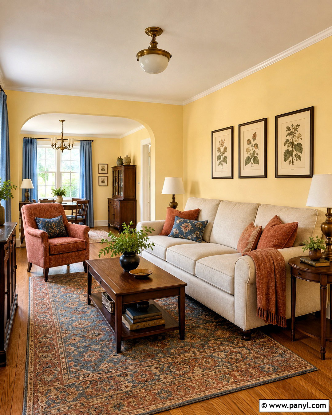
Benjamin Moore You Are My Sunshine 302 creates a creamy, uplifting background that feels colorful without taking over the room. Use it across the walls of a traditional living room with warm oak flooring, soft white trim, and a pale oatmeal sofa. A faded terracotta rug and rust-colored pillows bring out the paint’s warmer side, while dusty blue curtains create gentle contrast. Choose an antique brass floor lamp and medium-toned wood tables instead of cool chrome or glossy black. Natural linen, woven baskets, and simple botanical prints complete the relaxed look. This scheme works especially well in an east- or southeast-facing room, where morning sunlight can emphasize the color’s soft, whipped-butter quality. ()
2. Farrow & Ball Hay House Exterior
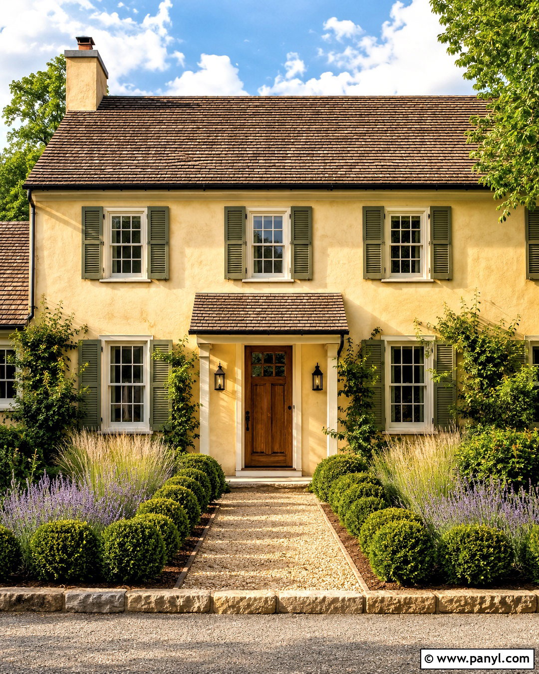
Farrow & Ball Hay No. 37 can give a cottage or traditional house a warm, settled appearance. Cover the siding or stucco in this muted yellow, then add creamy off-white trim rather than a sharp, blue-based white. A medium brown shingle roof, natural stone foundation, and stained oak front door keep the palette grounded. For contrast, use aged bronze lighting, charcoal planters, and deep olive shutters. Finish the curb appeal with boxwood, lavender, ornamental grasses, and a curved gravel walkway. Because Hay is softer than a classic sunny yellow, it feels comfortable across a complete facade. Sample it beside the roof and masonry first, since those permanent materials will influence how golden the paint appears. ()
3. Sherwin-Williams Goldenrod Laundry Room
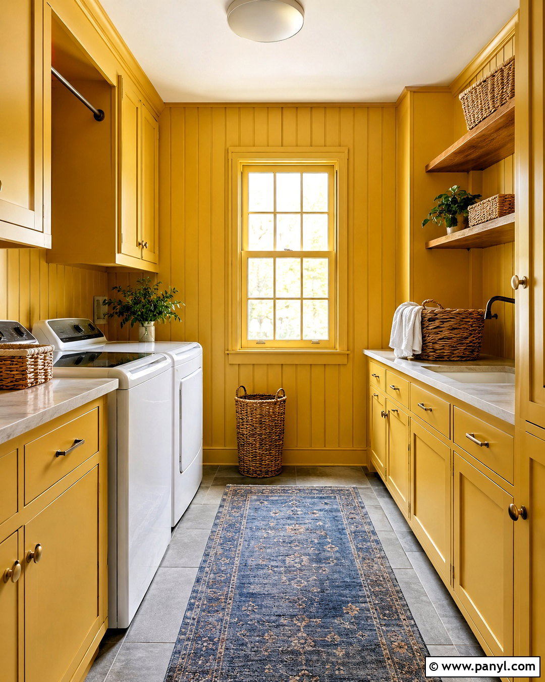
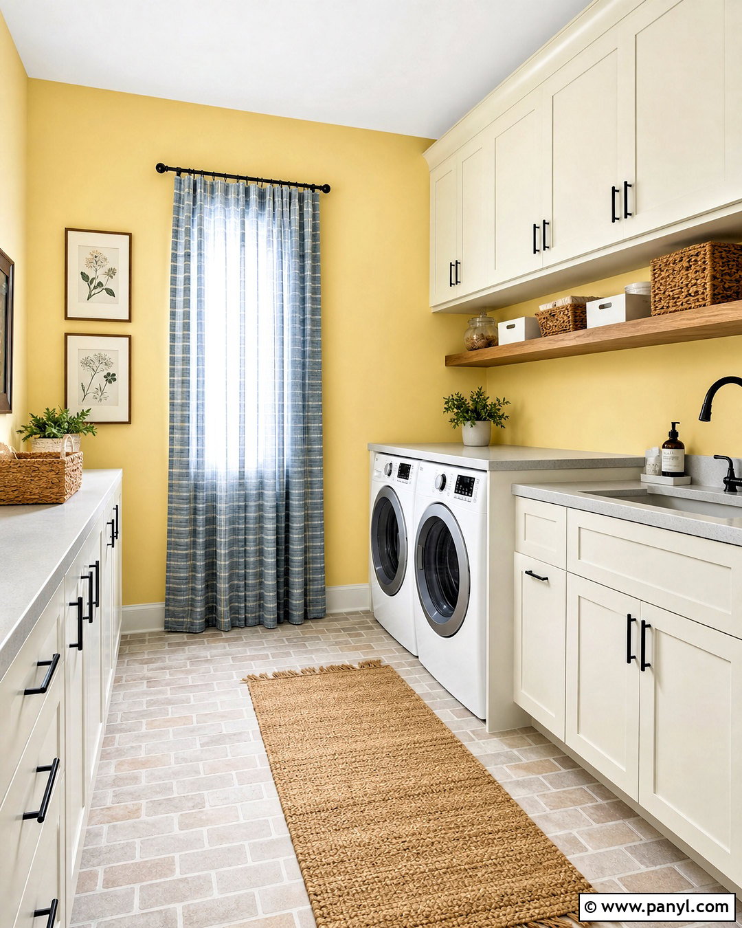
For a richer interpretation of butter yellow, Sherwin-Williams Goldenrod SW 6677 can turn a practical laundry room into a cheerful destination. Paint the cabinetry, paneled walls, and trim in the same warm golden shade for a cozy color-drenched effect. Balance the stronger color with creamy quartz counters, a white farmhouse sink, and warm gray stone flooring. Unlacquered brass cabinet pulls add an aged character that suits the yellow’s depth. Include open oak shelves for folded linens, woven storage baskets, and a small vintage-inspired rug in faded blue and rust. Bright white appliances provide clean contrast without making the room feel busy. This deeper shade is particularly effective in compact utility spaces where bold color can create intentional personality. ()
4. Behr Smooth Silk Entryway
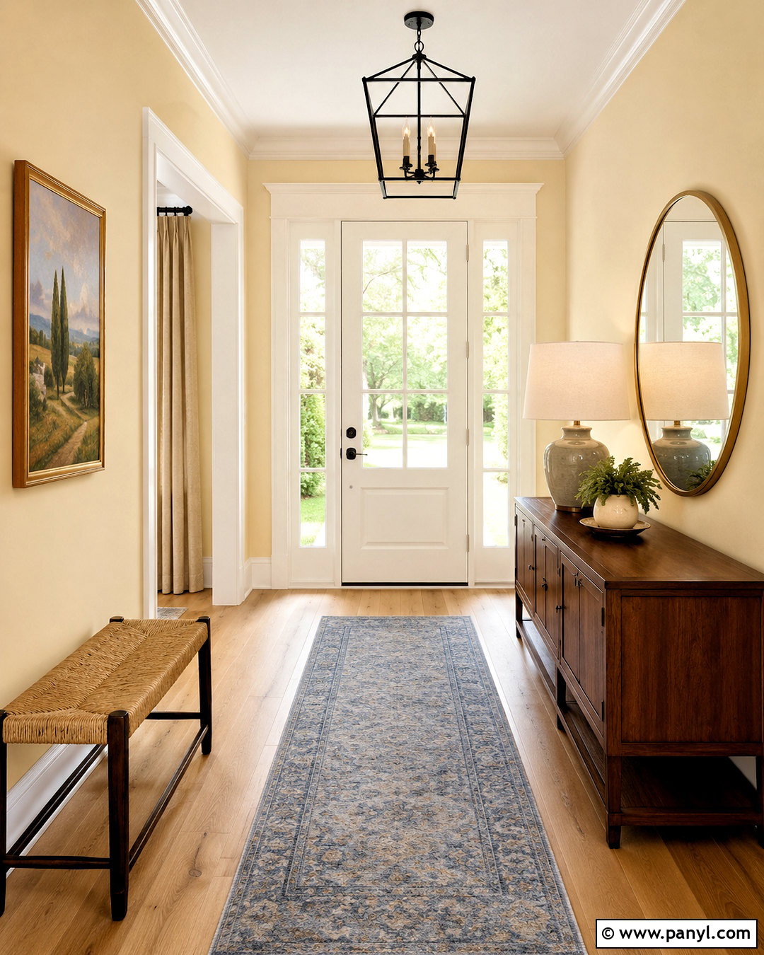
Behr Smooth Silk YL-W07 is an excellent choice when you want only a quiet trace of butter yellow. Use it on the entryway walls with warm white millwork, light oak flooring, and a slim walnut console table. A round brass mirror adds warmth, while a blue-gray runner keeps the pale golden undertones from feeling overly creamy. Complete the space with a ceramic lamp, a woven bench, and a few pieces of simple landscape art. Painting the ceiling in a clean but gentle white will preserve an open feeling. This scheme suits small entrances because the color behaves much like a warm neutral. However, it still offers more life and softness than standard beige, creating a welcoming transition into nearby rooms. ()
5. Benjamin Moore Banana Cream Bedroom
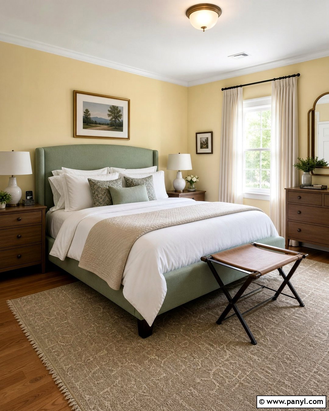
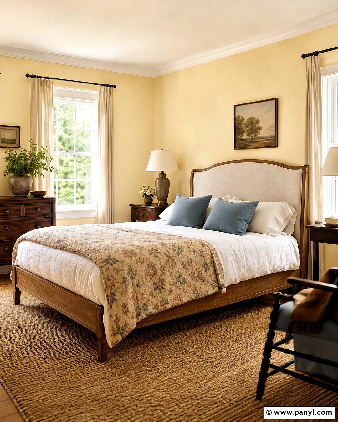
Benjamin Moore Banana Cream brings a muted yellow glow to a restful bedroom without creating too much visual energy. Paint all four walls in this creamy shade, then use soft white on the ceiling and simple window trim. Center the room around a medium oak bed with an upholstered oatmeal headboard. Layer white bedding with dusty blue pillows, a faded floral quilt, and one chocolate brown lumbar cushion. Linen curtains, a natural jute rug, and ceramic bedside lamps reinforce the calm, comfortable mood. Avoid filling the space with many other yellow accents; let the walls provide the main color. The finished bedroom feels sunny yet grounded, especially when deeper brown furniture and cool blue textiles balance the paint’s warmth. ()
6. Benjamin Moore Vanilla Ice Cream Kitchen
Benjamin Moore Vanilla Ice Cream 2154-70 offers a nearly white version of butter yellow, making it useful for kitchens that need warmth without obviously yellow walls. Apply it to perimeter cabinetry and walls, then use pale oak for the island and wide-plank flooring. Honed white marble counters, brushed brass hardware, and cream handmade-look backsplash tile continue the soft palette. Introduce contrast through dark bronze pendant lights and counter stools with woven seats. A Roman shade in blue-and-white ticking fabric adds a small pattern without disturbing the airy design. Because this color contains subtle buttery undertones, it works best beside warm whites instead of icy ones. The complete kitchen feels bright, classic, and welcoming rather than stark or overly coordinated. ()
7. Benjamin Moore Chestertown Buff Dining Room
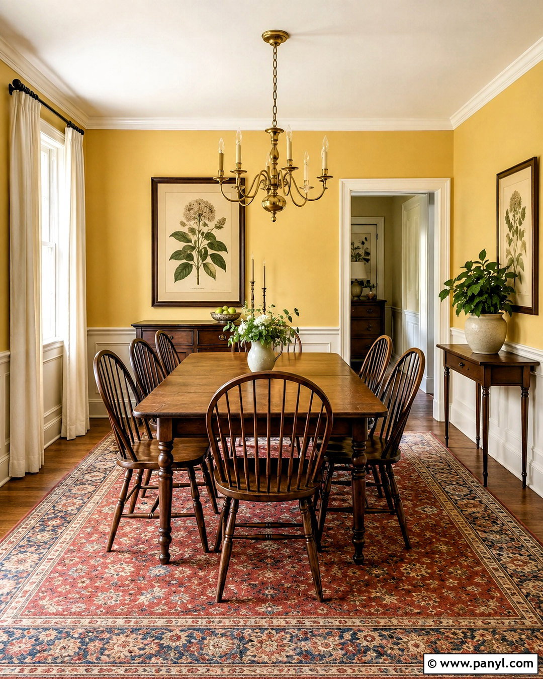
Benjamin Moore Chestertown Buff HC-9 is a deeper butter yellow with enough warmth to support a traditional dining room. Wrap the walls above the chair rail in this golden shade and paint the lower paneling a muted cream. A walnut dining table, spindle-back chairs, and an antique brass chandelier give the room a collected character. Choose a patterned rug containing brick red, sage green, and faded blue to connect the palette. Off-white linen curtains soften the windows, while framed botanical artwork introduces subtle detail. To keep the space from becoming too warm, use white ceramic dishes and a cool gray stone vase on the table. The result feels established and inviting, making it especially suitable for evening meals and family gatherings. ()
8. Sherwin-Williams Gambol Gold Breakfast Nook
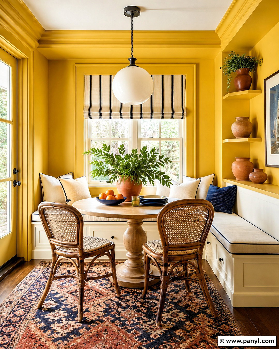
Sherwin-Williams Gambol Gold creates a bold, golden breakfast nook that feels energetic but still connected to the butter yellow family. Paint the walls and built-in bench in the same shade, using a washable finish on the seating base. Add a round white oak pedestal table and curved dining chairs with woven cane backs. Seat cushions in cream fabric soften the color, while navy piping and a striped Roman shade supply crisp contrast. A simple opal glass pendant keeps the light fixture visually calm. Finish the nook with terracotta pottery, a small patterned rug, and open shelves displaying white dishes. This saturated scheme works best when the surrounding kitchen is restrained, allowing the nook to become a cheerful, clearly defined gathering area. ()
9. Benjamin Moore Golden Straw Kitchen Cabinets
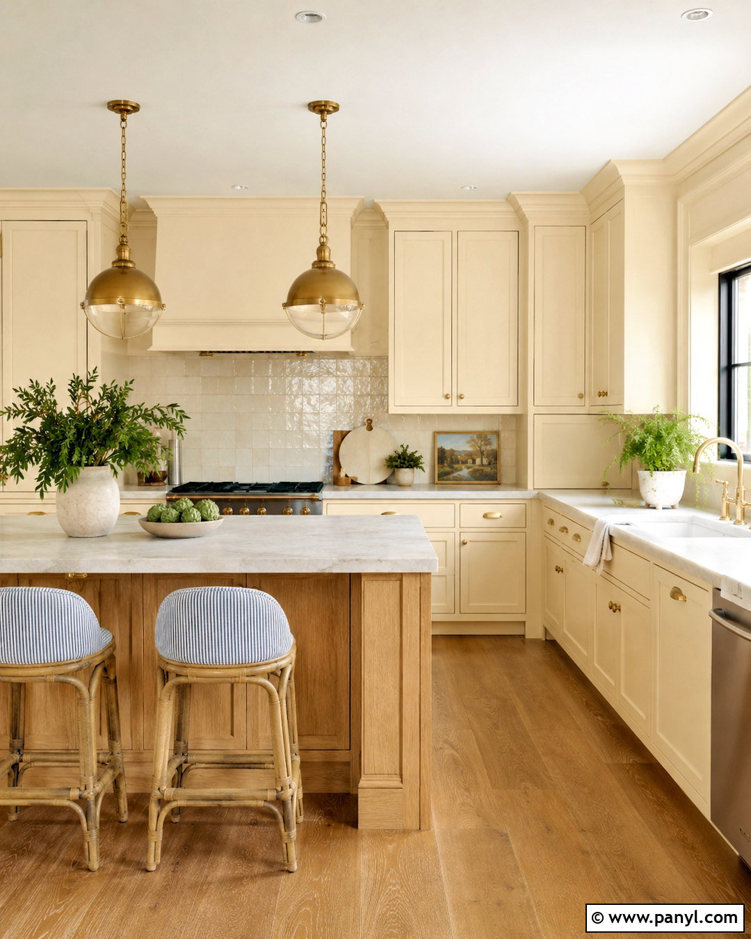
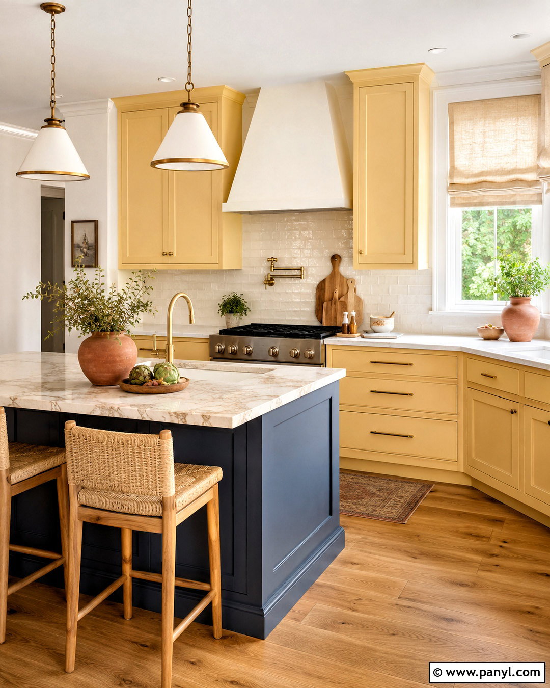
Benjamin Moore Golden Straw 2152-50 brings a soft blend of yellow, cream, and gentle peach to painted kitchen cabinets. Use it on both the base and upper cabinetry, then keep the walls a warm off-white for breathing room. Pale quartz counters with quiet caramel veining connect naturally to the cabinet color. Choose aged brass pulls, a plaster range hood, and medium oak flooring to build a warm, layered palette. For contrast, introduce a muted blue-gray island with woven counter stools. Handmade cream backsplash tile reflects light without looking too polished. A few terracotta accessories and linen window shades complete the room. This approach makes Golden Straw feel sophisticated and architectural rather than sweet, creating a kitchen that suits both cottage and transitional homes. ()

10. Benjamin Moore Hawthorne Yellow Exterior
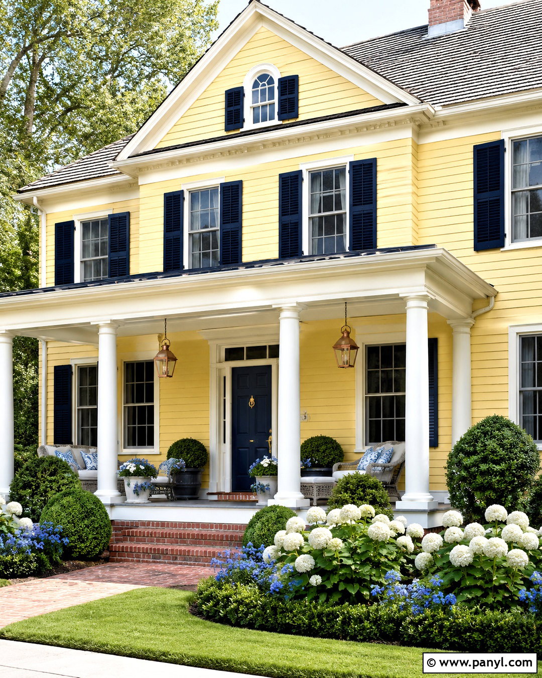
Benjamin Moore Hawthorne Yellow HC-4 delivers the classic yellow-house appearance while remaining softer than a bright primary shade. Use it across lap siding with creamy white trim, porch columns, and window casings. Deep navy shutters and a matching front door add traditional contrast, while a weathered gray roof prevents the palette from becoming too warm. Natural brick steps and copper lanterns bring texture and age to the facade. Surround the porch with white hydrangeas, clipped boxwood, and low blue flowering plants. Add natural wicker seating with blue-and-cream cushions for a complete, welcoming entrance. Since this yellow has a visible presence, test it in direct sun and shade to confirm that it works with the home’s roof, brick, and neighboring landscape. ()
11. Benjamin Moore Man On The Moon Nursery
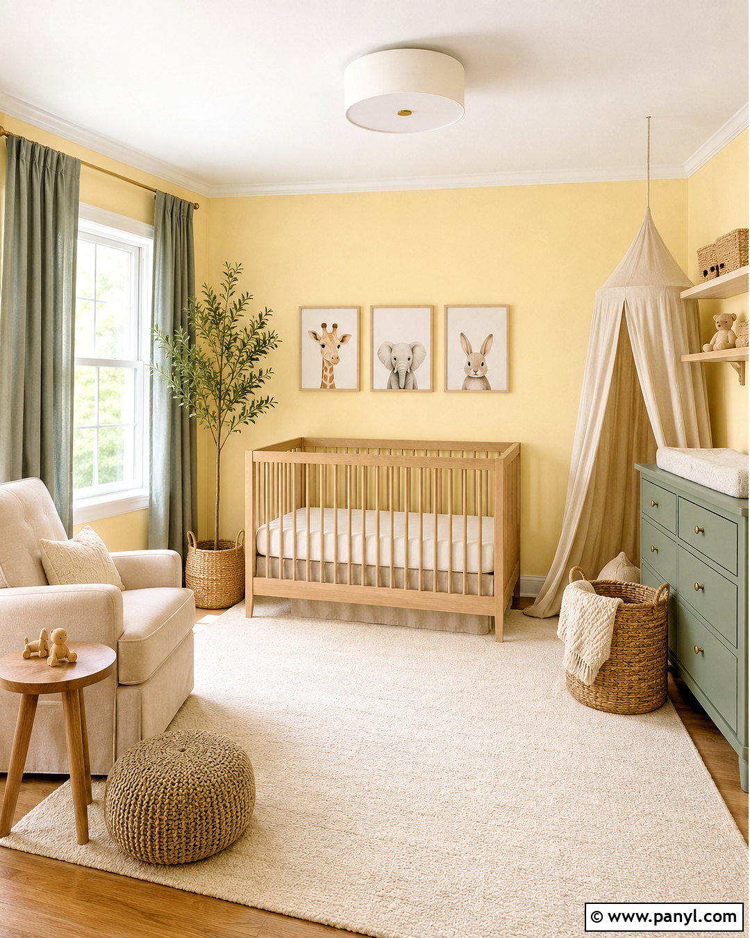
Benjamin Moore Man on the Moon OC-106 offers a pale, luminous yellow that can make a nursery feel gentle and naturally bright. Paint the walls in this shade and keep the ceiling, trim, and doors a soft warm white. Pair it with a light oak crib, an ivory wool rug, and a comfortable oatmeal-colored glider. Muted sage green curtains and a small painted dresser provide earthy contrast. Add woven storage baskets, simple animal artwork, and a linen canopy in cream rather than repeating more yellow. This restrained palette allows the walls to create a soft sunlit effect without making the room feel themed. The color is particularly useful in a north-facing nursery where cooler daylight might make an ordinary cream appear flat or gray. ()
12. Sherwin-Williams Icy Lemonade Home Office
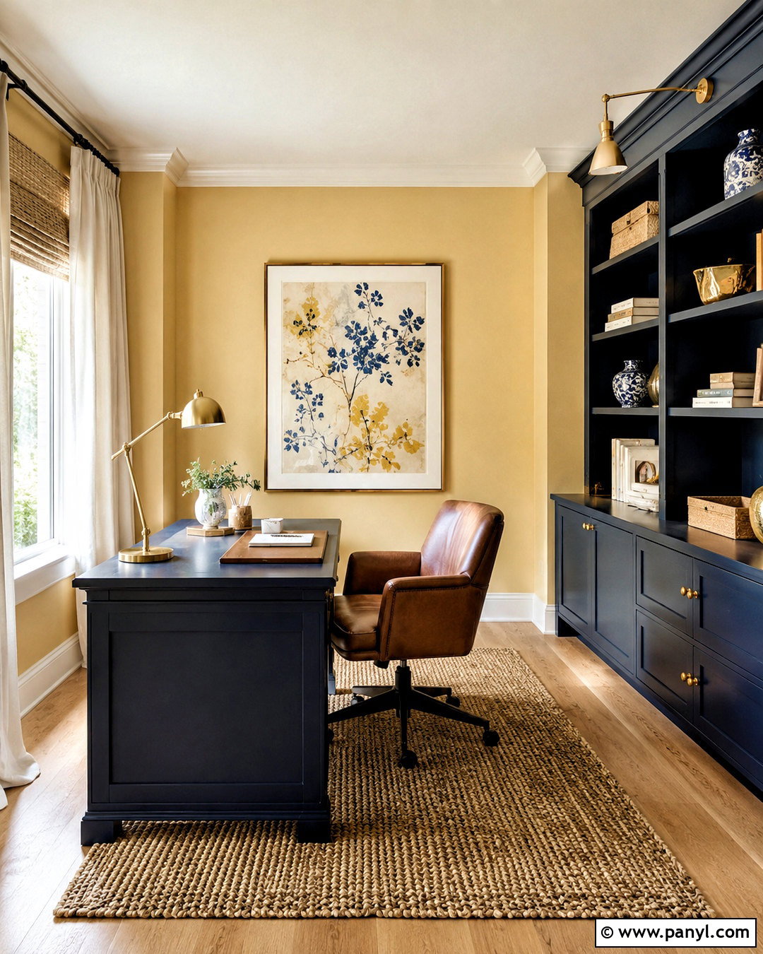
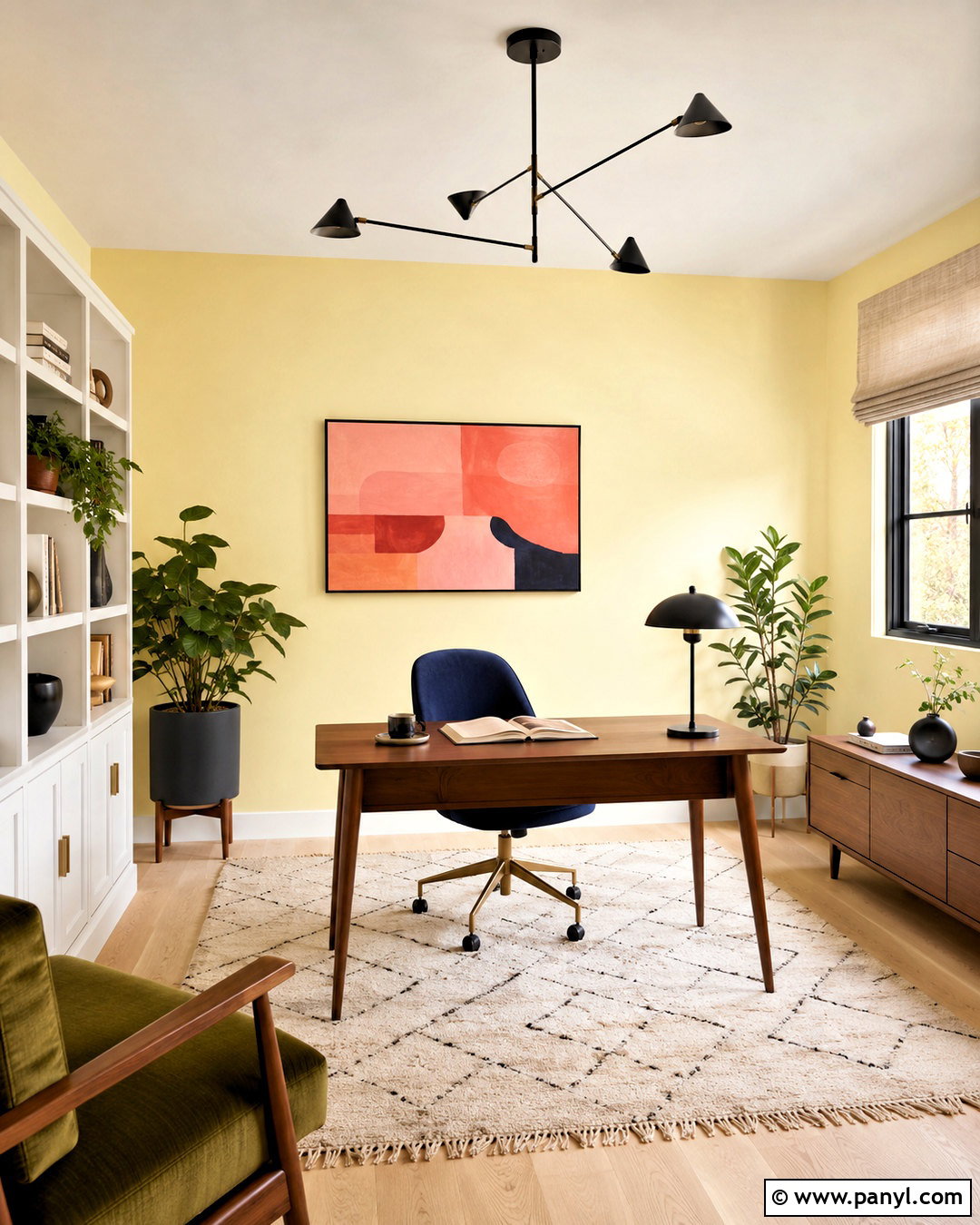
Sherwin-Williams Icy Lemonade SW 1667 gives butter yellow a slightly cooler, fresher direction. Use it on home office walls with crisp warm-white trim and pale maple flooring. Place a walnut desk near the window and add a slim white bookcase to keep the room balanced. Olive green upholstery, a navy desk chair, and abstract artwork with coral accents create a playful midcentury palette. Choose matte black lighting for definition, but limit dark accents so the workspace remains bright. A geometric cream rug and simple linen shade finish the design. The paint’s subtle green influence works well with plants and natural wood. It creates an upbeat office that feels colorful and focused without the intensity of a sharp lemon yellow. ()
13. Benjamin Moore Sweeney Yellow Library
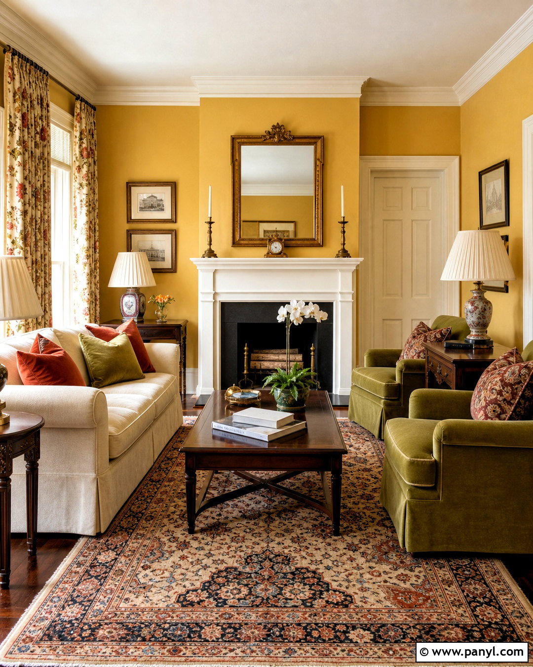
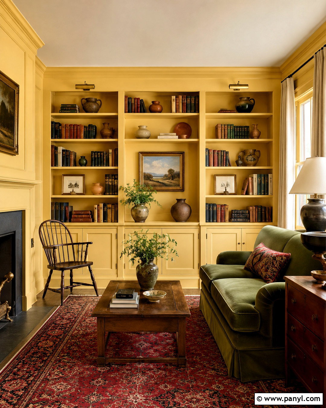
Benjamin Moore Sweeney Yellow CW-370 is a warm, historic-looking yellow that suits a cozy home library or reading room. Color-drench the walls, built-in shelves, and trim for an enveloping finish, then leave the ceiling a soft ivory. Fill the shelving with books, pottery, and framed art, allowing some open space to prevent clutter. A deep olive velvet sofa and a faded red Persian-style rug bring weight to the golden walls. Include dark walnut side tables and aged brass picture lights for traditional detail. Natural linen curtains help filter strong daylight and soften the room. Because Sweeney Yellow has noticeable depth, it works particularly well with antique furniture, earthy textiles, and architectural molding rather than cool, glossy contemporary pieces. ()
14. Behr Butter Yellow Cottage Kitchen
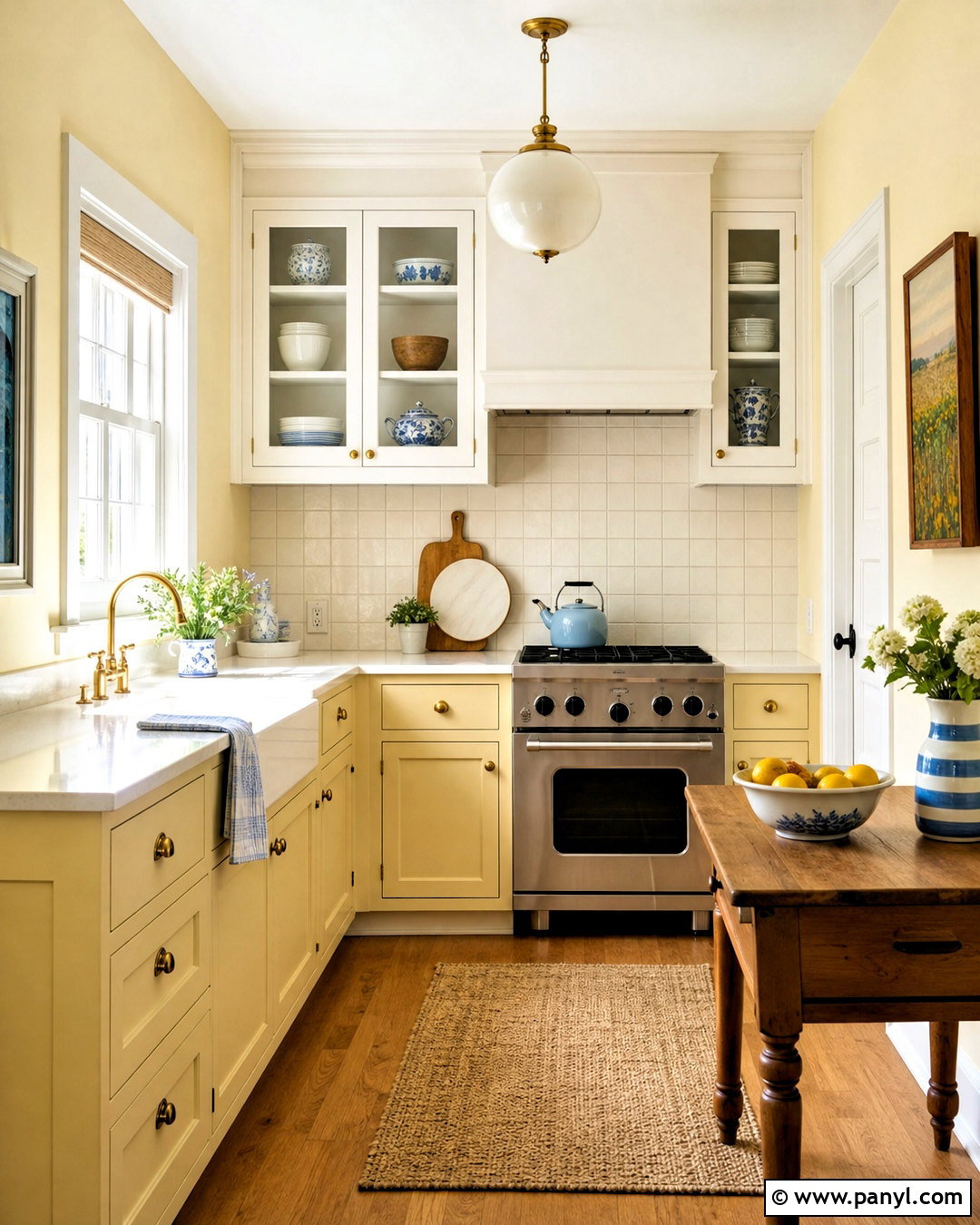
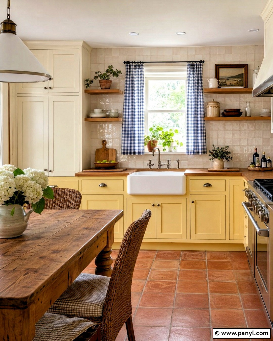
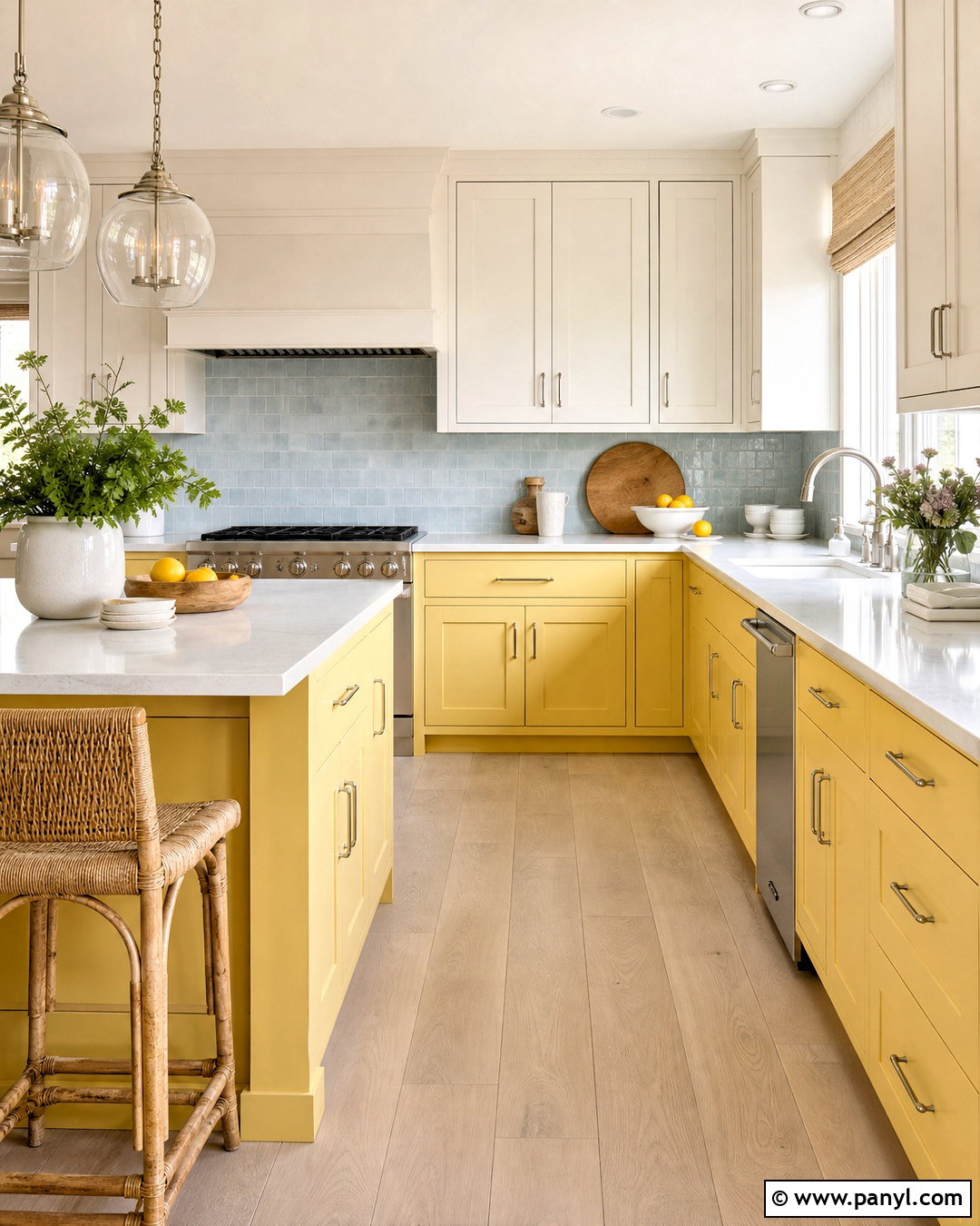
Behr Butter Yellow ICC-90 can create a cheerful cottage kitchen when it is paired with simple materials and plenty of warm white. Paint the lower cabinets in Butter Yellow and keep the upper cabinets creamy white to avoid overwhelming a small room. Add butcher-block counters, a white apron-front sink, and handmade square backsplash tile with light beige grout. Open oak shelves provide practical storage and break up the cabinetry. Use brushed nickel or aged pewter hardware for a cooler counterpoint to the yellow. A small wooden table, woven chairs, blue gingham window fabric, and terracotta floor tile complete the relaxed look. The result feels bright and nostalgic, yet the limited palette keeps it useful for everyday family life. ()
15. Sherwin-Williams Butter Up Dining Nook
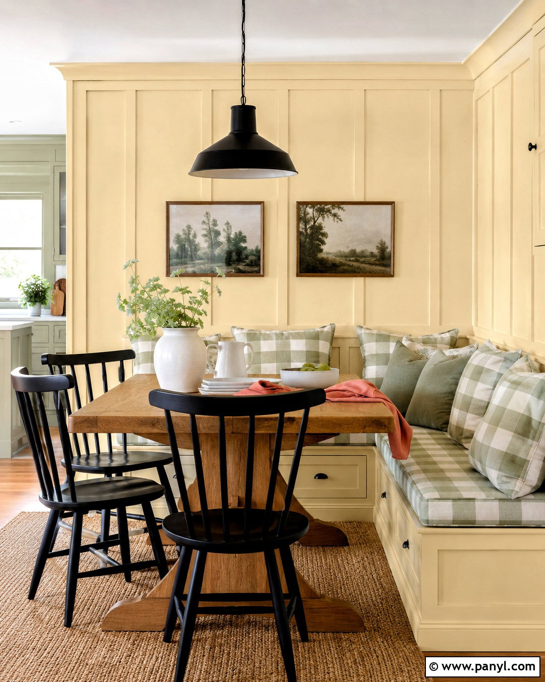
Sherwin-Williams Butter Up SW 6681 is a pure creamy yellow that works naturally in dining areas and other gathering spaces. Paint a built-in corner banquette, surrounding walls, and simple wall paneling in the same shade for a seamless, sunny effect. Add a rectangular oak table and upholstered bench cushions in a small sage-and-cream check. Black spindle chairs and a matte black pendant create enough contrast to sharpen the soft palette. Use a natural fiber rug, white ceramic dishes, and linen napkins in muted coral for warmth. Framed vintage-style landscape prints keep the design casual. This complete nook feels lively in morning light, while the wood, green fabric, and black details help the yellow remain grounded throughout the day. ()
16. Sherwin-Williams Napery Guest Bedroom
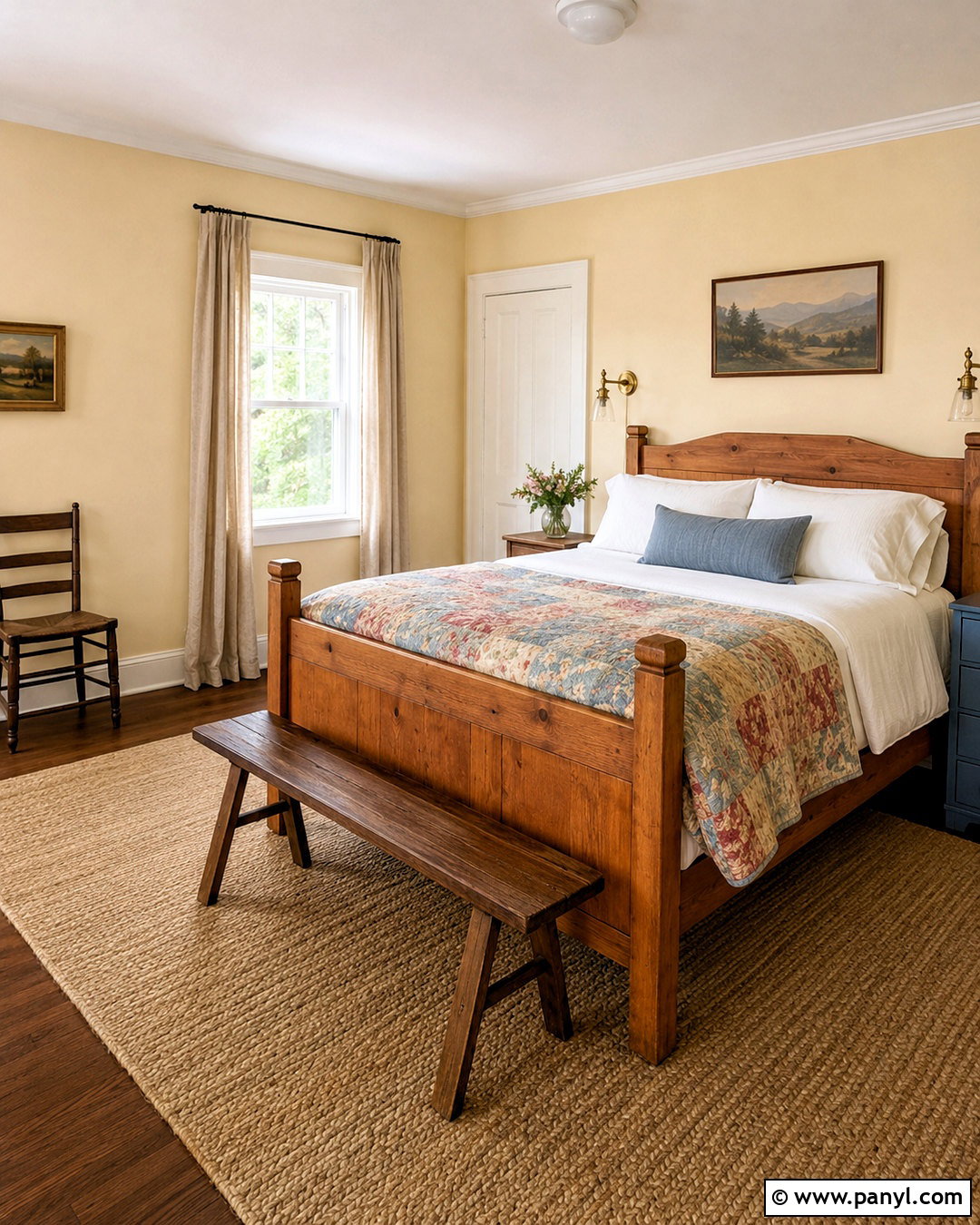
Sherwin-Williams Napery SW 6386 has a warm, creamy appearance that makes a guest bedroom feel welcoming and quiet. Use it on the walls with slightly lighter ivory trim rather than brilliant white. Build the room around an antique pine bed, layered white bedding, and a quilt containing faded blue, tan, and muted rose. Natural flax curtains and a soft wool rug continue the warm neutral foundation. Add one painted blue bedside chest and brass swing-arm lights for contrast and function. A simple wooden bench at the foot of the bed completes the arrangement. Since Napery is subtle, texture becomes important. Linen, wool, woven cane, and aged wood prevent the pale palette from looking unfinished while preserving its relaxed, restful character. ()
17. Farrow & Ball Dorset Cream Kitchen
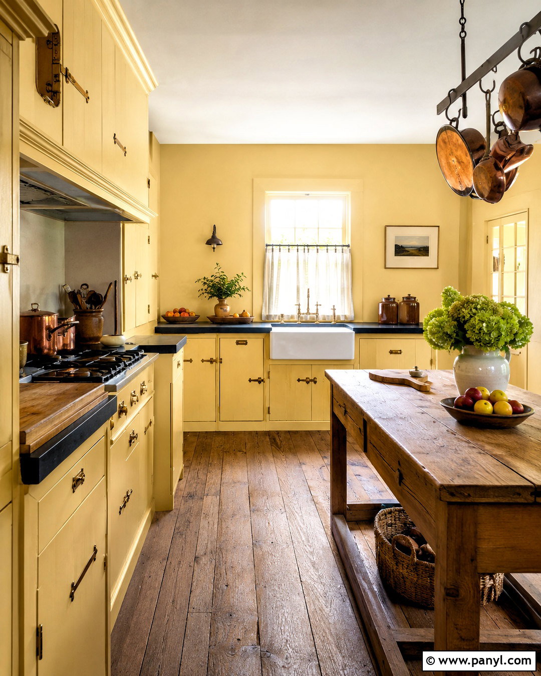
Farrow & Ball Dorset Cream No. 68 is a rich, yellow-toned cream that can bring authentic warmth to a country kitchen. Paint the cabinetry and paneled refrigerator surround in this shade, then use a gentler yellow-based neutral on the walls. Dark soapstone counters, a white ceramic sink, and aged brass latches create handsome contrast. Choose reclaimed oak flooring and a freestanding wooden worktable instead of a highly polished island. Cream subway tile, copper cookware, and linen café curtains support the traditional character. Avoid pairing Dorset Cream with a stark white, which could make its warmth appear stronger. A layered combination of muted cream, dark stone, aged metal, and natural wood gives the kitchen balance while allowing the cabinetry to remain the central feature. ()
18. Benjamin Moore Semolina Kitchen
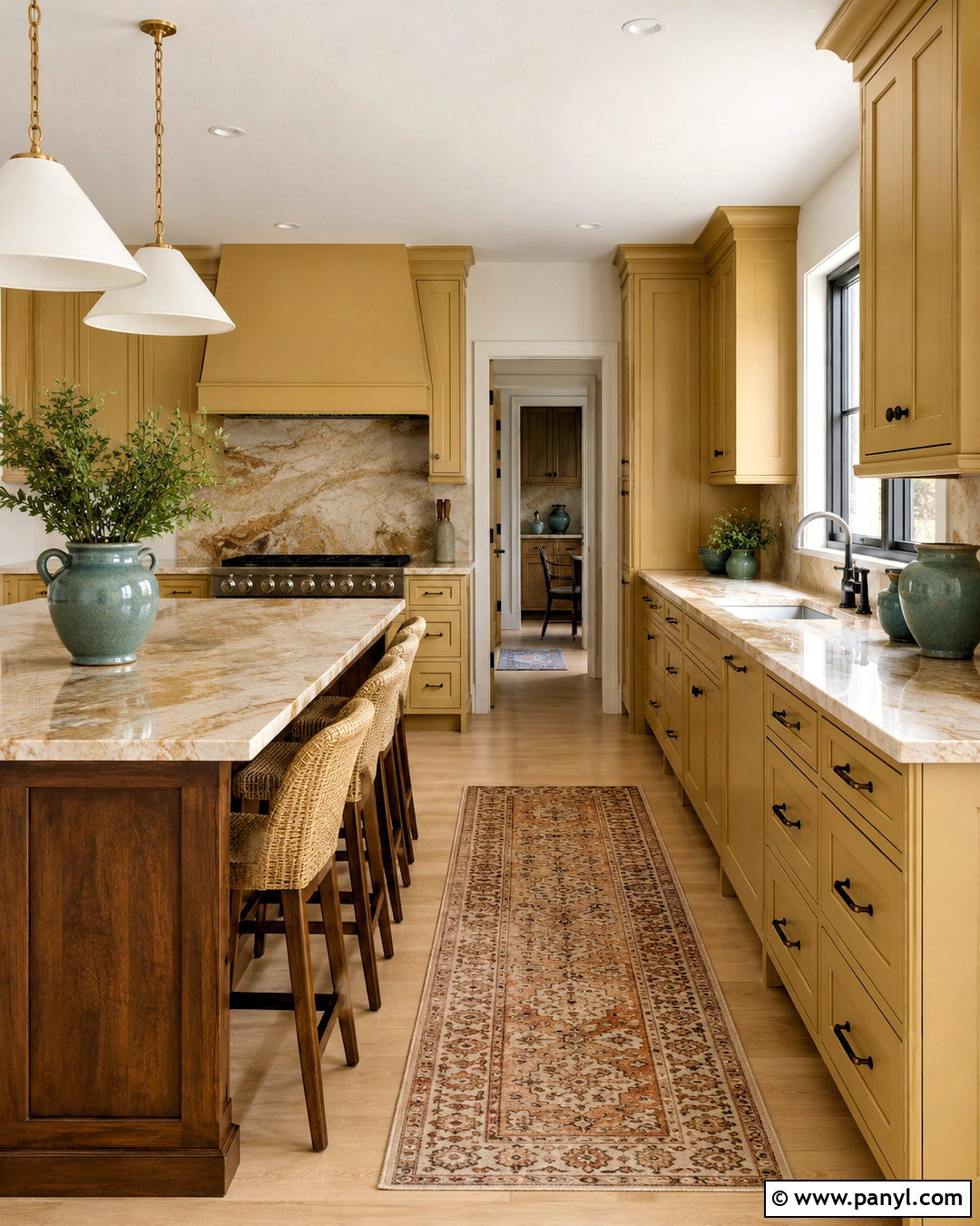
Benjamin Moore Semolina 2155-40 is an earthier, more saturated option for homeowners who want butter yellow with noticeable depth. Use it on Shaker-style cabinets and the range hood in a medium-size kitchen. Pair the color with creamy quartzite counters featuring caramel veining, warm white walls, and dark bronze hardware. A walnut island introduces richer wood, while woven counter stools add a casual texture. Choose light oak flooring to keep the room from feeling heavy. Small accents of muted teal, such as ceramic bowls or a patterned runner, cool the golden palette. Semolina works best as part of a complete material scheme rather than beside plain white surfaces alone. Stone, wood, bronze, and soft blue-green accents make its earthy character feel polished and intentional. ()
19. Farrow & Ball Tallow Nursery
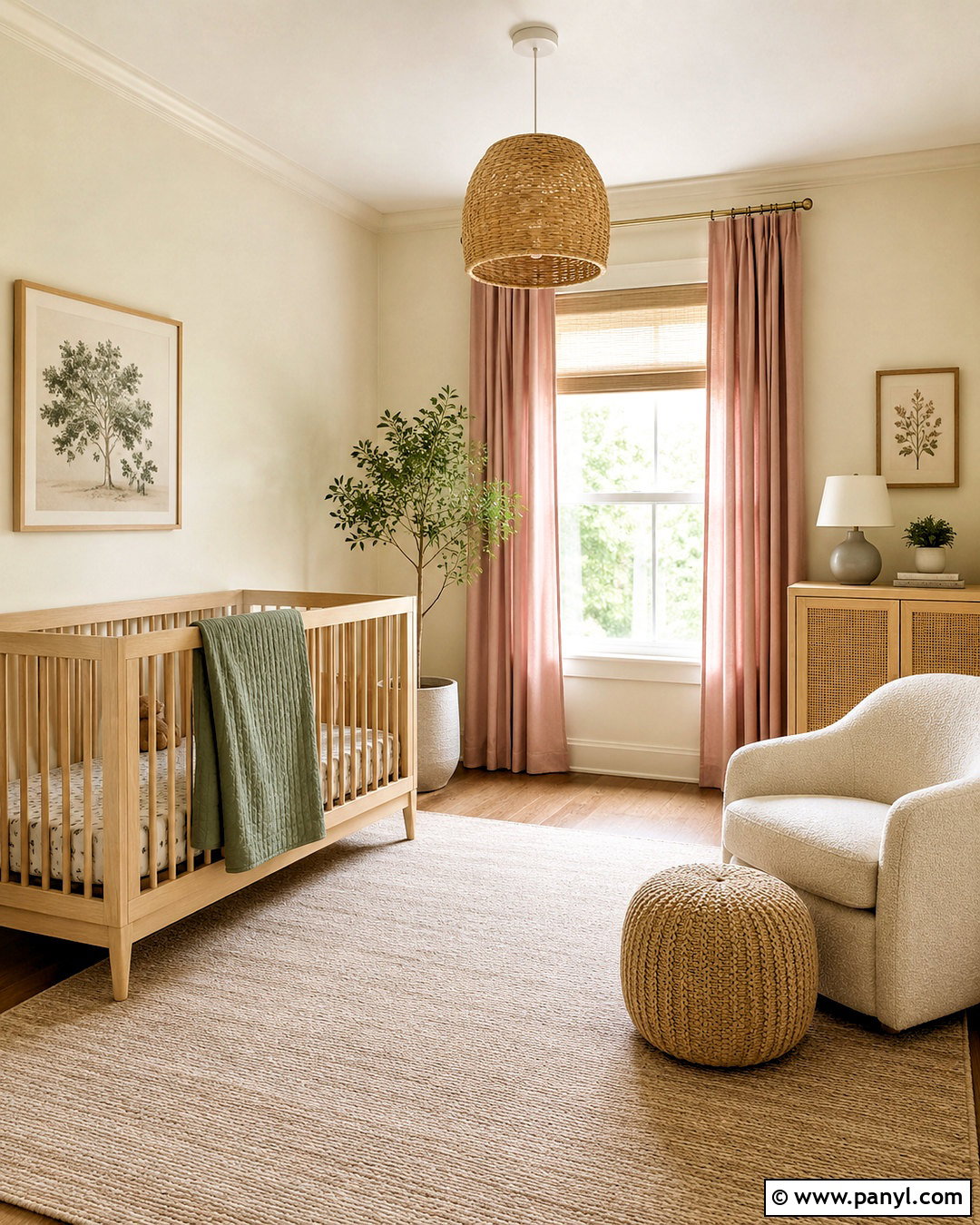
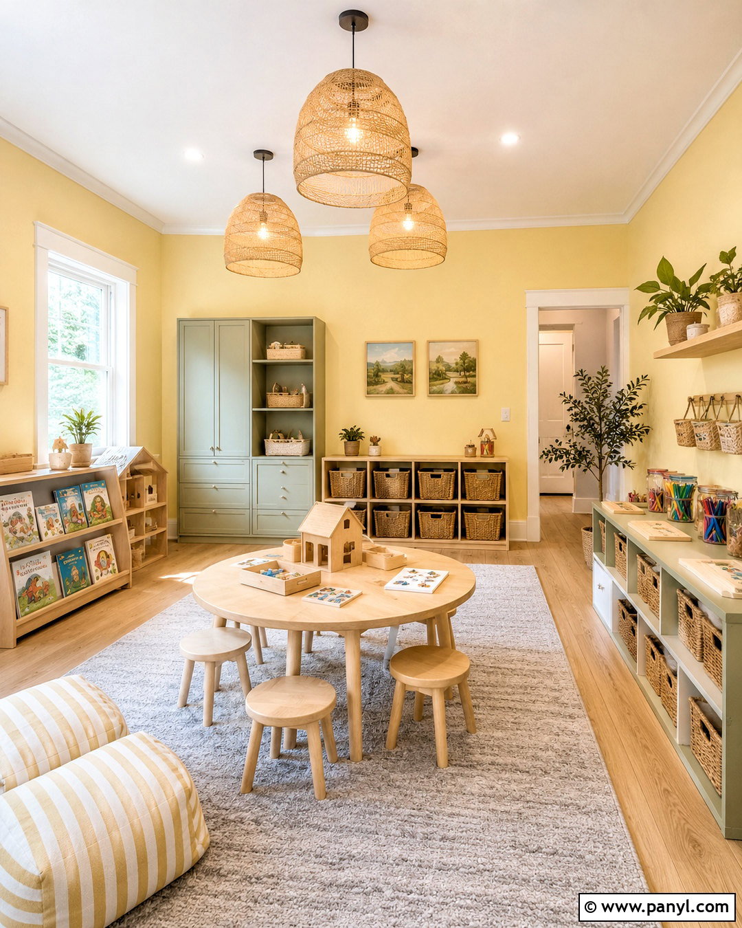
Farrow & Ball Tallow No. 203 sits close to pale cream, offering only a delicate wash of pink and yellow warmth. Use it throughout a nursery with matching walls and low-sheen woodwork for a soft, connected envelope. Pair the color with a white oak crib, natural cane cabinet, and ivory boucle chair. Dusty rose curtains and muted sage bedding add quiet color without creating a strongly themed room. A washable beige rug, woven pendant, and light wood picture frames complete the design. Because Tallow is so restrained, it can support changing furniture and decor as the child grows. The finished space feels warm and fresh, particularly when it receives cooler daylight that might make a standard white appear stark or slightly blue. ()
20. Farrow & Ball Farrow’s Cream Living Room
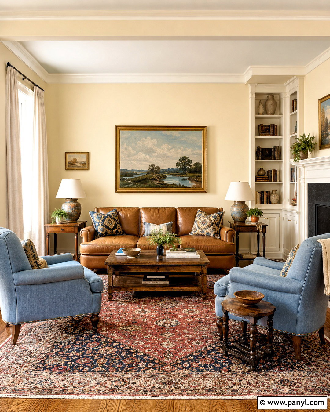
Farrow & Ball Farrow’s Cream No. 67 creates a traditional buttercream backdrop with more color than an off-white but less intensity than a sunny yellow. Use it on living room walls and built-in cabinetry, pairing it with soft ivory trim. A camel leather sofa, faded blue armchairs, and an antique oak coffee table create a comfortable collected look. Layer a patterned rug with muted red, cream, and navy beneath the seating group. Add linen curtains, ceramic lamps, and aged brass frames for gentle texture and shine. Keep the ceiling light and simple so the room remains open. This balanced combination lets the yellow-based cream connect warm wood, leather, and cool blue upholstery, making the entire room feel cohesive rather than overly golden. ()
Conclusion:
These **20 butter yellow paint colors** show how varied this welcoming color family can be. Pale shades such as Tallow, Smooth Silk, and Man on the Moon can replace ordinary white or cream, while Goldenrod, Semolina, and Sweeney Yellow bring richer character. The most successful room will balance yellow with warm white, natural wood, stone, and at least one cooler accent such as blue, sage, or charcoal. Before buying gallons, paint large sample boards and move them around the room. Check each color in morning light, afternoon sun, and evening lamplight. Testing carefully will help you find a butter yellow that feels warm, cheerful, and comfortable in your specific home.

Related Ideas and Inspiration:
Leave a Reply