
Cozy wall colors can make any room feel softer, warmer, and more welcoming. The best choices range from creamy neutrals and earthy browns to muted greens, restful blues, and gently faded pinks. Warm undertones often create intimacy, while deeper colors can make compact rooms feel comfortably cocooned rather than closed in. Lighting still matters, so test large samples beside your flooring, furniture, and trim throughout the day before committing. Natural wood, layered textiles, and warm metals will strengthen the effect without making the room feel overly themed. Current color trends also favor nuanced, nature-inspired shades that balance comfort with personality. () Use these complete room schemes to find practical, stylish inspiration among these **35 Cozy Wall Colors**.

1. Warm White Wall Color
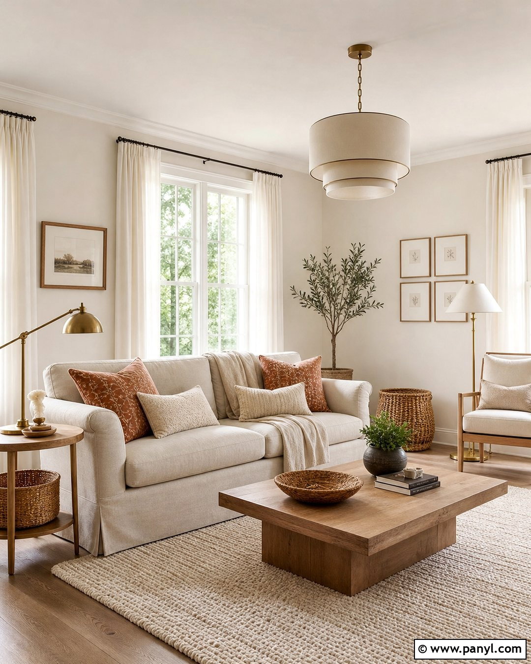
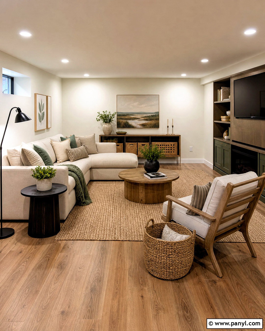
Warm white walls create an airy room without the stark feeling of a cooler, blue-based white. Use this color throughout a living room with an oatmeal linen sofa, light oak coffee table, and cream wool rug. Natural wood frames and woven baskets add gentle contrast, while tan and muted rust pillows keep the palette grounded. Choose soft white curtains that blend closely with the walls and make the windows appear larger. For definition, paint the trim a slightly cleaner white rather than using sharp black accents. Aged brass lamps and a simple landscape print complete the design. This combination works especially well in small rooms, apartments, and open layouts where you want brightness, flexibility, and a comfortable lived-in character.
2. Cream Wall Color
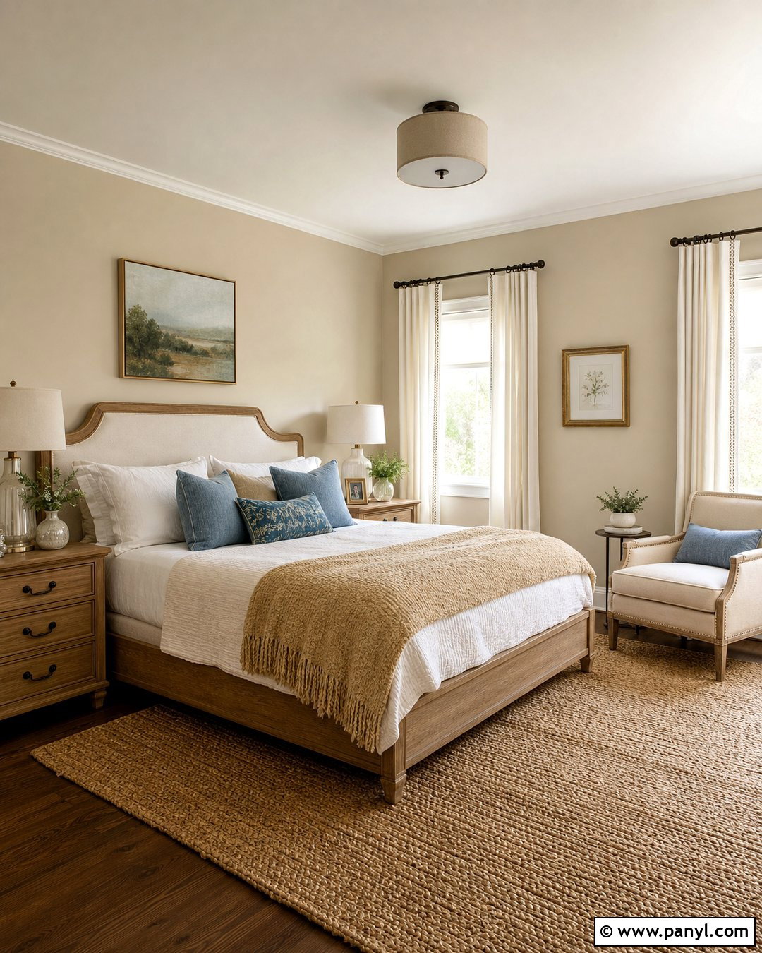
Cream walls have a soft yellow undertone that looks especially inviting beside traditional wood furniture. Build a cozy bedroom around this color with a medium oak bed, ivory upholstered headboard, and layered white and beige bedding. Add a camel-colored throw across the foot of the bed and use muted blue pillows for quiet contrast. Off-white curtains, a natural jute rug, and ceramic table lamps keep the room relaxed rather than overly formal. Continue the cream onto simple wall molding for a smooth, enveloping finish. Dark bronze curtain rods and picture frames provide small points of definition. This complete palette feels sunny during the day and gentle at night, making it a dependable choice for bedrooms that need warmth without visual heaviness.
3. Soft Greige Wall Color
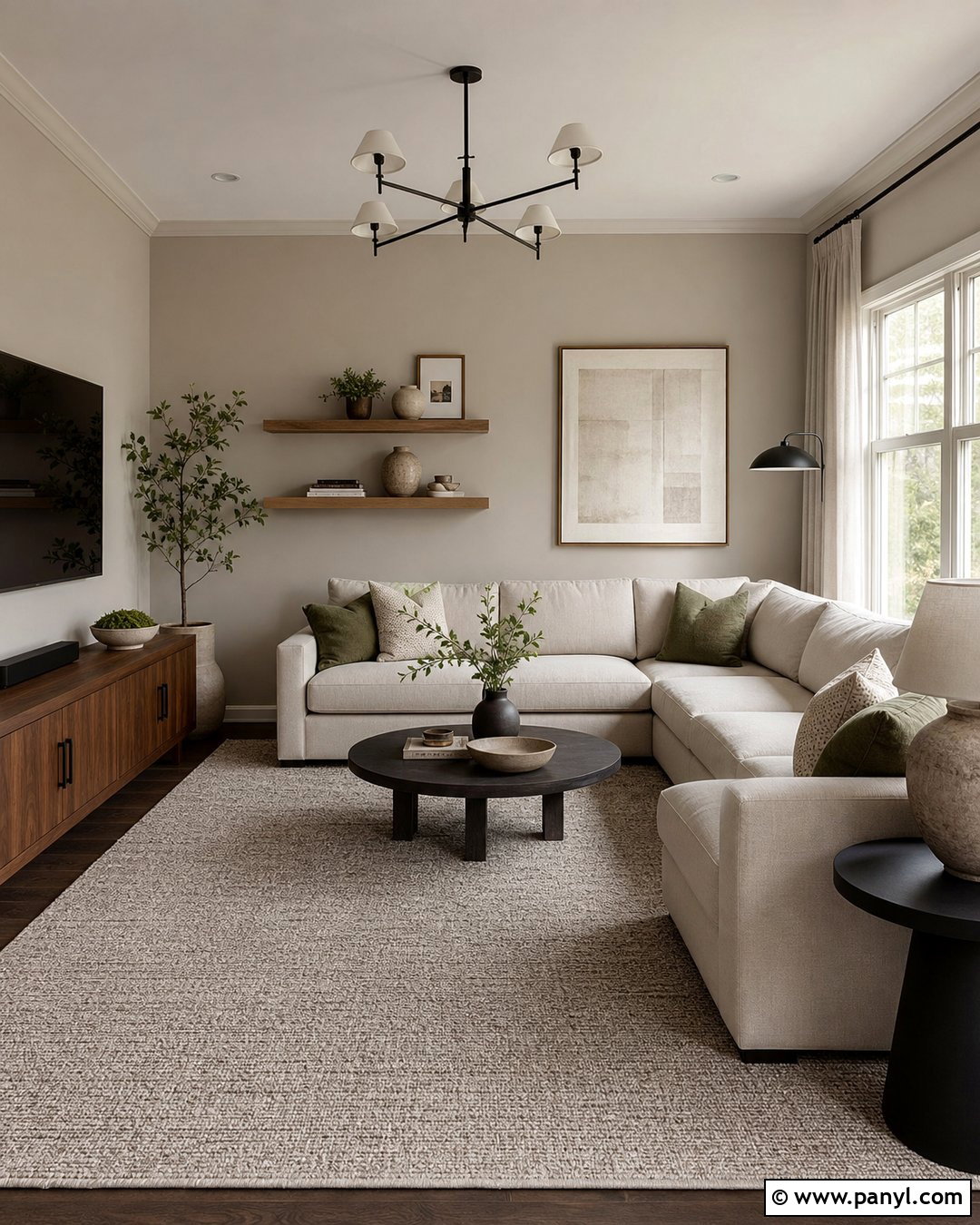
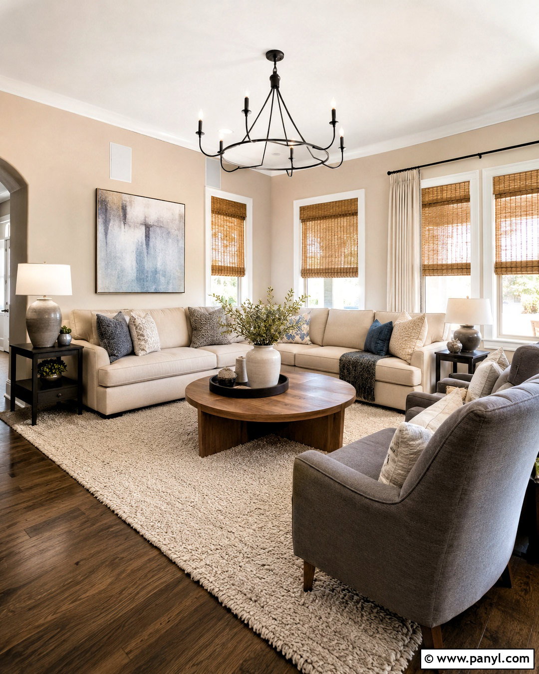
If gray feels too cool and beige feels too yellow, soft greige offers a comfortable middle ground. Use it in a family room with a cream sectional, walnut media console, and textured taupe rug. Accent the seating with olive, charcoal, and warm ivory pillows to connect the neutral wall color to richer natural tones. Matte black lighting can add structure, but balance it with wood, linen, and woven materials. Hang large abstract artwork containing sand, brown, and muted green rather than bright primary colors. White oak shelves styled with pottery and books make the room functional and welcoming. Soft greige also flows easily into nearby kitchens and hallways, so it is useful for creating a cohesive color scheme across an open-concept home.
4. Warm Taupe Wall Color
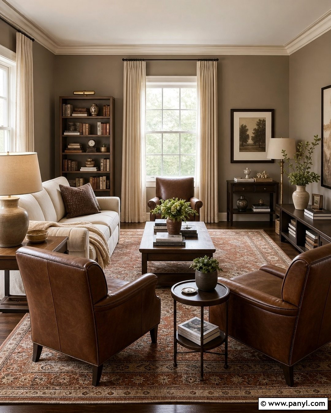
Warm taupe brings more depth than beige while remaining easy to decorate around. Cover the walls of a reading room or formal living room in this earthy neutral, then introduce a light beige sofa and two tobacco-brown leather chairs. A vintage-style rug containing faded rust, cream, and charcoal will tie the furniture and walls together. Use walnut side tables, bronze lamps, and floor-length oatmeal curtains to reinforce the warmth. Keep the ceiling and trim creamy white so the room feels polished rather than dark. A substantial bookcase or low console can be painted in matching taupe for a built-in effect. The finished room feels grounded and intimate, with enough contrast to stay interesting through changing seasons and decor updates.
5. Sand Beige Wall Color
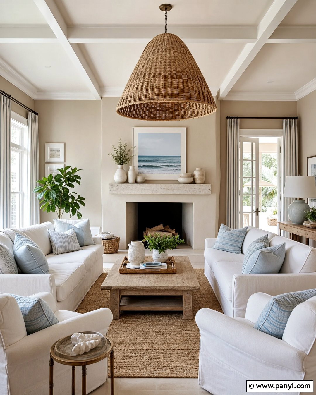
Sand beige creates the relaxed warmth of natural linen, pale stone, and sun-dried grass. It is ideal for a casual living room with slipcovered ivory seating, a weathered oak coffee table, and a large woven rug. Layer in pale blue-gray pillows, sandy striped curtains, and handmade ceramic decor for a subtle coastal influence without obvious beach motifs. Keep wood finishes light to medium rather than very dark. An oversized rattan pendant can add texture above the seating area, while a simple plaster fireplace strengthens the organic appearance. Use white trim with a creamy undertone to avoid harsh contrast. This wall color performs beautifully in rooms with generous sunlight, but layered lamps and soft textiles help it remain inviting after sunset.
6. Mushroom Wall Color
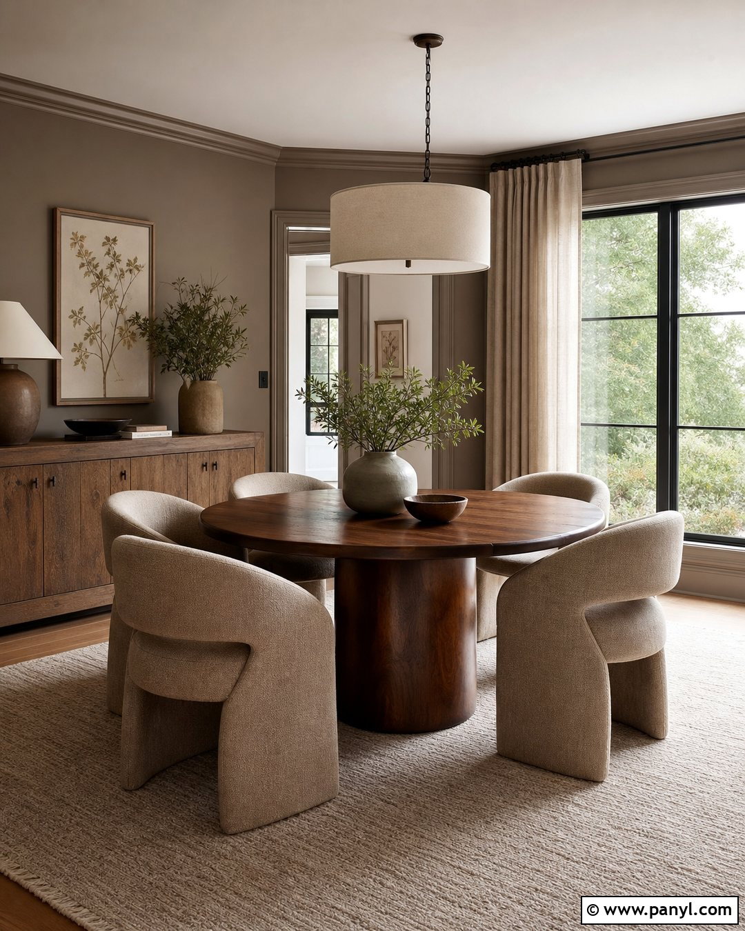
Mushroom is a muted brown-gray that gives neutral rooms richer character. Try it in a dining room with a round walnut table, curved upholstered chairs, and a warm ivory area rug. Paint the walls and molding the same mushroom tone to create a calm, continuous backdrop. A linen drum pendant, dark bronze hardware, and framed botanical artwork introduce definition without disturbing the quiet palette. Add a sideboard in aged oak and style it with matte ceramic vessels and leafy branches. For windows, choose natural flax curtains that are slightly lighter than the walls. The result feels sophisticated but still comfortable enough for everyday meals. Mushroom also coordinates well with adjoining rooms painted warm white, taupe, soft green, or muted clay.
7. Camel Wall Color
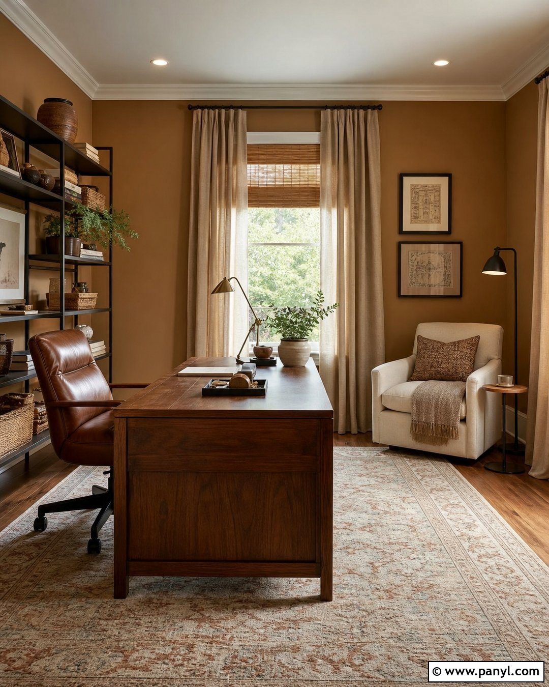
Camel walls bring golden brown warmth to a room and look especially rich with cream upholstery. Create a welcoming home office using camel paint, a substantial walnut desk, and a cognac leather chair. Place a low-pile patterned rug beneath the work area, choosing faded navy, rust, and beige details. Cream curtains will soften the wall color and reflect daylight, while dark bronze shelving provides practical storage. Include a small upholstered reading chair with an ivory throw to make the office useful beyond working hours. Keep accessories simple and tactile, such as wooden boxes, pottery, and linen-covered notebooks. Camel is stronger than a standard neutral, yet its earthy foundation makes it surprisingly versatile with dark woods, aged metals, and natural fabrics.
8. Caramel Wall Color
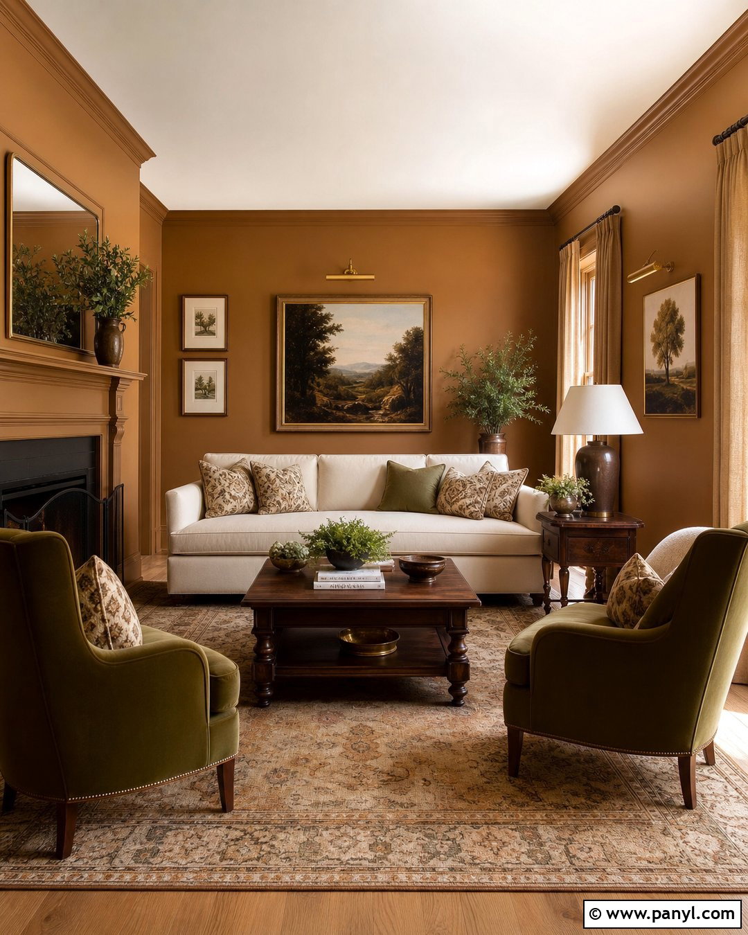
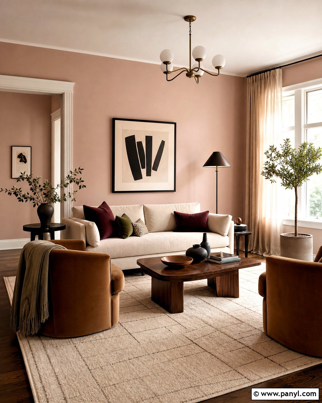
Caramel wall color can turn a plain sitting room into a warm, intimate retreat. Pair it with a deep cream sofa, two olive velvet chairs, and a dark wood coffee table. A large vintage-inspired rug containing faded gold, brown, and soft red will distribute the wall color throughout the room. Use pale oatmeal curtains to lighten the windows and prevent the scheme from feeling too saturated. Brass picture lights, landscape paintings, and patterned cushions add traditional character. Consider painting the trim in a lighter caramel instead of white for a softly color-drenched effect. This palette works best with several light sources, including table lamps and a central fixture, so the brown-gold walls remain dimensional and welcoming in the evening.
9. Light Mocha Wall Color
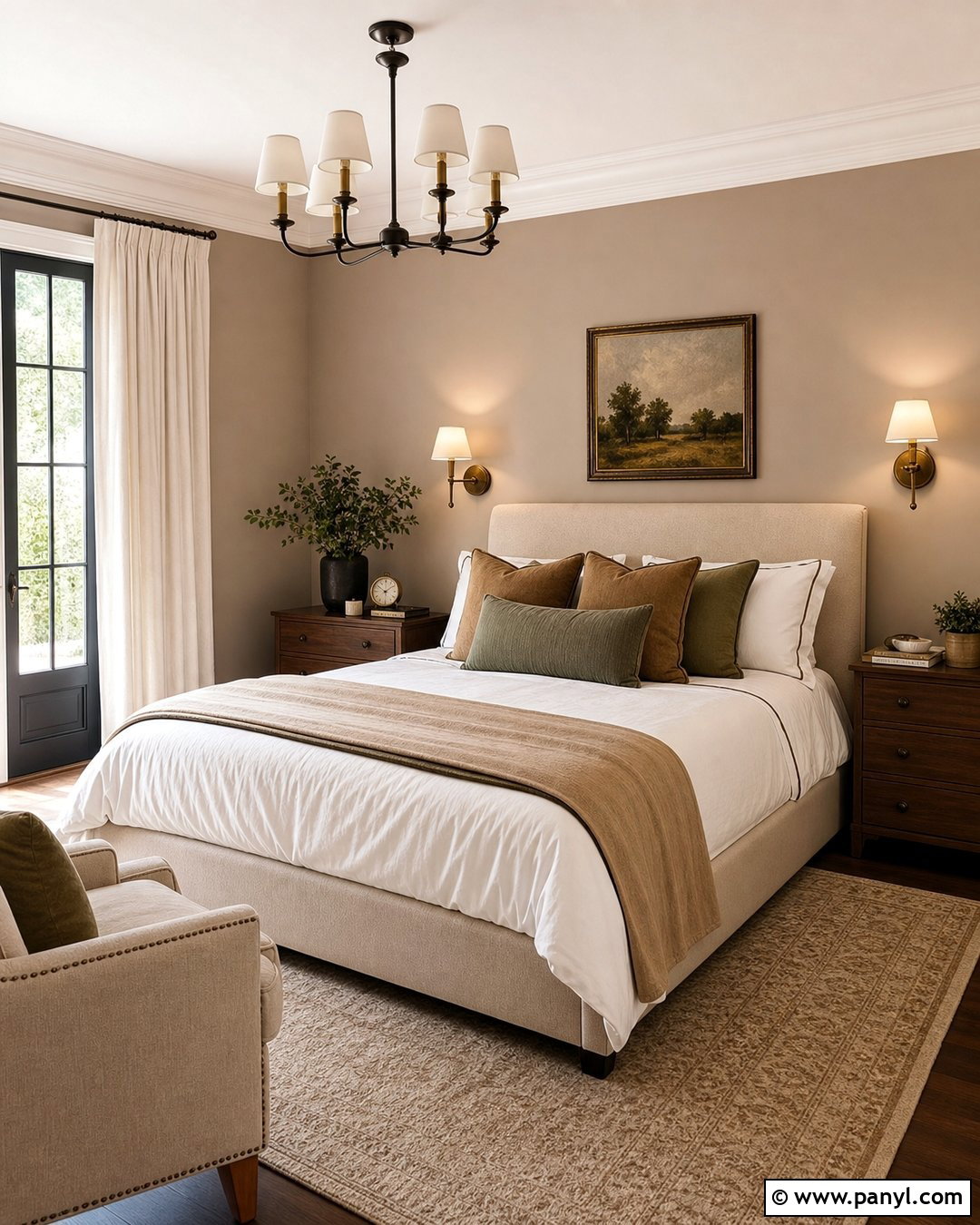
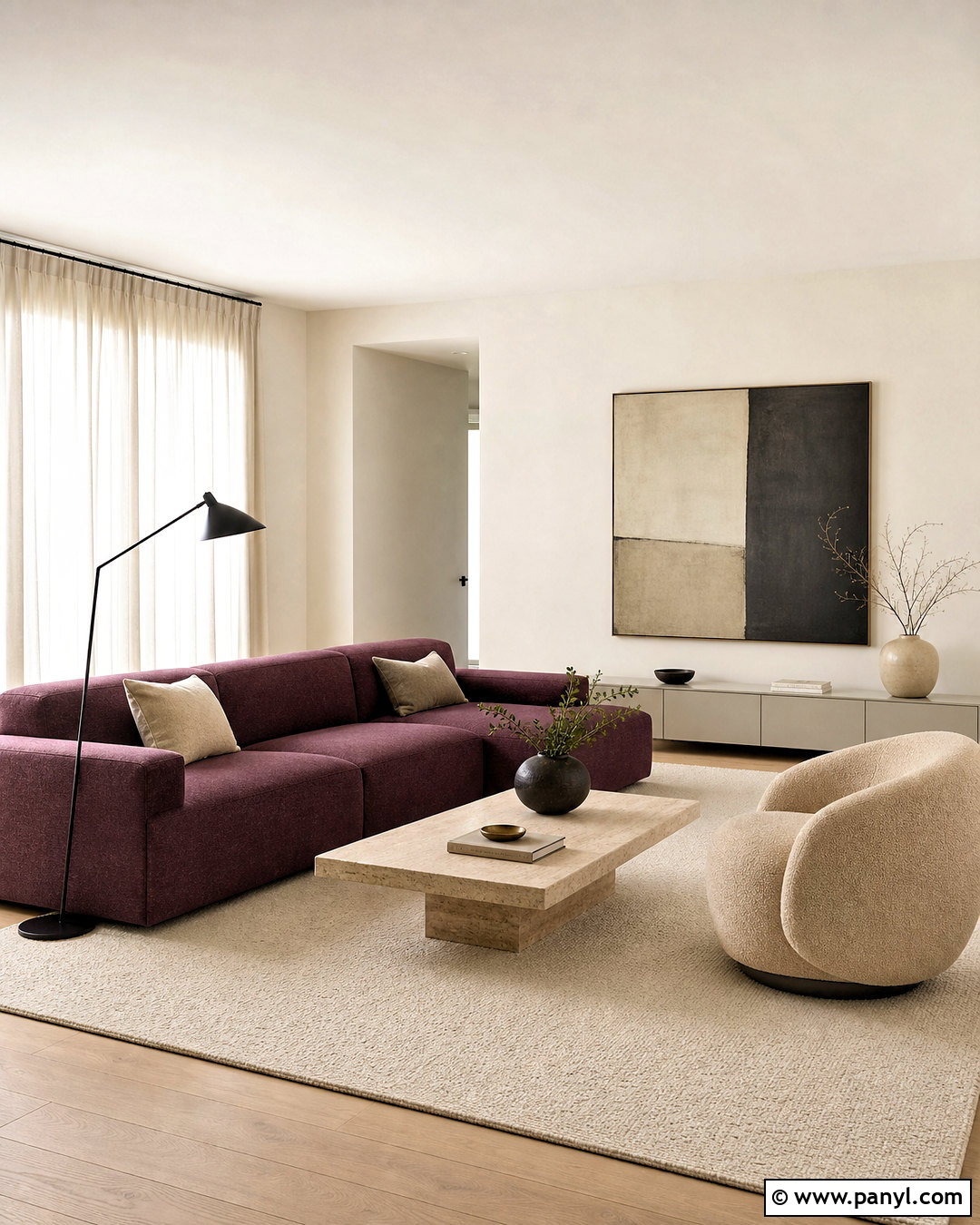
Light mocha walls offer the comfort of brown in a softer, more flexible form. Use this shade in a bedroom with an upholstered oatmeal bed, medium walnut nightstands, and crisp ivory bedding. Add chocolate piping, a textured camel blanket, and muted sage pillows to create depth without overwhelming the restful palette. A warm beige carpet or wool rug will make the room feel comfortable underfoot. Choose creamy curtains that extend from ceiling to floor and use aged brass sconces beside the headboard. Black accents should be limited to thin frames or small hardware. Painting the ceiling warm white keeps the room open, while repeating the mocha color on doors or built-ins gives the complete design a thoughtful, custom appearance.
10. Cocoa Brown Wall Color
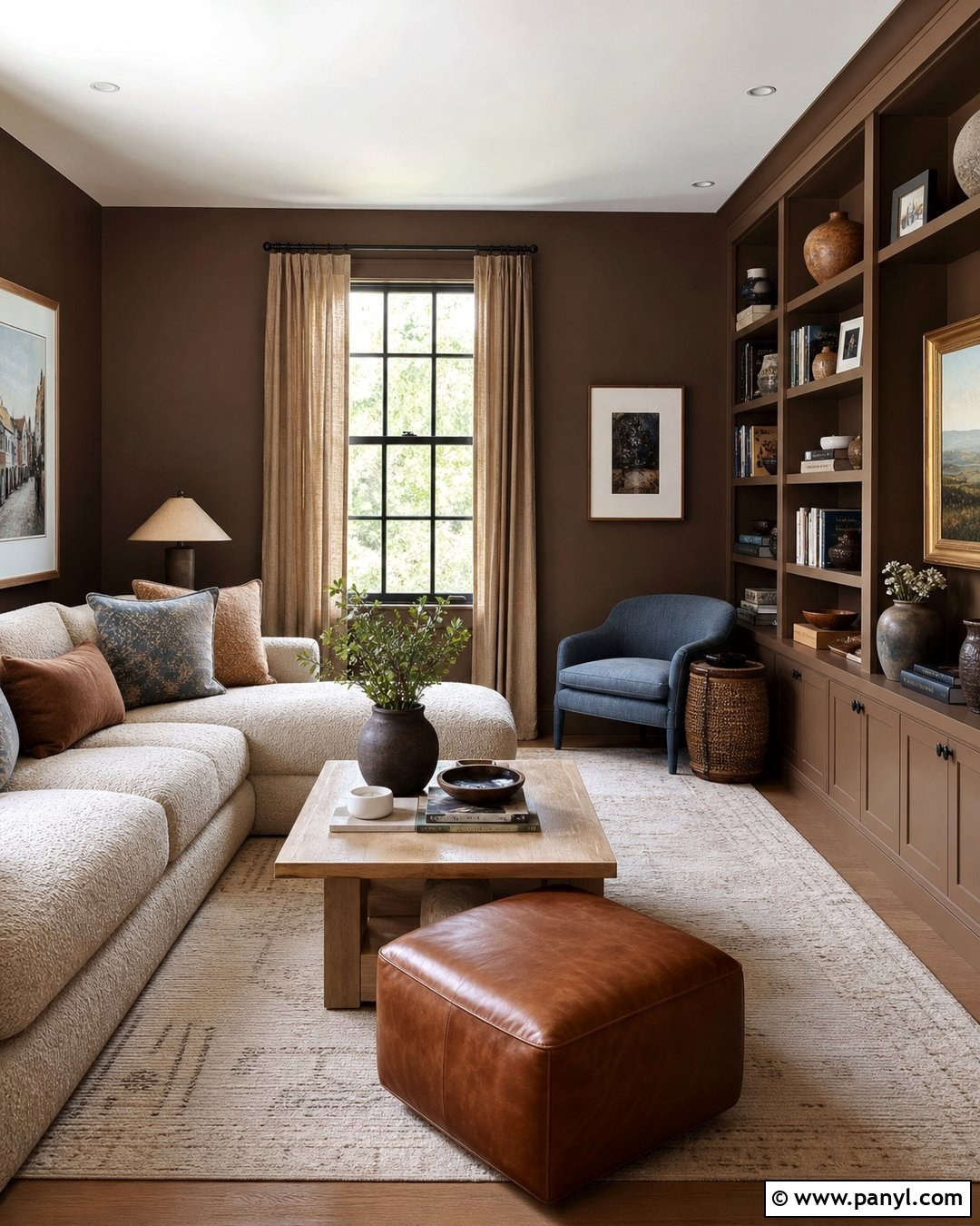
Cocoa brown produces a comforting, enveloping atmosphere in rooms intended for relaxing. Paint a compact den in this medium brown and use a cream boucle sofa as the visual anchor. Add a walnut coffee table, cognac leather ottoman, and patterned rug in tan, rust, and muted blue. Built-in shelves painted the same cocoa shade will make the walls appear deeper and more architectural. Display books, stoneware, and framed art with generous empty space between objects. Oatmeal curtains and several pale lampshades prevent the room from looking heavy. For an especially cohesive finish, carry the brown onto the trim while leaving the ceiling a soft cream. The contrast creates a cocooning room that still feels balanced, practical, and distinctly residential.
11. Chocolate Brown Wall Color
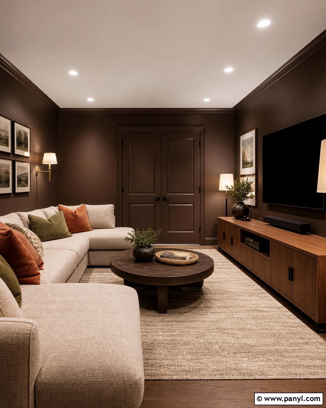
Deep chocolate walls can feel luxurious and snug when balanced with enough pale upholstery and reflective detail. Use the color in a media room with a large oatmeal sectional, a warm oak console, and a plush beige rug. Paint the baseboards and doors chocolate as well, creating an uninterrupted envelope that reduces visual clutter. Introduce antique brass lamps, cream linen shades, and framed artwork with wide ivory mats. Pillows in rust, tan, moss, and subtle patterns keep the seating from appearing flat. Choose medium-toned wood instead of nearly black furniture, which could make the room feel overly dense. Layered lighting is essential here, allowing the walls to reveal their rich brown undertones while maintaining an inviting atmosphere for everyday relaxation.
12. Espresso Wall Color
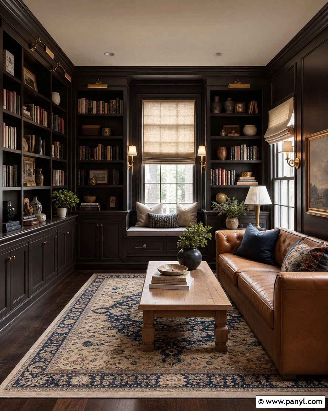
Espresso walls create dramatic comfort in a small library, study, or television room. Pair the near-brown shade with floor-to-ceiling shelving painted to match, then add a caramel leather sofa and a substantial natural oak coffee table. A faded Persian-style rug with cream, brick, and navy details will break up the dark perimeter. Use brass sconces, a pale ceiling, and multiple linen lampshades to distribute light around the room. Window coverings should remain warm and light, such as textured ivory Roman shades. Books provide natural color, but leave some shelf space open for pottery and framed objects. This complete design feels intimate rather than gloomy because its lighter furniture, warm metals, and balanced lighting create clear contrast against the espresso backdrop.
13. Terracotta Wall Color
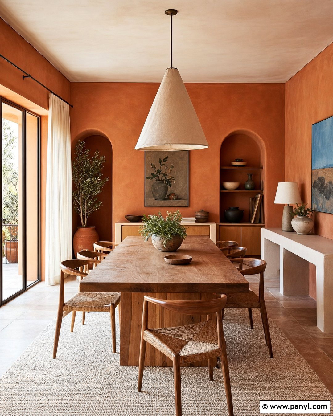
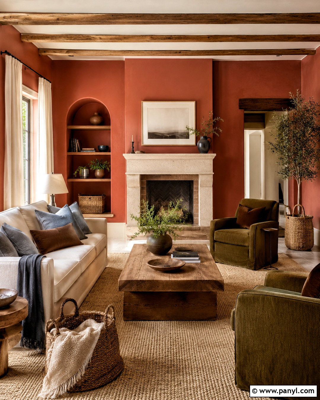
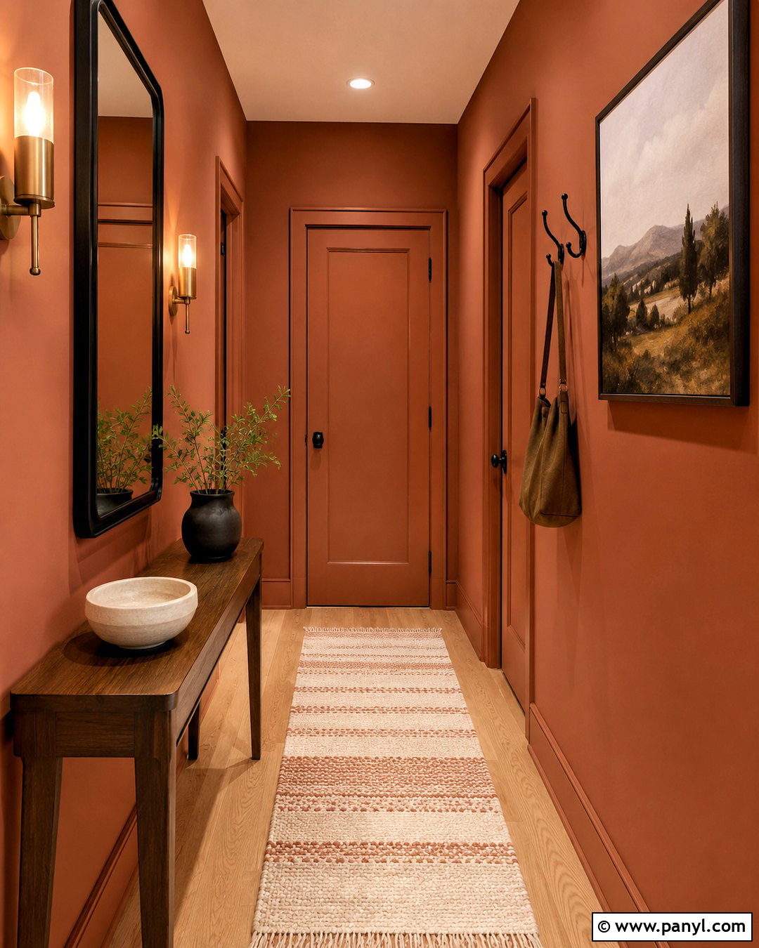
Terracotta walls bring sunbaked warmth and an easy Mediterranean influence to a dining space. Combine the color with a long natural oak table, woven dining chairs, and a textured cream rug. Use an oversized linen pendant above the table and hang simple artwork with blue, olive, and sandy details. Off-white curtains will frame the windows while softening the intensity of the clay-red walls. Add a low plaster-finish sideboard or pale wood cabinet for functional storage. Ceramic serving pieces, leafy branches, and rust-colored seat cushions complete the natural palette. Keep the trim warm white rather than bright white. Terracotta looks especially cohesive beside stone, wood, linen, and aged brass, creating a room that feels colorful, grounded, and welcoming.
14. Soft Clay Wall Color
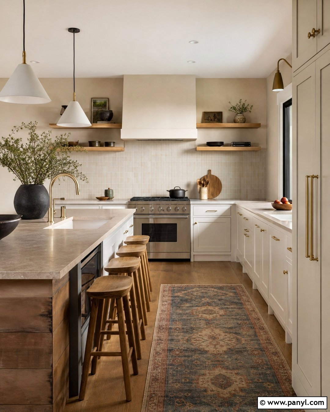
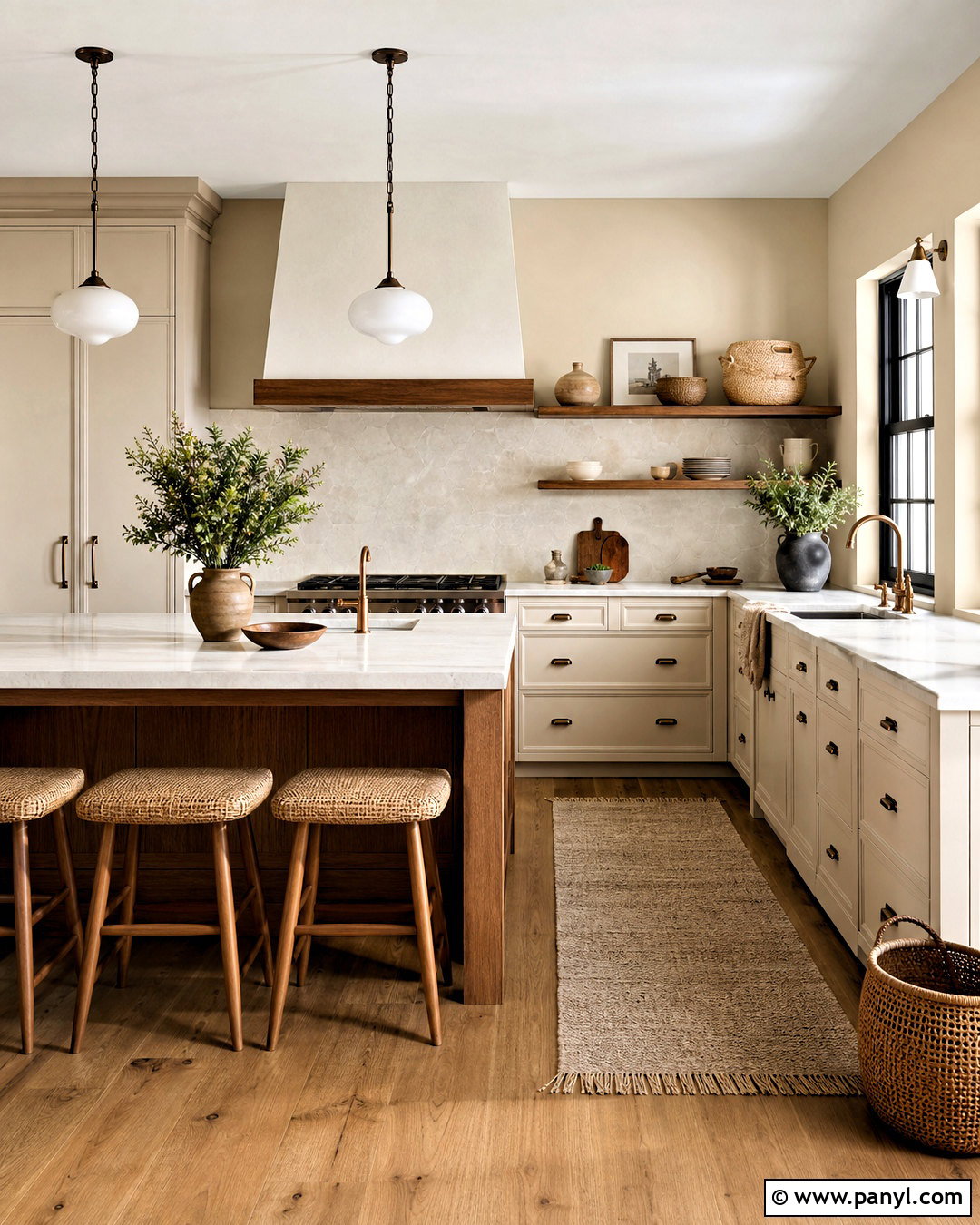
Soft clay is a pale earth tone that sits between beige, peach, and muted terracotta. It can warm a kitchen without competing with cabinetry or countertops. Pair clay walls with creamy white cabinets, brushed brass hardware, and honed beige stone counters. Natural oak stools and open shelves will enhance the organic character, while small black accents add clean definition. Use a simple backsplash in handmade off-white tile so its uneven surface catches the light. A washable runner containing muted blue, tan, and rust provides subtle pattern underfoot. Keep appliances visually quiet with paneled fronts or stainless finishes. This full kitchen scheme feels more personal than an all-white room, yet the softened wall color remains gentle enough for a busy everyday space.
15. Dusty Peach Wall Color
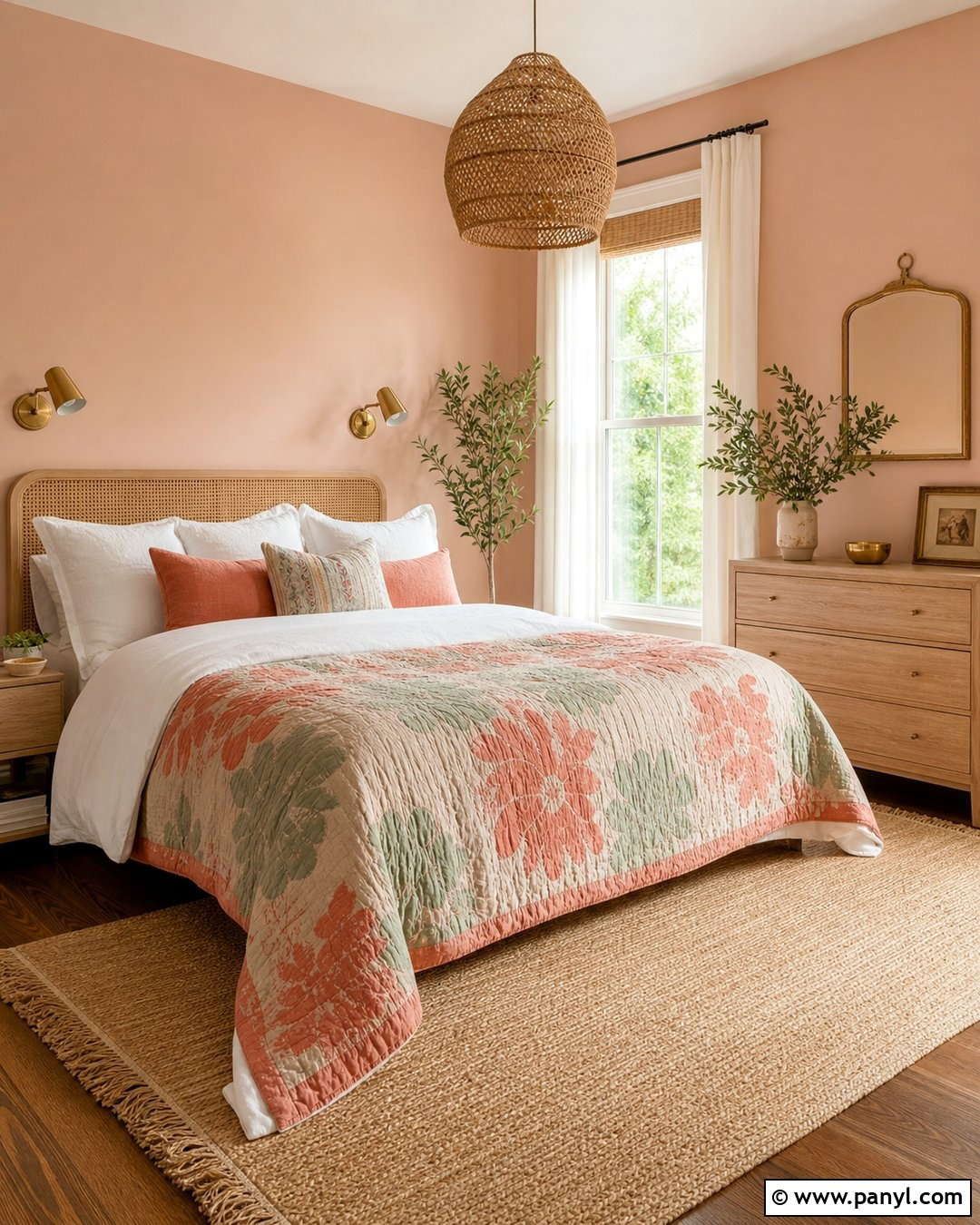
Dusty peach gives a room warmth and freshness without the sweetness of a brighter pastel. Use it in a guest bedroom with a natural cane headboard, white linen bedding, and a pale oak dresser. Add a quilt containing cream, muted coral, and faded sage to connect the wall color with the rest of the room. A woven pendant and jute rug introduce texture, while aged brass sconces add a polished touch. Choose simple ivory curtains and paint the trim a warm white. Avoid excessive pink accessories; instead, balance peach with wood, green, beige, and small charcoal details. The completed bedroom feels cheerful during the day and soothing at night, offering guests a comfortable space that is colorful without becoming overly decorative.
16. Muted Apricot Wall Color
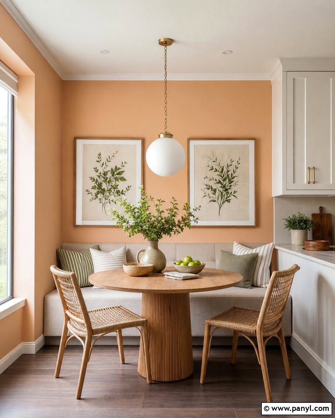
Muted apricot works beautifully in a breakfast nook or casual dining area that receives soft morning light. Cover the walls in this warm orange-beige, then add a built-in banquette upholstered in oatmeal fabric. A round oak pedestal table and woven chairs make the layout practical for meals, homework, and conversation. Use striped cushions in cream, olive, and rust to give the nook relaxed pattern. A white globe pendant provides a clean contrast, while a small gallery of botanical prints adds personality. Keep adjacent kitchen cabinets warm white or pale wood so the spaces connect naturally. Apricot feels more energetic than beige, but its muted finish remains comfortable. The resulting nook appears sunny, informal, and thoughtfully integrated into the home.
17. Pale Blush Wall Color
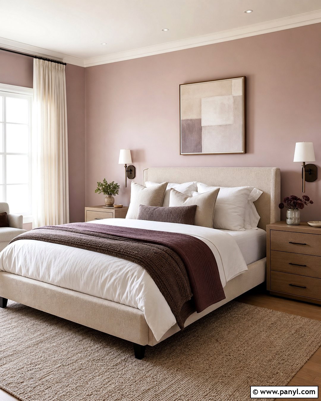
Pale blush walls can behave like a warm neutral when the pink undertone is soft and dusty. Design a calm bedroom around this shade with a cream upholstered bed, light walnut nightstands, and layered white bedding. Introduce taupe, cocoa, and muted plum through pillows and a folded blanket rather than using more pink. A wool rug in warm beige grounds the furniture, while bronze sconces add contrast beside the headboard. Choose ivory curtains and understated abstract art containing blush, brown, and charcoal. Painting the trim in a coordinated off-white keeps the palette smooth. This approach creates a grown-up room that feels gentle and cozy, proving that pale pink can be versatile when paired with earthy neutrals and simple, substantial furnishings.
18. Dusty Rose Wall Color
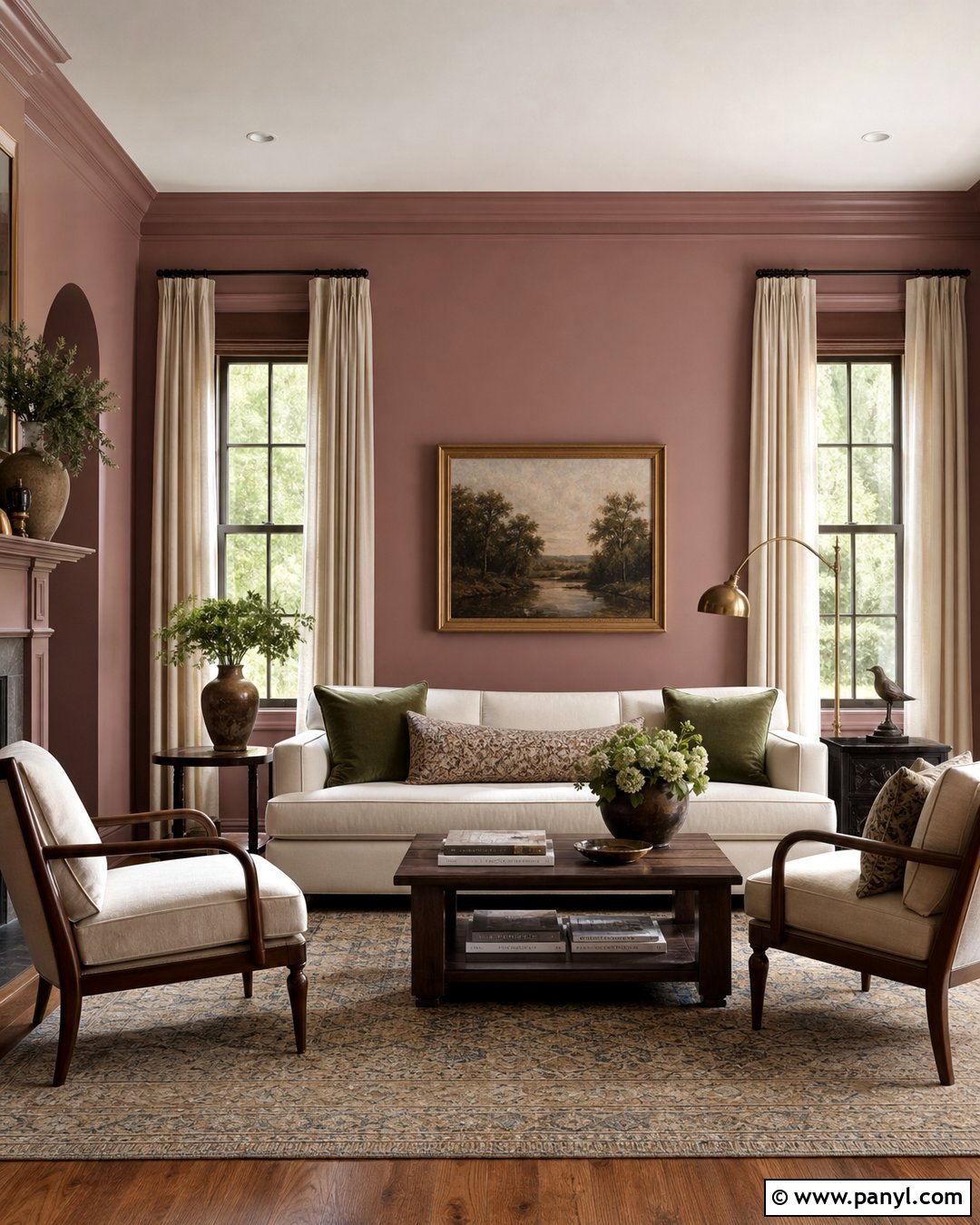
Dusty rose provides deeper warmth than blush and can make a formal living room feel approachable. Pair the walls with an ivory sofa, walnut-framed lounge chairs, and a patterned rug in faded rose, tan, and navy. Use full-length oatmeal curtains to soften the windows and reduce the amount of visible pink. A dark wood coffee table, aged brass floor lamp, and large landscape painting add traditional weight. Include cushions in olive, cream, and muted blue for balanced color. Keep the ceiling pale and consider matching the trim to the walls for a sophisticated finish. The finished room feels collected and comfortable rather than delicate. Dusty rose works particularly well with natural wood because its muted red undertone emphasizes the grain’s warmth.
19. Warm Mauve Wall Color
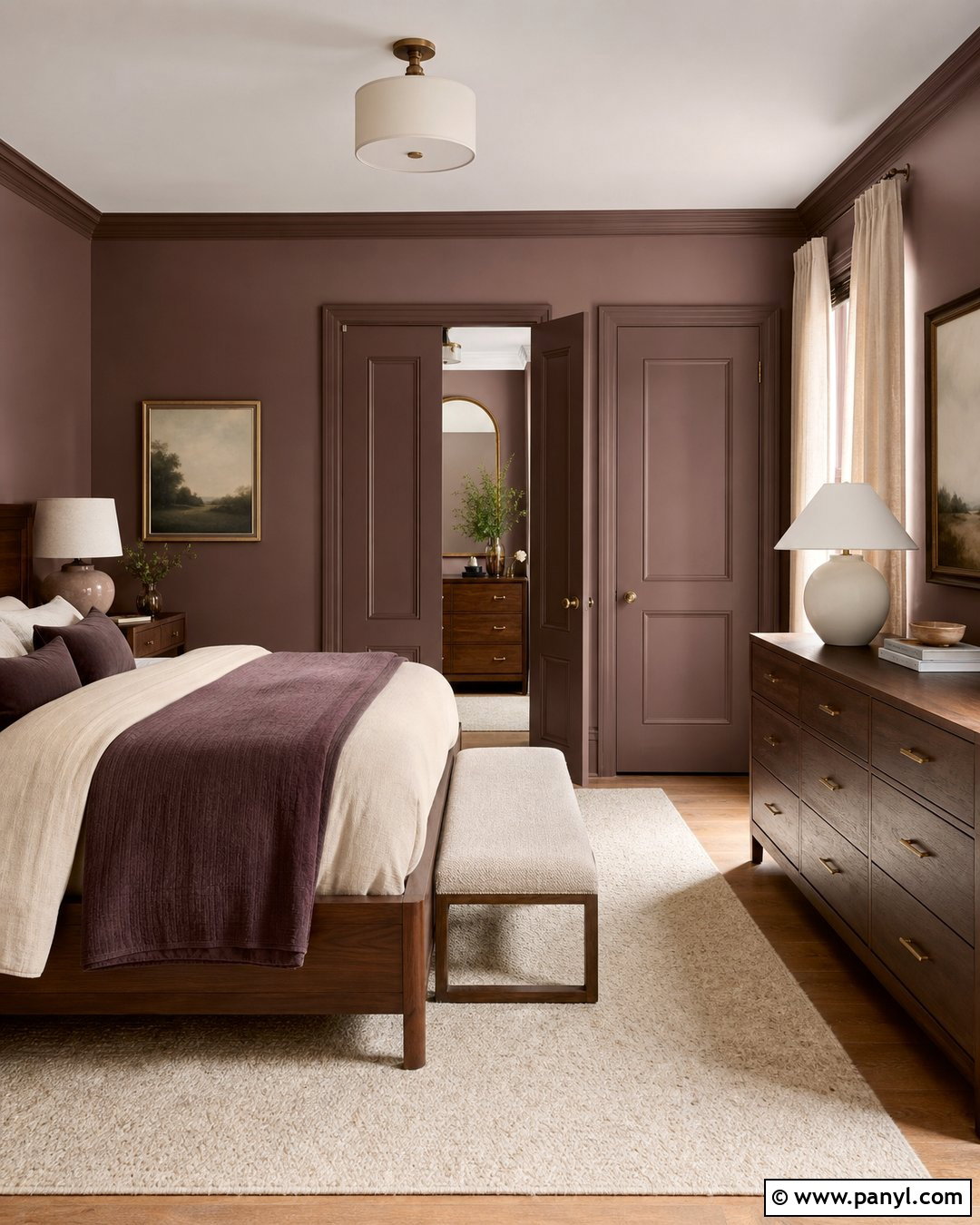
Warm mauve blends faded purple, pink, and brown into a surprisingly restful wall color. Use it in a dressing room or bedroom with walnut furniture, an oatmeal upholstered bench, and a creamy wool rug. Add linen curtains in pale taupe and bedding that combines ivory, cocoa, and soft plum. Aged brass hardware and sculptural ceramic lamps will keep the design polished without becoming ornate. For artwork, choose simple landscapes or abstracts containing mauve, beige, and olive. Paint doors and baseboards in the same wall color for gentle color drenching, but leave the ceiling warm white. The full scheme feels cocooning and mature. Mauve becomes especially cozy when repeated in varied textures rather than matched through numerous decorative accessories.
20. Muted Brick Red Wall Color
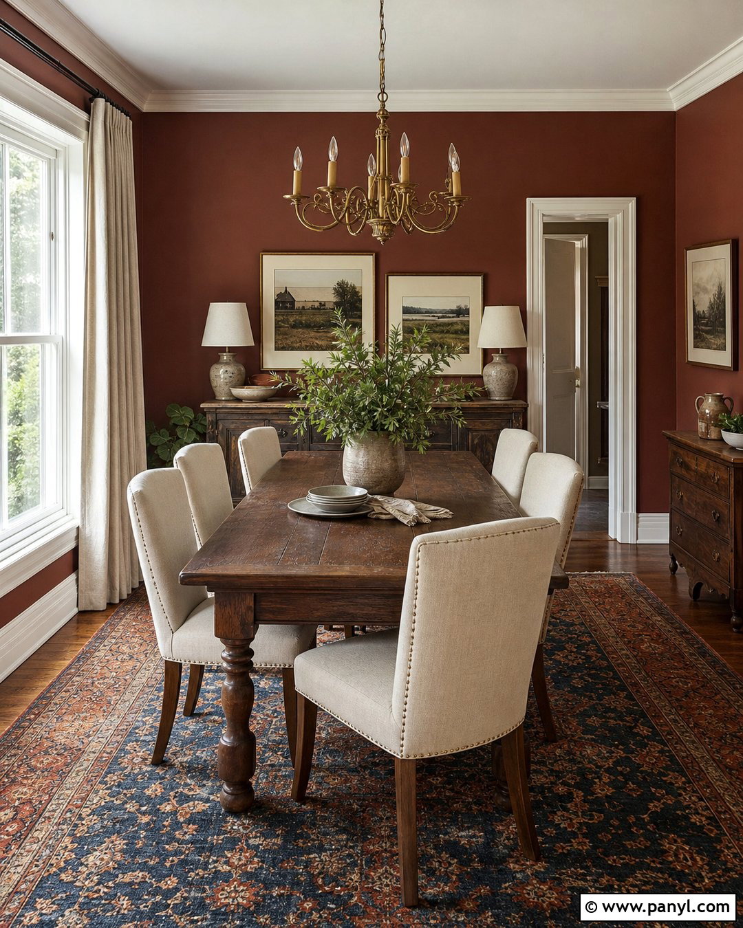
Muted brick red gives a dining room depth, warmth, and historic character. Cover the walls in a softened red-brown, then introduce a dark oak table and cream upholstered dining chairs. A faded rug containing navy, tan, and rust will connect the strong wall color to the floor. Use a simple aged brass chandelier and hang framed artwork with wide cream mats to create lighter breaks across the walls. Natural linen curtains soften the architecture and keep the design comfortable. A wood sideboard topped with stoneware adds useful storage and another warm material. Paint the trim a creamy off-white for clear but gentle contrast. This complete scheme suits traditional, farmhouse, and transitional homes without making the red walls feel overly formal or themed.
21. Rust Wall Color
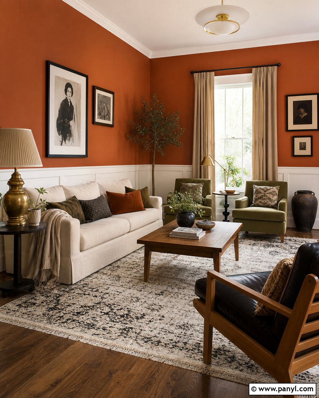
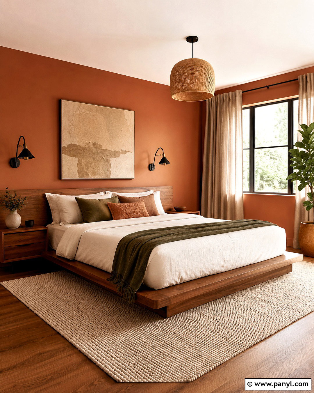
Rust walls bring a rich autumnal quality to a living room, especially when surrounded by tactile neutral materials. Use a light beige sofa, olive armchairs, and an oak coffee table to balance the red-orange background. Add a cream and charcoal patterned rug, along with cushions in tan, sage, and ivory. Pale flax curtains will frame the windows without creating sharp contrast. Choose simple black-framed artwork, but warm the room with brass lamps and handmade pottery. If four rust walls feel too intense, use the shade above painted paneling in a creamy neutral. This treatment still creates a complete, deliberate palette. The final room feels earthy and energetic while remaining comfortable enough for everyday use throughout the year.
22. Golden Ochre Wall Color
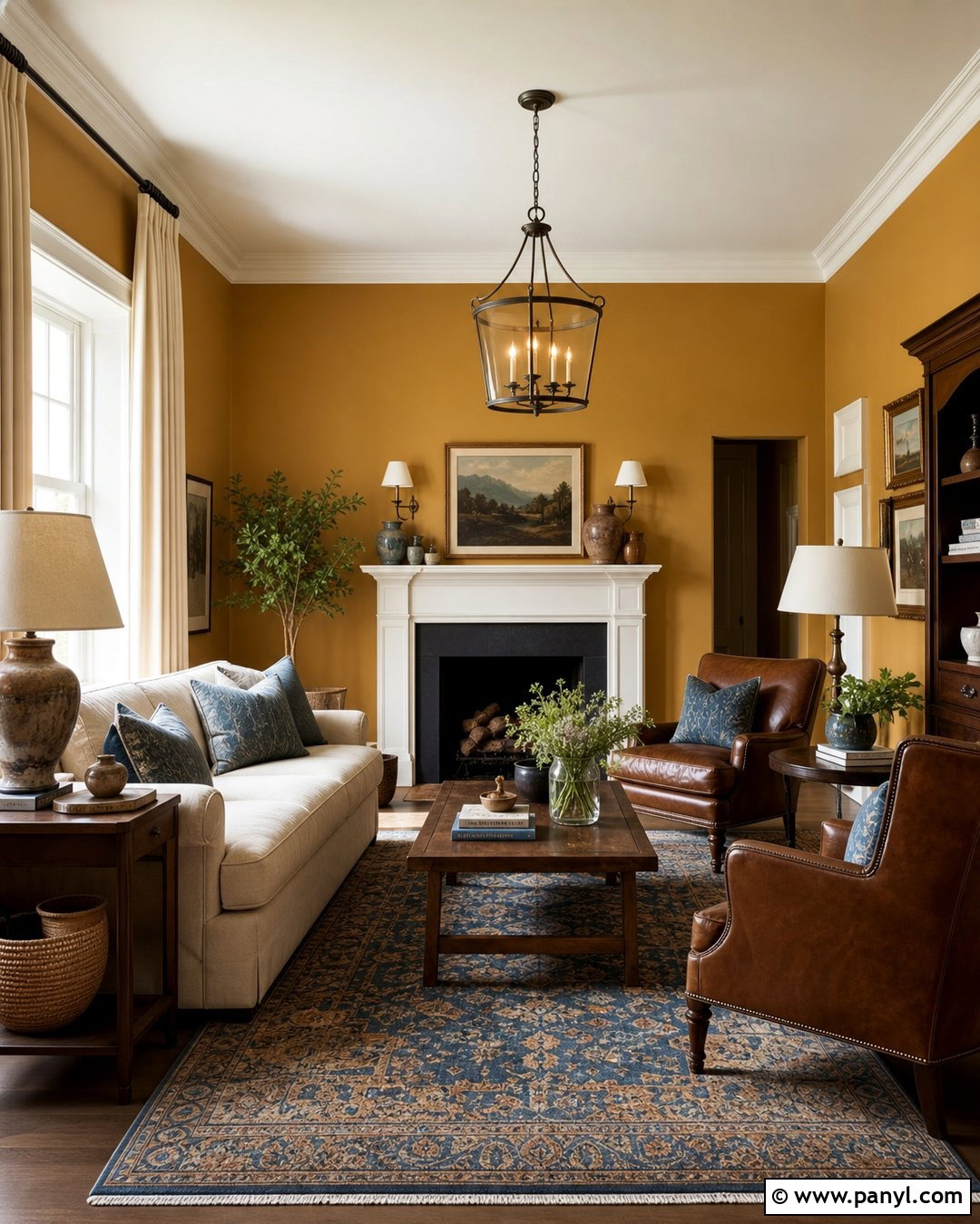
Golden ochre walls can make a north-facing room feel warmer and more animated. Create a complete sitting room with a cream sofa, dark walnut chairs, and a vintage-style rug featuring muted blue, brown, and gold. Add oatmeal curtains, an aged brass chandelier, and several ceramic lamps to distribute light evenly. Blue-gray pillows offer useful contrast, while tan leather and woven baskets reinforce the earthy foundation. Keep the ceiling and trim creamy white to prevent the yellow-gold tone from becoming overwhelming. Simple artwork with generous pale backgrounds will also provide visual breathing room. Ochre works best when treated as an established earth color rather than a bright accent, resulting in a cozy room with personality, depth, and a naturally collected appearance.
23. Soft Mustard Wall Color
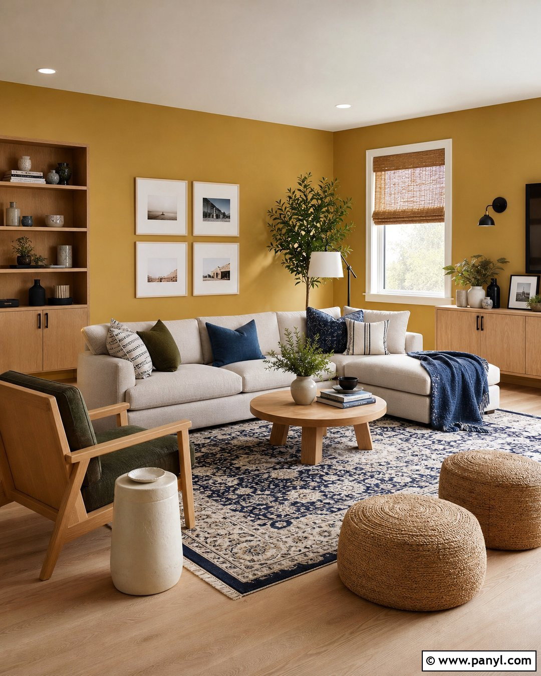
Soft mustard brings cheerful warmth to a breakfast room, playroom, or casual family space. Pair the walls with a cream sectional or upholstered bench, natural birch furniture, and a washable rug containing navy, ivory, and muted orange. Use white oak storage cabinets to keep games, books, and everyday items organized. Woven shades will filter sunlight while repeating the furniture’s natural texture. Add denim blue pillows and a few forest green details to balance the yellow undertone. Keep the trim warm white and choose simple matte black hardware for definition. The completed space feels energetic but not loud because every color is slightly softened. Mustard also hides everyday marks better than very pale neutrals, making it practical for active rooms.
24. Buttery Yellow Wall Color
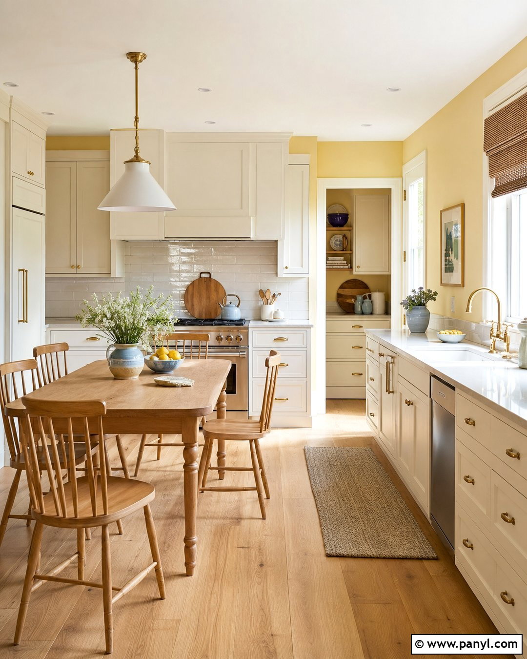
Buttery yellow creates a soft glow that is particularly welcoming in kitchens and breakfast areas. Use it with warm white cabinets, light oak flooring, and a creamy quartz or stone countertop. An off-white tile backsplash keeps the palette light, while brushed brass hardware repeats the wall color’s golden undertone. Add a small wooden table with simple spindle-back chairs and a washable striped runner. Pale blue ceramics and muted green plants provide fresh contrast without changing the gentle mood. Keep window treatments minimal with natural woven shades or white cafe curtains. Unlike bright lemon yellow, a buttery shade should appear mellow and slightly creamy. The finished kitchen feels sunny, familiar, and comfortable, even when natural light is limited.
25. Sage Green Wall Color
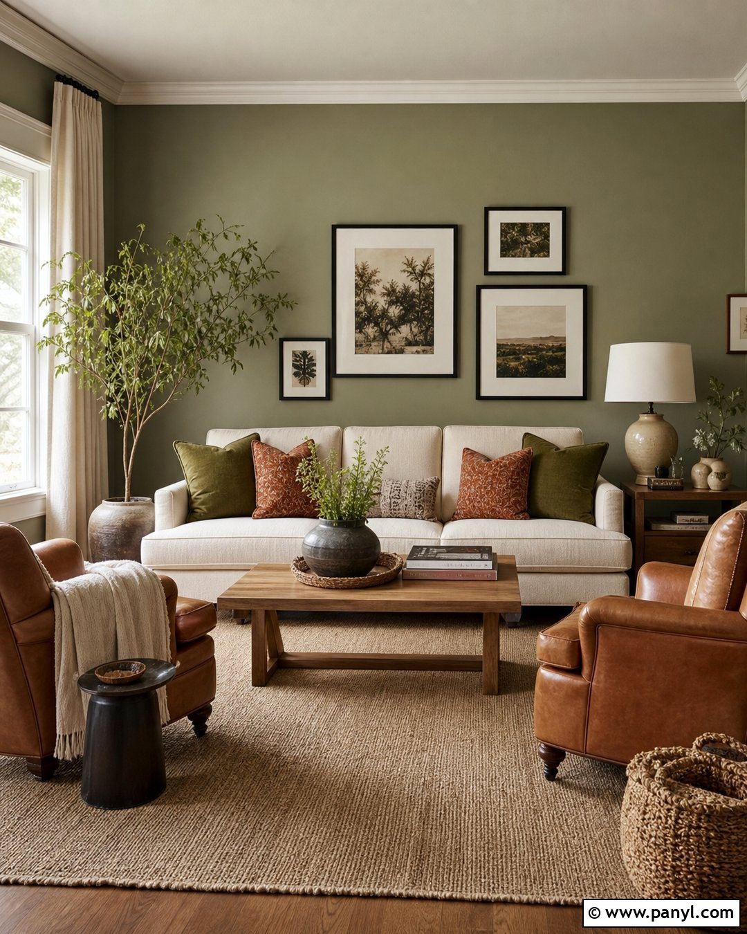
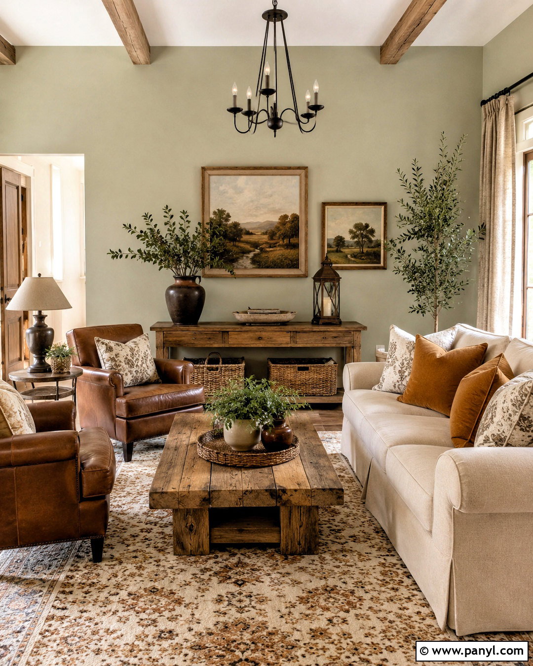
Sage green walls create a calm, nature-inspired backdrop that works across traditional and modern interiors. Use the color in a living room with an ivory sofa, medium oak coffee table, and two camel leather chairs. A woven beige rug and oatmeal curtains establish a warm neutral base. Add pillows in rust, cream, and deeper olive to build subtle layers around the muted green. Black picture frames and a slim metal floor lamp provide definition, while ceramic vessels and leafy branches reinforce the organic scheme. Keep the trim creamy white for freshness, or paint it sage for a softer envelope. The finished room feels restful without appearing cold because natural woods, warm leather, and textured fabrics balance the green’s quieter character.
26. Eucalyptus Green Wall Color
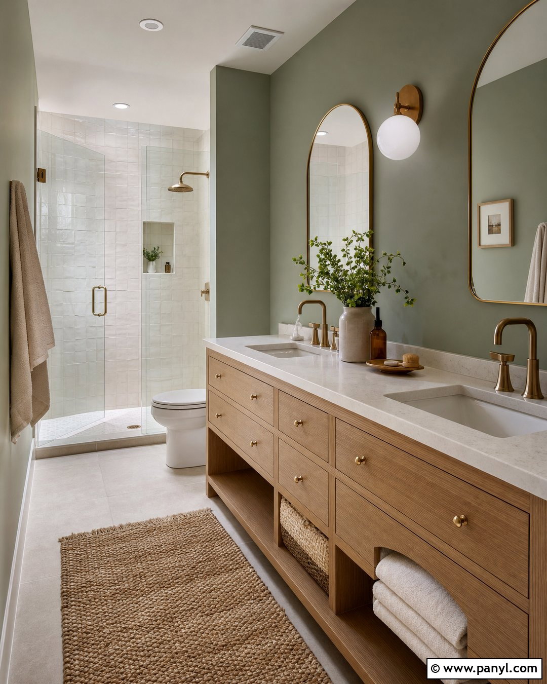
Eucalyptus green has a soft gray undertone that makes bathrooms feel relaxing and refined. Pair the walls with a natural oak vanity, honed white stone counter, and brushed brass fixtures. Use handmade ivory tile in the shower and carry the same material around the vanity backsplash for a cohesive finish. A frameless glass enclosure keeps the compact space open, while cream towels and a woven bath mat add softness. Include a simple arched mirror and white globe sconces for clean, balanced lighting. Paint the door and trim in warm white to define the eucalyptus walls without harsh contrast. This full bathroom design feels fresh but still cozy, particularly when natural wood and warm metal prevent the muted green from becoming overly cool.
27. Olive Green Wall Color
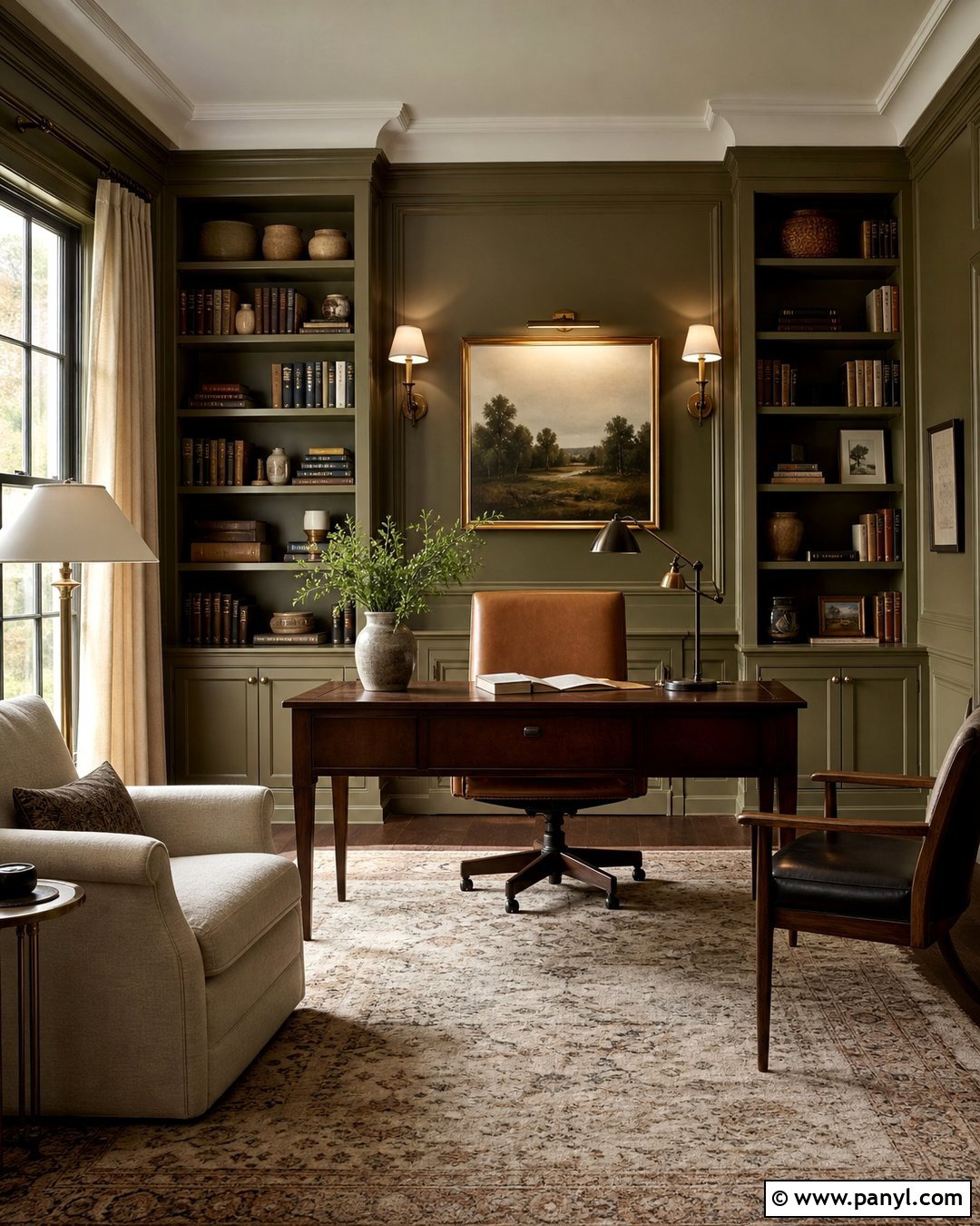
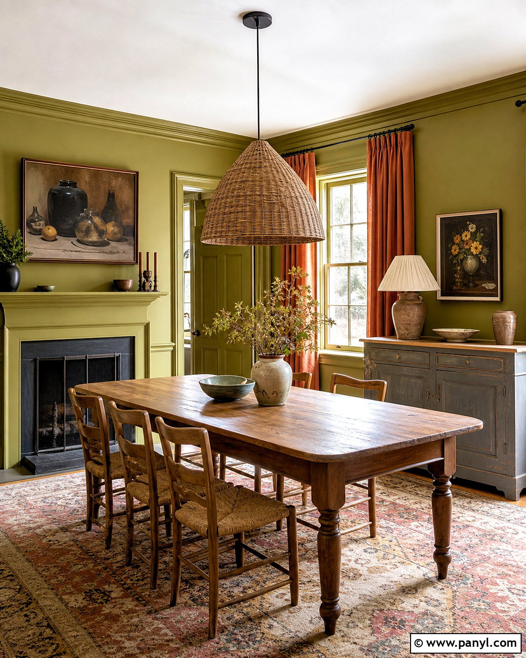
Olive green creates a grounded, enveloping room that pairs naturally with wood and leather. Use it in a study with built-in bookcases painted the same color as the walls. Add a walnut desk, caramel leather chair, and neutral patterned rug to establish warmth. Cream linen curtains and pale lampshades will lighten the windows, while aged brass sconces provide focused illumination. Style the shelves with books, framed photographs, and pottery in off-white and brown. A small upholstered chair in oatmeal fabric can create a separate reading corner. Keep the ceiling warm white unless you want a stronger color-drenched effect. This coordinated workspace feels established and comfortable, with enough practical storage to keep the deep green room orderly rather than visually crowded.
28. Moss Green Wall Color
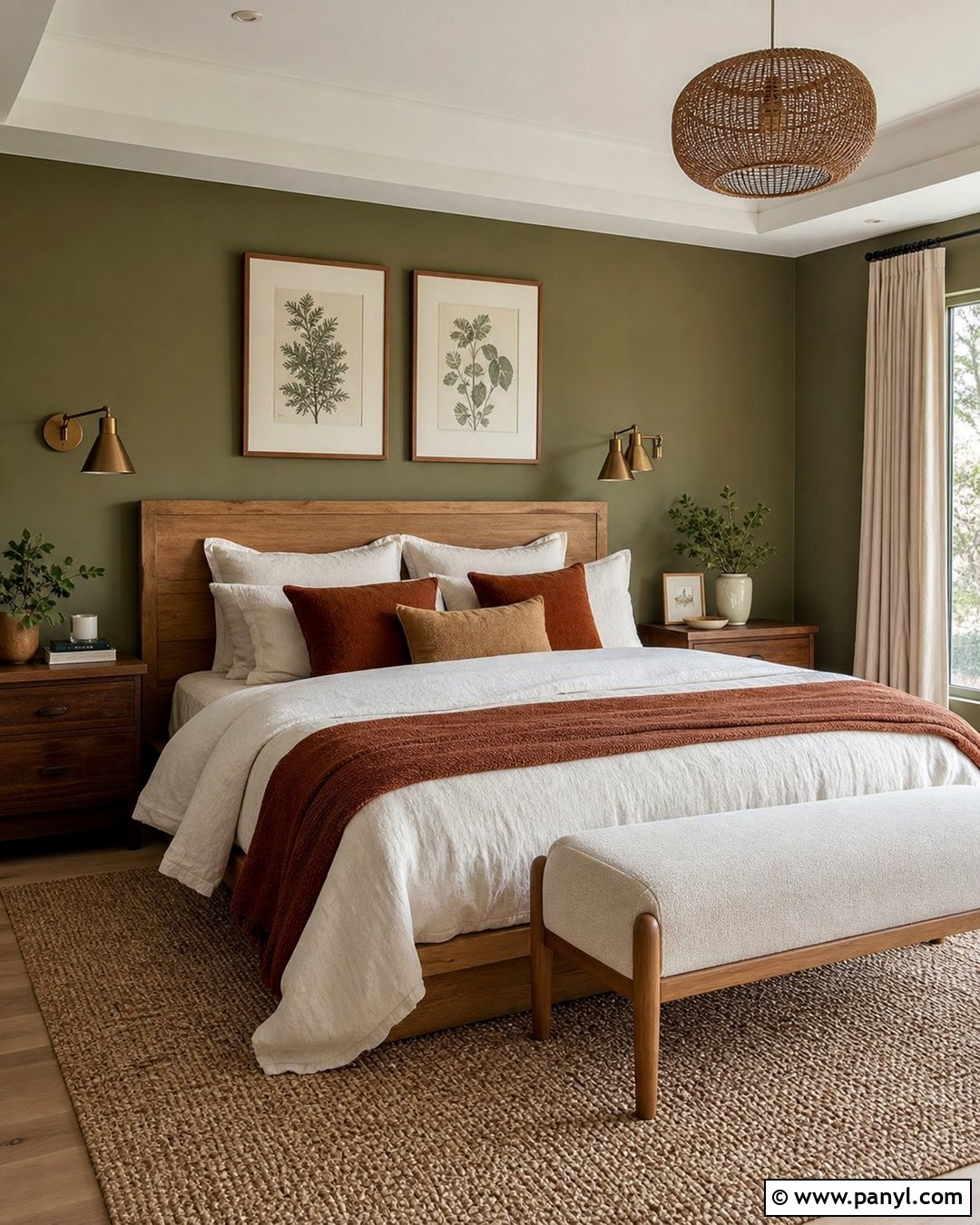
Moss green walls bring a forest-inspired calm to a bedroom while feeling warmer than blue-based greens. Pair the color with a natural oak bed, ivory linen bedding, and walnut nightstands. Layer rust, camel, and cream through a quilt, lumbar pillow, and upholstered bench. Choose oatmeal curtains and a textured beige rug to brighten the perimeter. Bronze sconces and dark wood frames add definition without introducing a stark black-and-white contrast. Botanical artwork can support the organic palette, but select simple pieces so the room does not become overly themed. Paint the trim in matching moss for a cocooning finish or warm white for a lighter result. Either approach creates a restful bedroom grounded in natural colors and tactile materials.
29. Forest Green Wall Color
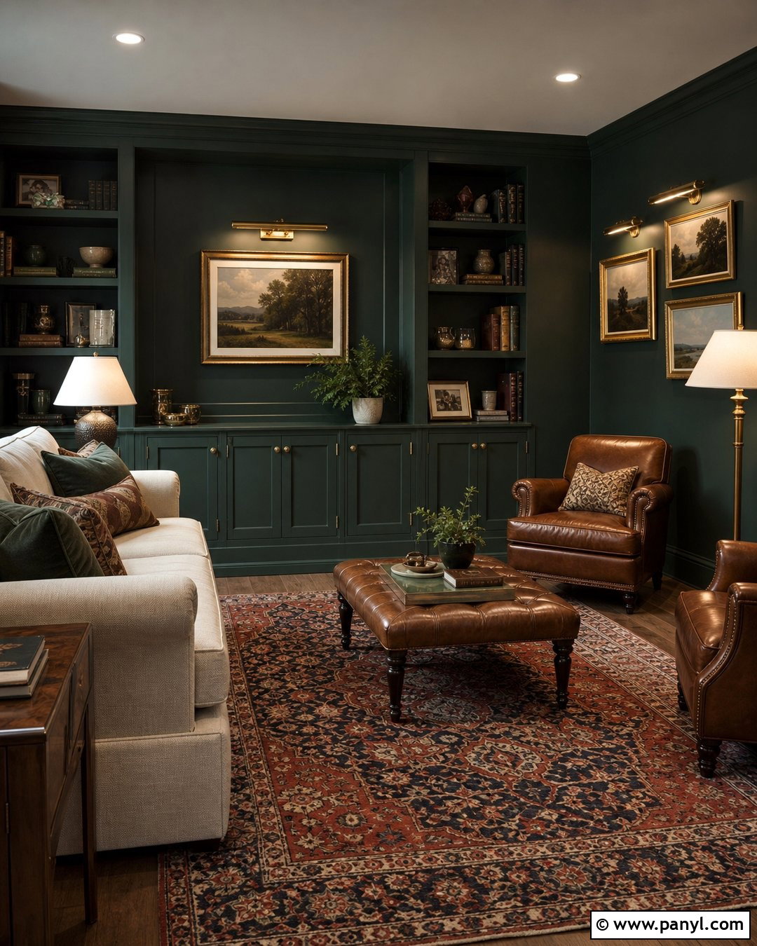
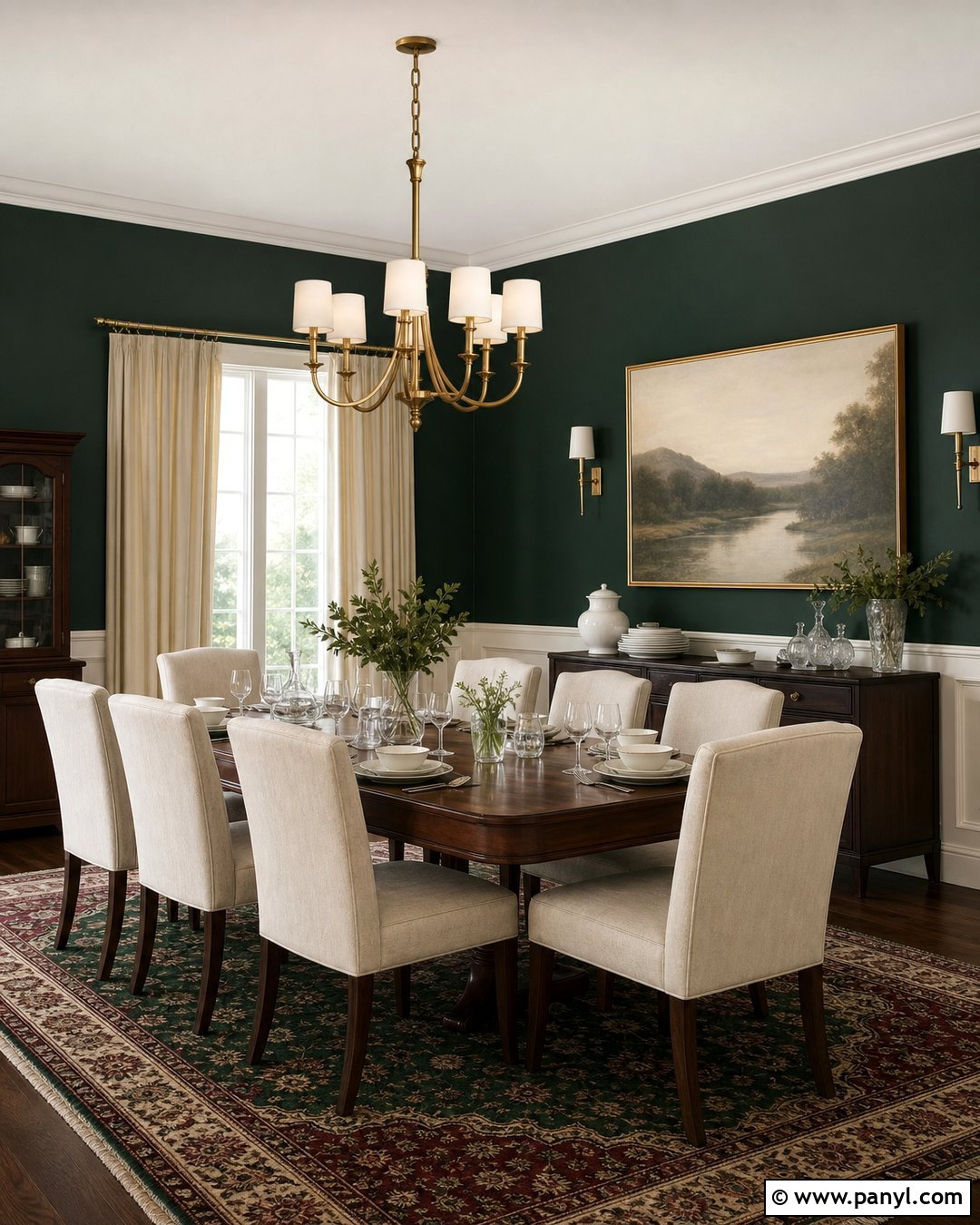
Forest green can transform a small den into a rich retreat when the furniture provides enough visual contrast. Paint the walls, trim, and built-in cabinets in the same deep green for a tailored, seamless effect. Place a cream sofa against the darkest wall and add a cognac leather ottoman as a warm focal point. A vintage rug with faded red, gold, and navy details will keep the room layered. Use brass picture lights, pale lampshades, and an off-white ceiling to maintain brightness. Walnut shelves and framed landscape art suit the traditional character of the color. The final space feels intentionally compact and comforting, proving that a deep wall color can enhance a small room instead of simply making it appear smaller.
30. Blue Gray Wall Color
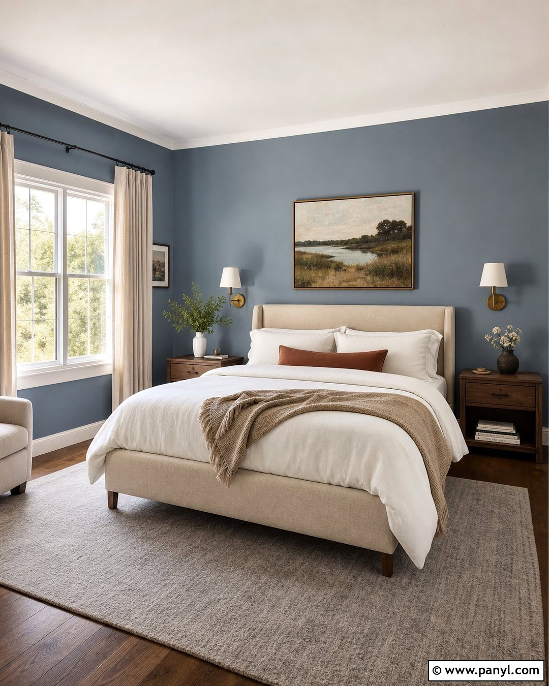
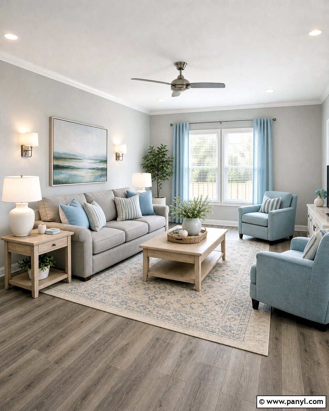
Blue-gray walls can feel cozy when the shade contains enough warmth and is paired with natural materials. Use this color in a bedroom with a beige upholstered bed, walnut nightstands, and crisp ivory bedding. Add a camel throw, rust-colored lumbar pillow, and woven wool rug to offset the cooler wall tone. Natural linen curtains and aged brass sconces keep the room soft and inviting. Select artwork that combines blue-gray with brown, cream, and muted green so the palette feels connected. Paint the trim warm white rather than brilliant white, which could sharpen the blue. The complete design remains restful and airy during the day, while layered textiles and warm lighting give it a comfortable, sheltered quality in the evening.
31. Slate Blue Wall Color
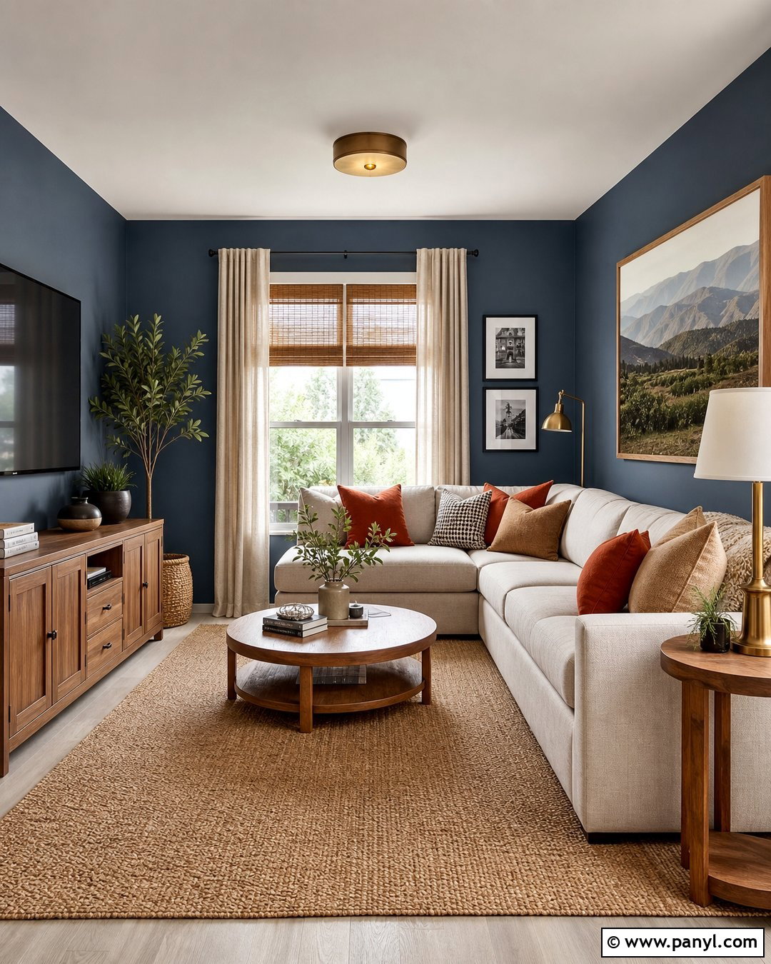
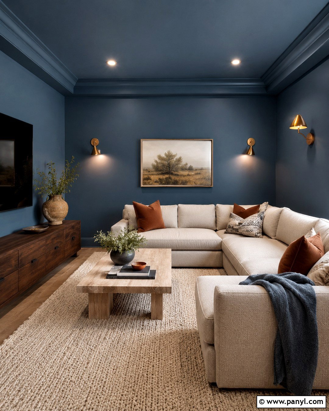
Slate blue offers more depth than pale blue while remaining calm enough for everyday living spaces. Build a cozy family room around it with a cream sectional, medium oak media cabinet, and warm beige rug. Add cushions in camel, rust, ivory, and subtle stripes to balance the blue walls. Woven shades and oatmeal curtains can be layered at the windows for texture and light control. Use black sparingly through narrow frames and hardware, then introduce brass lamps for warmth. A large wood-framed landscape print will connect the wall color to natural browns and greens. Paint the ceiling and trim a soft cream. The finished room feels restful, grounded, and practical rather than nautical, which keeps slate blue suitable for many home styles.
32. Smoky Teal Wall Color
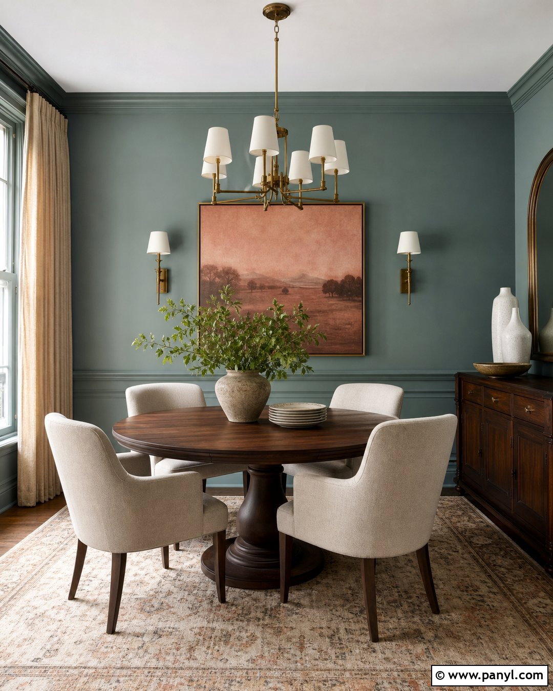
Smoky teal brings a sophisticated mix of blue and green to dining rooms, libraries, and compact living spaces. Pair it with a round walnut dining table, cream upholstered chairs, and a faded beige patterned rug. Aged brass lighting emphasizes the color’s warm undertones, while natural linen curtains keep the windows light. Use artwork containing muted coral, olive, and ivory to create balanced contrast. A dark wood sideboard can provide storage, but style it with pale pottery so it remains visible against the deep wall color. Consider painting the molding and trim smoky teal for a continuous, enveloping result. This complete scheme feels colorful without becoming overly bright, and it works particularly well in rooms used for evening meals and relaxed conversation.
33. Deep Navy Wall Color
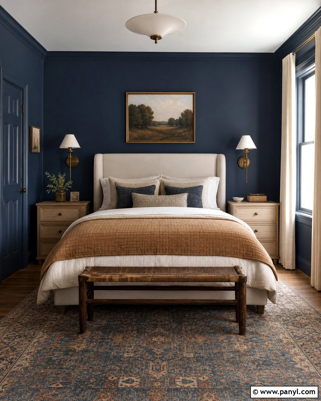
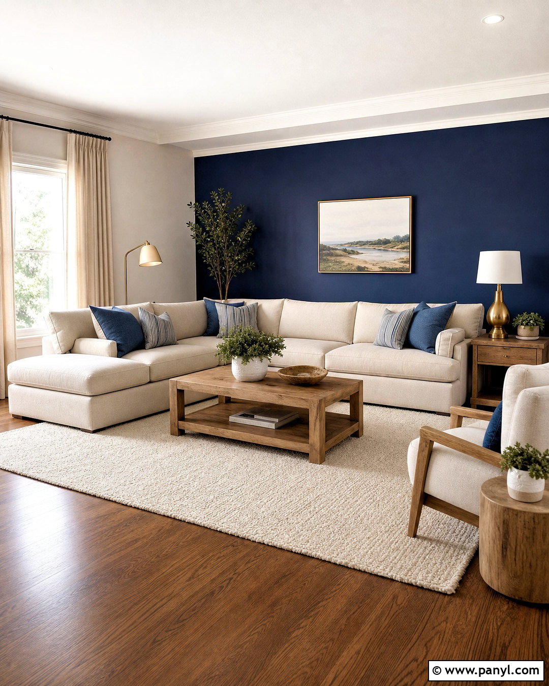
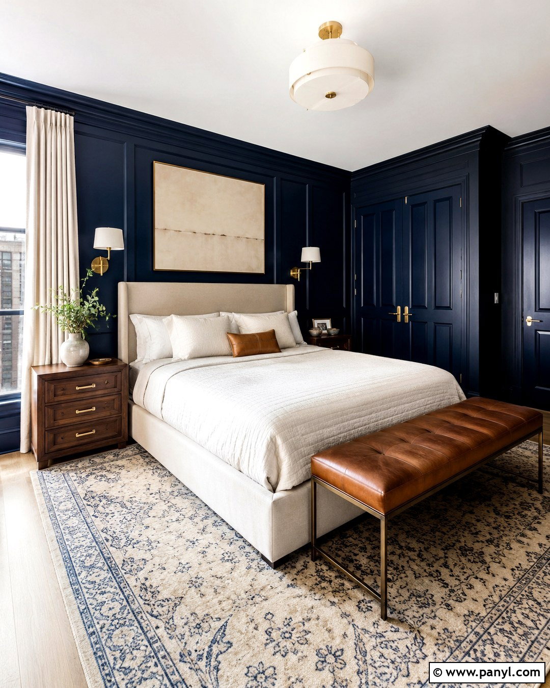
Deep navy walls can create a peaceful, cocooning bedroom when paired with warm neutrals instead of crisp nautical white. Choose a tall oatmeal upholstered bed, natural oak nightstands, and ivory bedding with a camel quilt. Add a patterned rug containing faded blue, tan, and rust to connect the walls and furniture. Use aged brass sconces and warm linen lampshades rather than polished chrome. Floor-length flax curtains soften the dark perimeter and provide a lighter vertical element. Paint the trim navy for an immersive finish, while keeping the ceiling cream to reflect light. Simple landscape artwork and a wooden bench complete the space. The resulting bedroom feels dramatic yet comfortable, with sufficient softness to make the saturated blue easy to live with.
34. Plum Wall Color
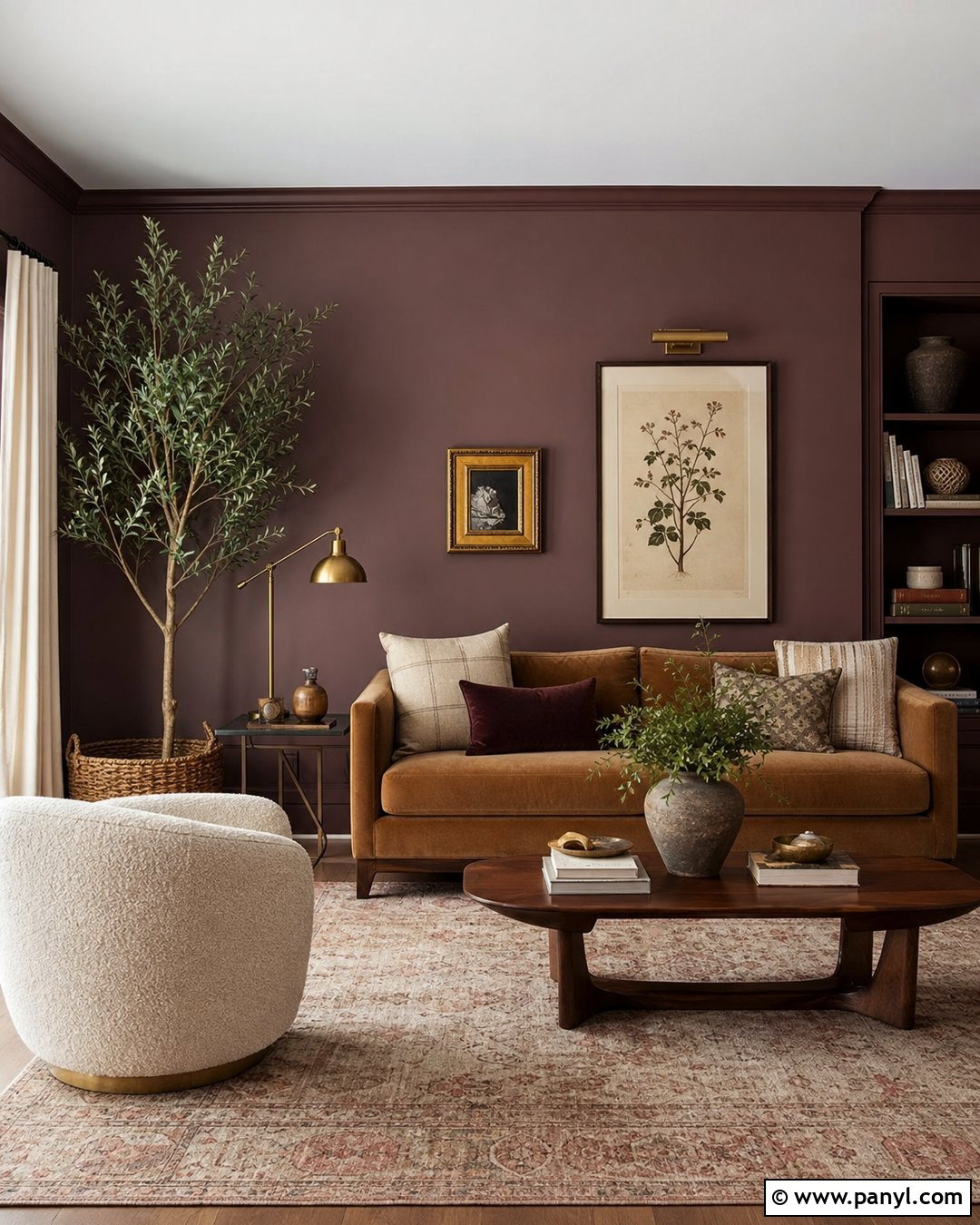
Muted plum walls introduce cozy color without the intensity of a brighter purple. Use them in a small sitting room with a camel sofa, cream boucle chair, and walnut coffee table. A faded rug in beige, rose, brown, and muted blue will blend the palette naturally. Add oatmeal curtains, aged brass table lamps, and simple botanical artwork with pale backgrounds. Keep accessories earthy, using pottery, books, wood, and woven baskets instead of matching every detail to the walls. Painting the trim plum creates a smooth, enveloping look, while a creamy ceiling prevents the room from feeling too enclosed. This complete design feels warm, distinctive, and mature because the purple is balanced by brown undertones, natural materials, and plenty of tactile neutral fabric.
35. Warm Charcoal Wall Color
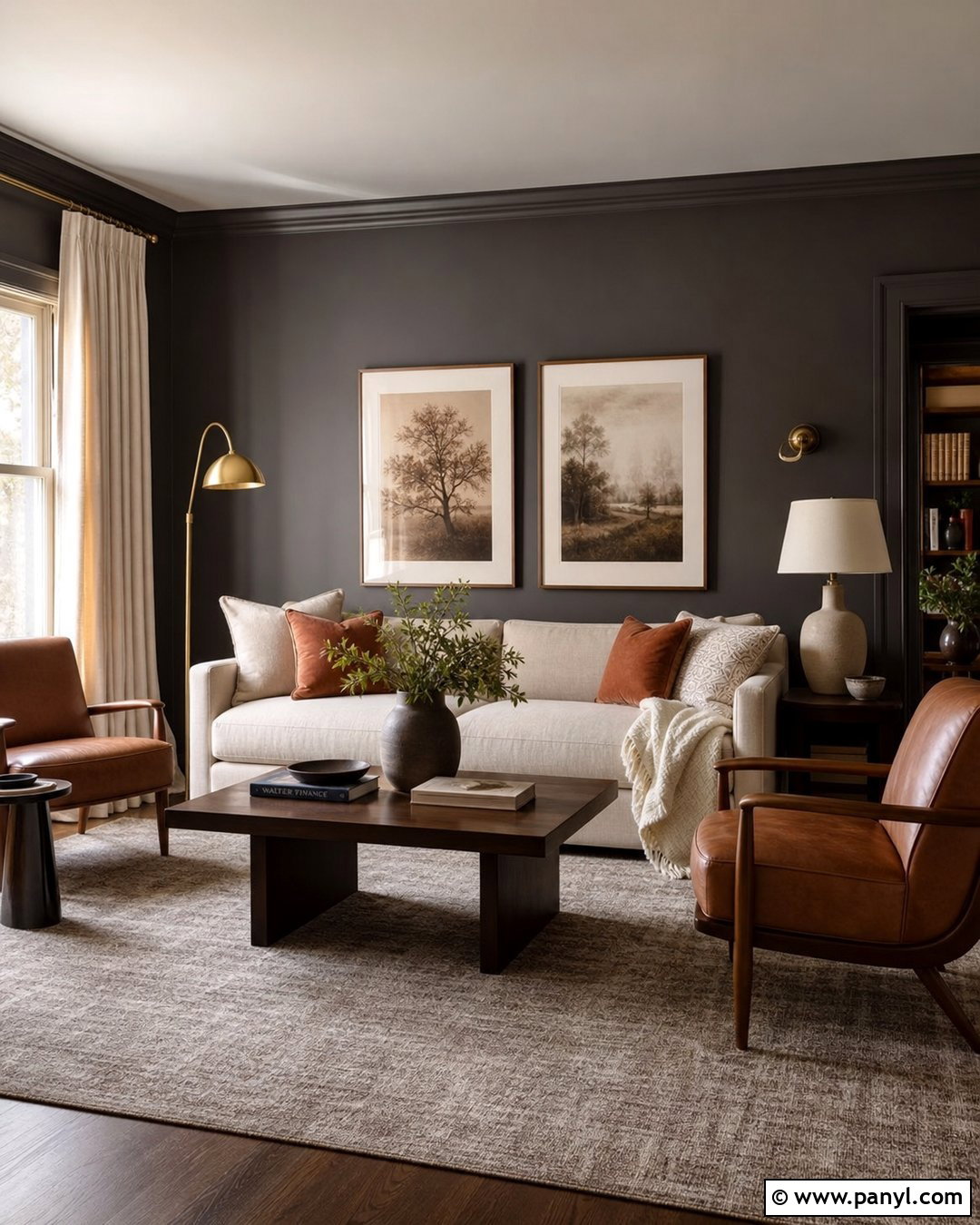
Warm charcoal is an excellent choice for anyone who wants a dark, cozy room without using black. Build a sophisticated living room with charcoal walls, a large cream sofa, walnut lounge chairs, and a warm taupe rug. Add caramel leather, rust pillows, and a textured ivory throw to soften the deep backdrop. Brass floor lamps and pale ceramic table lamps will create multiple pools of light. Choose oatmeal curtains and artwork with wide cream mats so the walls retain visible contrast. Paint the trim charcoal for a modern, continuous envelope, but leave the ceiling warm white. The completed room feels intimate and polished rather than severe, especially when warm woods and tactile fabrics offset the gray’s subtle depth.
Conclusion:
The most effective **35 Cozy Wall Colors** offer more than surface-level decoration. They establish a complete atmosphere when the paint, furniture, flooring, lighting, and textiles work together. Warm whites and earthy neutrals provide flexibility, while terracotta, ochre, green, blue, plum, and deep brown create stronger personality. Before painting the full room, test a large sample on more than one wall and view it during morning, afternoon, and evening light because undertones can shift noticeably. () Then coordinate the shade with materials already present, especially flooring and major furniture. Whether you prefer a bright cream bedroom or a dramatic forest green den, thoughtful layering will make the finished space feel genuinely comfortable, cohesive, and personal.

Related Ideas and Inspiration:
Leave a Reply