
Emerald green can make an ordinary room feel grounded, polished, and full of personality. The right shade may appear bright and jewel-like in direct sunlight, then deeper and more dramatic at night. That flexibility makes emerald useful for living rooms, kitchens, bedrooms, bathrooms, offices, and even exterior details. Pair clearer greens with crisp white and brass, or soften darker shades with oak, linen, stone, and warm cream. Before committing, test a large sample beside flooring, furniture, and trim throughout the day. Also consider sheen: matte creates a velvety backdrop, while satin highlights cabinetry and architectural details. The complete room schemes below show practical ways to decorate with 20 emerald green paint colors. ()
1. Benjamin Moore Emerald Isle Paint Color
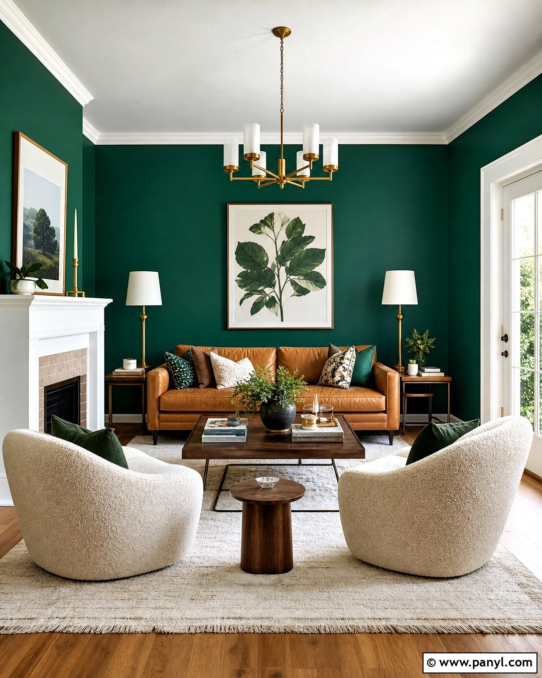
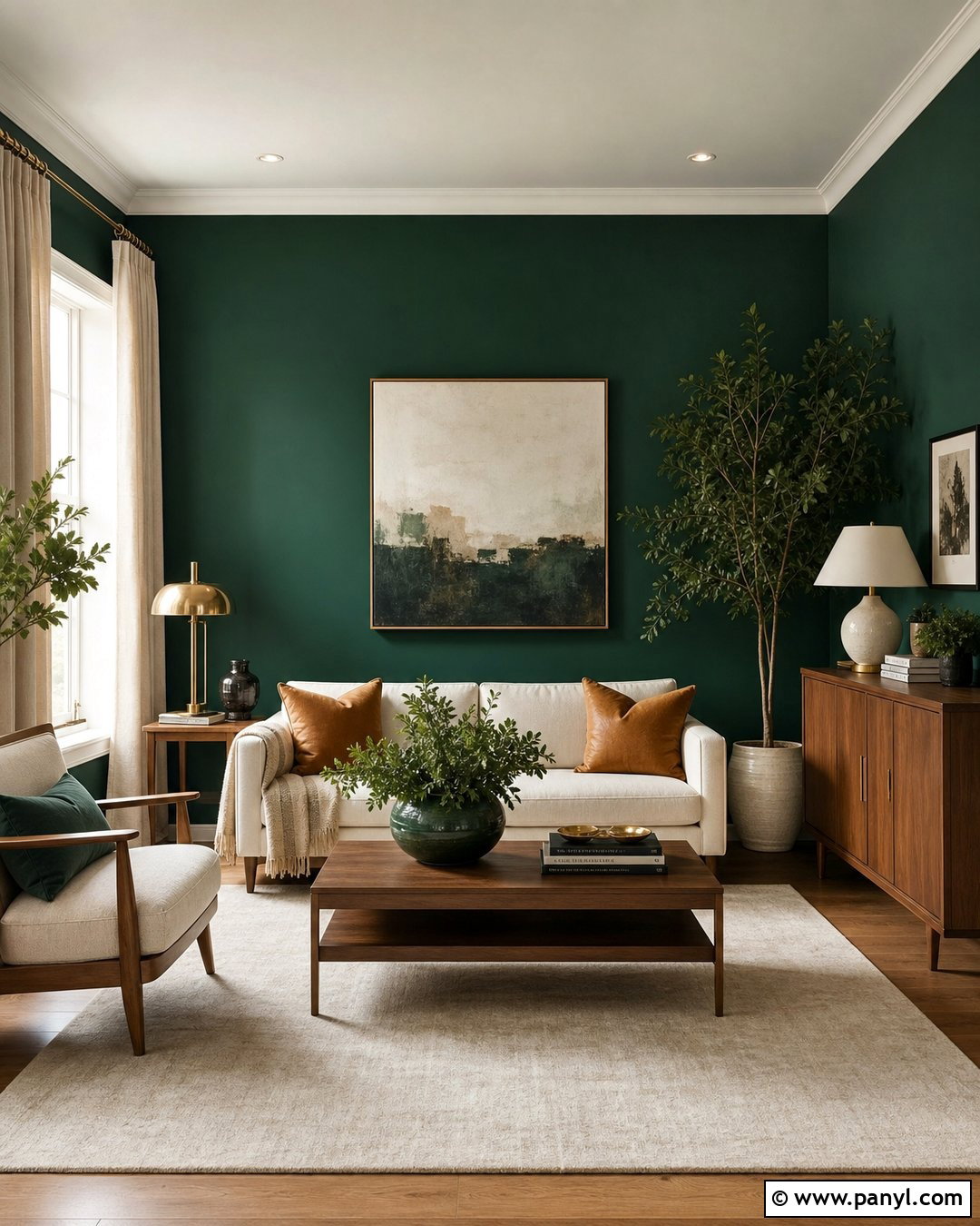
Benjamin Moore Emerald Isle delivers the clear, saturated character many homeowners picture when they hear emerald green. Create a sophisticated living room by painting every wall in a soft matte finish while keeping the ceiling and detailed trim warm white. Add a caramel leather sofa, two ivory boucle chairs, and a medium-tone walnut coffee table to balance the strong color. An understated cream rug prevents the room from feeling too heavy. Bring in brushed brass lamps, botanical artwork, and patterned pillows that repeat green, rust, and beige. Medium oak flooring adds natural warmth beneath the jewel tone. This complete palette works especially well in a room with steady daylight, where Emerald Isle can remain vibrant without overwhelming the furniture.
2. Behr Exquisite Emerald Paint Color
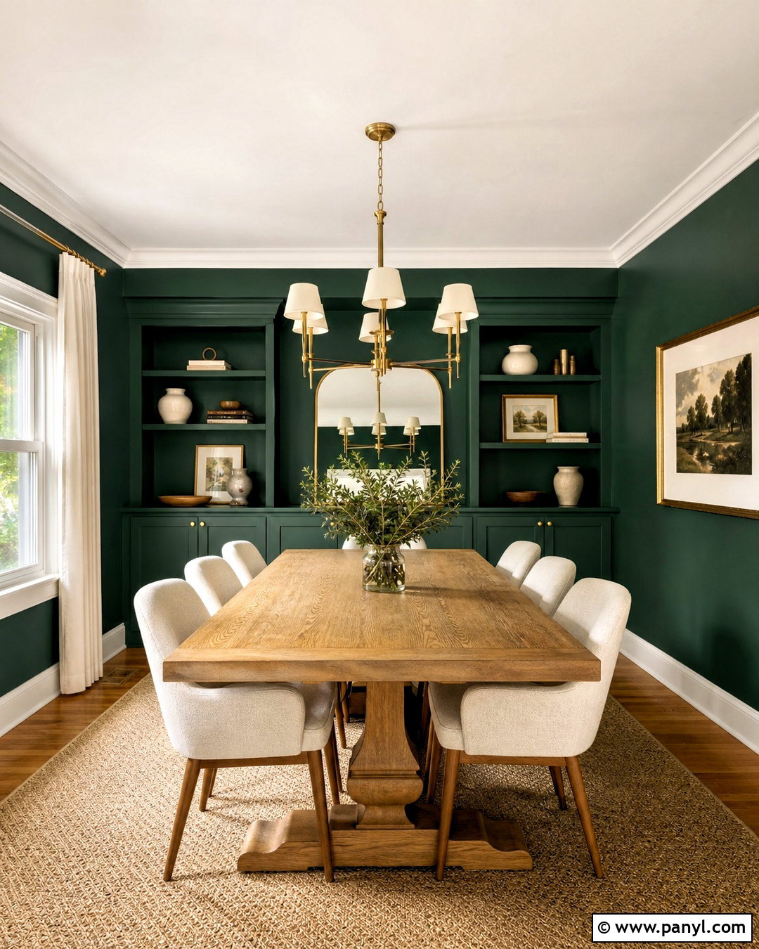
Imagine a dining room that feels dramatic but still comfortable enough for everyday meals. Behr Exquisite Emerald can cover the walls and built-in storage, creating a rich envelope around a rectangular oak dining table. Use satin paint on the cabinetry and matte paint on the walls for subtle contrast. Upholstered cream chairs, a woven neutral rug, and pale linen curtains lighten the arrangement. Choose a wide brushed brass chandelier with simple lines rather than an ornate fixture. Black-framed artwork gives the room structure, while ceramic tableware and leafy branches keep it relaxed. Continue warm white across the ceiling and crown molding. This emerald green paint color looks particularly balanced beside medium and dark woods, which reinforce its deep, luxurious appearance.
3. Behr Sparkling Emerald Paint Color
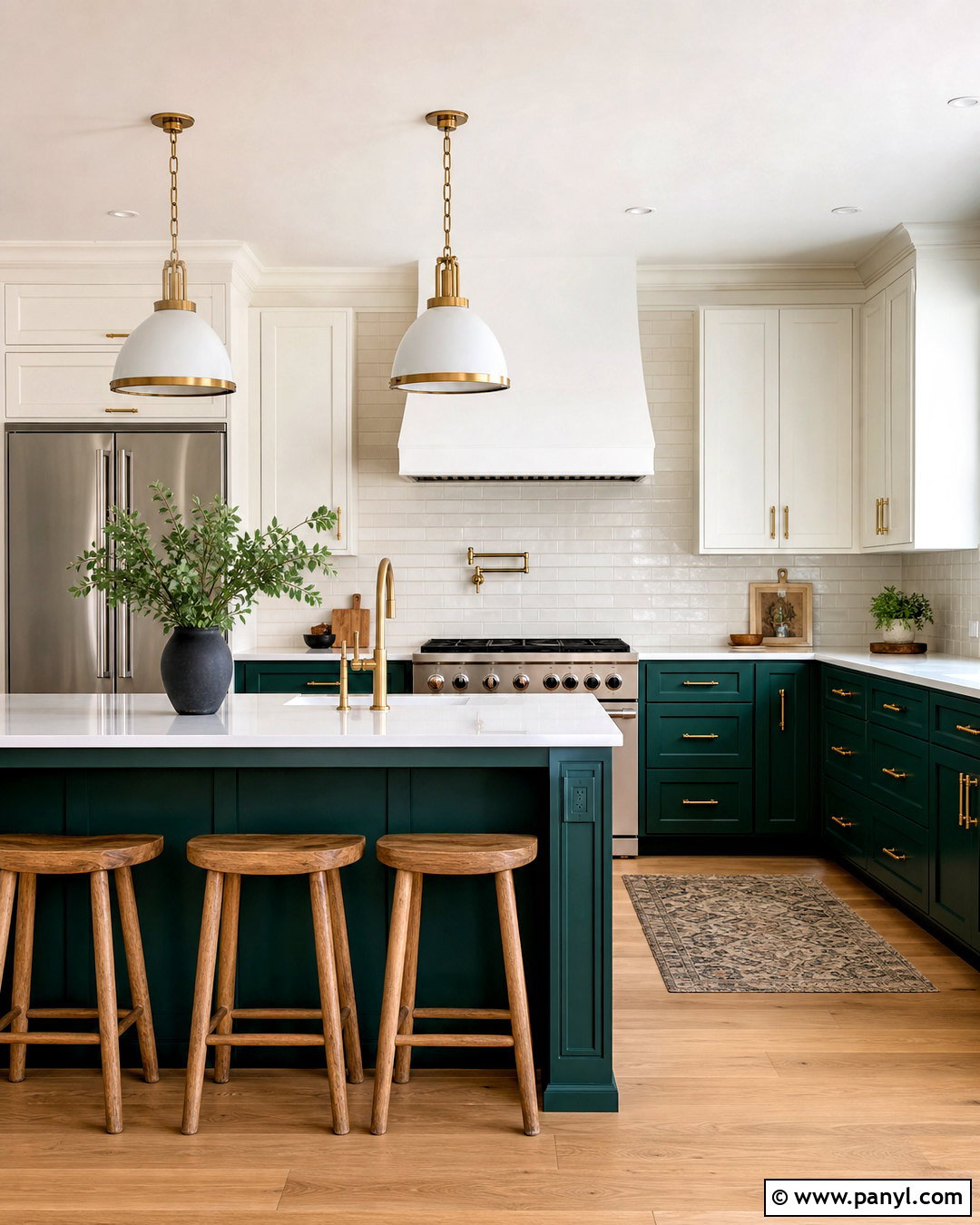
A colorful kitchen can feel timeless when bold cabinetry is balanced with simple, durable surfaces. Use Behr Sparkling Emerald on lower cabinets and the island, then select warm white paint for upper cabinets and surrounding walls. White quartz counters with restrained gray veining provide a clean transition between the two colors. Add brushed brass knobs, globe pendants, and a matching faucet for controlled warmth. Light white oak flooring keeps the room bright, while natural wood counter stools prevent the design from feeling formal. Finish the backsplash with handmade cream subway tile and warm gray grout. Because this green is strong, avoid adding several competing accent colors. Black appliances, white ceramics, and a small amount of natural greenery complete the coordinated kitchen.
4. Sherwin-Williams Frosted Emerald Paint Color
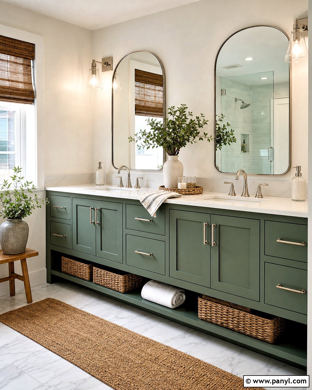
Sherwin-Williams Frosted Emerald offers a softer route into the emerald family, making it useful for rooms where an intense jewel tone might feel excessive. Build a refreshing bathroom around a Frosted Emerald double vanity with simple Shaker-style doors. Keep the walls creamy white and install pale marble-look porcelain tile across the floor and shower. Polished nickel faucets add a cooler shine that suits the fresher green. Above the vanity, use two rounded mirrors and clear glass sconces to maintain an open feeling. White towels, a natural wood stool, and woven storage baskets introduce practical texture. Finish the cabinetry in satin for easy cleaning. This complete scheme feels bright and calm, yet the green vanity gives the bathroom enough color to look distinctive.
5. Benjamin Moore Hunter Green Paint Color
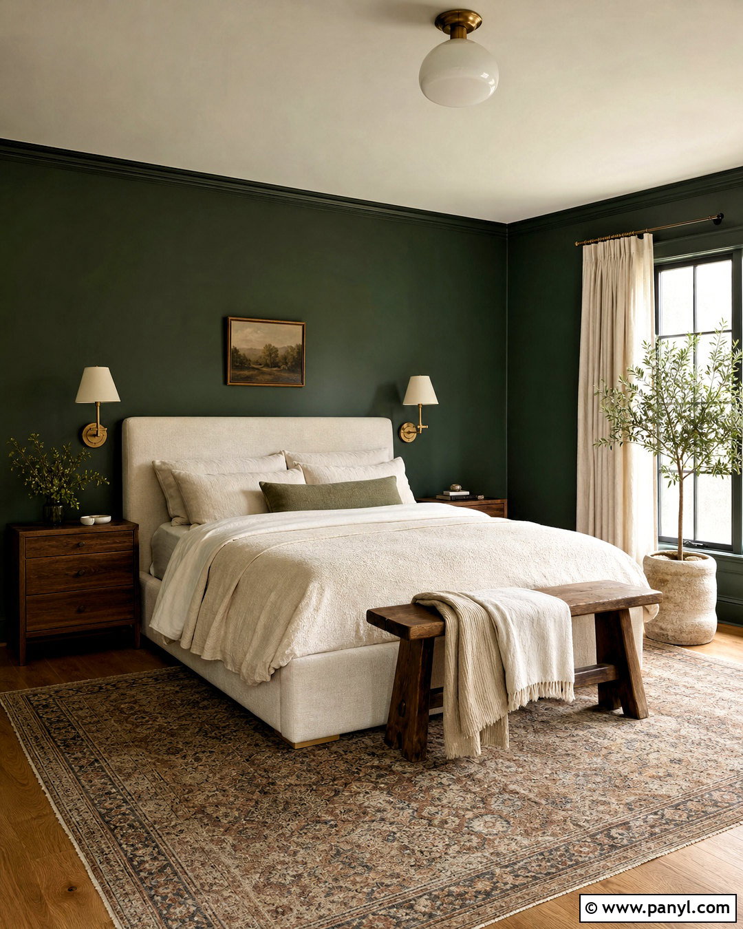
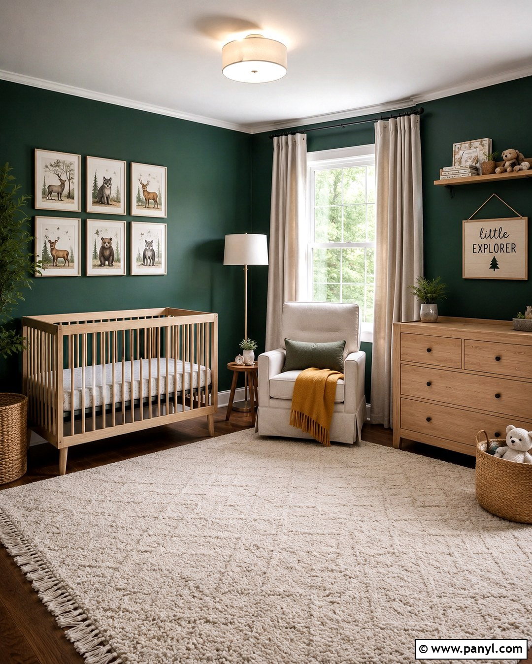
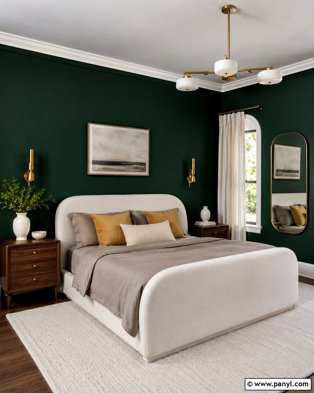
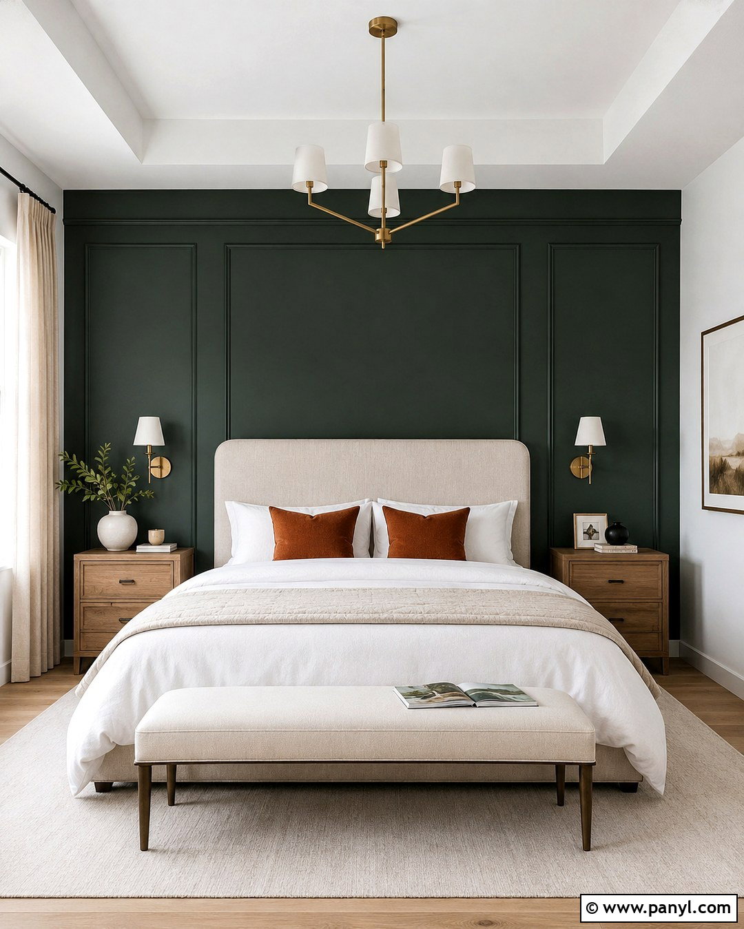
Would you enjoy a bedroom that feels sheltered, restful, and connected to nature? Benjamin Moore Hunter Green can create that effect when used across the walls and behind a layered upholstered bed. Choose warm ivory for the ceiling, window trim, and doors to soften the contrast. Dress the bed in oatmeal linen, cream quilts, and one rust-colored lumbar pillow. Walnut nightstands and aged brass reading sconces add warmth against the dark green background. Underfoot, use a faded traditional rug containing beige, muted red, and touches of blue. Keep window treatments simple with full-length natural linen curtains. A medium-tone oak floor and one large landscape print complete the room. The result is cozy and classic without becoming overly dark or themed.
6. Benjamin Moore Essex Green Paint Color
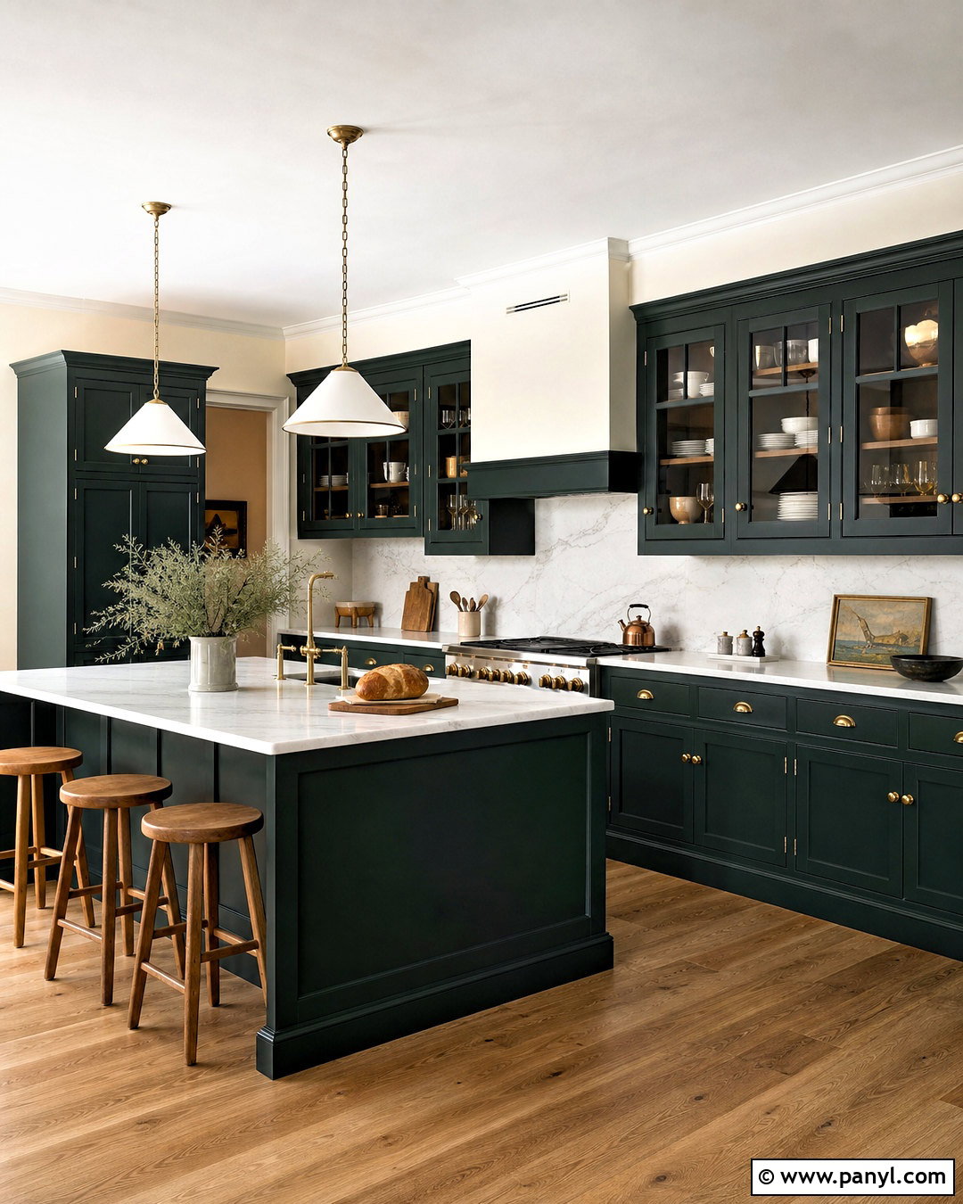
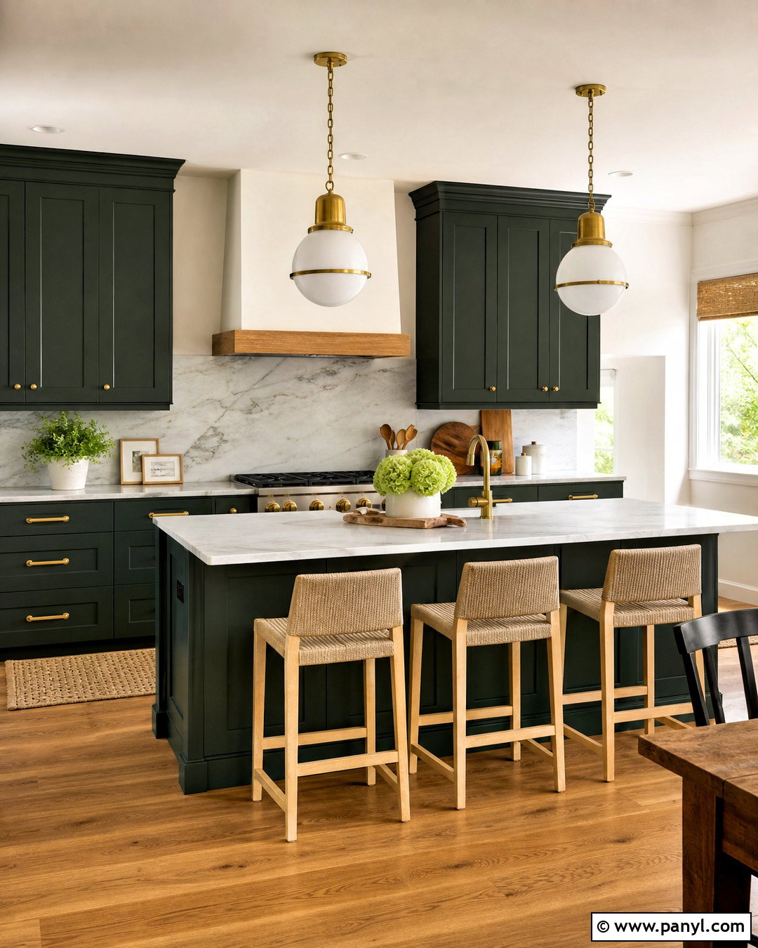
Deep Essex Green is well suited to a traditional kitchen where cabinetry should look substantial and architectural. Apply it to floor-to-ceiling cabinets, the island, and a built-in range hood in a durable satin finish. Keep the walls and ceiling soft cream, then add honed white marble counters and a matching slab backsplash. Unlacquered brass hardware develops warmth and character beside the nearly black green. Choose medium oak flooring and simple wood stools to prevent the kitchen from looking too polished. Glass-front upper cabinets can break up long stretches of dark color and display white dishes. Finish the design with warm metal pendants and a farmhouse-style sink. Generous daylight will reveal the green, while evening light makes it feel especially intimate.
7. Benjamin Moore Vintage Vogue Paint Color
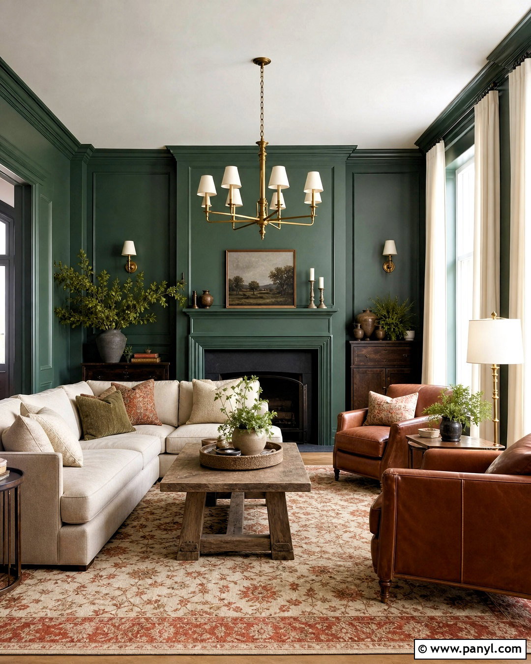
Vintage Vogue creates a muted emerald look that bridges colorful and neutral decorating. Use it throughout a relaxed living room with traditional architectural details, including wall paneling painted in the same color as the upper walls. This color-drenching approach makes the space feel cohesive rather than visually divided. Place a beige linen sectional against the green, followed by a weathered oak coffee table and two cognac leather accent chairs. A vintage-inspired rug with cream, dusty blue, and faded terracotta brings gentle pattern to the floor. Add antique brass lighting, off-white curtains, and charcoal-framed prints. Avoid bright white, which may look sharp beside this softened green. Warm cream and natural fibers maintain the comfortable, lived-in quality of the complete room.
8. Benjamin Moore Salamander Paint Color
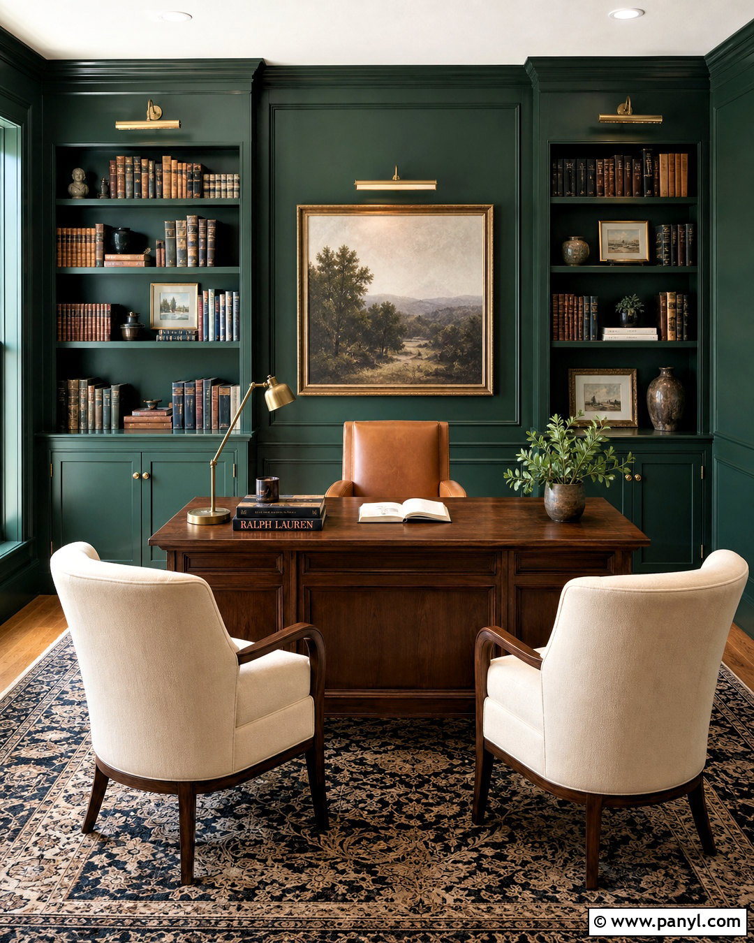
For a library-inspired office, Benjamin Moore Salamander provides a dark green foundation with impressive depth. Paint the walls, bookcases, trim, and interior door in the same satin or eggshell color, then leave the ceiling a gentle warm white. Center a substantial walnut desk in the room rather than pushing it against a wall. A camel leather desk chair and two cream guest chairs create a comfortable conversation area. Use a patterned wool rug to introduce burgundy, tan, and muted navy without competing with the green. Picture lights, cabinet hardware, and a classic desk lamp can share an aged brass finish. Fill the shelves sparingly with books, ceramics, and framed photographs. The completed office feels focused, polished, and welcoming rather than gloomy.
9. Benjamin Moore Deep Sea Green Paint Color
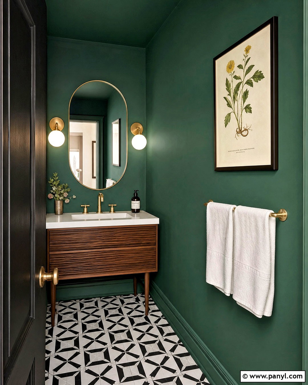
Small powder rooms can handle saturated color because they are experienced in short, memorable moments. Cover the walls and ceiling with Benjamin Moore Deep Sea Green for an immersive effect, then introduce a slim walnut vanity with a white stone top. A rounded brass-framed mirror softens the room’s straight edges. Choose two opal glass sconces to distribute bright, even light across the deep walls. Graphic black-and-white floor tile adds pattern without introducing another strong color. Keep the sink, toilet, and hand towels crisp white for contrast. A small framed botanical print and a simple ceramic vase provide enough decoration. Using one green across every painted surface also reduces visual breaks, helping a compact powder room look intentional, complete, and surprisingly spacious.
10. Sherwin-Williams Shamrock Paint Color
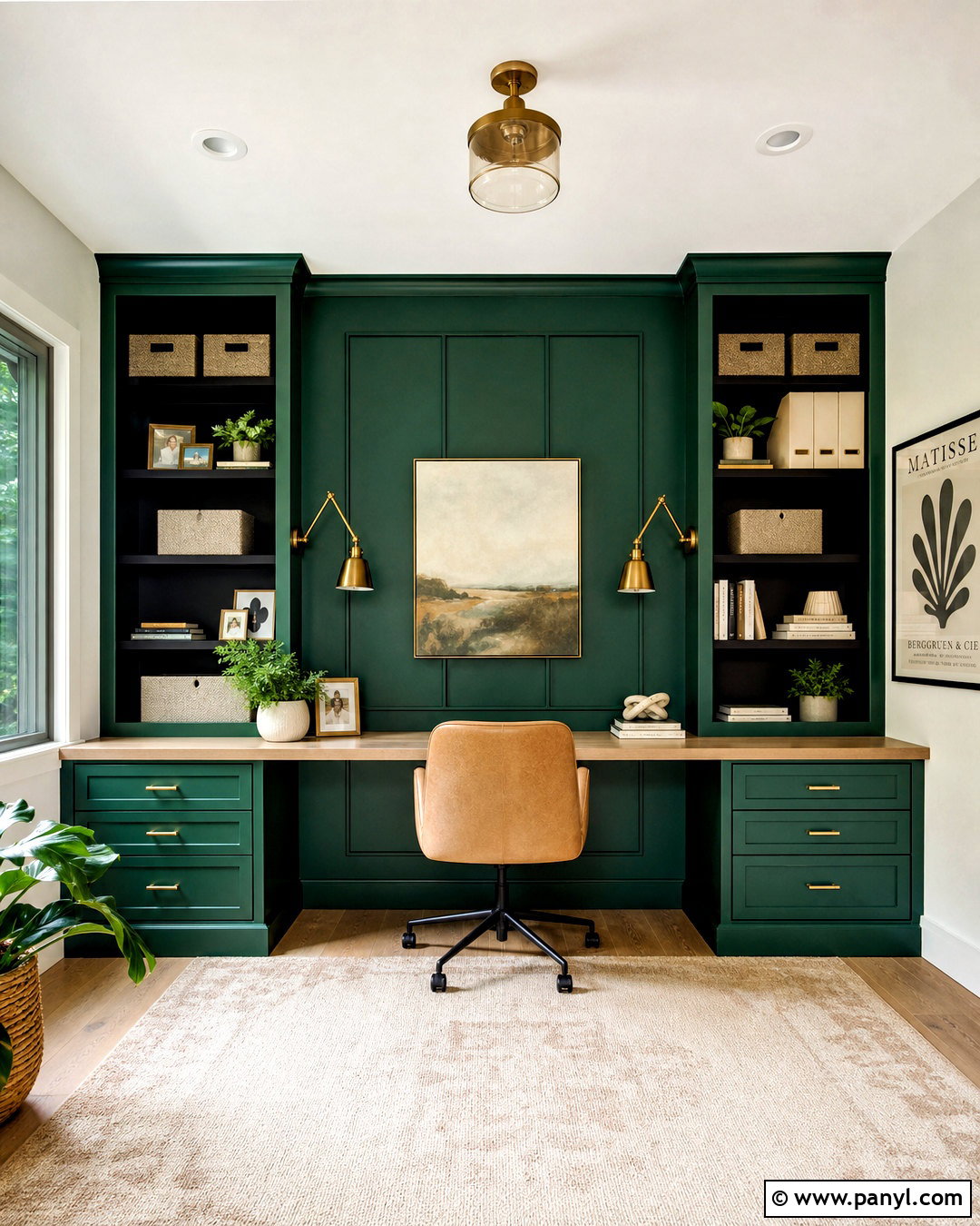
Sherwin-Williams Shamrock brings lively emerald energy to a home office, craft room, or creative studio. Use it on the main wall and built-in cabinets, while painting the remaining walls a warm, clean white. This controlled placement keeps the room stimulating without allowing the green to dominate every surface. Install a long white oak worktop over the cabinetry and pair it with a comfortable tan upholstered chair. Add a flat-woven cream rug, matte black shelving, and adjustable brass task lights. Storage boxes in natural canvas keep supplies organized and visually quiet. A few framed geometric prints can repeat the green alongside ochre and pale pink. The completed workspace feels cheerful, productive, and polished, with enough neutral space to support detailed projects and daily tasks.
11. Sherwin-Williams Derbyshire Paint Color
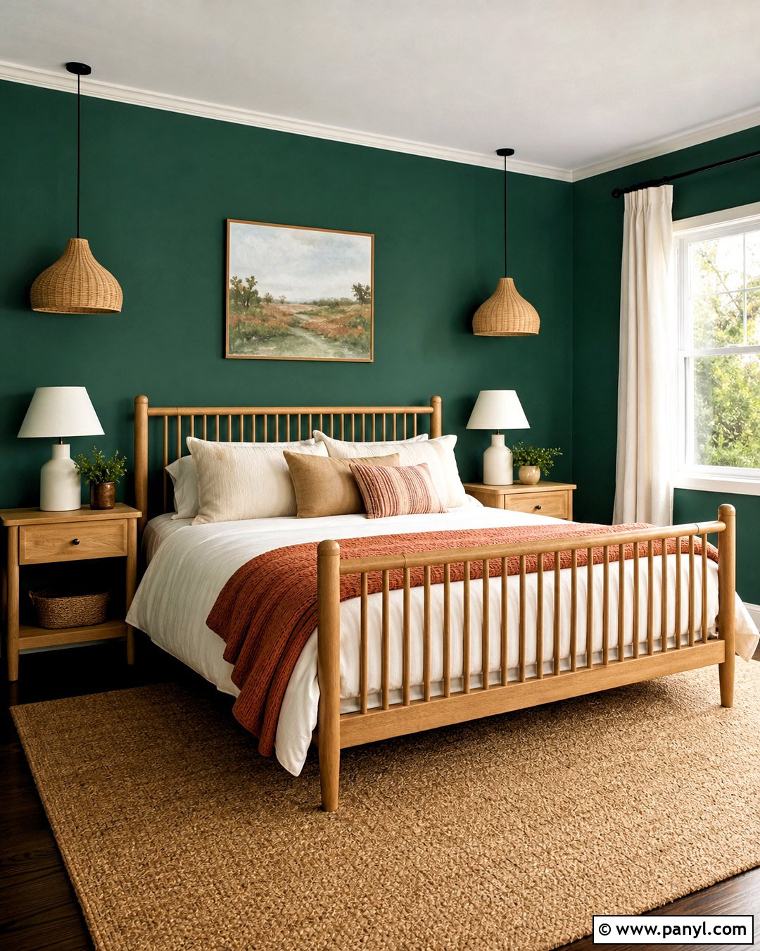
A Derbyshire bedroom can feel fresh and tailored when the stronger green is paired with plenty of warm neutrals. Paint the wall behind the bed and the adjacent window wall, then keep the remaining surfaces soft ivory. Choose an oak spindle bed or a simple cream upholstered headboard to stand clearly against the color. Layer white cotton sheets with a beige quilt, green-patterned pillows, and a muted coral throw. Light oak nightstands and woven pendant lights introduce natural texture. Hang full-length cream curtains high above the window to make the ceiling appear taller. A large jute-blend rug grounds the furniture without adding visual clutter. This balanced arrangement allows the emerald green paint color to feel bright and energizing while preserving a restful bedroom atmosphere.
12. Sherwin-Williams Isle Of Pines Paint Color
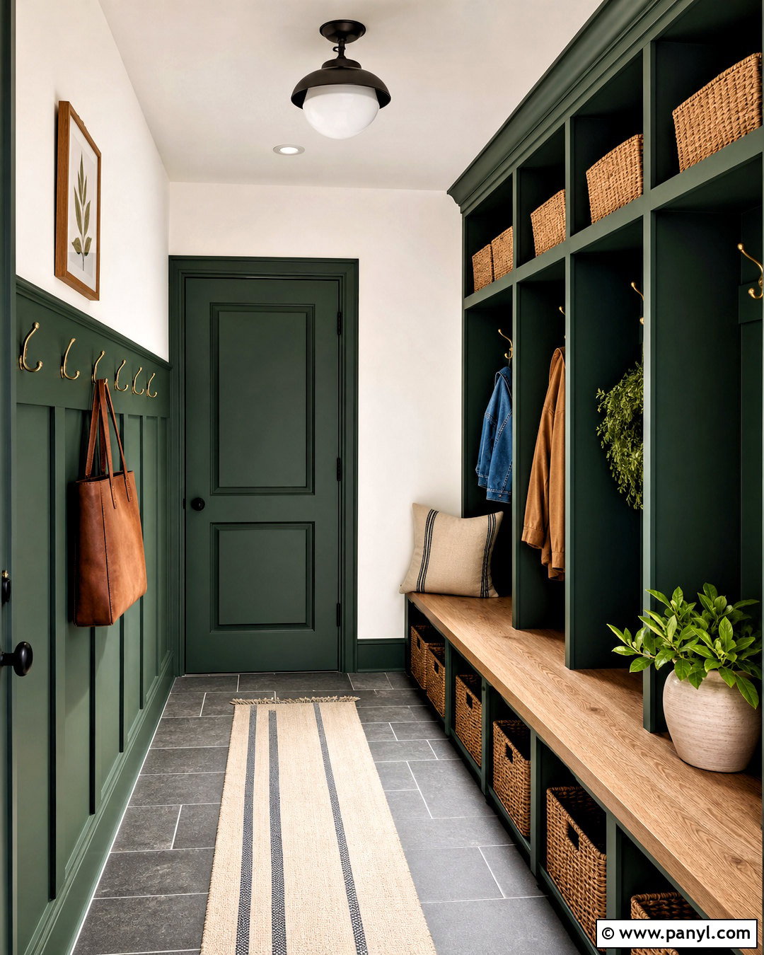
Isle of Pines can give a mudroom the character of custom millwork while hiding the everyday marks that appear in a busy entry. Paint built-in lockers, a storage bench, lower wall paneling, and the interior door in a washable satin finish. Use warm white on the upper walls and ceiling to keep the narrow space open. Add a thick white oak bench seat, brass hooks, and woven baskets sized to fit the upper cubbies. Durable slate-look porcelain tile provides a practical dark floor beneath the green cabinetry. A striped indoor-outdoor runner introduces cream and charcoal without showing dirt easily. Include a simple globe ceiling light and one framed landscape. The completed mudroom combines organized storage, durable materials, and an inviting emerald-based palette.
13. Sherwin-Williams Hunt Club Paint Color
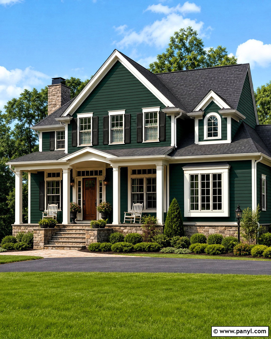
Hunt Club creates a stately exterior when the surrounding finishes are kept warm and natural. Use this deep green on the siding of a traditional one- or two-story home, then outline windows, fascia, and porch columns with creamy off-white trim. A stained medium-brown wood front door adds warmth without introducing an unrelated color. Choose a weathered charcoal roof and dark bronze exterior lighting to ground the scheme. Along the foundation, repeat the warm tones with natural stone or muted brick. Landscaping should include layered evergreen shrubs, white flowering plants, and ornamental grasses for soft contrast. A pale concrete walkway keeps the approach bright. This complete exterior palette feels established and refined, while the dark emerald body color helps an average home look more distinctive.
14. Sherwin-Williams Jasper Paint Color
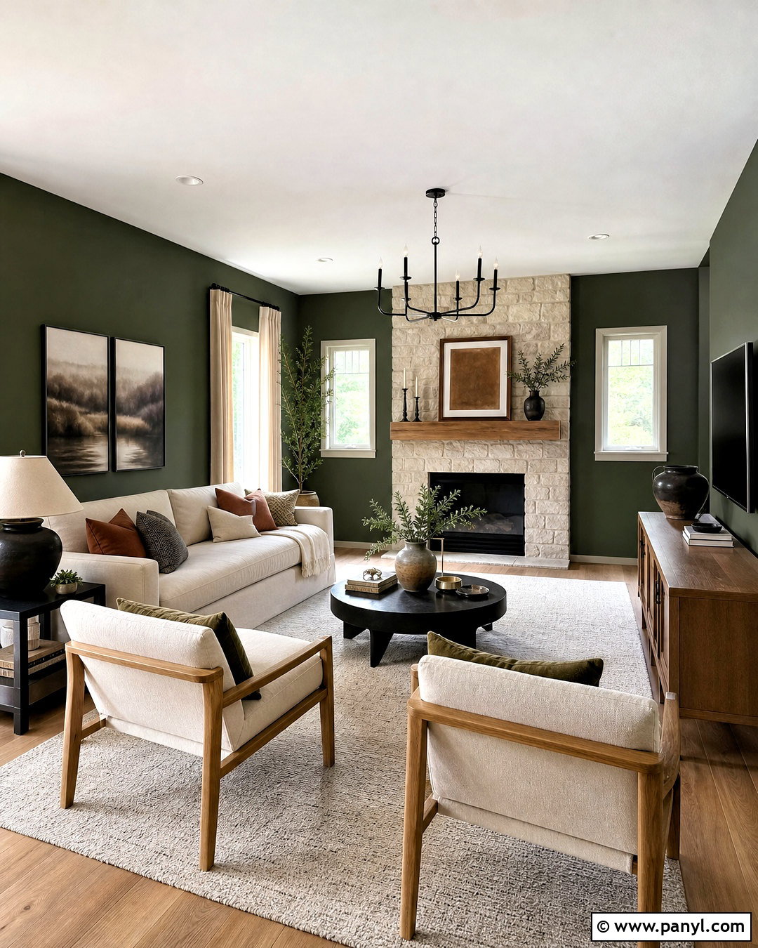
Sherwin-Williams Jasper can turn a casual living room into a calm, nature-inspired retreat. Paint the walls in matte Jasper, but preserve warm white on the ceiling, baseboards, and window casing. Arrange a low-profile oatmeal sofa opposite a textured stone fireplace, with two light oak chairs angled toward the center. A large cream wool rug prevents the deeper green from weighing down the room. Use black metal side tables, ceramic lamps, and a simple oak media console for contrast. Linen curtains should closely match the trim rather than introducing another dominant shade. Finish with rust, tan, and muted gold pillows, plus a few sculptural branches. This complete look balances Jasper’s earthy darkness with light upholstery, natural grain, and clean contemporary furniture shapes.
15. Sherwin-Williams Billiard Green Paint Color
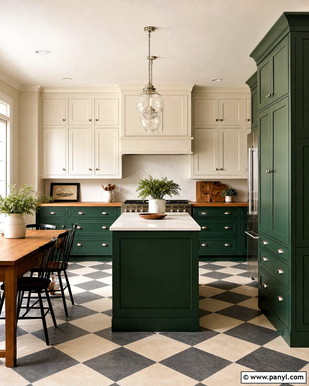
Billiard Green works beautifully in a vintage-inspired kitchen that feels colorful without relying on novelty details. Coat all lower cabinetry and a freestanding pantry in the green, then use creamy white for upper cabinets and walls. Select butcher-block counters around the perimeter and durable pale quartz for the island. Checkerboard flooring in warm white and soft charcoal gives the room classic pattern. Add polished nickel cup pulls, a white apron-front sink, and opal glass pendants for a bright finish. An oak breakfast table with mixed wood chairs keeps the design friendly and informal. Display only a few white bowls and copper cookware pieces on open shelves. Together, the materials create a practical kitchen where saturated green feels familiar, balanced, and enduring.
16. Sherwin-Williams Kale Green Paint Color
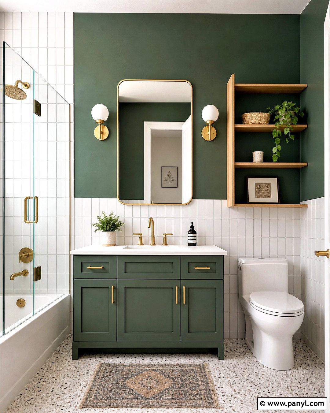
A compact bathroom gains personality when Kale Green is used as part of a clean, modern palette. Paint the vanity and the wall above the tile in this rich botanical green. Install vertical white ceramic tile around the lower half of the room and inside the shower to reflect light. A white quartz vanity top, brushed brass faucet, and slim brass-framed mirror add polished contrast. Choose pale terrazzo flooring with subtle green and beige fragments to connect the surfaces. White towels and a light oak storage shelf prevent the room from becoming overly colorful. Finish with two simple globe sconces and a frameless shower screen. This complete bathroom scheme feels crisp and current, while the emerald-leaning green provides a clear focal point without reducing visual space.
17. Sherwin-Williams Inverness Paint Color
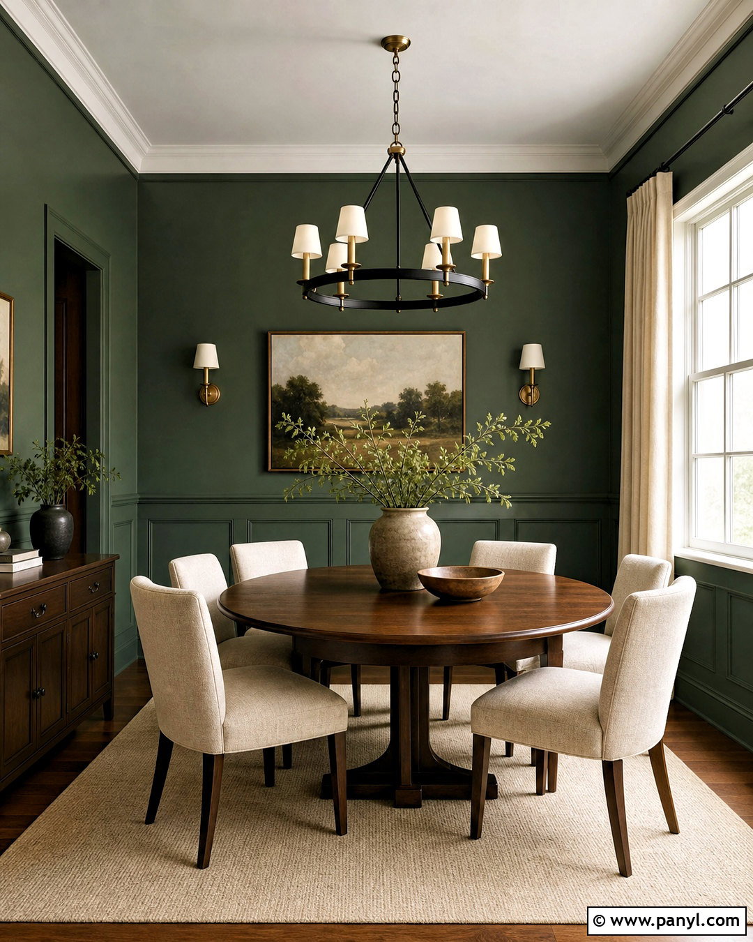
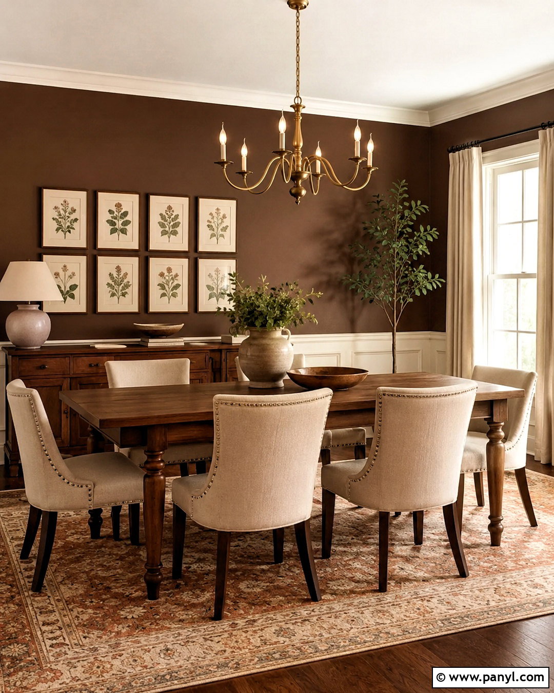
Inverness brings a slightly warmer green character to a dining room filled with natural materials. Apply it to the walls and traditional wainscoting for a cohesive, enveloping backdrop. Pair the paint with an oval walnut table and chairs upholstered in light oatmeal fabric. A cream flat-weave rug defines the dining zone and provides relief beneath the dark furniture. Overhead, hang a black and aged brass chandelier with simple curved arms. Full-length beige curtains soften the windows and improve the room’s acoustics. Add a large landscape painting containing cloudy blue, soft brown, and touches of green. A stoneware centerpiece keeps the table casual. The completed dining room feels rich but approachable, especially when warm bulbs and natural daylight reveal the layered green surface.
18. Behr Vine Leaf Paint Color
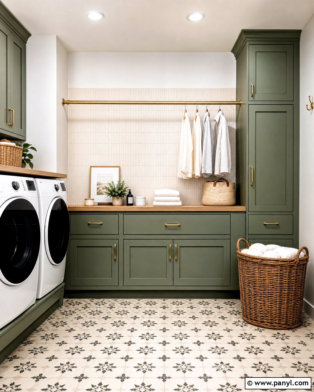
Behr Vine Leaf offers a grayer, more understated alternative to brilliant emerald. It is a useful choice for a laundry room where color should feel calming and easy to live with. Paint the base cabinets, tall utility storage, and open shelving in Vine Leaf. Keep the walls warm white and use a pale wood countertop above the washer and dryer for folding clothes. A cream vertical-tile backsplash adds texture while remaining simple. Install aged brass cabinet pulls, a brass hanging rod, and a woven pendant for warmth. Patterned floor tile in ivory, charcoal, and muted green handles heavy use while disguising minor debris. Woven baskets, glass containers, and folded white linens complete an organized room that looks attractive without sacrificing practical storage.
19. Behr Hidden Gem Paint Color
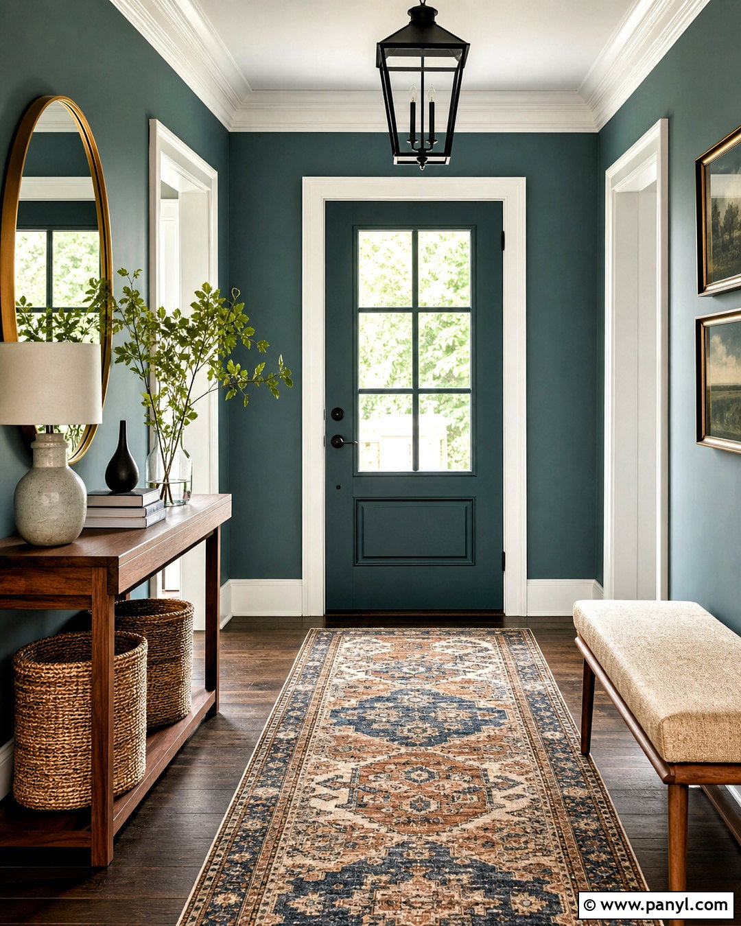
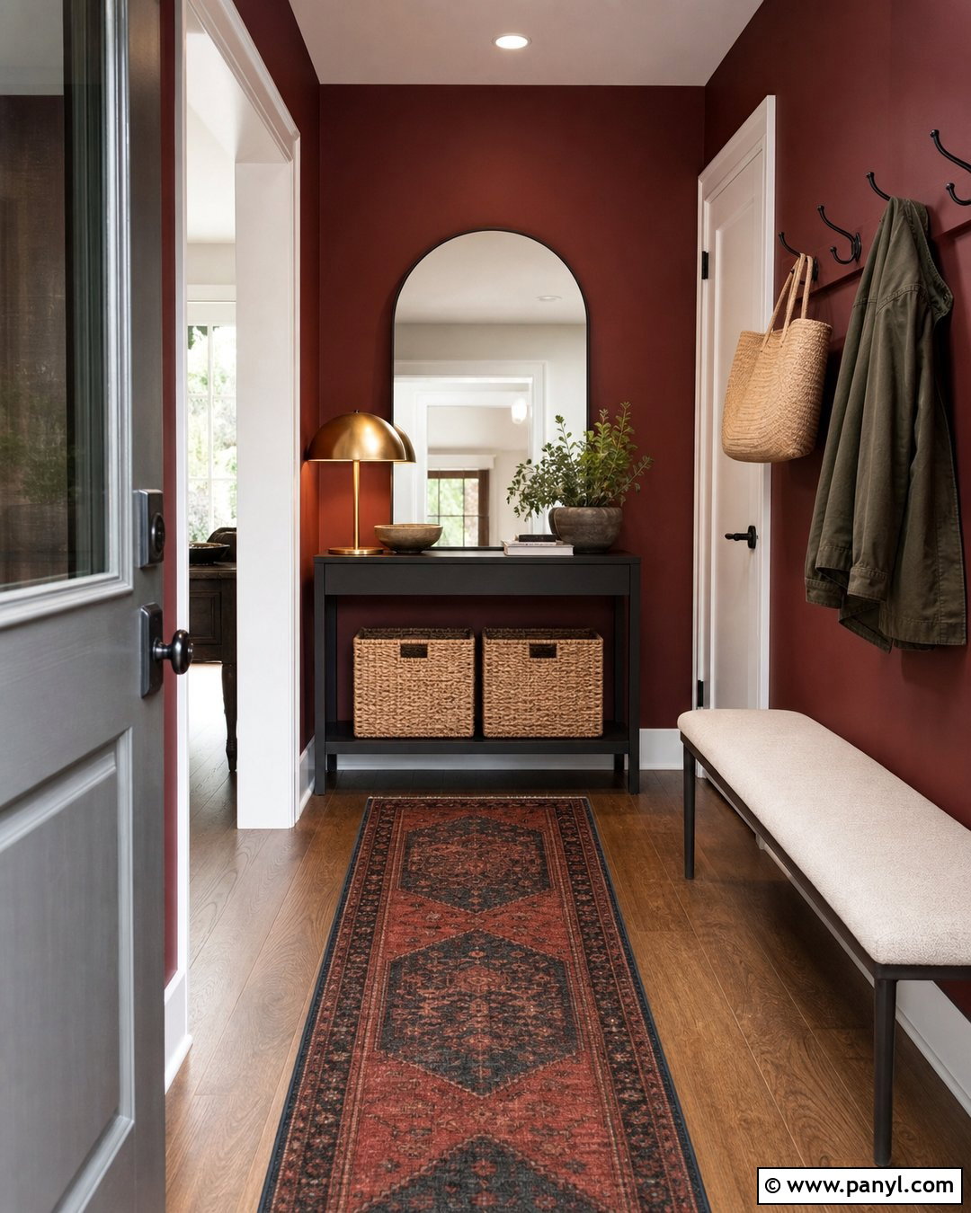
Hidden Gem suits an entryway that needs a sophisticated bridge between brighter rooms and darker furnishings. Use the color across the walls and interior side of the front door, while leaving the ceiling and detailed trim creamy white. Place a narrow walnut console against one wall with a rounded brass mirror above it. An upholstered bench in oatmeal fabric provides a useful place for shoes without crowding the walkway. Ground the area with a vintage-patterned runner containing rust, beige, navy, and touches of green. Add a black lantern-style ceiling fixture and a ceramic table lamp for layered lighting. Natural woven baskets can hold small everyday items below the console. This complete entry scheme feels welcoming, composed, and connected to the rest of the home.
20. Behr Dark Everglade Paint Color
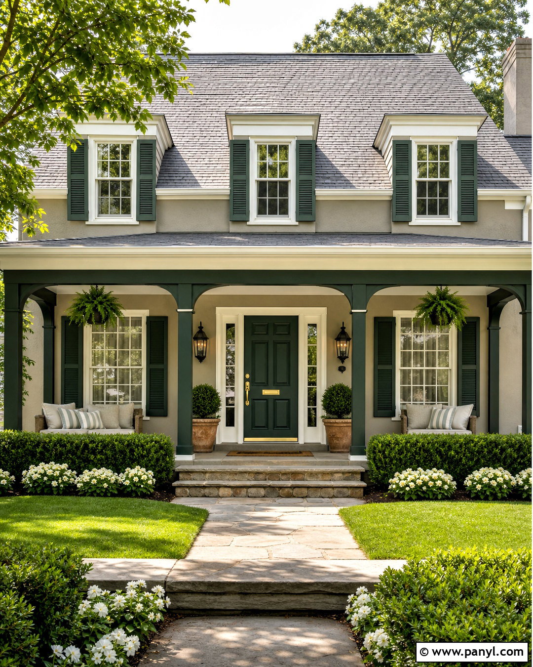
Dark Everglade creates a restrained emerald exterior when used on a prominent front door and supporting architectural elements. Paint the door, shutters, and porch ceiling beams in this deep green, then keep the house body a soft warm greige. Choose creamy white trim around the windows and porch columns for clear definition. A medium-gray shingle roof, black metal lanterns, and aged brass door hardware finish the structure. Repeat the green naturally through boxwood, ferns, and low evergreen shrubs along the walkway. Terracotta planters filled with white flowers add a small amount of warm contrast. A natural coir mat and simple wood bench make the porch functional. The complete scheme gives an average neutral home richer curb appeal without requiring full exterior repainting.
Conclusion:
Choosing among 20 emerald green paint colors becomes easier when you consider the entire space instead of viewing each shade alone. Flooring, daylight, trim, furniture, hardware, and textiles can make one green look crisp, muted, warm, or almost black. Brighter emeralds suit energetic kitchens and creative workspaces, while deeper forest-inspired versions create comforting bedrooms, offices, and dining rooms. Softened greens are especially flexible in practical spaces such as bathrooms, mudrooms, and laundry rooms. Always test movable sample boards on several walls before buying paint. Compare them during the morning, afternoon, and evening. With thoughtful lighting and balanced materials, these 20 emerald green paint colors can produce rooms that feel colorful, coordinated, and lasting.

Related Ideas and Inspiration:

Leave a Reply