
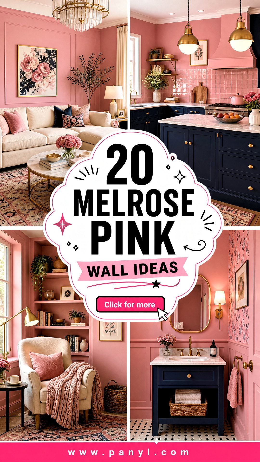
Benjamin Moore Melrose Pink 1363 is a deep, mid-tone pink with a noticeable violet undertone and an LRV of 26.46, giving walls more richness than a pale blush. () It can feel playful, sophisticated, vintage, or modern depending on the surrounding colors and materials. Bright white trim creates crisp contrast, while walnut, oak, brass, and woven textures bring warmth. Deeper shades like navy, burgundy, teal, and chocolate brown make the pink appear more refined. Because this color has substantial depth, lighting and room size matter. Test a large sample on multiple walls before committing, then view it throughout the day. The complete rooms below offer practical, coordinated, and visually distinct ways to recreate these 20 Melrose Pink wall ideas.
1. Melrose Pink Living Room With Cream Sofa
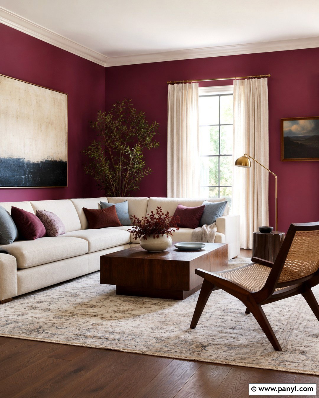
Create a welcoming living room by covering all four walls in Melrose Pink and balancing the color with a generously sized cream sofa. Choose an oatmeal-toned performance fabric rather than stark white, which can create overly sharp contrast. Ground the seating area with a warm ivory rug featuring a subtle taupe pattern. A walnut coffee table, woven accent chair, and aged brass floor lamp will introduce natural depth. Hang one large abstract artwork containing cream, rust, and muted blue above the sofa. Keep window treatments simple with full-length linen curtains in soft ivory. Finish the room with burgundy pillows, a dusty blue throw, and a few dark wood accessories. The resulting space feels colorful, comfortable, and mature without losing the cheerful quality of pink walls.
2. Melrose Pink Bedroom With Walnut Furniture
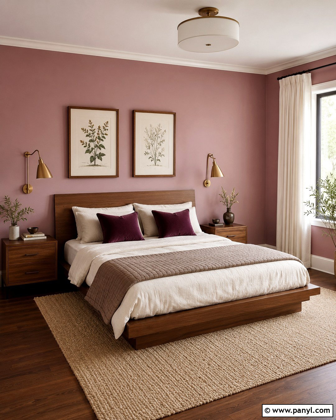
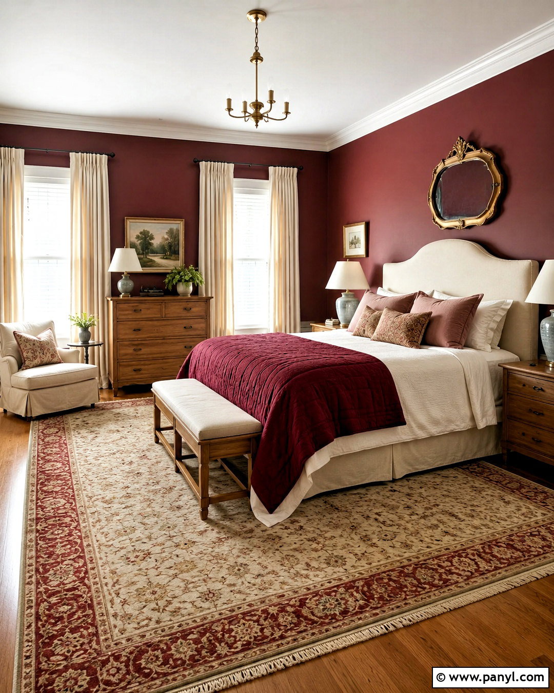
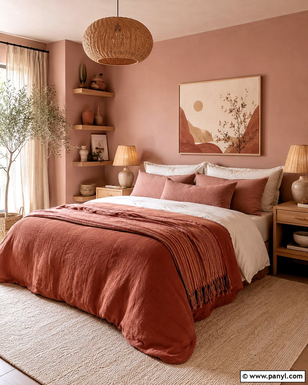
Melrose Pink can create a cozy bedroom when it is paired with substantial walnut furniture and quiet neutral bedding. Paint every wall pink, but leave the ceiling and trim a soft warm white to keep the room visually open. Position a low walnut bed against the longest uninterrupted wall and frame it with matching nightstands. Layer the bed with ivory linen sheets, a light taupe quilt, and two plum velvet pillows. A natural wool rug will soften the contrast between the walls and dark furniture. Add antique brass sconces instead of table lamps to preserve nightstand space. Choose simple botanical prints with cream mats and walnut frames. The combination of rosy walls, rich wood, and understated fabrics produces a restful room that feels collected rather than overly sweet.
3. Melrose Pink Dining Room With Brass Accents
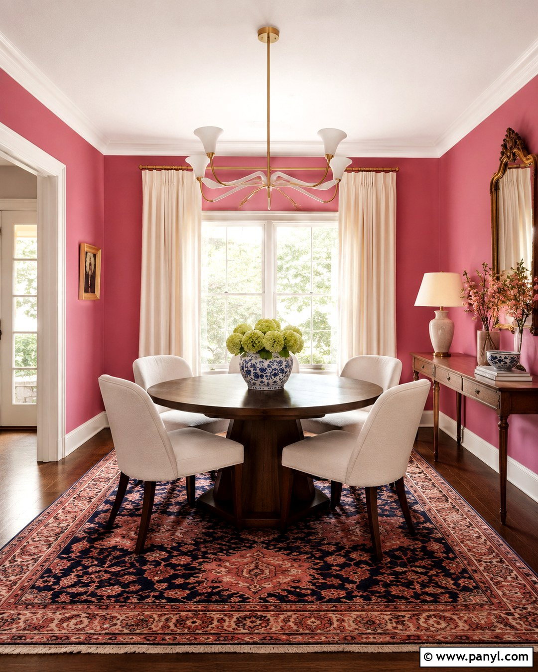
Imagine entering a dining room where Melrose Pink walls glow beside warm brass and dark wood. Center a round mahogany or stained oak table beneath a sculptural brass chandelier. Surround it with upholstered dining chairs in cream, camel, or muted olive fabric. A vintage-inspired rug containing pink, rust, and navy will connect the wall color to the furniture while disguising everyday wear. Paint the trim warm white and use linen curtains in the same tone for continuity. Display a large gilded mirror or a landscape painting above a narrow wood console. Keep the tabletop simple with a ceramic bowl and leafy branches. Brass should appear in only a few intentional places, including the light fixture, curtain rod, and cabinet hardware, so the finished room remains elegant instead of overly decorative.
4. Melrose Pink Home Office With White Built-Ins
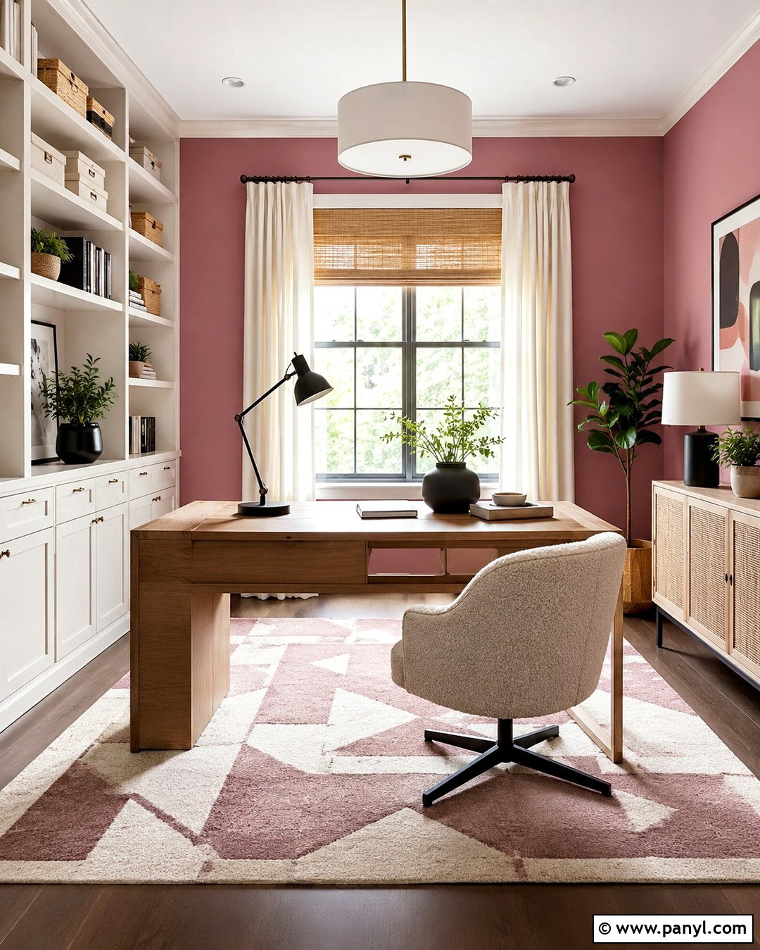
A home office becomes energetic and organized when Melrose Pink surrounds clean white storage. Paint the open wall areas pink, then use warm white on floor-to-ceiling built-ins, baseboards, and crown molding. Place a streamlined oak desk in the center or facing a window rather than pushing it against the wall. A cream boucle chair and washable geometric rug will keep the workspace comfortable. Style the shelves with white storage boxes, small plants, framed artwork, and a limited collection of books. Matte black desk lighting adds a crisp contemporary note that prevents the palette from feeling too delicate. Use natural woven shades under ivory curtain panels for adjustable light control. This complete office look combines expressive color with practical storage, making the room feel focused, polished, and pleasant enough for daily use.
5. Melrose Pink Nursery With Natural Wood
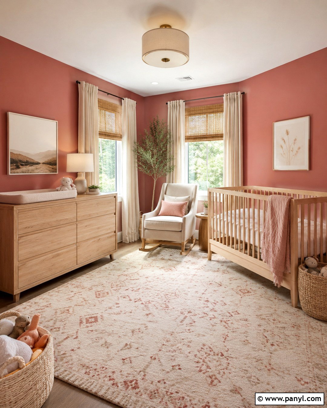
For a nursery that can grow with a child, combine Melrose Pink walls with light natural wood and simple shapes. Choose a pale oak crib, matching dresser, and comfortable cream upholstered rocking chair. Place the crib against a solid wall away from windows, cords, and hanging decorations. An ivory washable rug with a small terracotta pattern will soften the floor and connect the room’s warm tones. Use cordless woven shades and plain cream curtains for a layered window treatment. Add closed baskets for toys, picture ledges for lightweight artwork, and a shaded ceiling fixture that distributes light evenly. Keep accessories limited to dusty lavender, warm white, and muted green. This approach celebrates the personality of pink while avoiding a theme that could quickly feel dated, creating a practical and adaptable room.
6. Melrose Pink Bathroom With White Tile
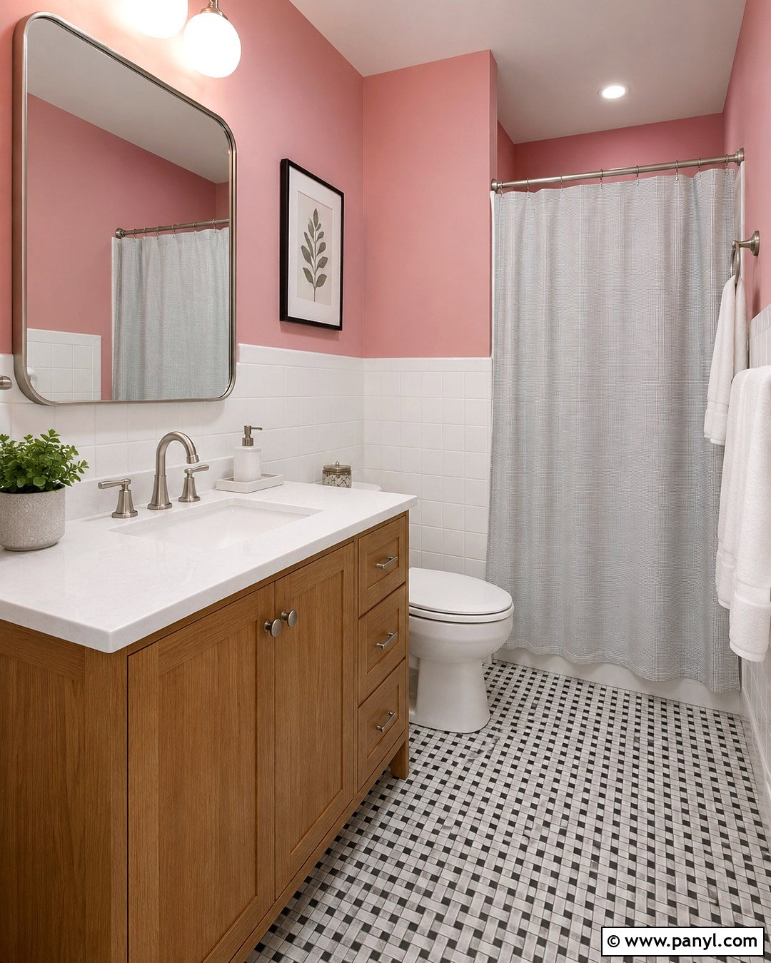
Melrose Pink brings unexpected warmth to a bathroom lined with classic white tile. Use the color on the upper walls above white subway tile or simple square ceramic tile. A medium oak vanity with a white quartz top will soften the transition between the saturated paint and bright surfaces. Choose polished nickel fixtures for a fresh, reflective finish, then install a rounded rectangular mirror with a thin matching frame. The floor can feature white and charcoal mosaic tile for subtle graphic contrast. Add fluffy white towels, a pale gray shower curtain, and one small green plant that tolerates humidity. Keep countertops clear with a ceramic soap dispenser and covered storage container. This balanced scheme feels clean and colorful, while the tile, streamlined vanity, and restrained accessories prevent the pink from overwhelming the compact room.
7. Melrose Pink Kitchen With Navy Cabinets
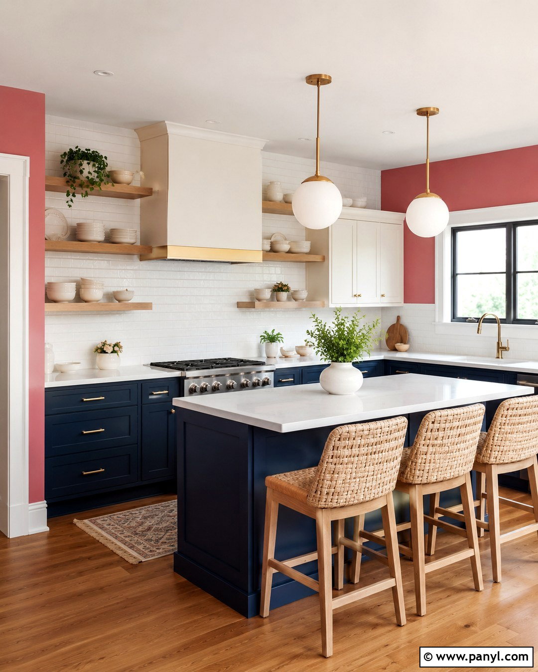
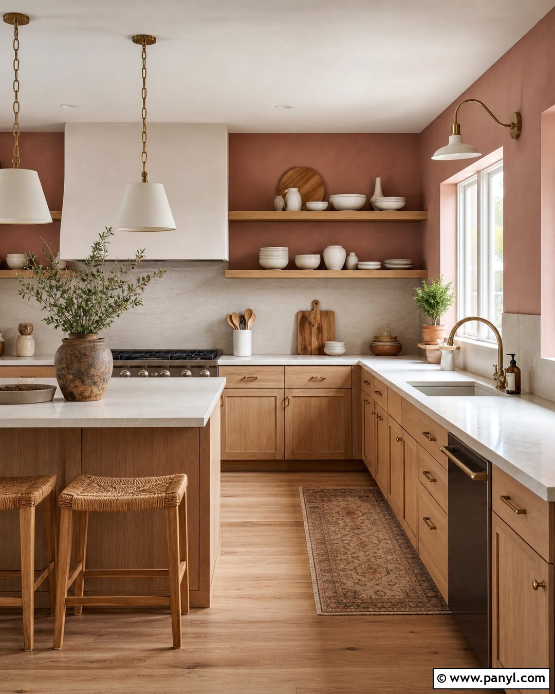
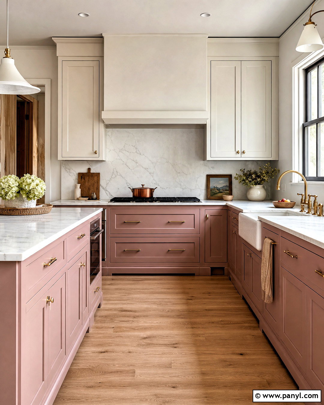
A bold kitchen can successfully combine Melrose Pink walls with deep navy cabinetry when light surfaces separate the two colors. Use the pink on open wall areas and around windows, then paint lower cabinets a classic inky navy. Keep upper cabinets warm white, or replace some with light oak shelves to reduce visual weight. White quartz countertops and a simple white backsplash will create breathing room between the saturated shades. Select brushed brass hardware and globe pendants to warm the palette. Medium oak flooring provides a natural foundation, while counter stools in woven cane add texture. Display only a few cream dishes and wood cutting boards on the shelves. The result is a colorful but functional kitchen where pink feels intentional, navy adds structure, and pale finishes maintain a bright everyday atmosphere.

8. Melrose Pink Entryway With Black Accents
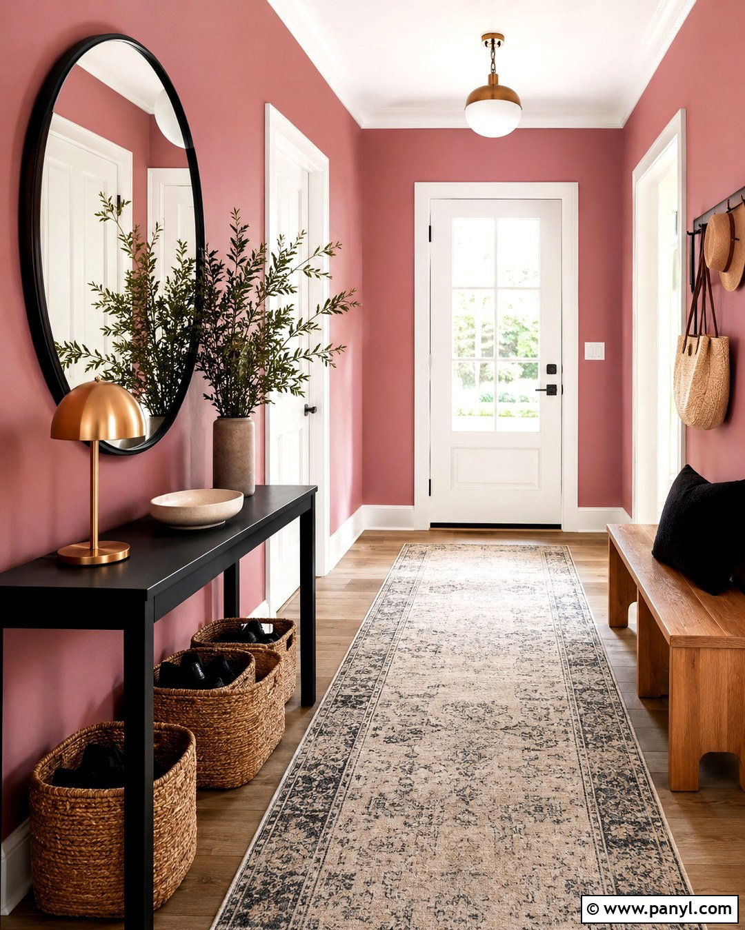
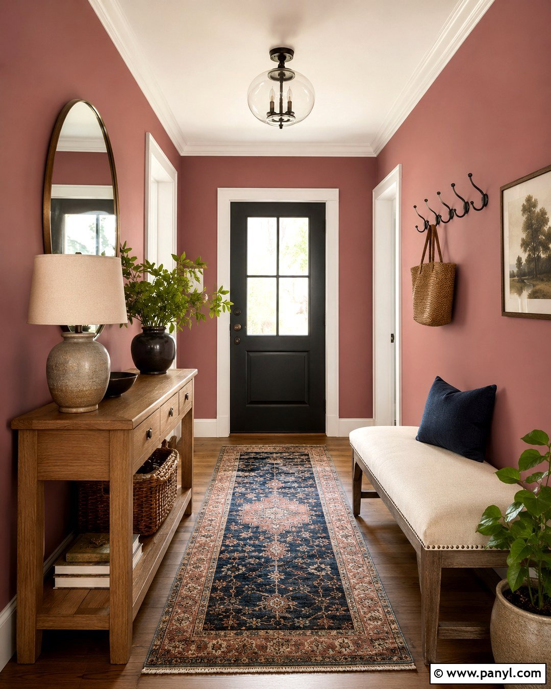
Make a memorable first impression by pairing Melrose Pink entryway walls with slim black accents. A narrow black console provides a practical landing place without taking up excessive floor space. Hang a large round mirror with a thin black frame above it, then add a shaded brass table lamp for warmth. Use a durable runner containing cream, charcoal, and faded rose to disguise dirt while repeating the wall color. A natural oak bench with a woven seat can provide convenient shoe storage on the opposite side. Paint doors and trim warm white so the entry still feels crisp. Finish with a ceramic tray, a lidded basket, and one tall vase of greenery. This coordinated arrangement gives a small transitional space a clear identity while keeping circulation paths open and household essentials neatly contained.
9. Melrose Pink Accent Wall With Gray Furniture
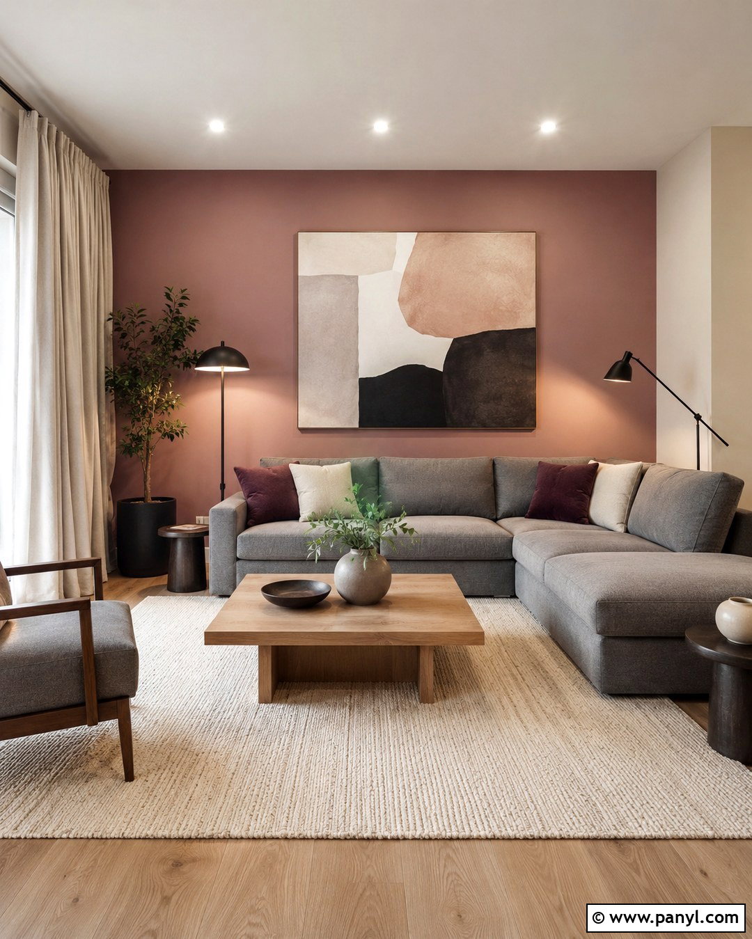
If four pink walls feel too intense, use Melrose Pink as a single focal wall in a neutral living room. Paint the wall behind a medium-gray sectional, then cover the remaining walls in a soft off-white with a subtle warm undertone. Choose a light oak coffee table and an ivory textured rug to keep the room from appearing cold. Pillows in plum, blush, and cream will bridge the sectional and accent wall. Add a pair of black reading lamps and one oversized artwork with muted pink and charcoal details. Full-length off-white curtains can make windows appear taller and soften the overall contrast. Keep large furniture understated so the painted wall remains the main feature. This arrangement provides a manageable way to introduce strong color while maintaining a flexible, family-friendly neutral foundation.
10. Melrose Pink Color Drenching
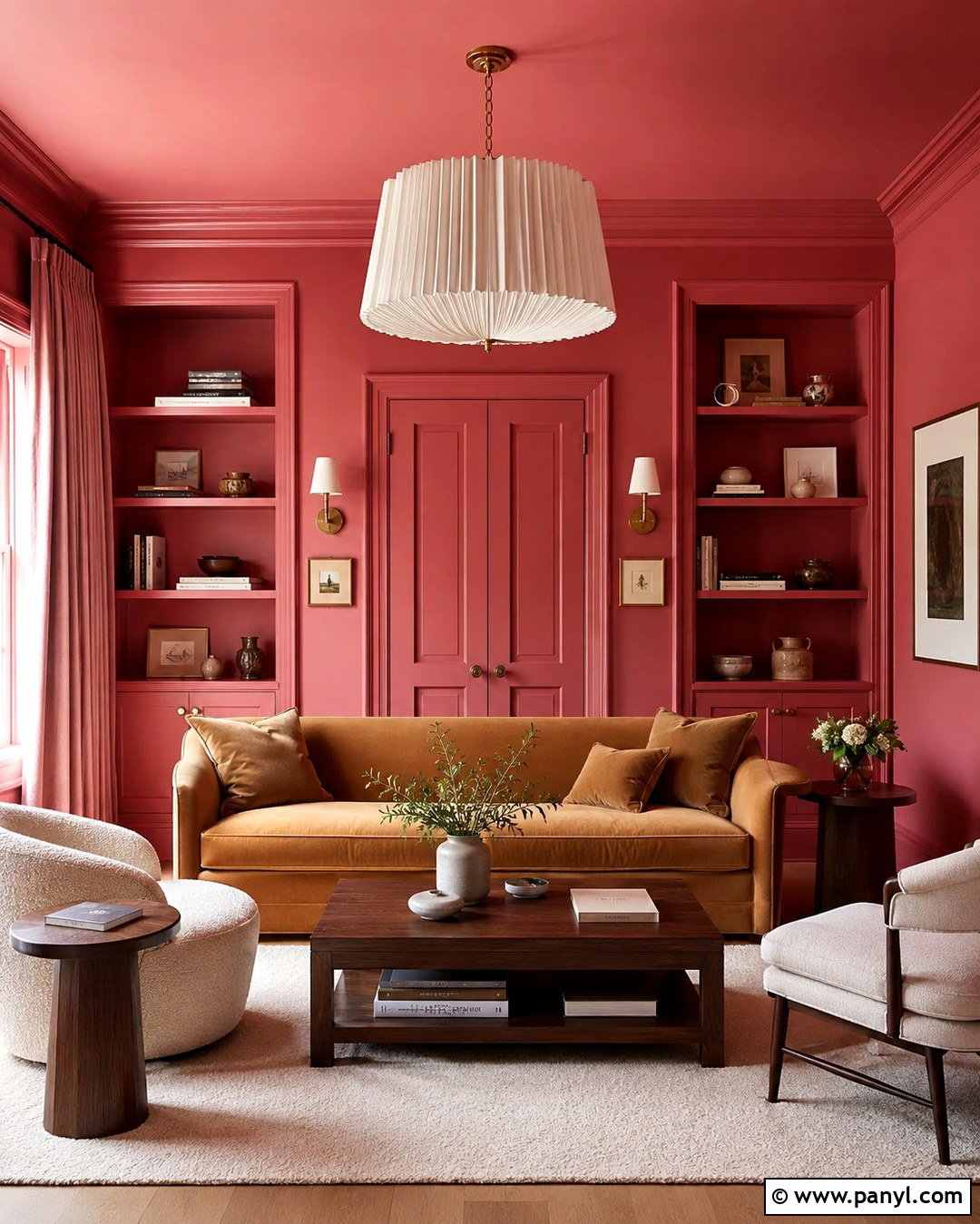
Color drenching makes Melrose Pink feel immersive, architectural, and surprisingly sophisticated. Apply the shade to the walls, baseboards, doors, crown molding, and built-in shelving using suitable finishes for each surface. Continue it across the ceiling only in a room with good natural light or generous artificial lighting. Introduce contrast through a camel velvet sofa, dark walnut side tables, and an ivory rug rather than additional paint colors. Select artwork with wide cream mats to create restful visual pauses. A pleated linen pendant and shaded wall sconces will spread light softly across the saturated surfaces. Keep curtains close to the wall color for a seamless effect. Because every architectural element shares one hue, furniture shape and material become especially important. The finished room feels enveloping and cohesive rather than busy.
11. Melrose Pink Wall With Sage Green
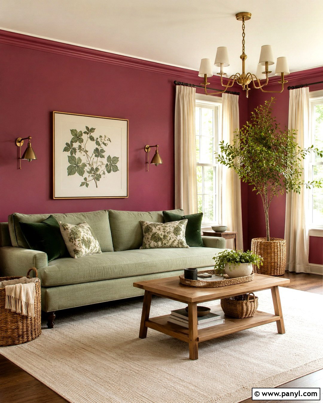
Melrose Pink and sage green create a balanced room inspired by garden colors without becoming overly themed. Cover the walls in pink, then introduce sage through a linen sofa, painted side cabinet, or full-length curtains. Keep the largest rug cream with small touches of olive and dusty rose. Natural oak furniture and woven baskets reinforce the organic character of the palette. Add botanical artwork sparingly, choosing simple leaves or landscapes rather than many floral prints. Antique brass lighting will complement both colors, while warm white trim keeps edges clean. Include deeper forest green through one or two pillows to give the lighter sage more definition. This scheme works especially well in a sitting room, bedroom, or home office where a calm atmosphere is wanted alongside a confident use of color.
12. Melrose Pink Wall With Burgundy
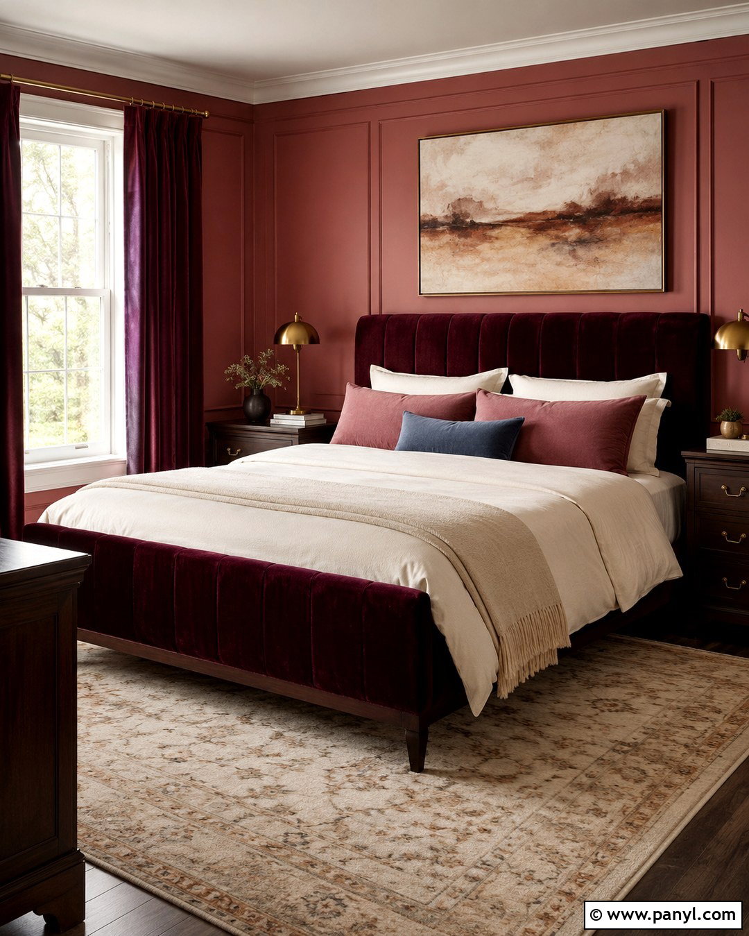
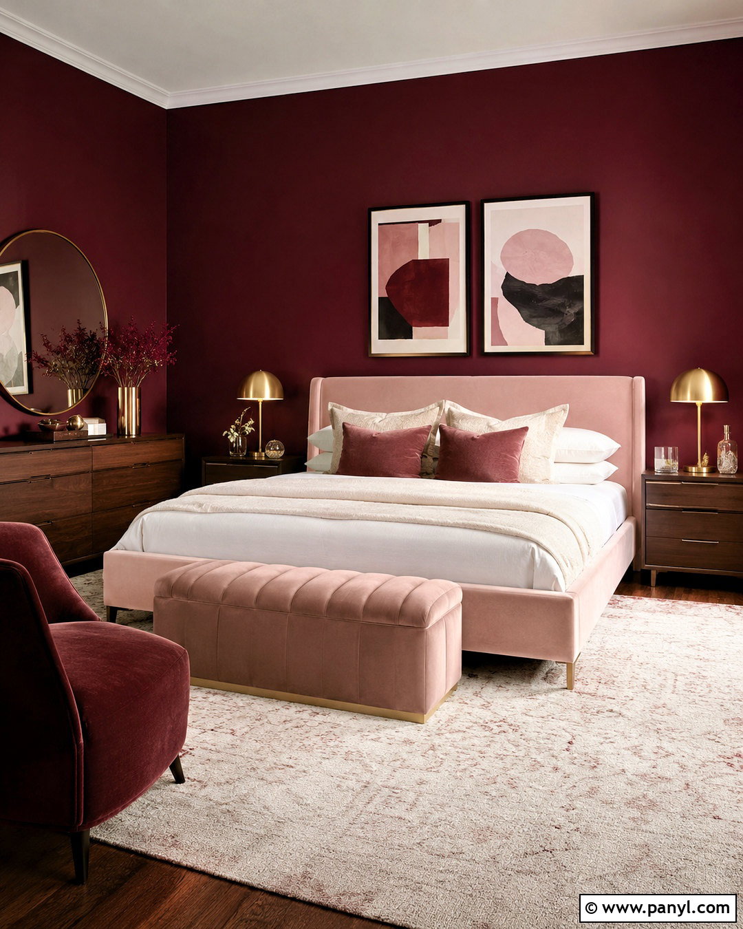
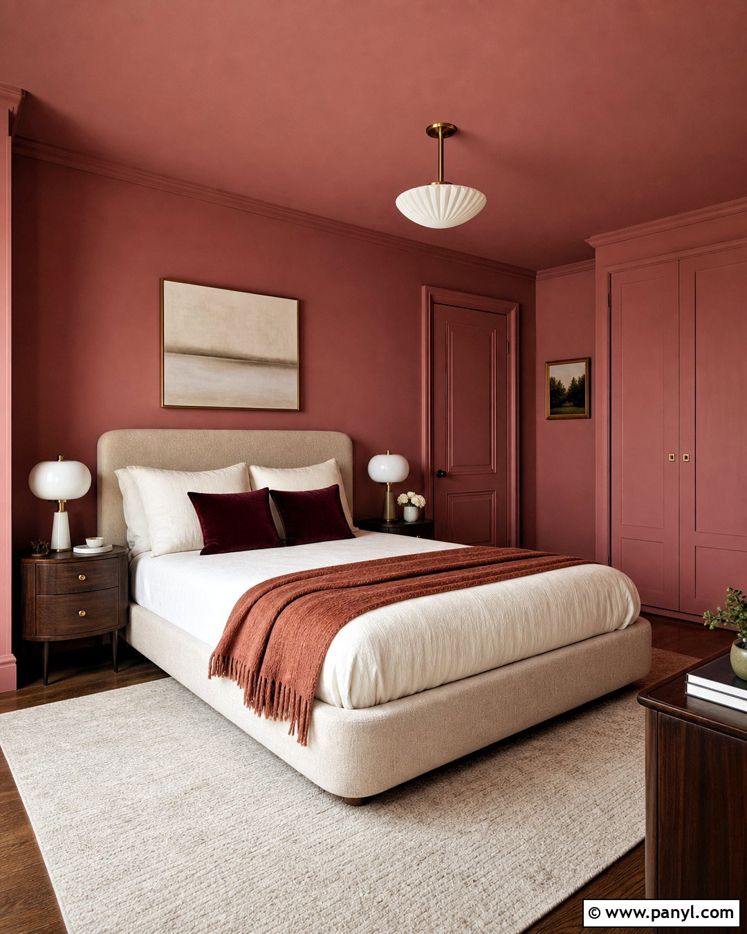
Layering Melrose Pink with burgundy creates a rich tonal room that feels warm and intentional. Begin with pink walls and use burgundy on a velvet headboard, upholstered armchair, or full-length curtains. Break up the closely related colors with ivory bedding, a cream rug, and warm white trim. Dark walnut nightstands or a matching dresser provide enough visual weight to support the saturated palette. Choose aged brass lamps with simple linen shades rather than highly ornate fixtures. Artwork can include plum, rust, beige, and muted red, but it should contain lighter areas to prevent the wall from feeling crowded. Add one dusty blue pillow or small ceramic lamp for a controlled contrast. The final space feels cocooning and elegant, making this combination particularly effective in a bedroom, library, or formal sitting area.
13. Melrose Pink Wall With Teal
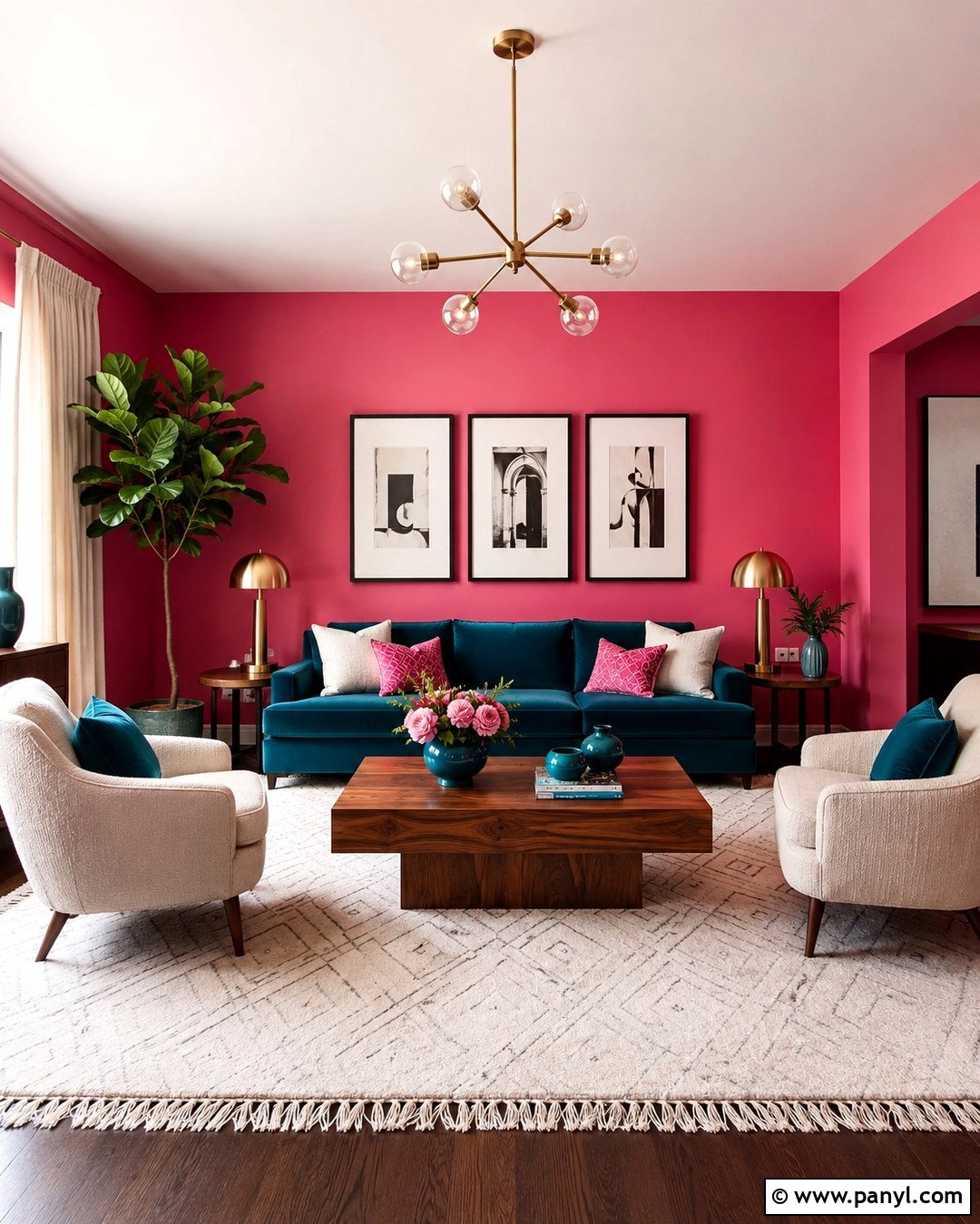
For a lively yet polished combination, place deep teal furniture against Melrose Pink walls. In a living room, choose a teal sofa with a clean silhouette and pair it with two cream accent chairs. Ground the strong colors using a large ivory rug with a restrained geometric pattern. A medium walnut coffee table will bridge the warm pink and cool teal without competing with either. Repeat teal in small doses through artwork or a ceramic vase, but avoid filling every surface with both colors. Brushed brass lighting adds warmth, while black picture frames introduce definition. Hang neutral linen curtains and keep the ceiling warm white. This room works because each bold shade has a clear role: pink creates the backdrop, teal anchors the seating, and quiet neutrals give the eye comfortable places to rest.
14. Melrose Pink Wall With Chocolate Brown
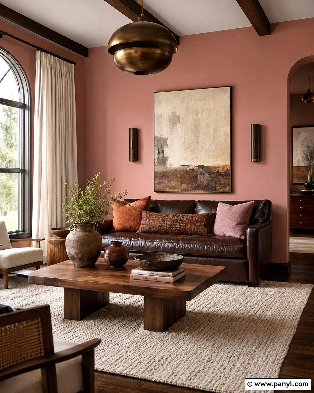
Chocolate brown can make Melrose Pink appear earthy, grounded, and distinctly grown-up. Paint the room pink and anchor it with a dark brown leather sofa or a pair of cocoa-colored upholstered chairs. Add a substantial oak or walnut coffee table with visible wood grain. An ivory wool rug will prevent the palette from becoming too heavy, while rust and mauve pillows create a gradual transition between pink and brown. Use cream linen curtains to filter daylight and soften the windows. Artwork with beige, terracotta, plum, and dark brown can connect every major color in the space. Choose antique bronze or aged brass lighting instead of bright chrome. A few handmade ceramics and woven accents complete the room. The finished look feels warm, comfortable, and enduring rather than sugary or trend dependent.
15. Melrose Pink Wall With Cobalt Blue
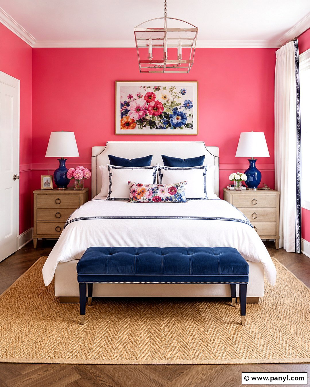
Cobalt blue gives Melrose Pink a crisp, energetic contrast that suits a creative bedroom or cheerful guest room. Paint all walls pink, then position a white upholstered bed against the main wall. Introduce cobalt through matching bedside lamps, patterned pillows, and one tailored bench at the foot of the bed. White bedding with narrow blue borders keeps the composition neat and hotel-inspired. Ground the brighter colors with a natural jute or herringbone wool rug. Light wood nightstands will feel softer than black furniture, while polished nickel hardware brings a clean finishing touch. Add one floral or abstract artwork that contains pink, cobalt, green, and white. By concentrating the blue in a few substantial accents, the room looks coordinated and vibrant without becoming chaotic or overly youthful.
16. Melrose Pink Wall With Black And White
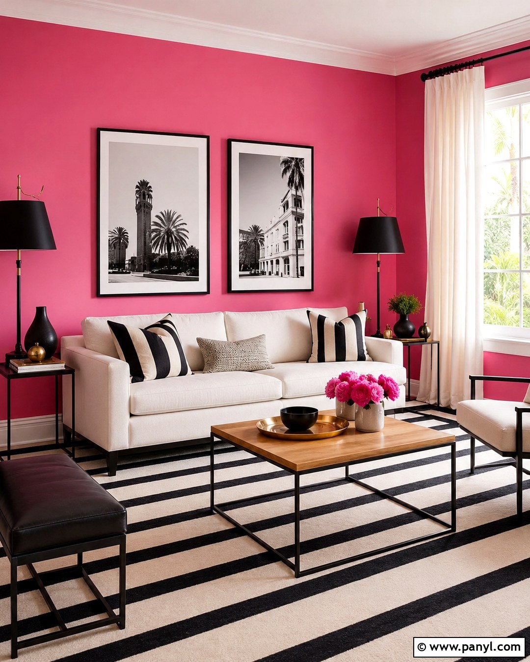
Black and white accents give Melrose Pink walls sharp definition and modern structure. Start with a white sofa or bed, then introduce black through slender furniture frames, lamps, curtain rods, and artwork. A black-and-ivory striped rug can establish a graphic foundation, but select a broad or irregular stripe to avoid visual clutter. Keep major storage pieces white so the room remains bright. Add a natural wood table and a small amount of brass to warm the high-contrast palette. Black-and-white photography looks especially clear against the pink, whether displayed as one oversized piece or a carefully aligned grid. Use plain ivory curtains and minimal patterned textiles. The result feels fresh and fashion-forward because pink provides personality, black outlines the room, and white offers enough open visual space to maintain balance.
17. Melrose Pink Gallery Wall
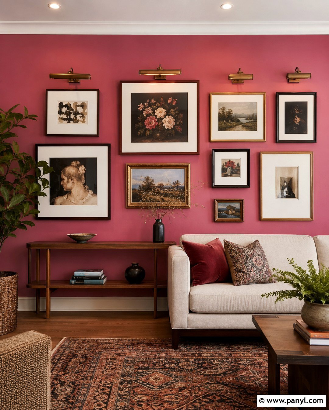
A gallery wall can turn Melrose Pink into a dramatic background for art rather than simply a decorative paint choice. Select one main wall and arrange a balanced collection of paintings, drawings, and photographs in walnut, brass, black, and cream frames. Include generous white or ivory mats so individual pieces remain distinct against the saturated color. Place a low cream sofa or slim wood console beneath the arrangement to visually anchor it. Repeat colors from the art in a nearby rug and a few pillows, but avoid matching every piece. Picture lighting or adjustable ceiling spots can illuminate the display evenly. Keep adjacent walls simple and limit nearby accessories. The complete composition should feel connected through frame spacing and color repetition while retaining enough variation to appear personal and gradually collected.
18. Melrose Pink Wainscoting
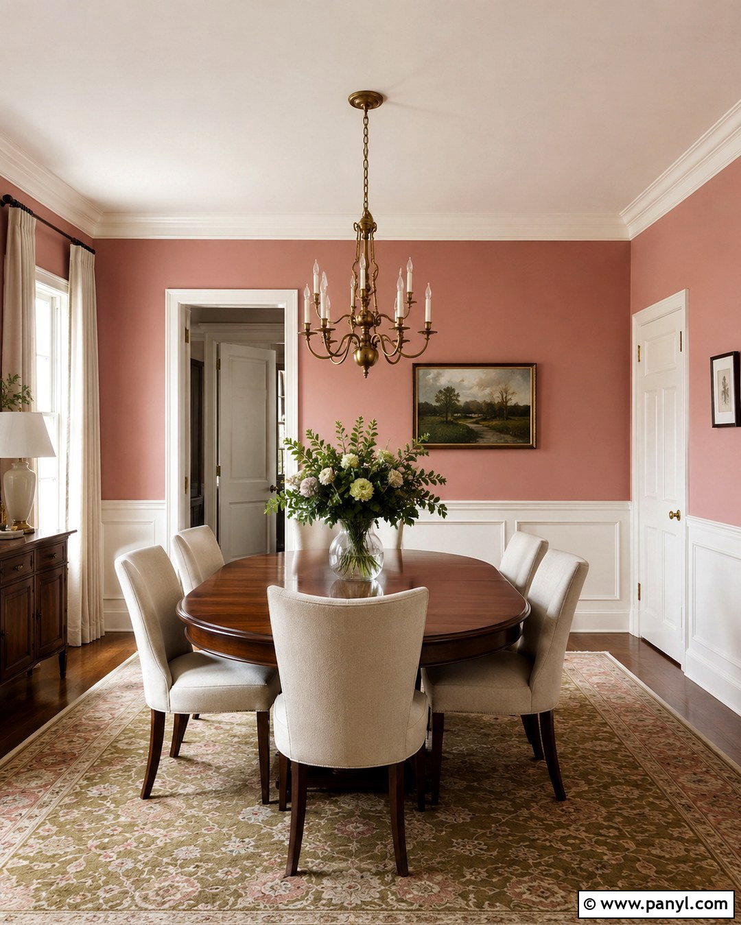
Two-tone walls offer an architectural way to use Melrose Pink while keeping the room light. Install simple box molding or Shaker-style paneling across the lower third of the walls and paint it warm white. Apply Melrose Pink above the chair rail, allowing the deeper color to frame artwork and windows. In a dining room, add an oval wood table, cream upholstered chairs, and a traditional brass chandelier. A faded patterned rug containing olive, rose, and beige will soften the formal lines of the paneling. Match the window trim and doors to the lower wainscoting for continuity. Hang linen curtains slightly above the window frames to increase the sense of height. This complete treatment blends classic millwork with expressive color, creating a room that feels polished without requiring decorative furniture or excessive wall accessories.
19. Melrose Pink Reading Nook
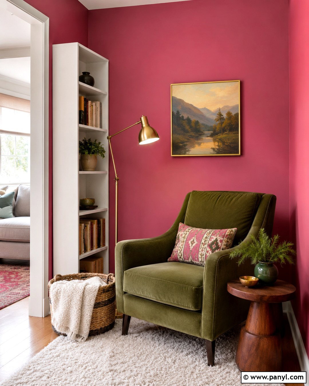
Turn an unused corner into a comfortable reading nook by using Melrose Pink to define the entire zone. Paint the corner walls pink and place a deep olive or camel armchair at a slight angle rather than flat against the wall. Add a compact walnut side table, an adjustable brass floor lamp, and a small cream rug beneath the chair. A narrow bookcase painted warm white can provide storage without competing with the wall color. Use one patterned lumbar pillow containing rose, green, and beige for comfortable support. Hang a single framed landscape or textile piece above the chair, leaving enough open wall around it. A woven basket can hold extra blankets and reading materials. This practical setup gives the saturated pink a purpose while transforming overlooked floor space into an inviting daily retreat.
20. Melrose Pink Small Powder Room
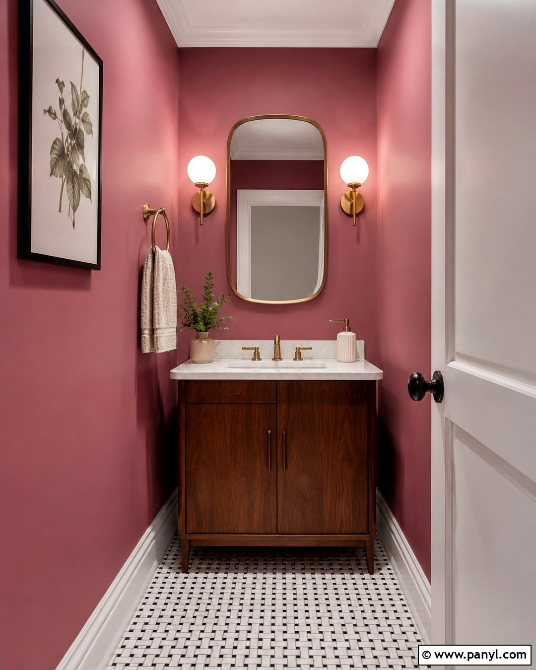
A small powder room is an ideal place to use Melrose Pink confidently because the compact space can support a memorable color statement. Paint all walls pink and add a wall-mounted or narrow walnut vanity with a white stone top. Install a rounded brass mirror and two opal glass sconces to distribute flattering, even light. White baseboards and a white ceiling will provide a clean visual boundary. Choose small black-and-white floor tiles for contrast and durability. A framed botanical print, cream hand towel, and ceramic soap dispenser are enough decoration for the limited space. If storage is needed, add a recessed cabinet or one slim shelf above the toilet. This complete design feels bold and finished while maintaining the clear surfaces, practical lighting, and uncluttered arrangement essential in a tiny room.
Conclusion:
These Melrose Pink wall ideas show how a saturated pink can support far more than one decorative mood. It becomes calm beside cream and oak, sophisticated with burgundy or chocolate brown, fresh with sage, and energetic with teal or cobalt. The best results come from treating the wall color as part of a complete room rather than an isolated statement. Consider the furniture scale, flooring, trim, lighting, window treatments, and artwork before painting. Because Melrose Pink has noticeable depth and violet character, test it under both daylight and artificial light. Whether used across an entire room, above wainscoting, or on one focal wall, it can create a distinctive interior that still feels balanced, useful, and comfortable.

Related Ideas and Inspiration:
Leave a Reply