
Sage green can make a home feel calm, grounded, and connected to nature without looking overly colorful. This guide to **20 sw sage green paint colors** covers pale green-grays, warm herbal tones, classic mid-range sages, and deep, dramatic greens from Sherwin-Williams. Each color is presented as a complete design look, including suitable rooms, coordinating finishes, furniture, textiles, and accent colors. Because green changes noticeably with daylight and surrounding materials, compare samples beside your flooring, countertops, cabinetry, and trim before committing. Sherwin-Williams also recommends considering natural light and light reflectance when selecting green paint. () Whether you are refreshing one room or planning a whole-home palette, these practical spaces show how to decorate with **20 sw sage green paint colors**.

1. Sea Salt SW 6204 Bathroom
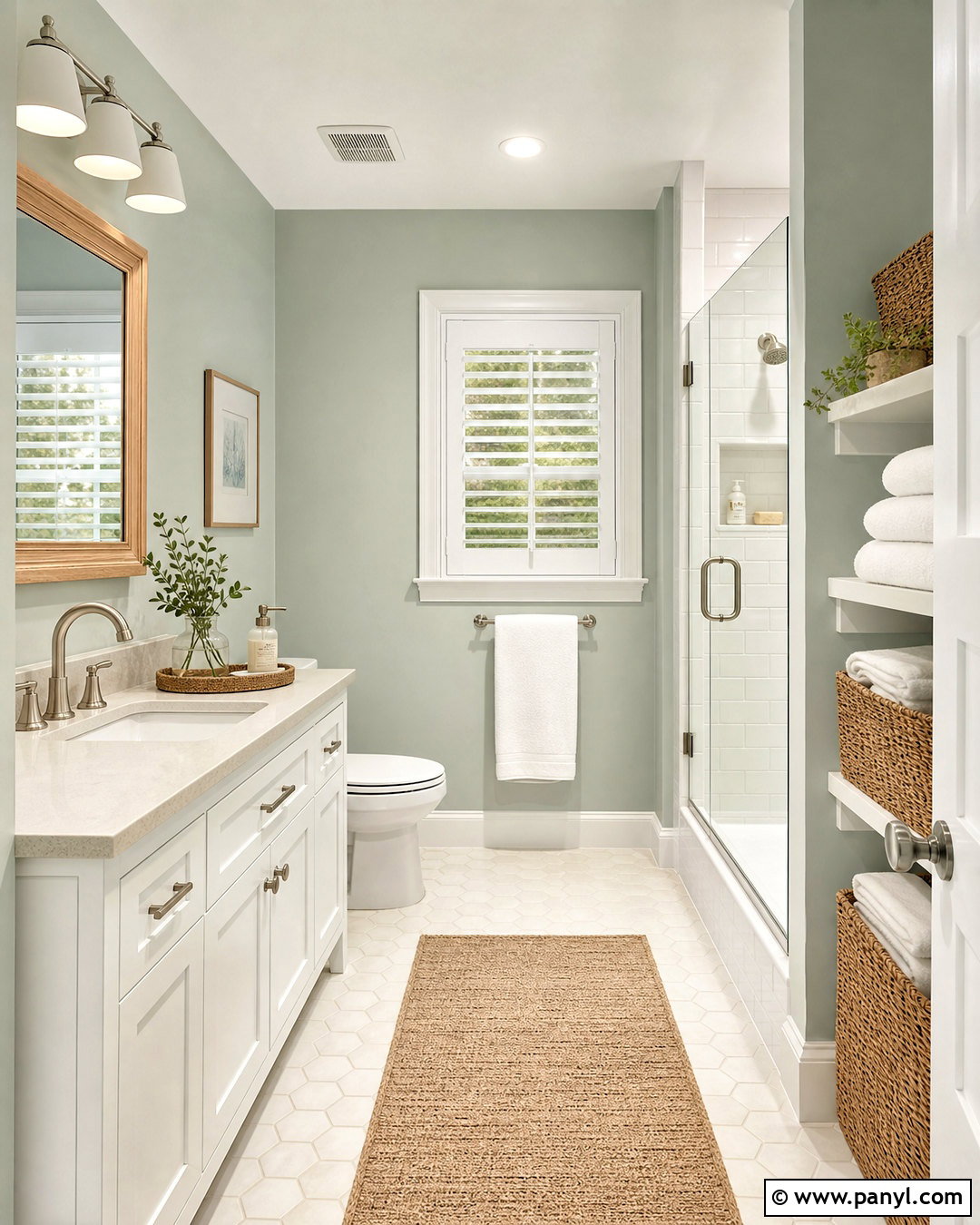
Sea Salt SW 6204 creates an airy bathroom with a soft green-gray appearance that can lean slightly blue in cooler light. Sherwin-Williams classifies it as a muted green with gray undertones, making it especially relaxing in bathrooms and laundry areas. () Paint the walls Sea Salt and use clean white on the ceiling, trim, and paneled vanity. Add a pale oak mirror, brushed nickel fixtures, and creamy quartz counters to keep the room light. White subway tile provides an easy backdrop, while subtle gray grout connects with the paint’s cooler character. Complete the look with a woven hamper, white cotton towels, and small leafy plants. Test this color carefully because strong daylight may reveal more green, while dimmer light can emphasize its gray-blue side.
2. Comfort Gray SW 6205 Bedroom
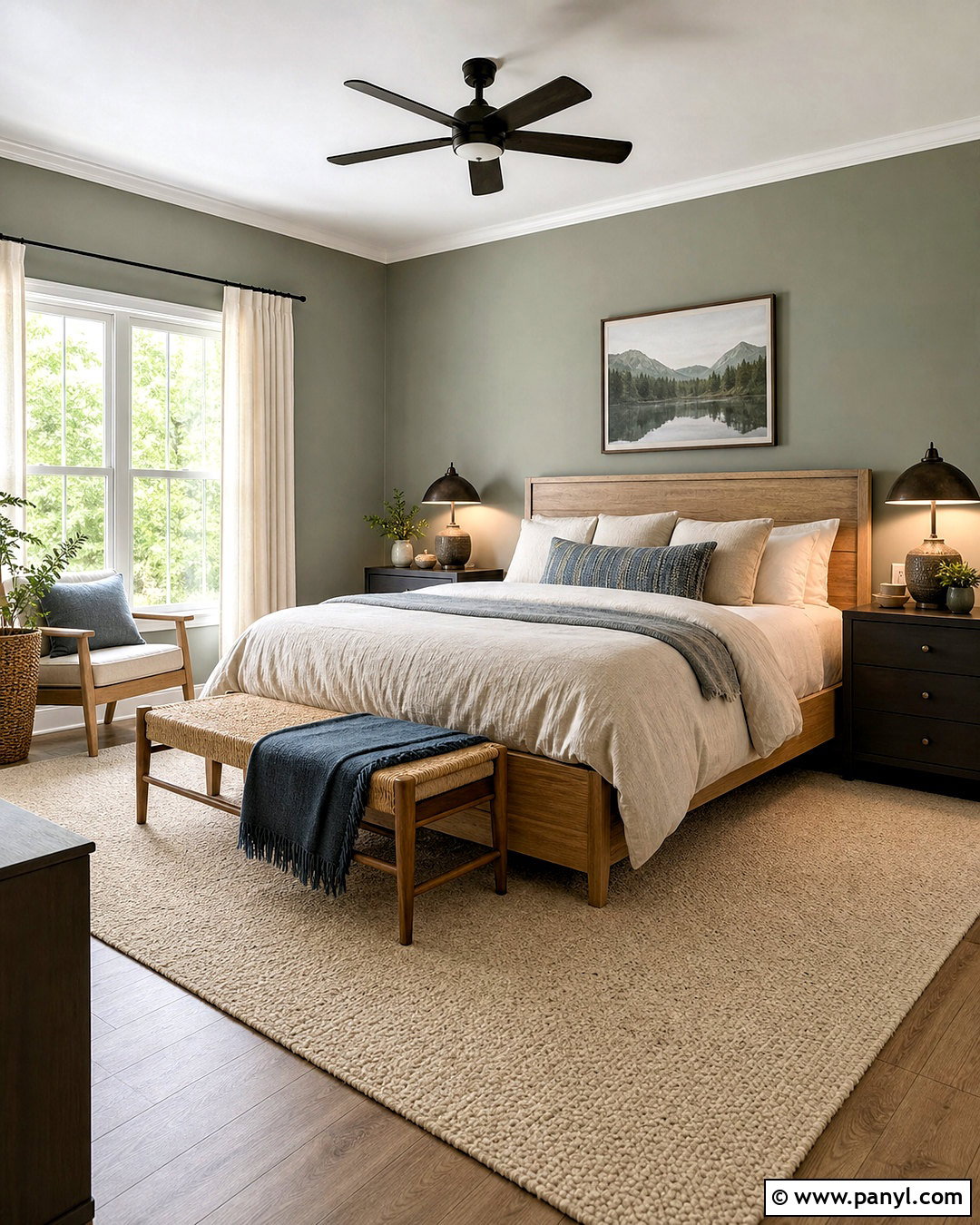
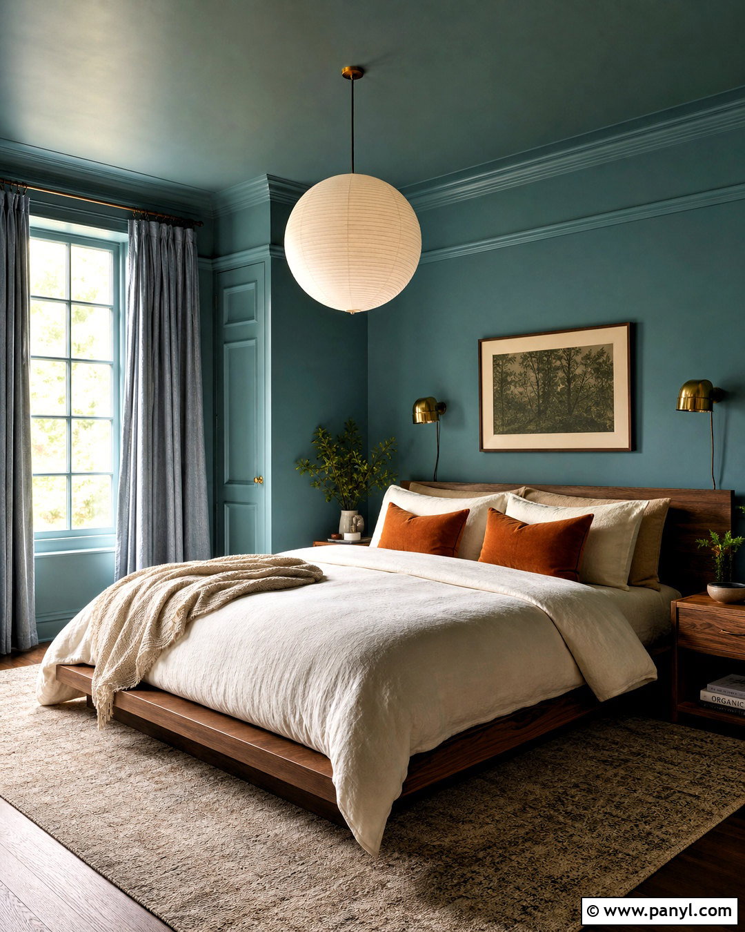
Comfort Gray SW 6205 brings more depth than a pale sage while maintaining a soothing, restful mood. Sherwin-Williams describes it as a calming green that adds softness and coziness to a room. () Use it across all four bedroom walls with warm white trim and a soft white ceiling. A natural oak bed, oatmeal linen bedding, and ivory curtains balance its cool green-gray quality. Introduce muted blue through a patterned lumbar pillow, then ground the room with a charcoal nightstand or dark bronze lamp. A wool rug combining cream, taupe, and faded green helps the palette feel connected rather than overly matched. In brighter rooms, Comfort Gray can appear distinctly green. In shadowed areas, it becomes deeper and grayer, so place a large sample behind the headboard before painting.
3. Oyster Bay SW 6206 Kitchen
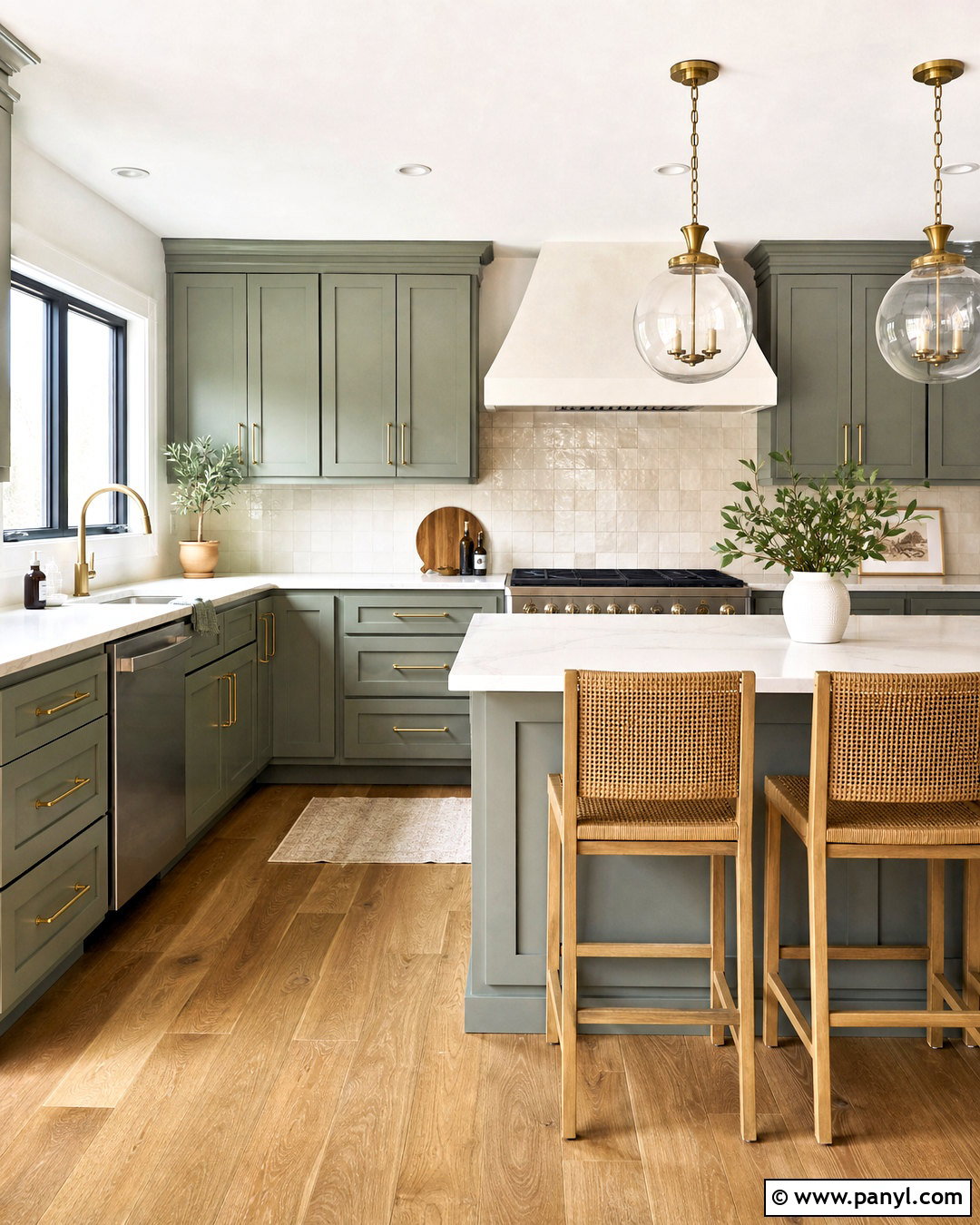
Oyster Bay SW 6206 has enough depth to make kitchen cabinetry noticeable without creating an overly dark room. It belongs to Sherwin-Williams’ green color family and sits among the brand’s muted green-gray options. () Use it on Shaker cabinets with warm white walls, handmade cream backsplash tile, and lightly veined quartz countertops. Brushed brass handles add warmth, while medium oak flooring prevents the scheme from feeling cold. Choose a simple plaster range hood painted to match the walls for a clean focal point. Over the island, hang clear glass pendants with aged brass fittings. Finish the space with counter stools in woven cane and black metal. Oyster Bay works particularly well when the kitchen receives ample natural light, which allows its subdued green character to remain visible.
4. Retreat SW 6207 Home Office
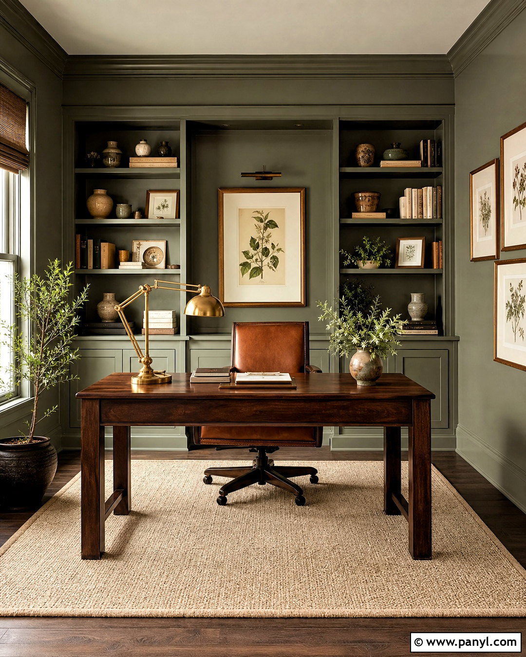
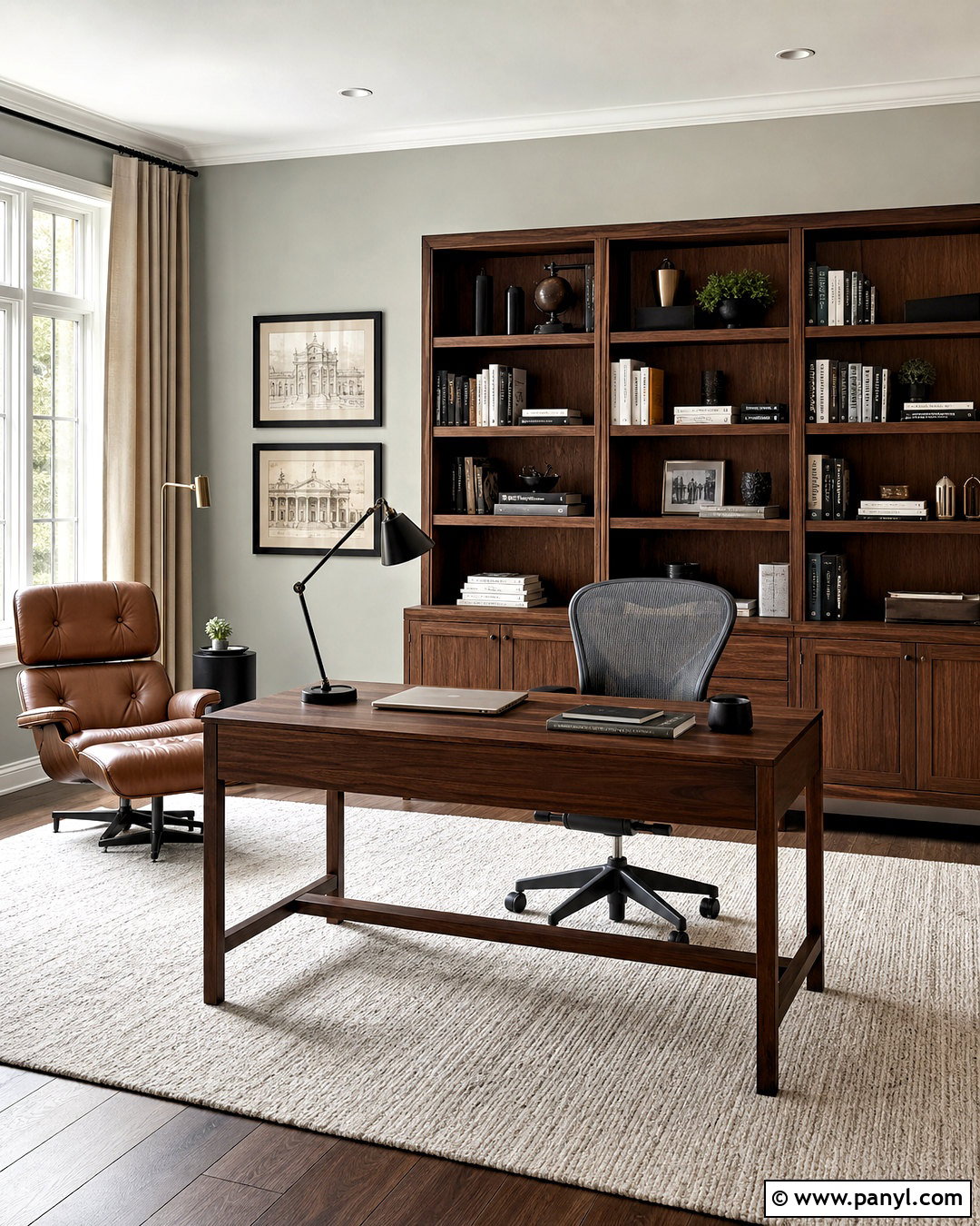
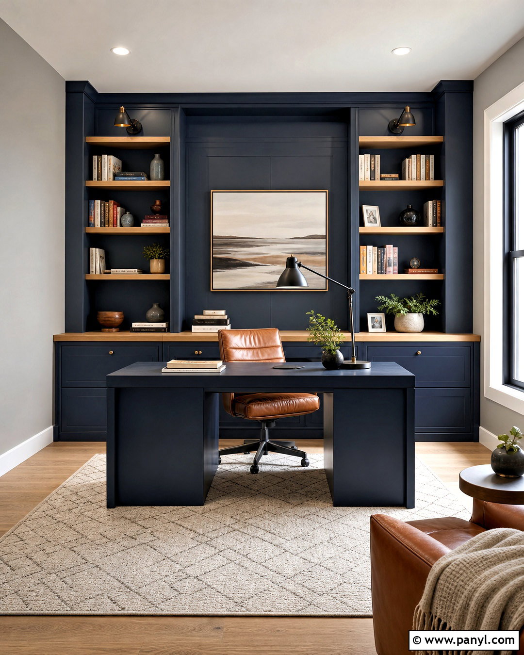
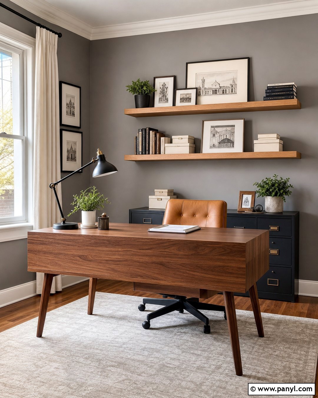
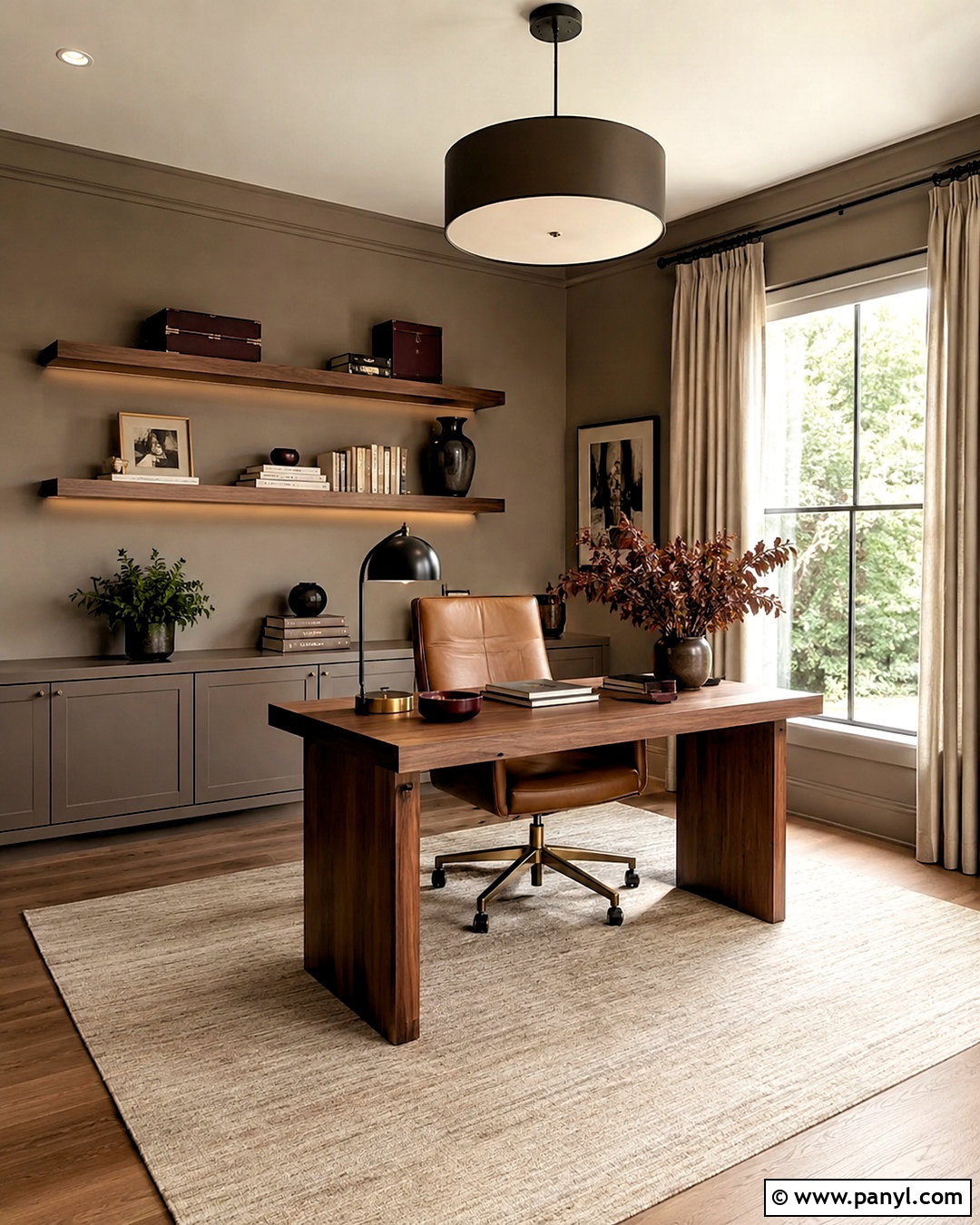
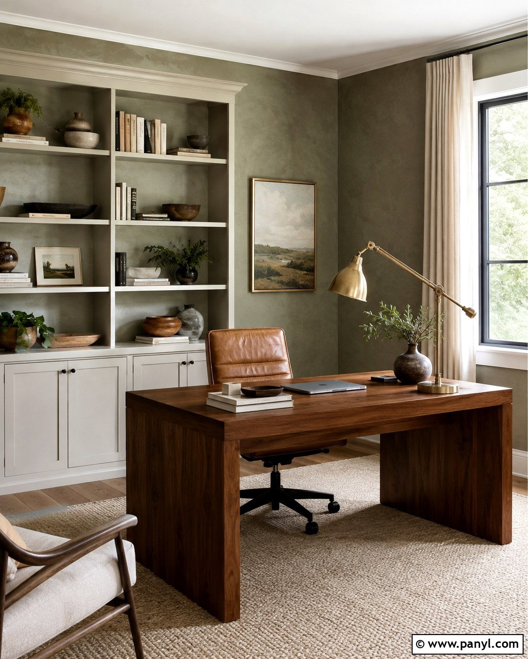
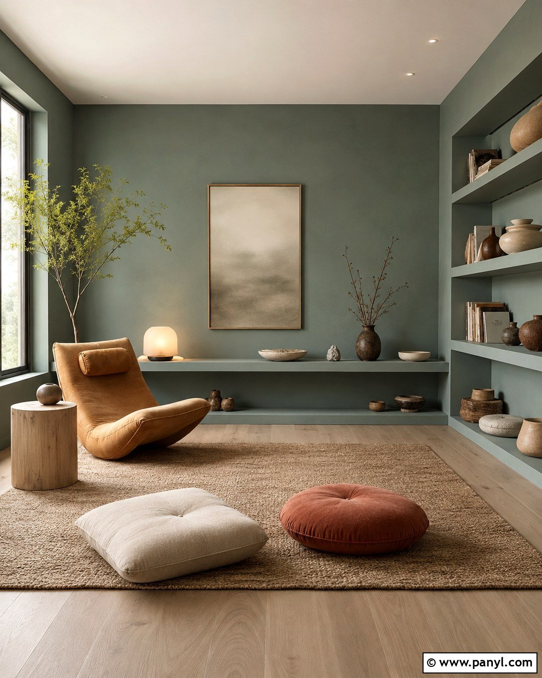
Retreat SW 6207 creates a focused home office with a deep, mature sage-green character. Sherwin-Williams lists Retreat within its green paint family, one step deeper in feeling than lighter green-gray choices. () Paint the walls and built-in bookcases the same color for a cohesive, enveloping effect. Keep the ceiling warm white so the room still feels open. Place a walnut desk near the window and add a cognac leather chair, antique brass task lamp, and cream wool rug. Books, pottery, and framed botanical artwork can introduce soft brown, ivory, and faded terracotta accents. Retreat is strong enough to support dark wood but restrained enough for daily use. Use a satin or semigloss finish on cabinetry and a washable matte or eggshell finish on walls to create subtle dimension.
5. Pewter Green SW 6208 Kitchen
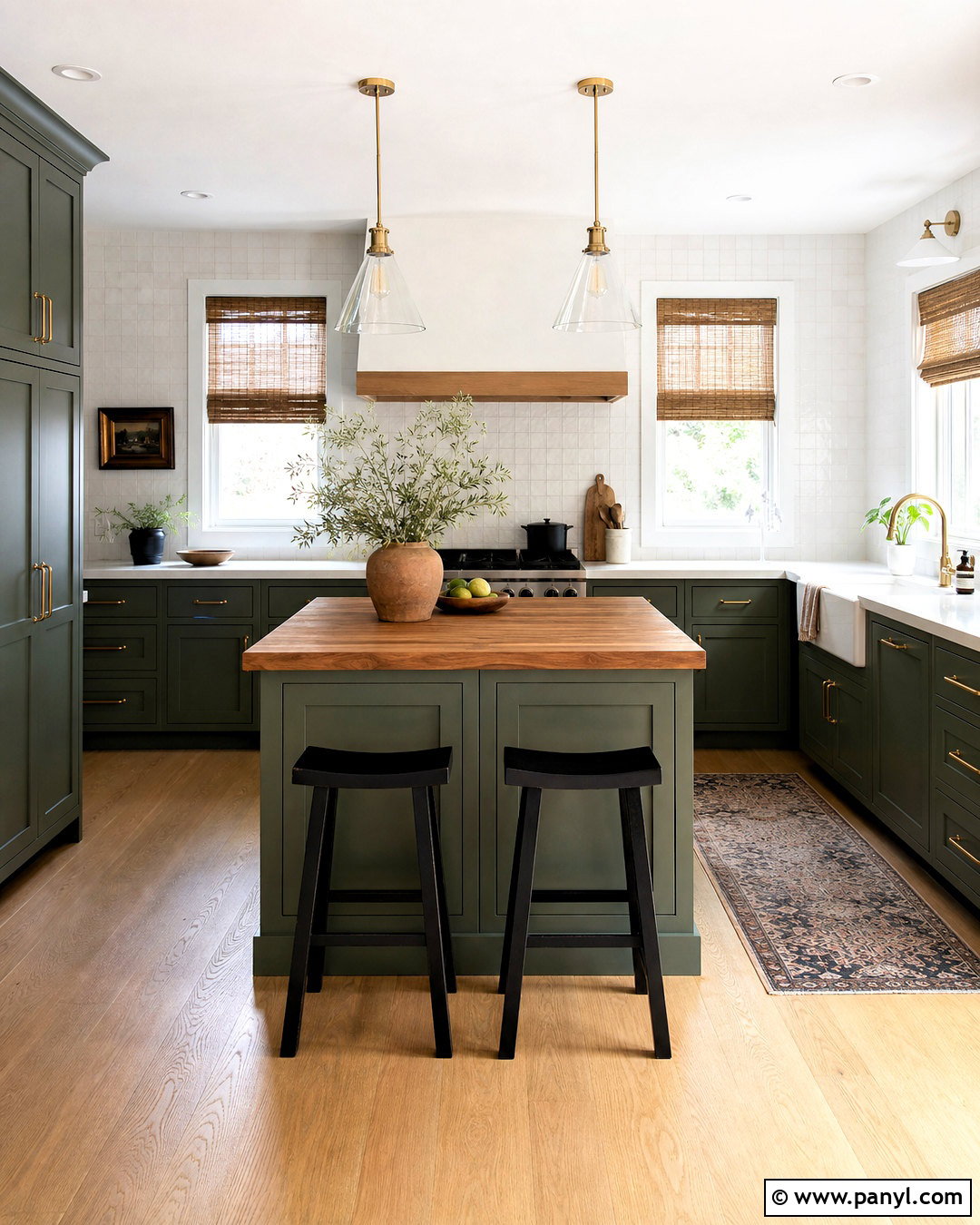
Pewter Green SW 6208 is an excellent choice when you want deep sage cabinetry that feels grounded rather than bright. Sherwin-Williams features this green in real-home kitchen cabinetry inspiration, confirming its suitability for substantial painted surfaces. () Apply it to lower and upper cabinets, then lighten the room with warm white walls and creamy stone countertops. A backsplash of off-white square tile keeps the kitchen classic, while aged brass knobs and a bridge faucet add gentle warmth. Choose medium-tone oak flooring and a butcher-block accent on a small island. Natural linen shades soften the windows without hiding daylight. Because this is a darker shade, include layered lighting under cabinets and over work areas. The completed kitchen feels sophisticated, organic, and comfortable rather than formal or severe.
6. Filmy Green SW 6190 Laundry Room
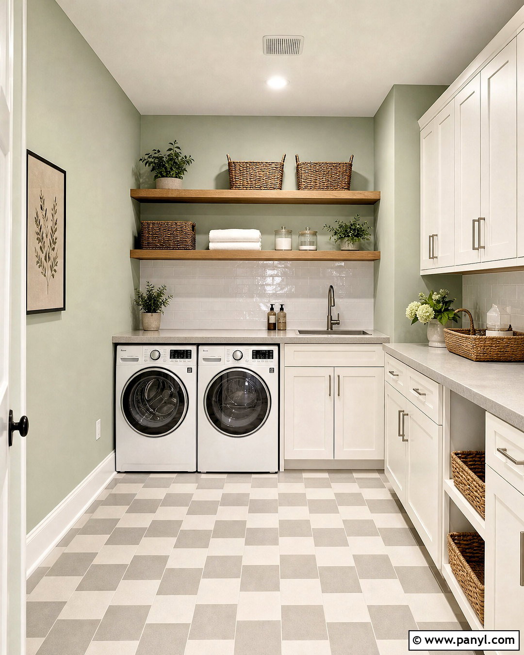
Filmy Green SW 6190 offers a light, quiet sage backdrop that suits a clean and organized laundry room. The color appears in Sherwin-Williams’ green family, making it a useful alternative to plain off-white in hardworking spaces. () Paint the walls Filmy Green and select warm white cabinetry that reaches the ceiling. Add a pale gray quartz counter above the washer and dryer for folding clothes. A backsplash of glossy white rectangular tile reflects light and keeps the room practical. Use brushed nickel cabinet pulls, natural oak floating shelves, and labeled woven baskets for texture. Soft checkerboard flooring in cream and muted gray gives the room character without competing with the walls. Include bright ceiling lighting because pale sage colors can look dull in poorly illuminated rooms. The finished space feels fresh, orderly, and gently colorful.
7. Contented SW 6191 Living Room
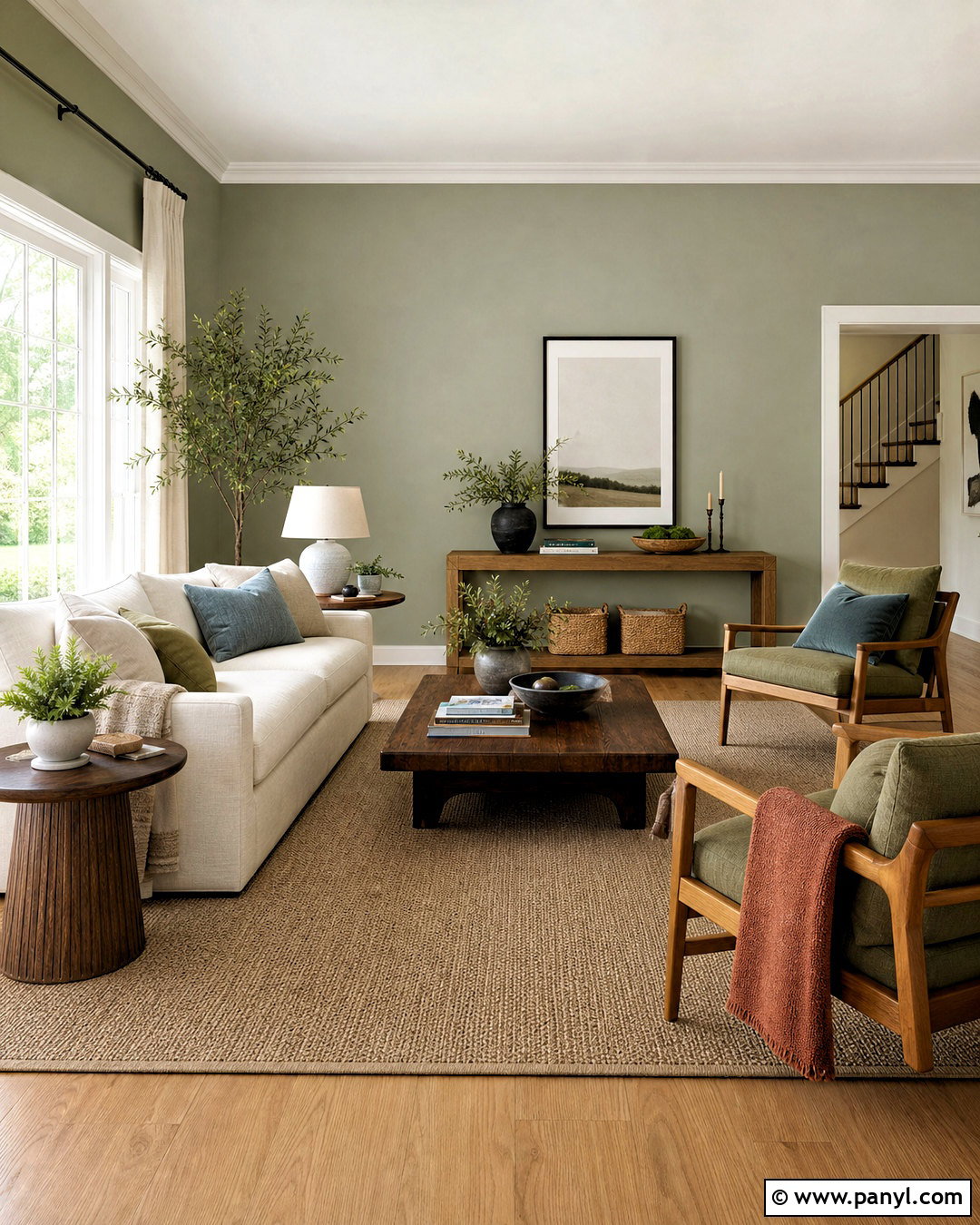
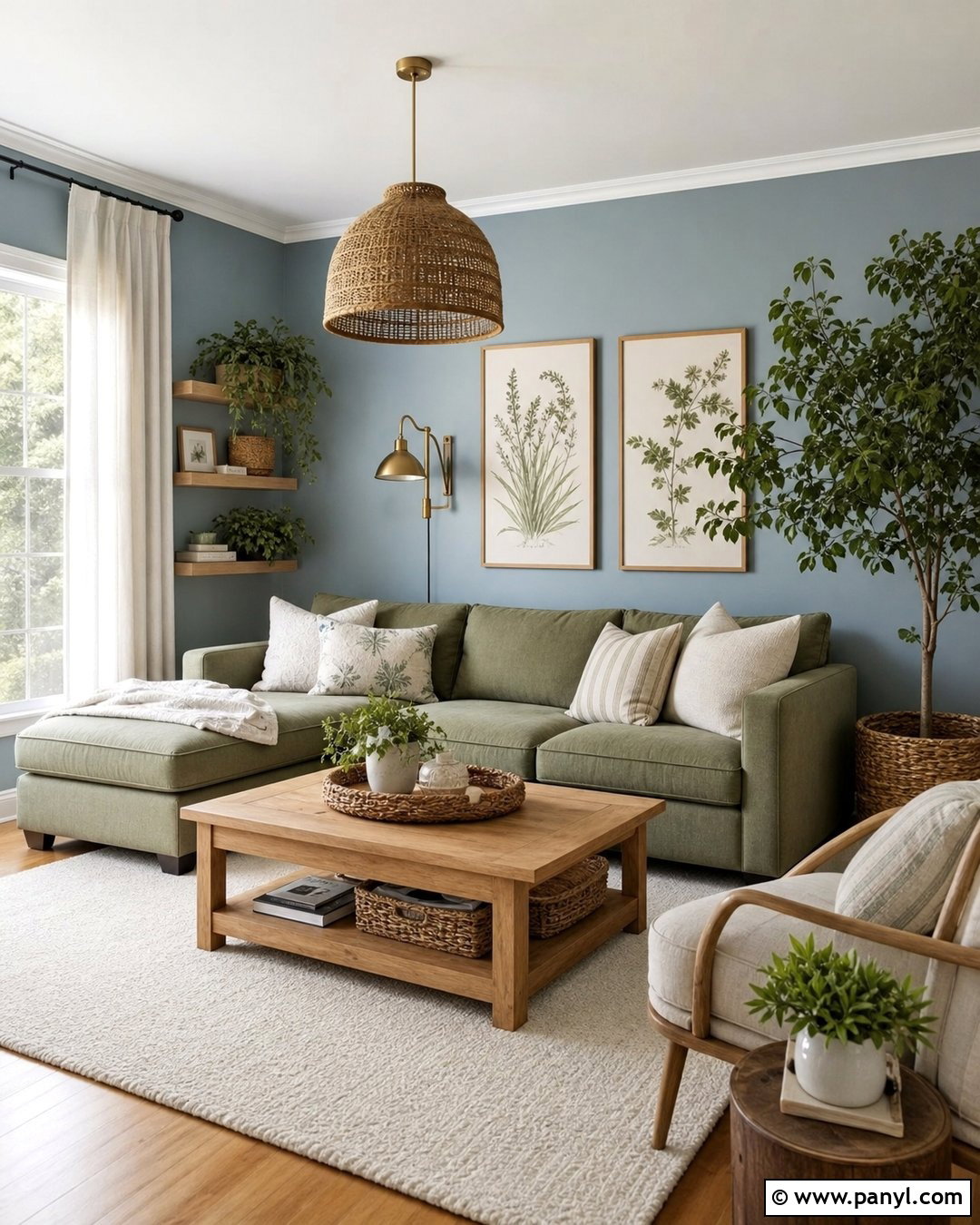
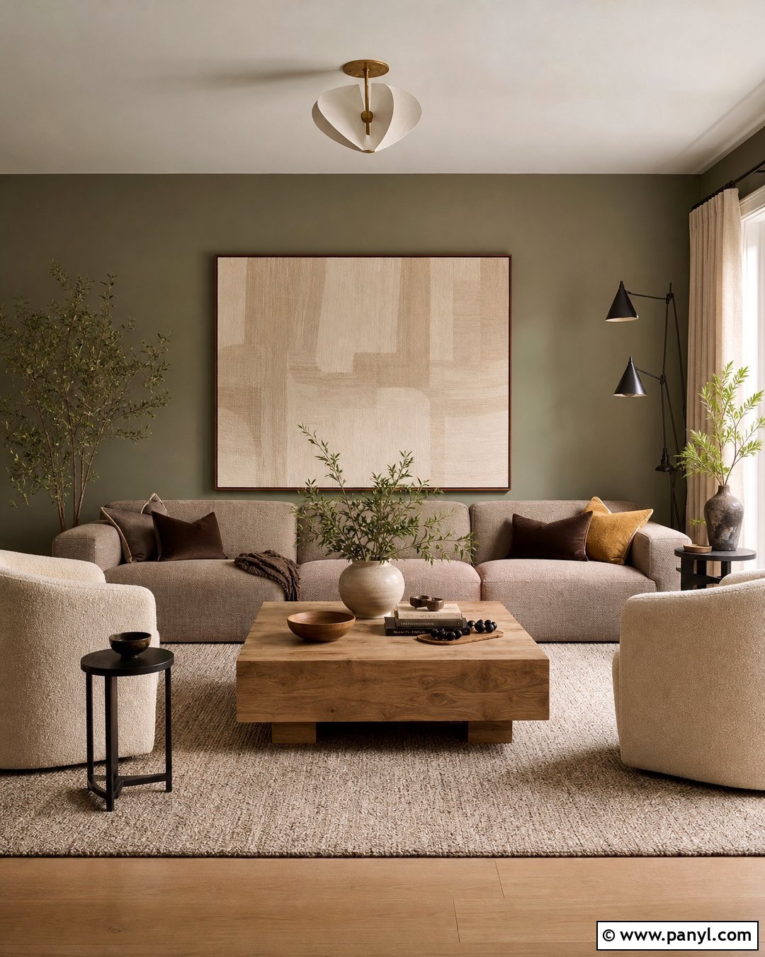
Contented SW 6191 works beautifully in a relaxed living room where you want noticeable green without strong saturation. Sherwin-Williams categorizes it within its green paint collection, and its muted quality allows it to function much like a colored neutral. () Cover the main walls in Contented, then use warm white for the trim, ceiling, and fireplace surround. Choose a cream sofa, two oak-framed lounge chairs, and a large taupe wool rug. Accent the arrangement with moss, dusty blue, and soft rust pillows to create an earthy but balanced palette. A medium walnut coffee table supplies contrast at the center of the room. Add linen curtains and simple landscape artwork with muted greens. This complete scheme is especially effective in open living areas where the wall color must coordinate with both warm wood and neutral upholstery.
8. Sagey SW 6175 Entryway
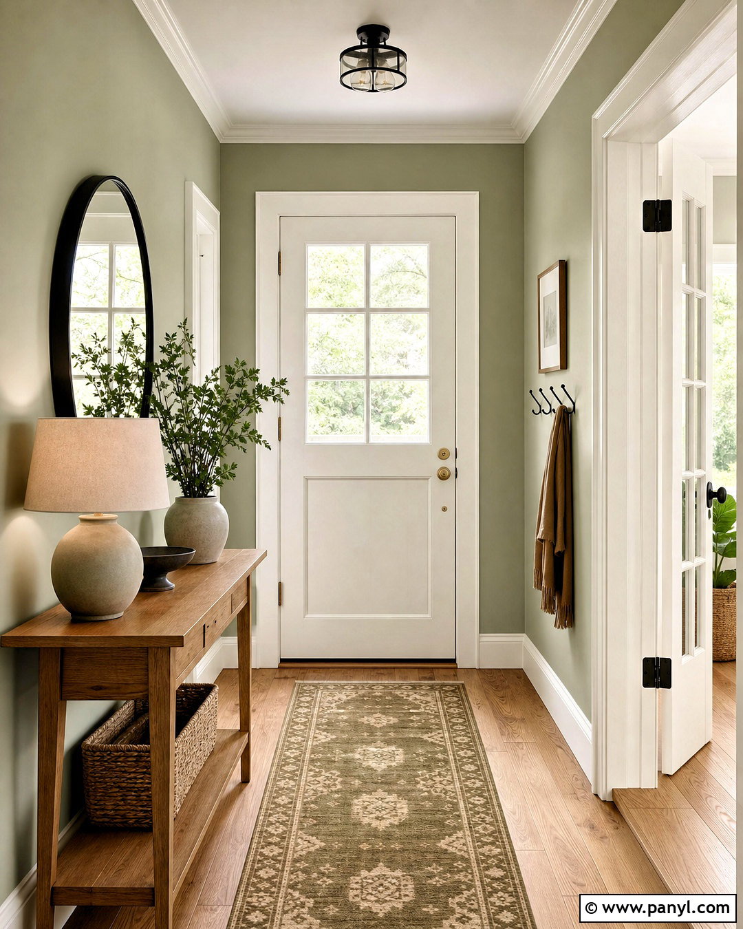
Sagey SW 6175 creates a light, welcoming entry that introduces color without overwhelming connecting rooms. Sherwin-Williams includes Sagey among its green colors and describes its broader green collection as ranging from fresh and airy to muted and grounding. () Paint the entry walls Sagey and retain creamy white on the trim, doors, and ceiling. Place a narrow natural oak console against one wall with a round black-framed mirror above it. A washable runner in cream, olive, and faded tan adds pattern while hiding everyday marks. Include a woven storage basket, ceramic table lamp, and simple wooden hooks for practical organization. Matte black hardware gives the pale walls needed definition. Continue one wood tone and the same white trim into nearby rooms so the entry feels connected to the rest of the home.
9. Liveable Green SW 6176 Dining Room
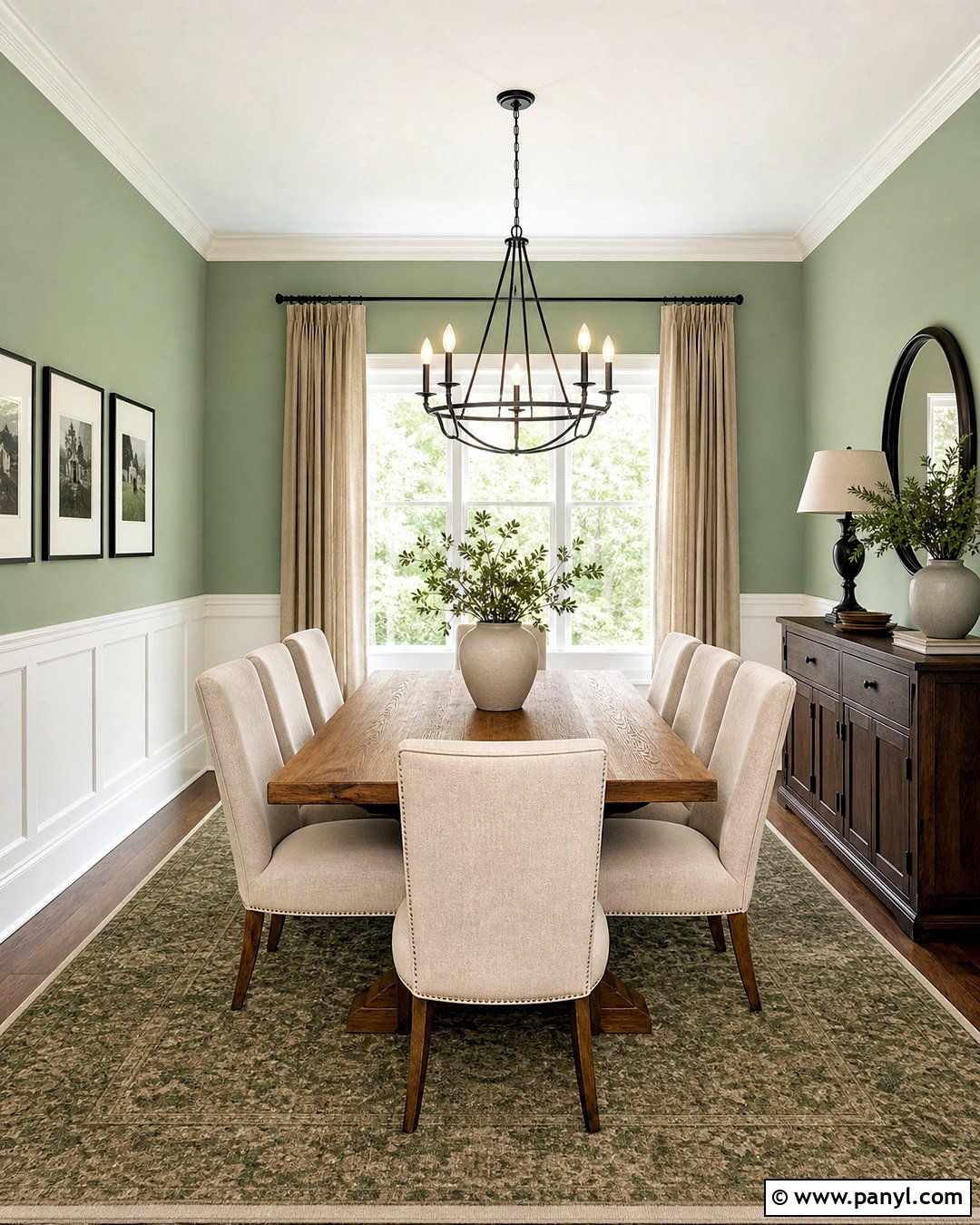
Liveable Green SW 6176 gives a dining room a gentle herbal color that feels warmer than many blue-based sage paints. It is officially listed within the Sherwin-Williams green color family. () Paint the walls above simple white wainscoting, creating a classic two-tone treatment that keeps the room bright. Center a medium oak dining table beneath a black iron chandelier and surround it with upholstered chairs in textured oatmeal fabric. Use flax linen curtains, cream ceramic serving pieces, and a faded patterned rug containing tan and olive. A dark wood sideboard adds enough weight to anchor the lighter palette. For a more contemporary interpretation, skip the wainscoting and color-drench the walls, trim, and built-in cabinet. Liveable Green pairs especially well with warm woods and natural fibers because they emphasize its soft, earthy warmth.
10. Softened Green SW 6177 Kitchen
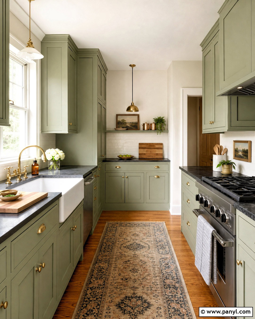
Softened Green SW 6177 creates a warm, timeworn kitchen look that feels comfortable in both traditional and modern homes. Sherwin-Williams lists it as a green paint color, and its subdued character helps compact kitchens gain personality without harsh contrast. () Paint Shaker cabinets Softened Green, then add creamy white walls and lightly mottled ivory backsplash tile. Select soapstone-look counters or dark charcoal quartz to provide definition against the softer cabinetry. Unlacquered brass hardware, a white farmhouse sink, and a walnut cutting board introduce warm, practical materials. Keep the floor medium oak rather than orange-toned wood. A small vintage-inspired runner can combine beige, faded red, and olive. Use bright task lighting to prevent the darker surfaces from absorbing too much light. The resulting kitchen feels established, collected, and highly usable.
11. Clary Sage SW 6178 Bedroom
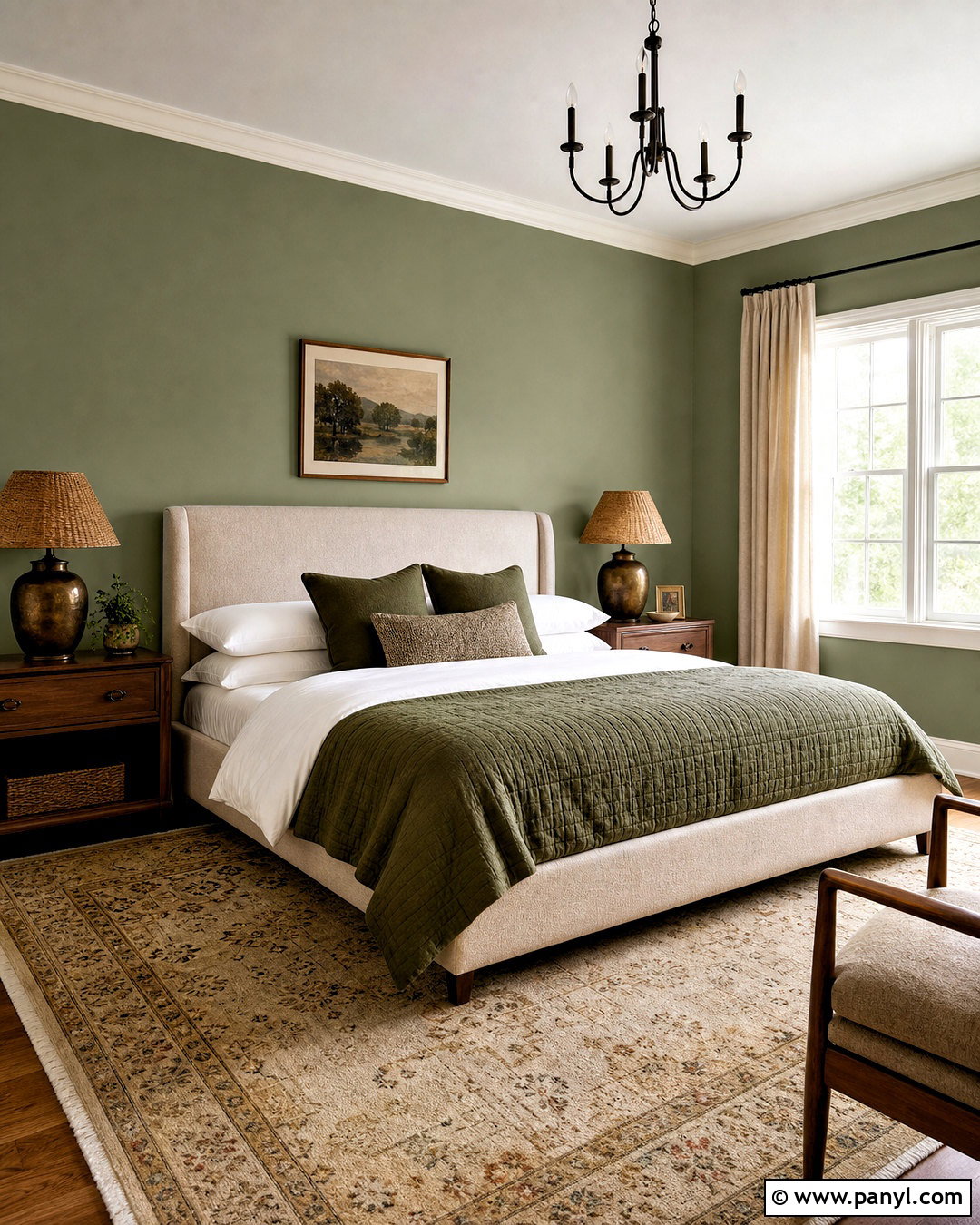
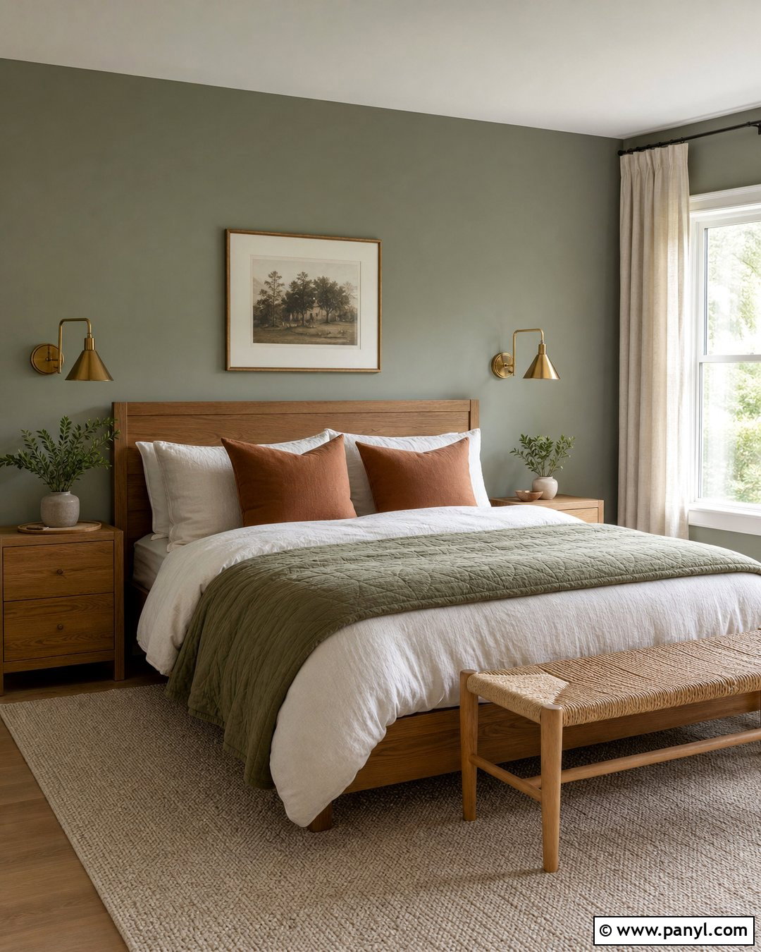
Clary Sage SW 6178 makes a bedroom feel grounded, botanical, and comfortably cocooned. Sherwin-Williams officially places the shade in its green paint family, and it carries greater visual weight than its lighter neighboring greens. () Paint every wall Clary Sage and use a warm ivory on the ceiling to soften the contrast. Build the room around an upholstered oatmeal bed with white sheets, a moss-colored quilt, and patterned pillows in cream and muted clay. Add walnut nightstands, aged bronze lamps, and woven shades that filter rather than block daylight. A vintage-style rug with beige, brown, and faded green connects the furnishings to the walls. Keep artwork simple and generously scaled. In a smaller bedroom, matching the trim to the walls can reduce visual breaks and create a more seamless, intentional finish.
12. Svelte Sage SW 6164 Living Room
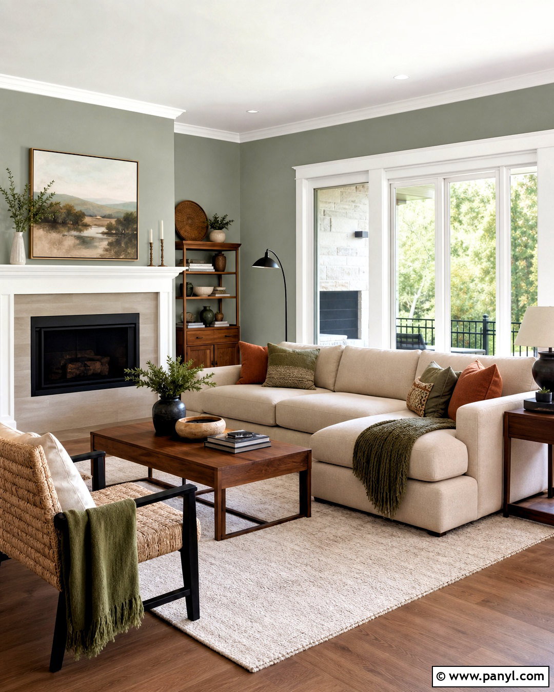
Svelte Sage SW 6164 delivers a balanced, medium sage that can support an entire living room palette. Sherwin-Williams describes it as a nature-inspired green with a cool gray undertone and recommends coordinating it with Nonchalant White, Creamy, and Maison Blanche. () Use Svelte Sage on the walls with Creamy trim for a softer result than crisp white. Arrange a beige sectional, walnut coffee table, and two woven accent chairs around a large ivory-and-taupe rug. Add black metal through curtain rods and floor lamps, then layer rust, olive, and cream cushions for warmth. Linen drapery and simple pottery keep the materials natural. Since the gray undertone may become stronger in northern light, include warm bulbs and substantial wood furniture to maintain an inviting, balanced atmosphere throughout the day.
13. Escape Gray SW 6185 Bathroom
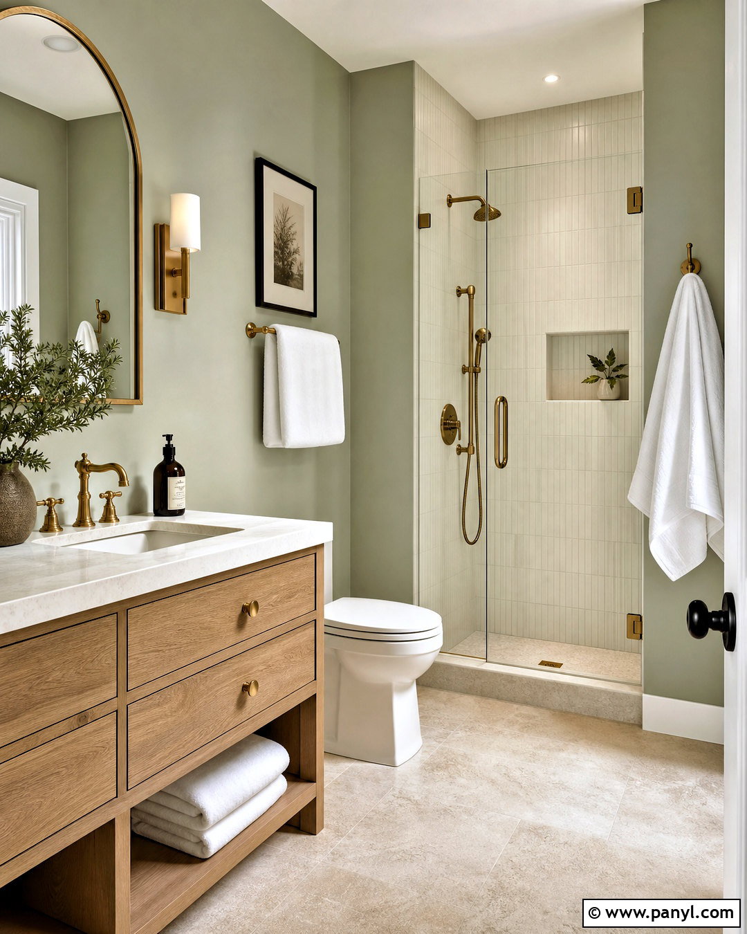
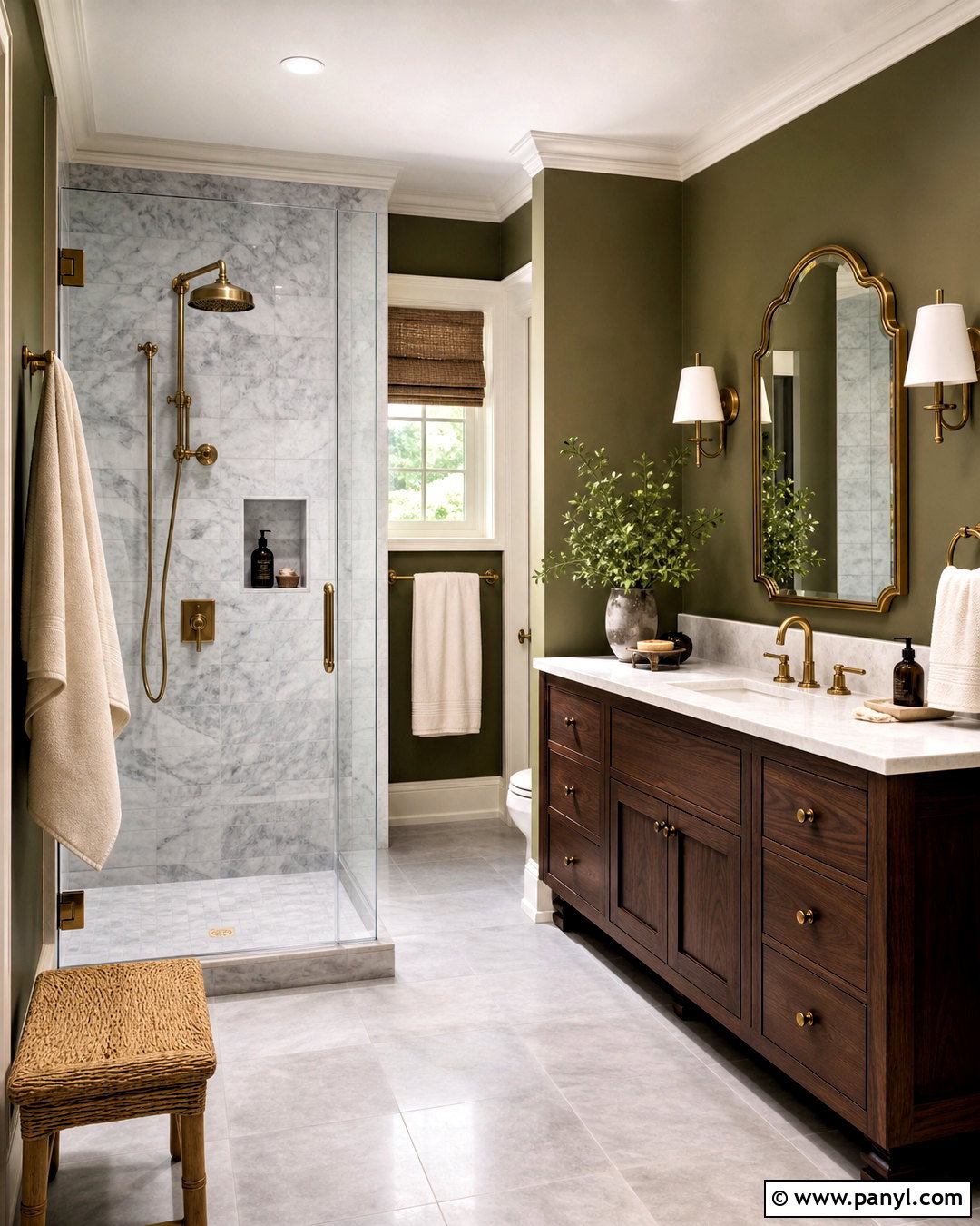
Escape Gray SW 6185 provides a subtle green-gray bathroom palette for homeowners who prefer restrained color. Despite its name, Sherwin-Williams categorizes Escape Gray within the green family. () Use it on the walls around a white oak vanity with a creamy quartz top. Install vertically stacked ivory tile inside the shower, along with brushed brass plumbing fixtures and a clear glass enclosure. A rounded mirror and slim brass sconces soften the straight tile lines. Choose limestone-look flooring in a warm beige rather than a cold blue-gray. Complete the room with white towels, a natural wood stool, and one leafy plant. Escape Gray can read more neutral in indirect light, making it useful for an attached bathroom that needs to coordinate with a beige, cream, or muted green bedroom.
14. Dried Thyme SW 6186 Kitchen
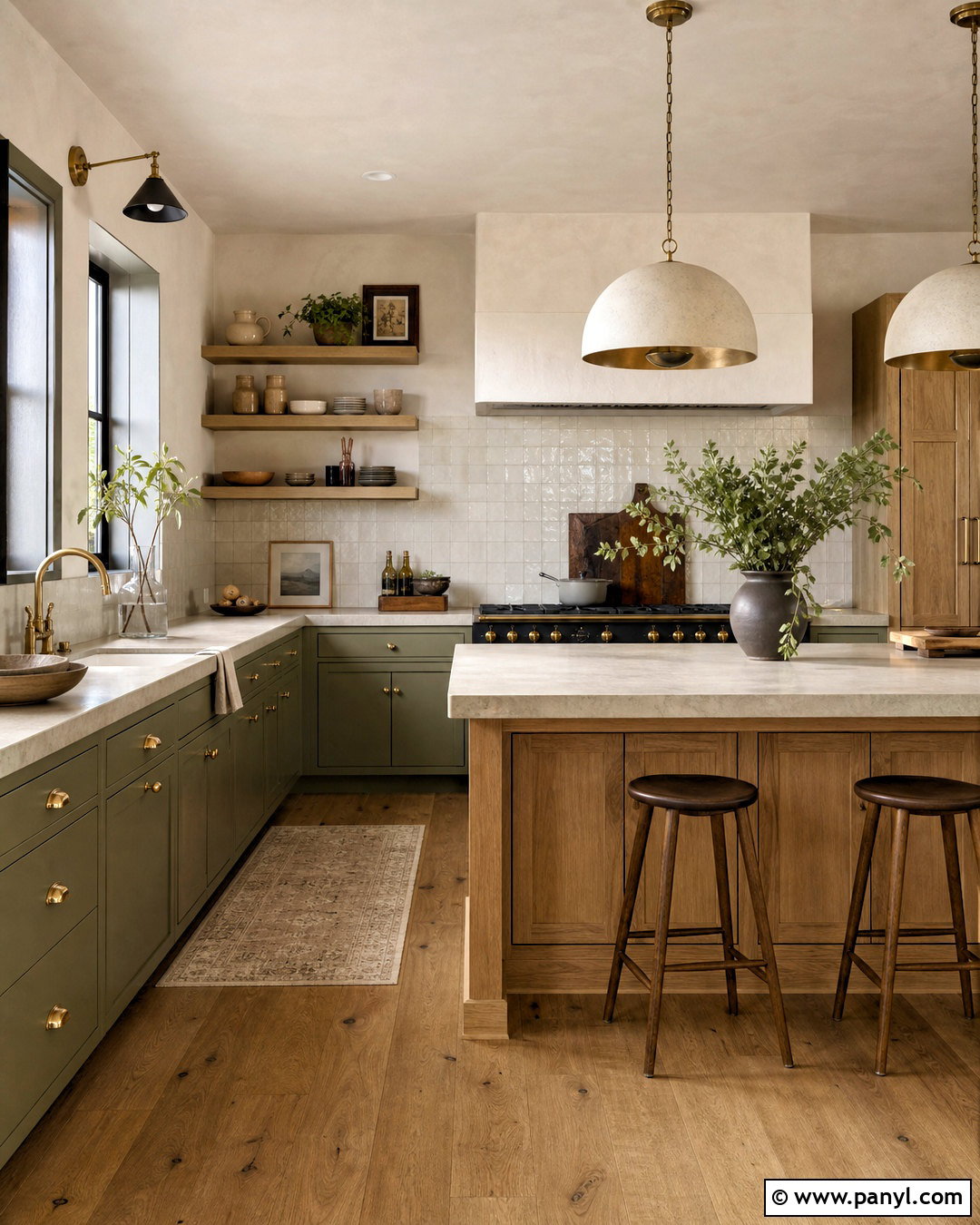
Dried Thyme SW 6186 creates rich olive-sage kitchen cabinets with a warm, organic presence. Sherwin-Williams includes this shade in its official selection of green paint colors. () Use it on full-height cabinetry and balance the depth with creamy plaster walls, a white oak island, and pale stone countertops. Handmade zellige-style backsplash tile in soft ivory adds reflected light and slight texture. Choose aged brass knobs, a matching faucet, and simple dome pendants over the island. Warm oak flooring connects the wood island to the surrounding room. Keep decorative pieces limited to cream pottery, wooden boards, and fresh greenery. Dried Thyme is particularly successful in kitchens with generous windows, but layered ceiling, pendant, and under-cabinet lighting will help the color remain readable after sunset.
15. Evergreen Fog SW 9130 Exterior
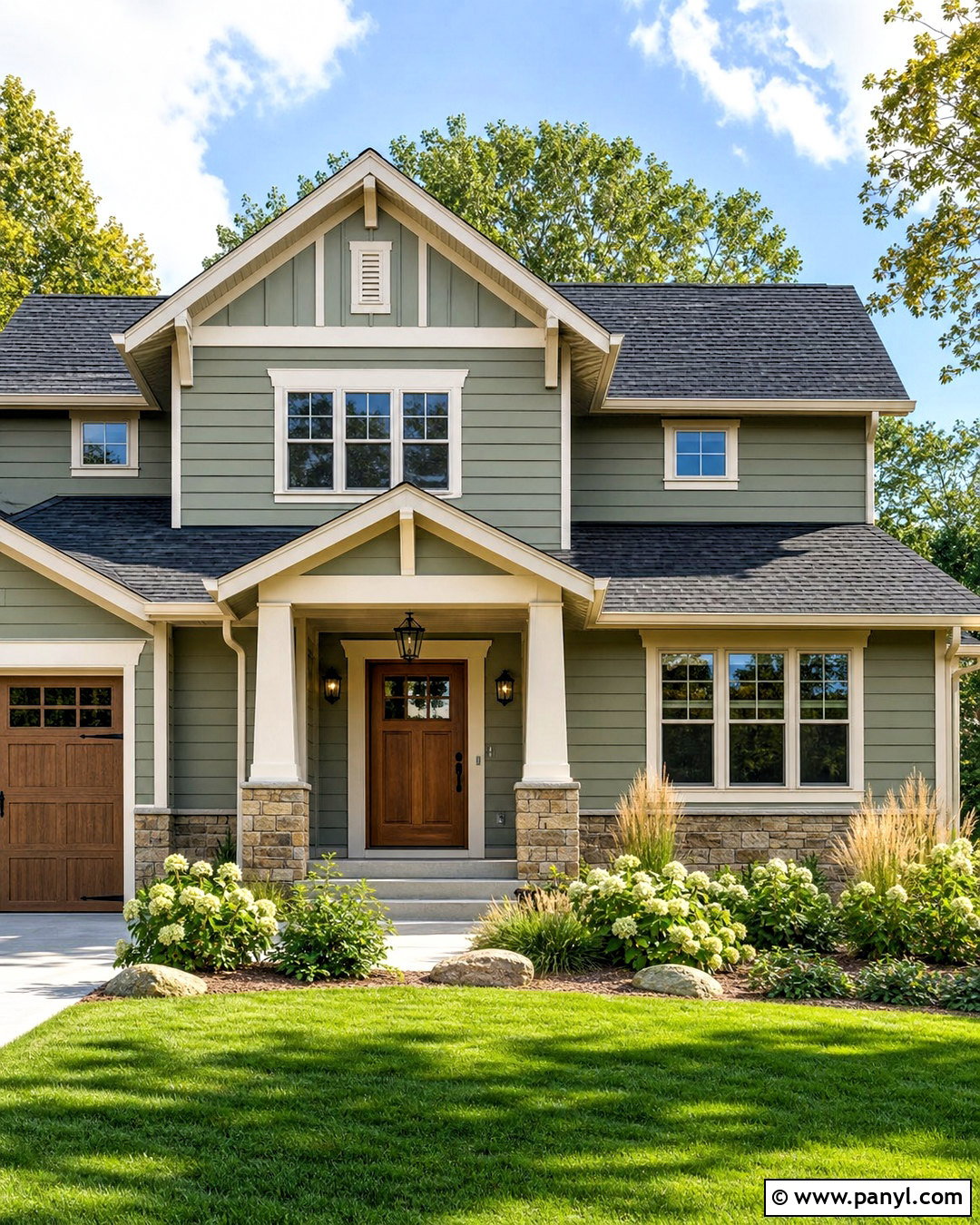
Evergreen Fog SW 9130 gives a house exterior a muted sage-green finish that feels current yet easy to coordinate with natural materials. Sherwin-Williams presents the color within its green collection and has featured it in both bedroom and kitchen applications. () Apply it to horizontal siding with warm white trim, charcoal roof shingles, and natural stone around the foundation. Use a stained medium-brown front door to introduce warmth, then repeat that tone on porch posts or garage details. Black lanterns and house numbers provide crisp contrast. Complete the curb appeal with ornamental grasses, evergreen shrubs, hydrangeas, and a light gravel walkway. Exterior sunlight can make muted colors appear lighter, so test a large sample on more than one side of the house before selecting the final formula.
16. Acacia Haze SW 9132 Mudroom
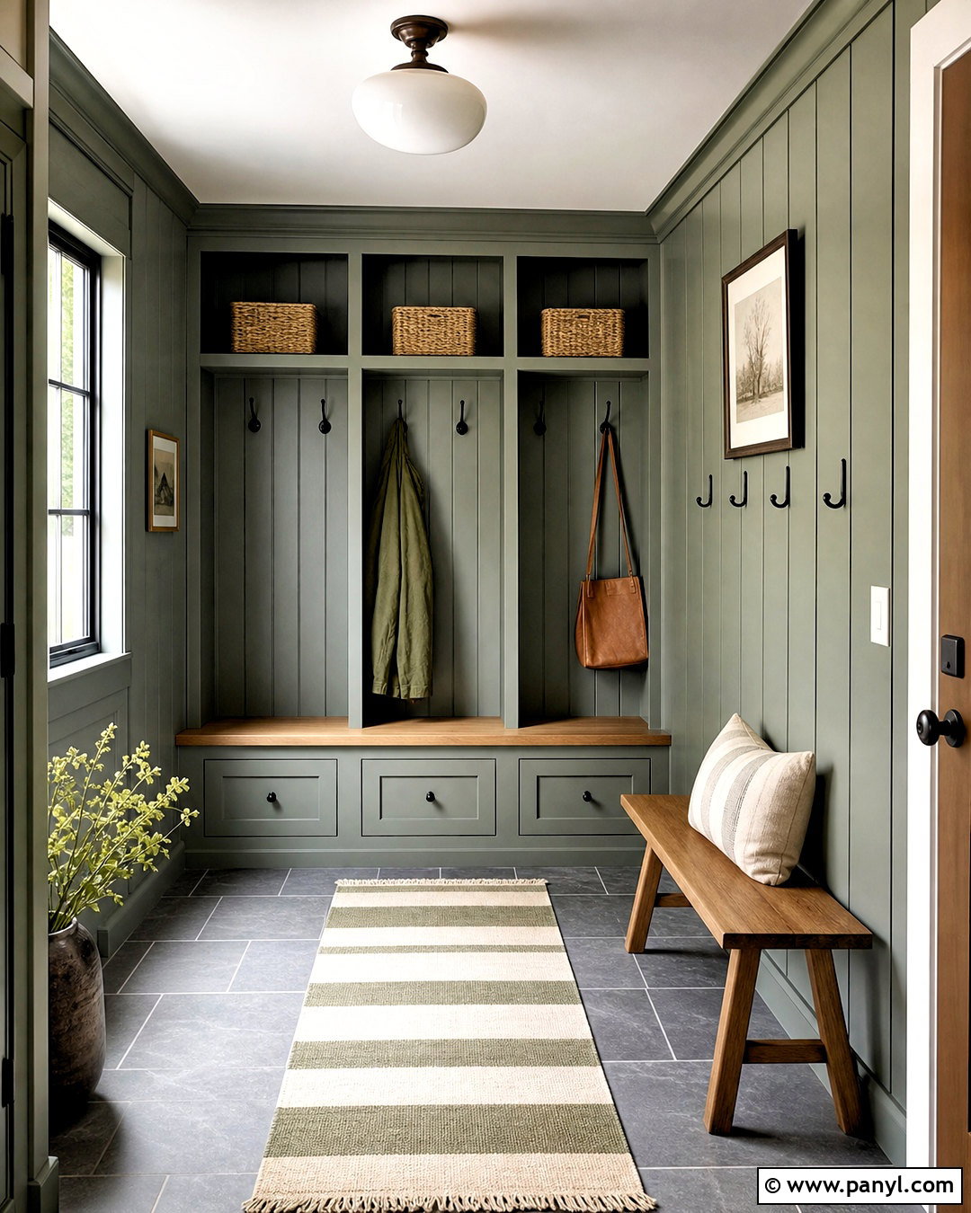
Acacia Haze SW 9132 creates a durable-looking mudroom with a deeper green-gray tone that can hide everyday scuffs better than a pale wall color. Sherwin-Williams officially lists it as part of its green paint family. () Paint built-in lockers, drawers, and wall paneling Acacia Haze, then use warm white above the paneling and across the ceiling. Add a natural oak bench seat, woven baskets, and sturdy black hooks. Flooring in warm gray slate or durable slate-look porcelain provides practical contrast. A striped indoor-outdoor runner can introduce cream, charcoal, and olive without appearing busy. Install a bright opal-glass ceiling fixture and concealed lighting inside darker storage areas. This color also works well on an interior door leading into the mudroom, helping the transition feel planned and cohesive.
17. Garden Sage SW 7736 Sunroom
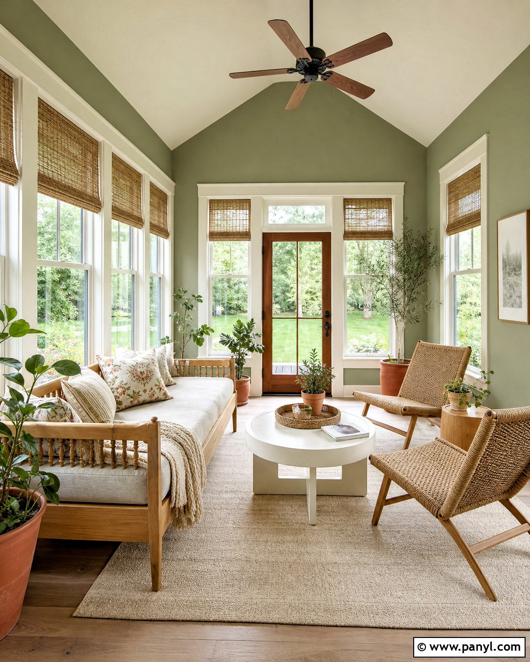
Garden Sage SW 7736 creates an earthy sunroom that complements abundant greenery outside the windows. Sherwin-Williams suggests Alabaster, Pacer White, and Portabello as coordinating colors for this shade. () Paint the walls Garden Sage and use Alabaster on the trim and ceiling for warm, understated contrast. Furnish the room with a light oak daybed, woven lounge chairs, and a round pedestal table in soft white. Add linen cushions in cream, Portabello-inspired brown, and faded botanical green. Natural fiber shades control glare, while an ivory indoor-outdoor rug keeps the room easy to maintain. Include several plants in terracotta and off-white pots, but vary their shapes and sizes to avoid clutter. The finished sunroom feels connected to the landscape while remaining comfortable, practical, and clearly defined as an indoor living space.
18. Sheraton Sage SW 0014 Dining Room
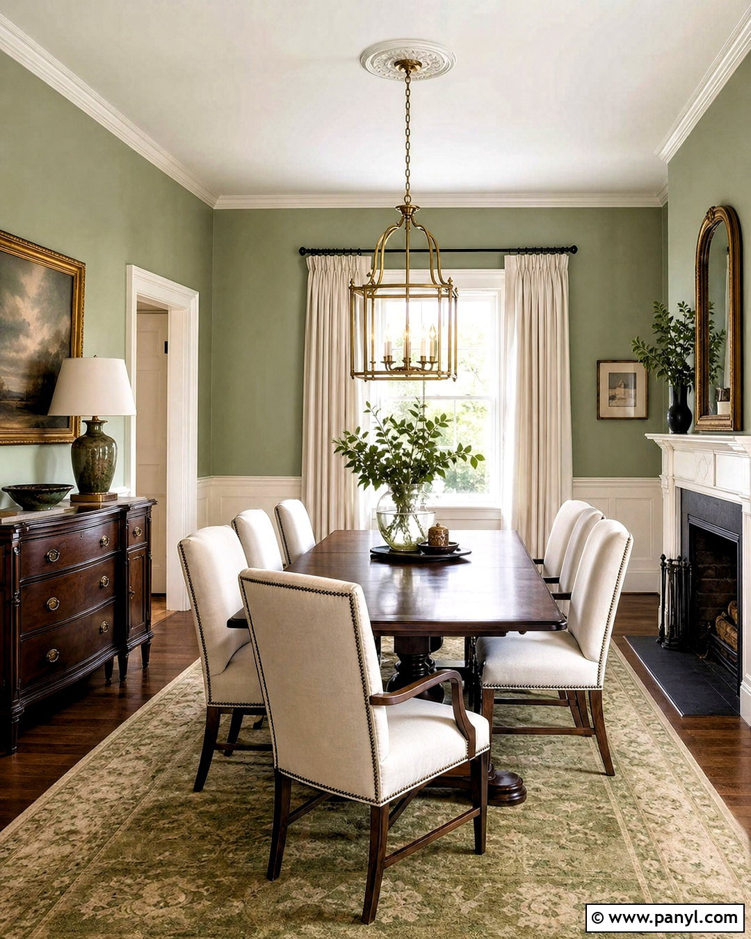
Sheraton Sage SW 0014 supports a historic-inspired dining room with traditional architecture and an understated green palette. Sherwin-Williams pairs this shade with Sedate Gray and Muddled Basil. () Use Sheraton Sage above warm white paneled wainscoting, then paint the ceiling a barely warm off-white. Center a dark walnut dining table in the room and add simple chairs upholstered in cream fabric. A brass lantern-style chandelier brings warmth overhead, while a muted Persian-style rug introduces olive, tan, and soft charcoal. Dress the windows with full-length ivory linen panels. Botanical prints in narrow antique brass frames reinforce the classic setting without making it feel themed. For continuity, repeat the dark wood in a sideboard and use Muddled Basil sparingly on a display cabinet or adjacent door.
19. Sage Green Light SW 2851 Porch
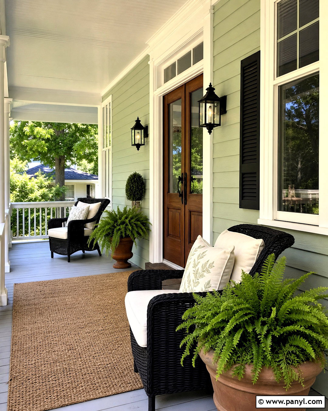
Sage Green Light SW 2851 creates a soft, historic porch scheme that looks natural beside traditional siding, brick, and mature landscaping. Sherwin-Williams identifies it as a historic green and lists it alongside Sage SW 2860. () Paint porch walls or siding Sage Green Light, then use creamy white on columns, railings, window trim, and the ceiling. A medium walnut front door supplies warmth, while matte black lanterns and hardware add definition. Furnish the porch with woven chairs, ivory seat cushions, and a small teak table. Use terracotta planters filled with ferns and restrained flowering plants. A natural coir rug finishes the entrance. Since covered porches receive less direct light, this lighter sage can retain its color without making the entry feel enclosed or shadowy.
20. Sage SW 2860 Exterior
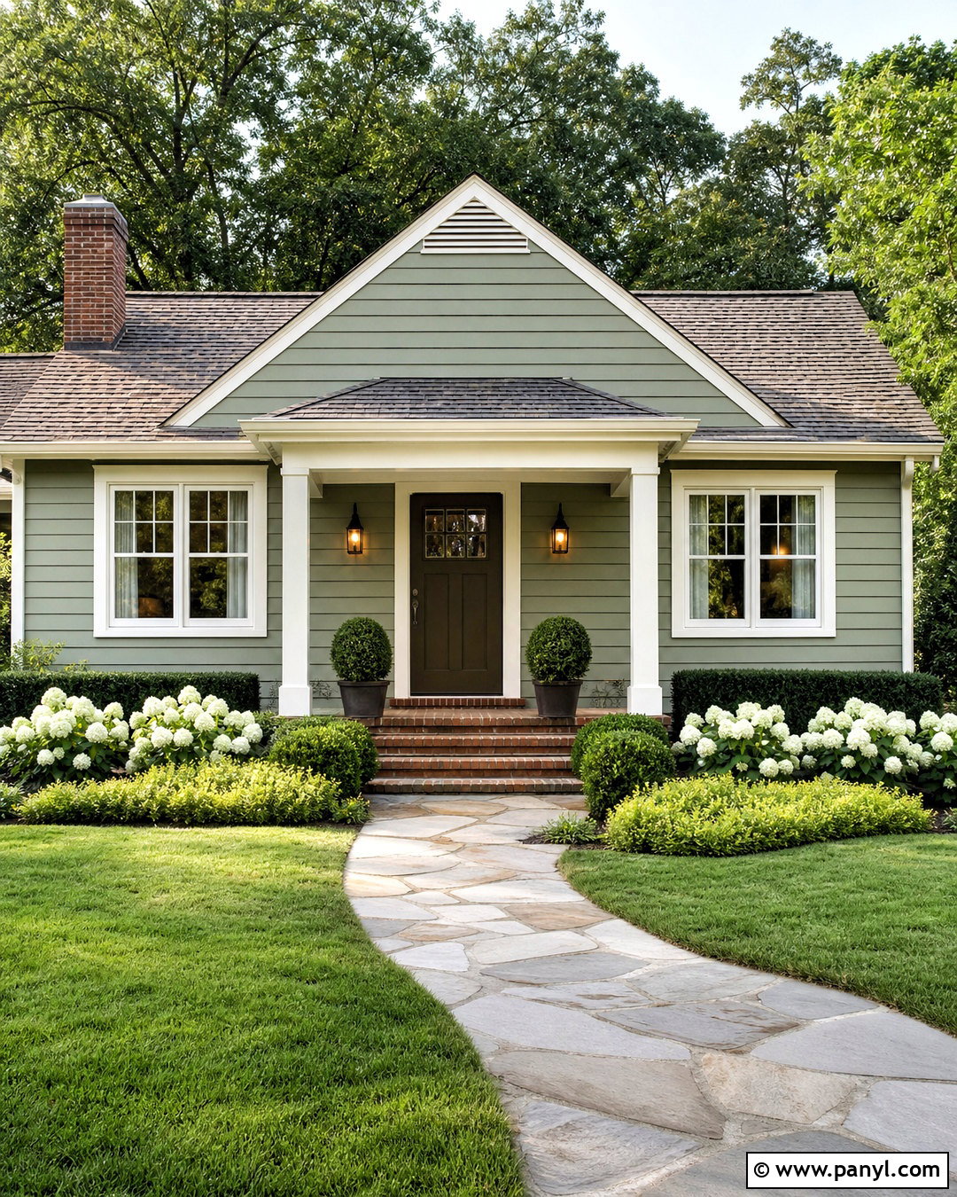
Sage SW 2860 offers a classic exterior green with a historic character and a subtle yellow influence. Sherwin-Williams describes it as a cool neutral green with lighthearted yellow tints and coordinates it with White Heron and Sage Green Light. () Use Sage on lap siding, White Heron on the trim and porch columns, and a deeper brown-green on the front door. A weathered gray roof keeps the palette quiet, while red-brown brick steps add warmth. Choose bronze exterior lights rather than stark black fixtures for a softer traditional effect. Complete the yard with boxwood, white hydrangeas, ornamental grasses, and a curved stone path. This full scheme suits cottages, bungalows, and modest traditional homes because the colors feel established without making the facade appear dated.
Conclusion:
These **20 sw sage green paint colors** show how varied sage can be, from the misty softness of Sea Salt to the substantial depth of Pewter Green. Pale shades work well in bathrooms, laundry rooms, and covered porches, while medium greens bring comfort to bedrooms, dining rooms, and living areas. Darker selections can transform cabinets, offices, mudrooms, and exterior siding. The most successful palette also considers flooring, wood tones, trim color, hardware, textiles, and lighting. Always view a large painted sample in morning, afternoon, and evening conditions. Check it beside every permanent finish before buying paint. With thoughtful testing, the right Sherwin-Williams sage can create a connected, calming home that still has personality and visual depth.

Related Ideas and Inspiration:
Leave a Reply