
Neutral accent walls add depth, warmth, and focus without overpowering a room. Instead of relying only on cool gray, today’s neutral palettes also include warm greige, taupe, mushroom, earthy brown, muted sage, and softened blue-gray. These shades create contrast while remaining easy to coordinate with furniture, flooring, and changing seasonal decor. Warm neutrals and nature-inspired tones are especially useful for creating comfortable, layered interiors that do not feel flat. () Choose the wall behind a bed, sofa, fireplace, desk, or dining table, then repeat its undertone through wood, textiles, and accessories. Always test a large sample because daylight and artificial lighting can change the result. Explore these complete and practical **20 Neutral Accent Wall Color Ideas**.

1. Warm Greige Accent Wall
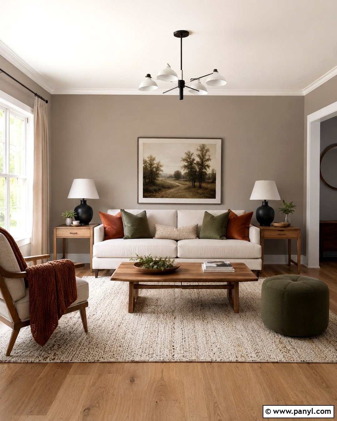
A warm greige accent wall gives a living room definition without creating harsh contrast. Paint the wall behind the sofa in a medium greige with balanced beige and gray undertones. Keep the surrounding walls warm white so the feature wall appears intentional and softly grounded. Add a cream linen sofa, a natural oak coffee table, and oatmeal curtains to continue the relaxed palette. Matte black lighting and picture frames provide crisp structure, while rust or muted olive pillows introduce restrained color. A textured wool rug helps connect the warm and cool elements. This scheme works particularly well in transitional living rooms because it complements both traditional furniture and clean modern lines. Use an eggshell finish for subtle durability and gentle light reflection.
2. Soft Taupe Accent Wall
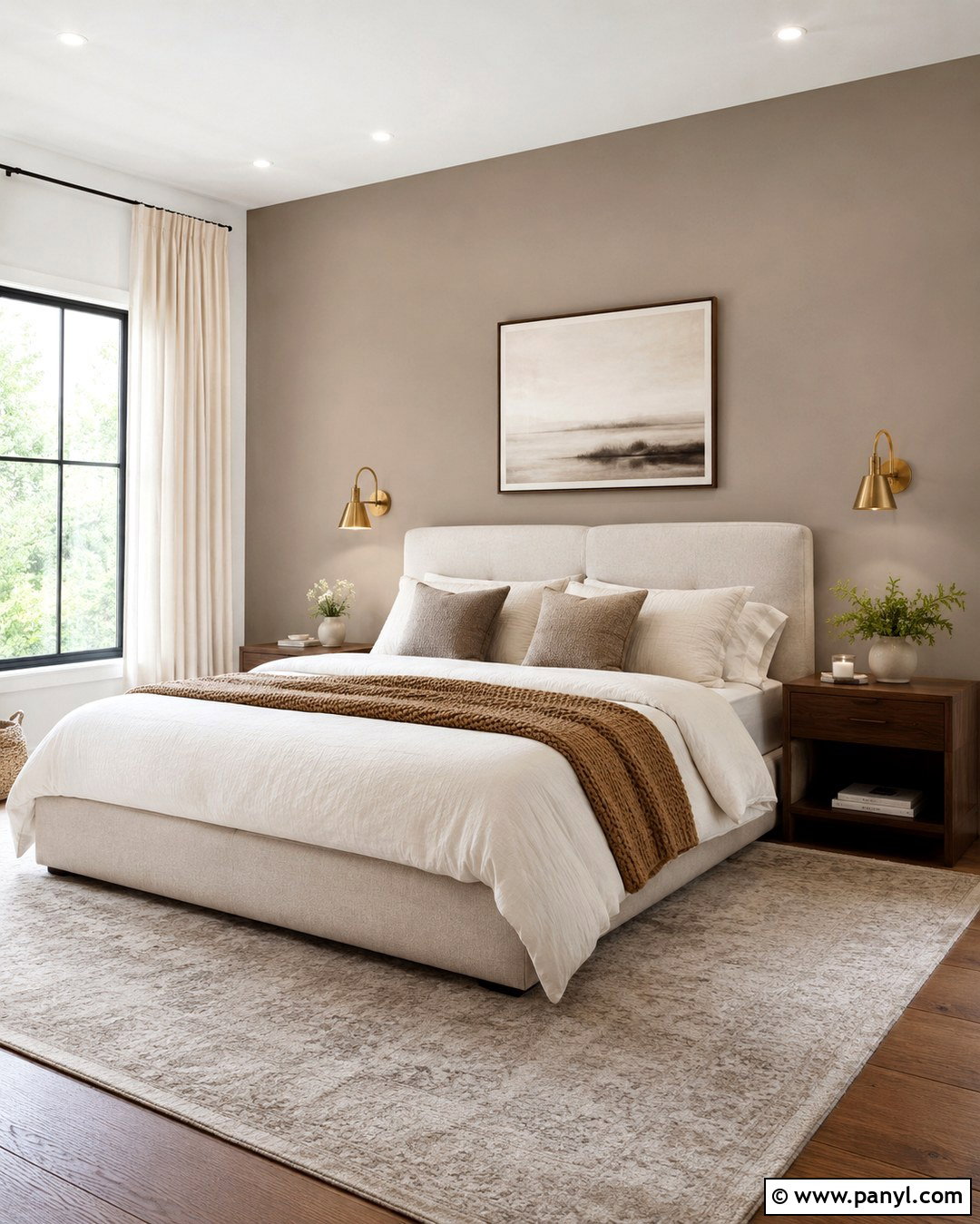
Soft taupe creates a cozy bedroom focal point while feeling more inviting than standard gray. Place the color behind an upholstered cream bed, where its brown undertones can frame the headboard and make pale bedding stand out. Choose warm white for the remaining walls and ceiling. Layer the bed with ivory sheets, mushroom-colored pillows, and a caramel knit throw. Walnut nightstands and brushed brass sconces reinforce the wall’s warmth without making the room feel overly brown. Finish the design with a faded beige rug and simple botanical artwork. Taupe changes noticeably throughout the day, so test it beside the flooring and fabric before painting. A medium-value shade usually provides enough contrast while preserving a quiet, restful atmosphere.
3. Mushroom Accent Wall
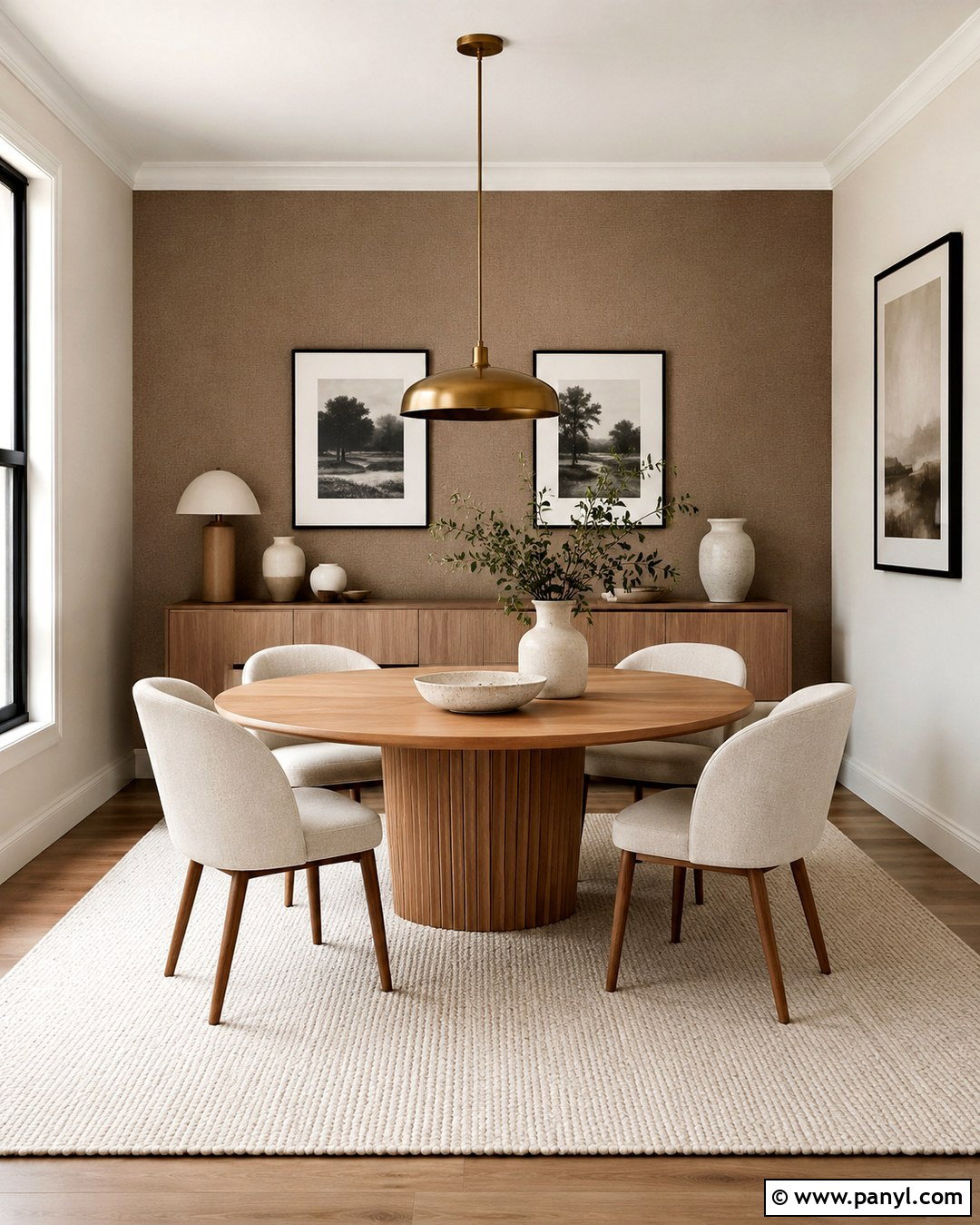
Mushroom paint brings sophisticated depth to a dining room by combining gray, beige, and subtle brown. Use it on the wall behind a sideboard or dining table, then surround it with creamy off-white walls and warm wood flooring. A round oak table keeps the space approachable, while oatmeal upholstered chairs soften the room’s harder surfaces. Add an antique brass pendant, black-framed artwork, and handmade ceramic pieces in ivory and sand. The finished palette feels layered but still simple. Mushroom is especially effective in rooms that receive warm afternoon light, which brings out its earthy character. If the shade appears slightly purple under artificial lighting, select warmer bulbs and repeat brown undertones through wood, woven shades, and natural linen curtains.
4. Charcoal Gray Accent Wall
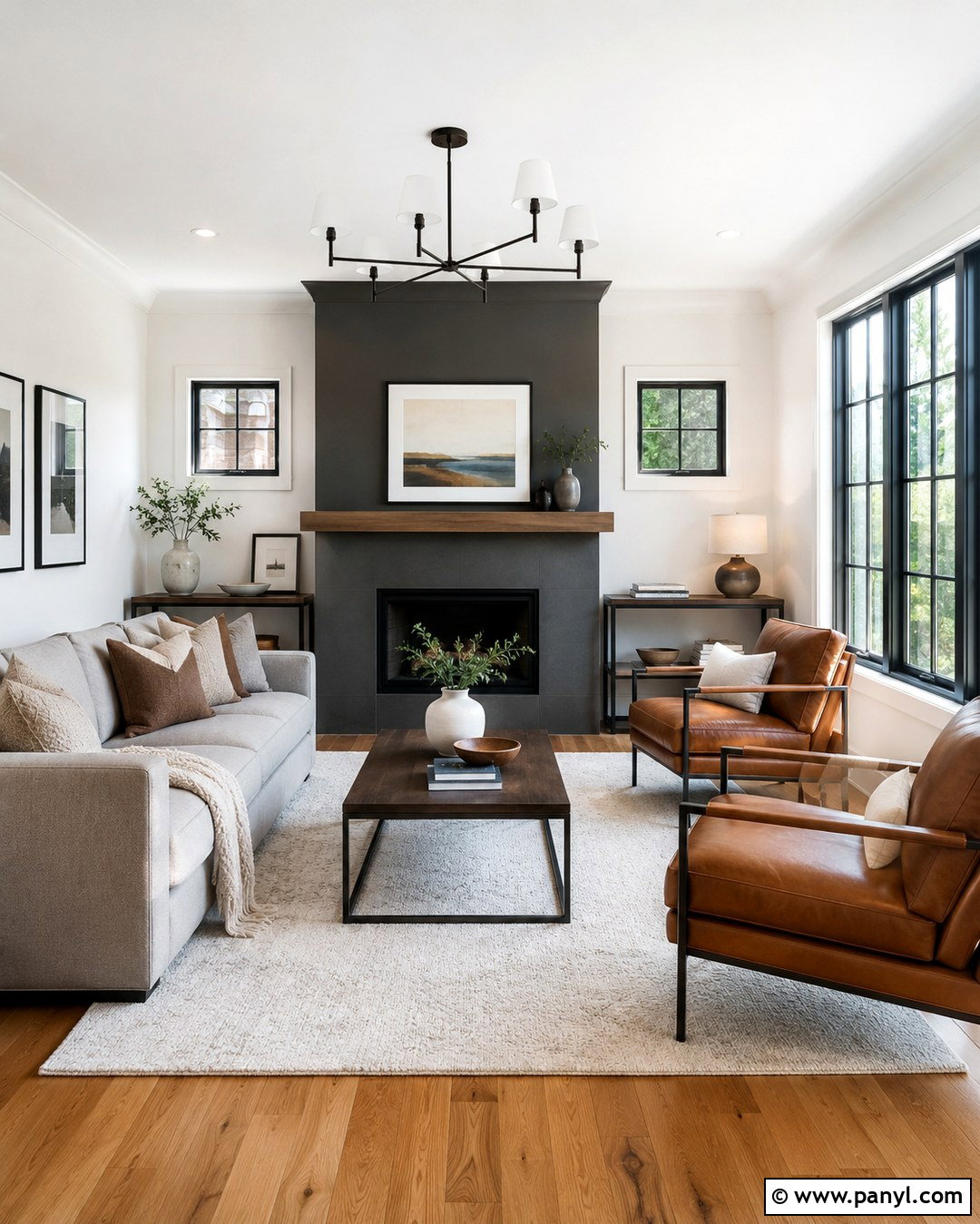
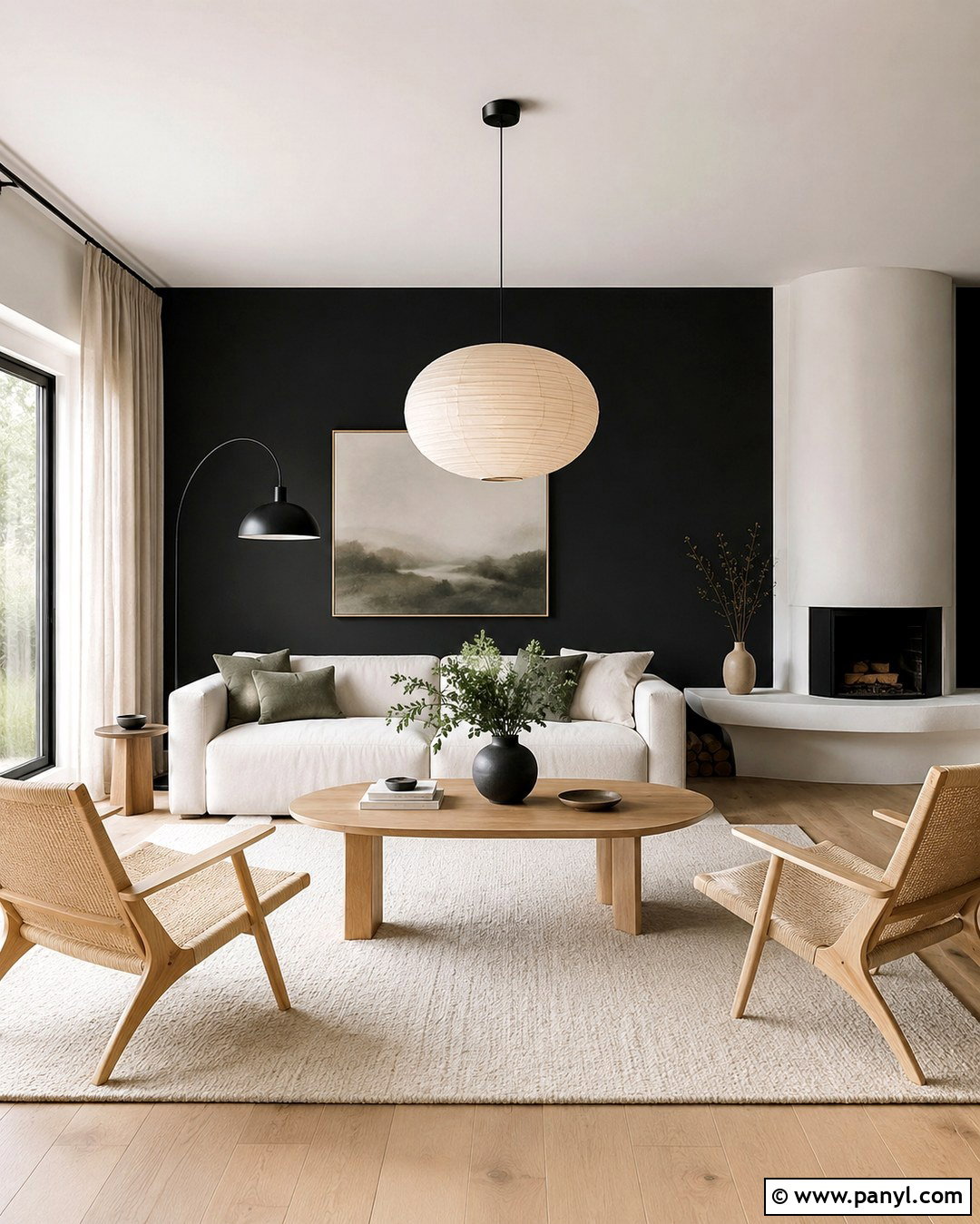
Want a dramatic feature that still reads as neutral? A charcoal gray accent wall can anchor a bright living room, especially when it highlights a fireplace, built-in shelving, or media console. Choose a softened charcoal rather than a sharp blue-black shade. Pair it with warm white surrounding walls, a pale gray sofa, and medium oak flooring. Cognac leather chairs and a chunky ivory rug prevent the room from feeling cold. Repeat the charcoal through thin metal frames, curtain rods, and one or two patterned pillows. Keep window treatments light and simple to preserve brightness. Flat paint creates a velvety effect, but washable matte or eggshell is more practical in active family spaces. Generous lighting is essential for maintaining balance.
5. Sandy Beige Accent Wall
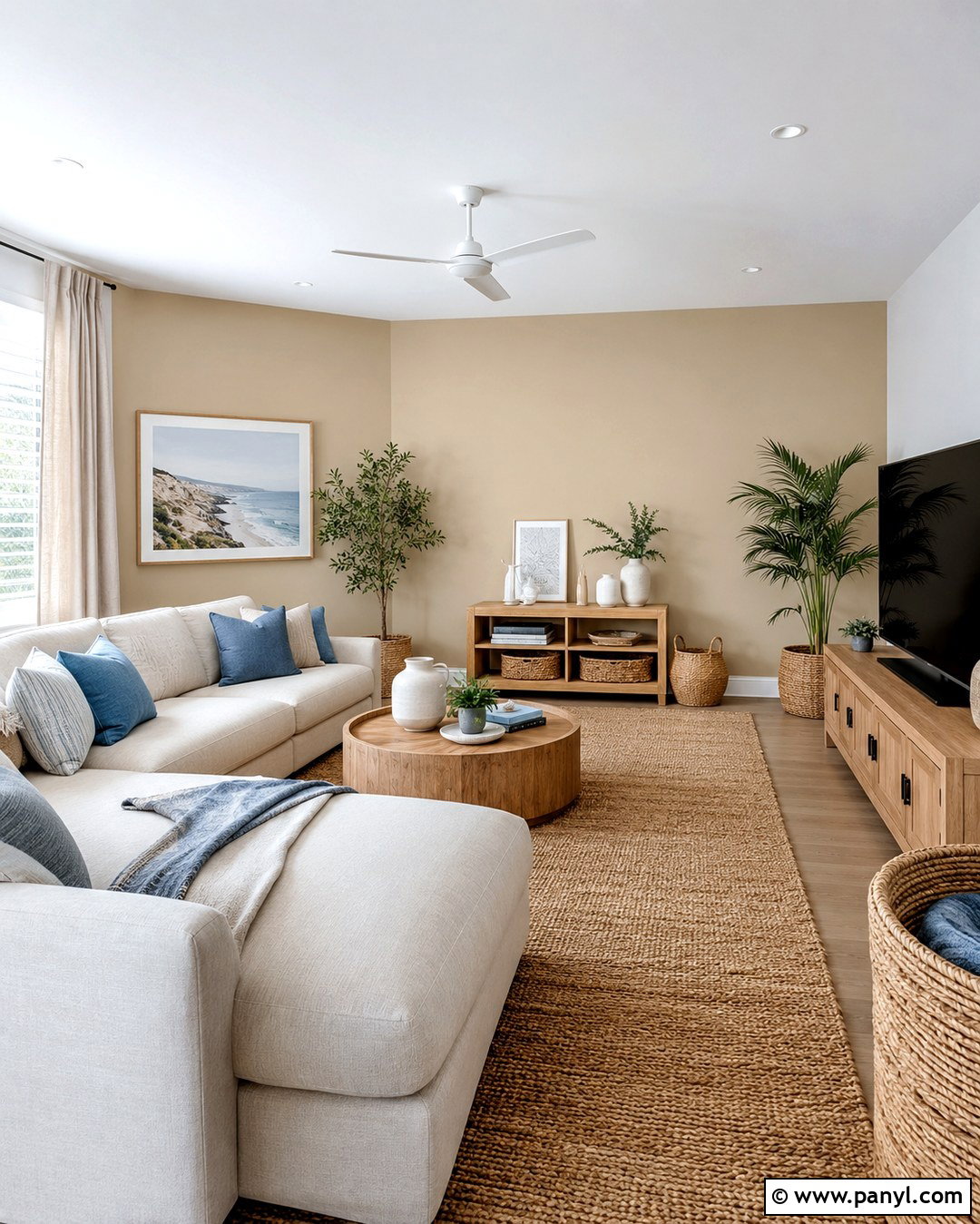
Sandy beige can turn an ordinary family room into a light, relaxed gathering space. Paint the main sofa wall in a medium sand tone with gentle golden undertones. Use soft ivory elsewhere to create visible but low-contrast separation. A slipcovered cream sectional, light oak media cabinet, and woven jute rug support the warm coastal influence without relying on obvious themed decor. Introduce muted blue through pillows and artwork, then add black accents sparingly for definition. Linen curtains, rattan baskets, and pale ceramics create texture across the neutral palette. Avoid matching every beige surface exactly. Instead, combine several related shades ranging from ivory to camel. This variation keeps the complete design dimensional, comfortable, and easier to update throughout the year.
6. Creamy Ivory Accent Wall
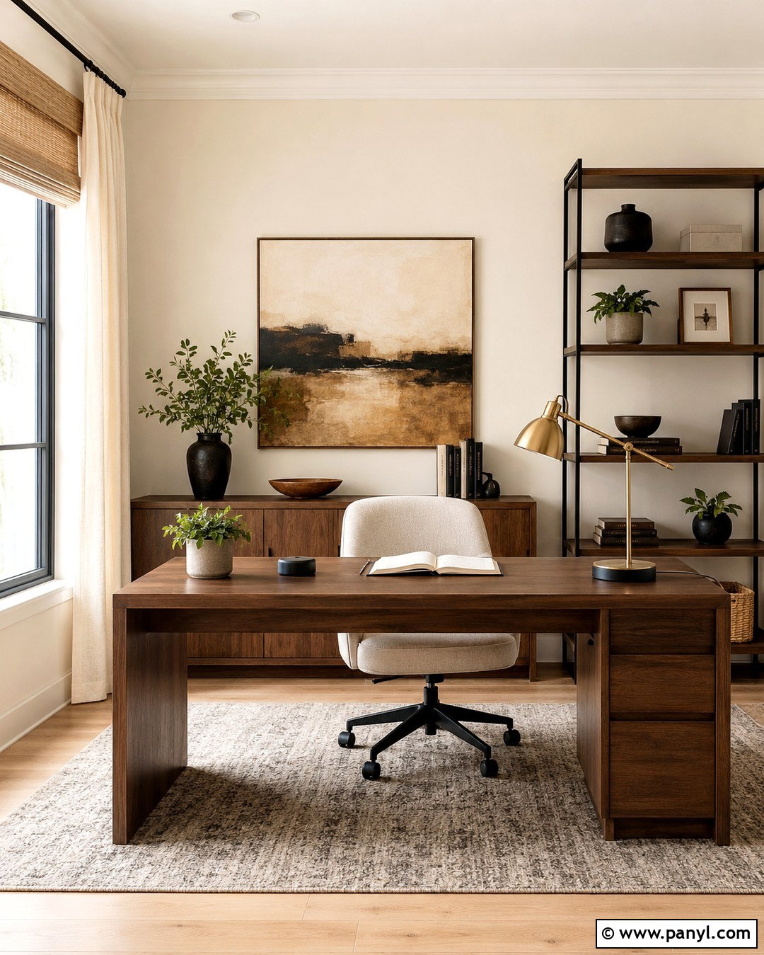
A creamy ivory accent wall is a subtle solution for a home office that needs warmth rather than strong color. Select an ivory that is slightly deeper than the adjoining warm white walls, then use it behind the desk and shelving. The quiet tonal difference will define the work zone without visually shrinking the room. Pair it with a walnut desk, an oatmeal desk chair, and light oak flooring. A brushed brass lamp and natural woven shade add warmth, while matte black accessories create useful contrast. Include framed abstract art with beige, clay, and charcoal details. Because ivory can look yellow beside cool white, keep the ceiling, trim, and surrounding walls within the same warm undertone family for a smooth and intentional transition.
7. Putty Gray Accent Wall
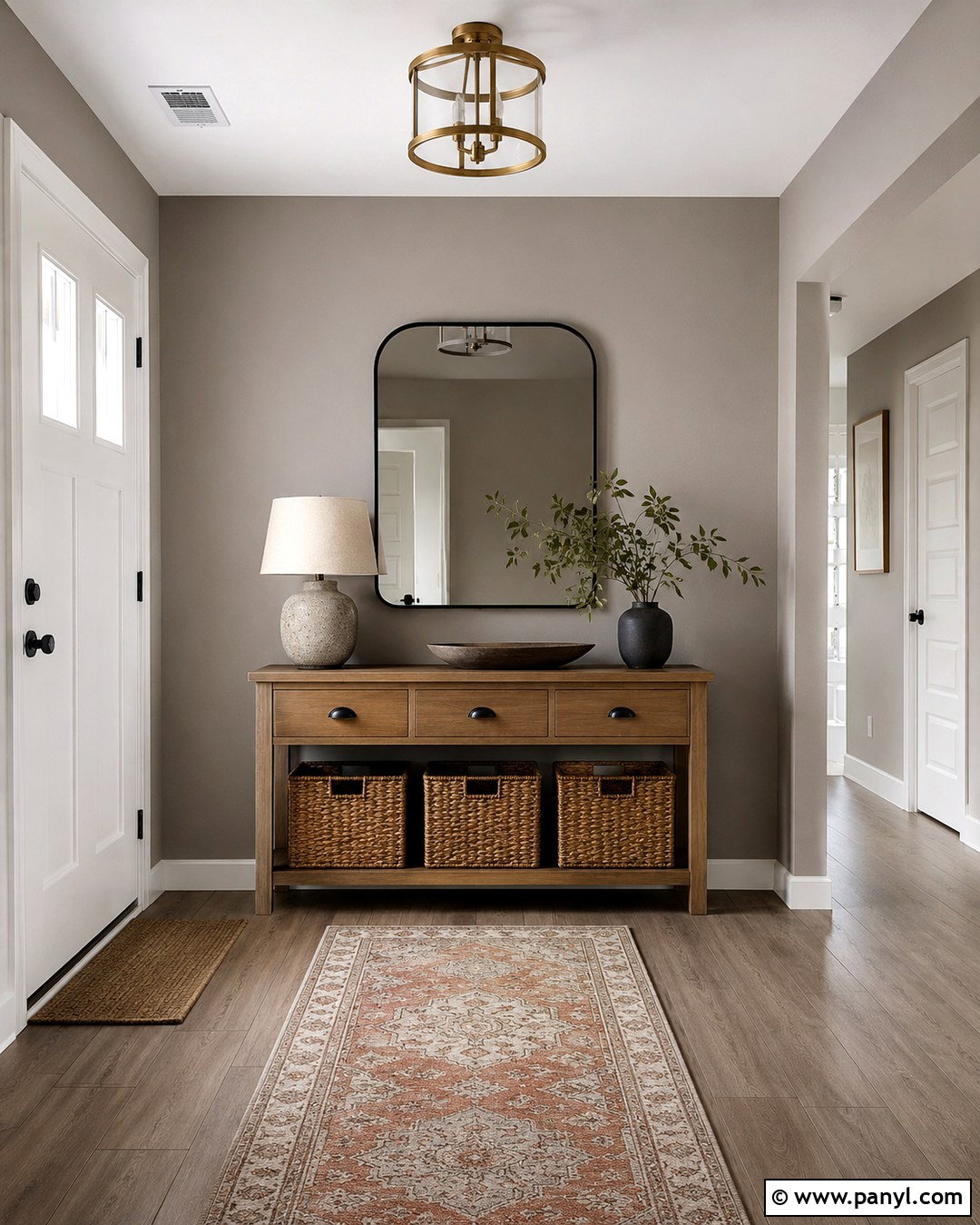
Putty gray offers a practical middle ground between traditional beige and modern gray. It works beautifully in an entryway because it disguises minor marks while creating a calm background for furniture and storage. Paint the wall behind a slim console or built-in bench, leaving the other walls soft white. Add a medium-tone oak console, a rounded black mirror, and woven baskets for everyday organization. A vintage-inspired runner featuring taupe, cream, and faded rust introduces pattern without overwhelming the narrow area. Install a simple brass ceiling light to warm the gray undertone. Finish with ceramic lamps and restrained greenery. The complete entry should feel functional, open, and coordinated with nearby rooms, making putty gray an excellent transition color for connected layouts.
8. Warm Stone Accent Wall
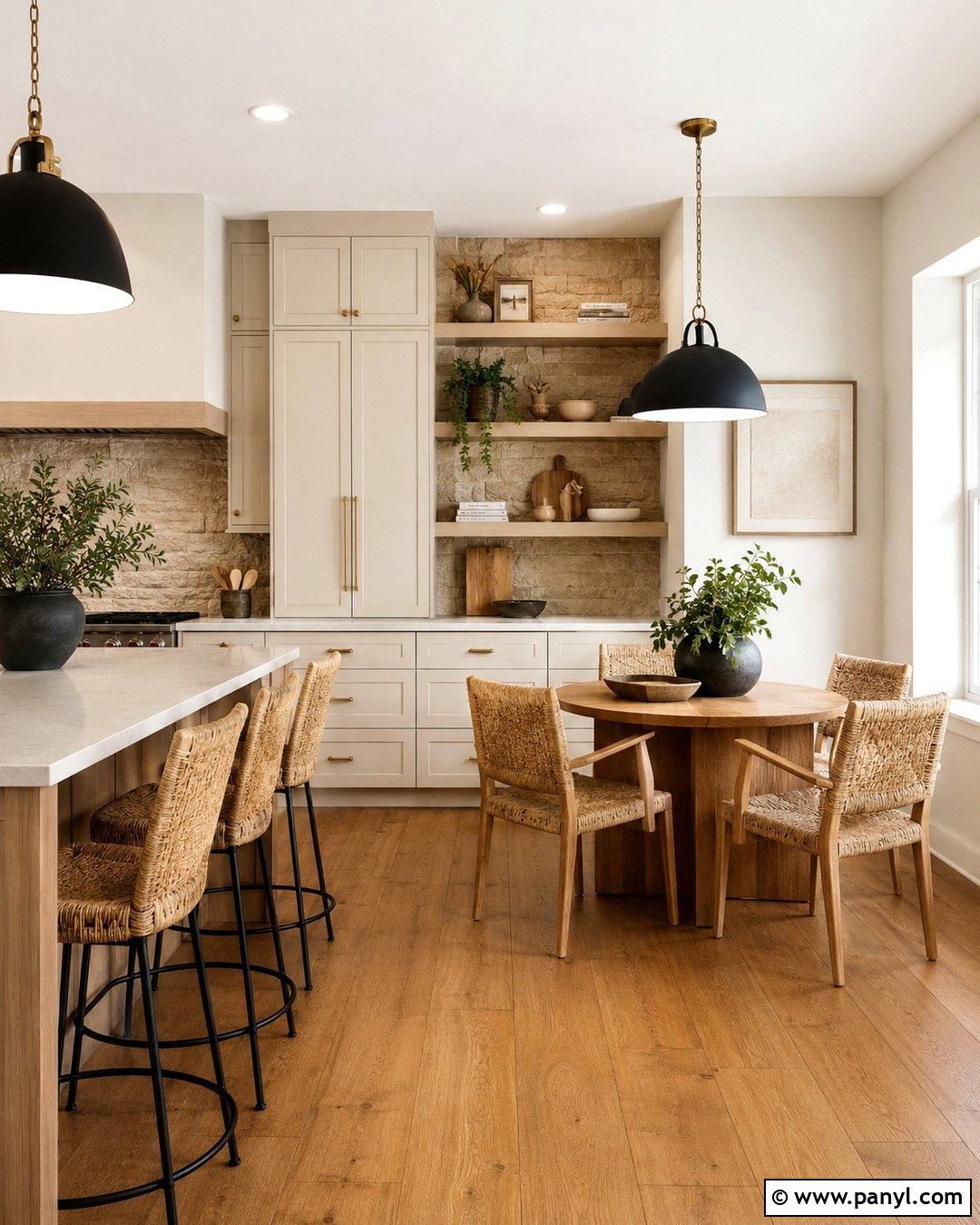
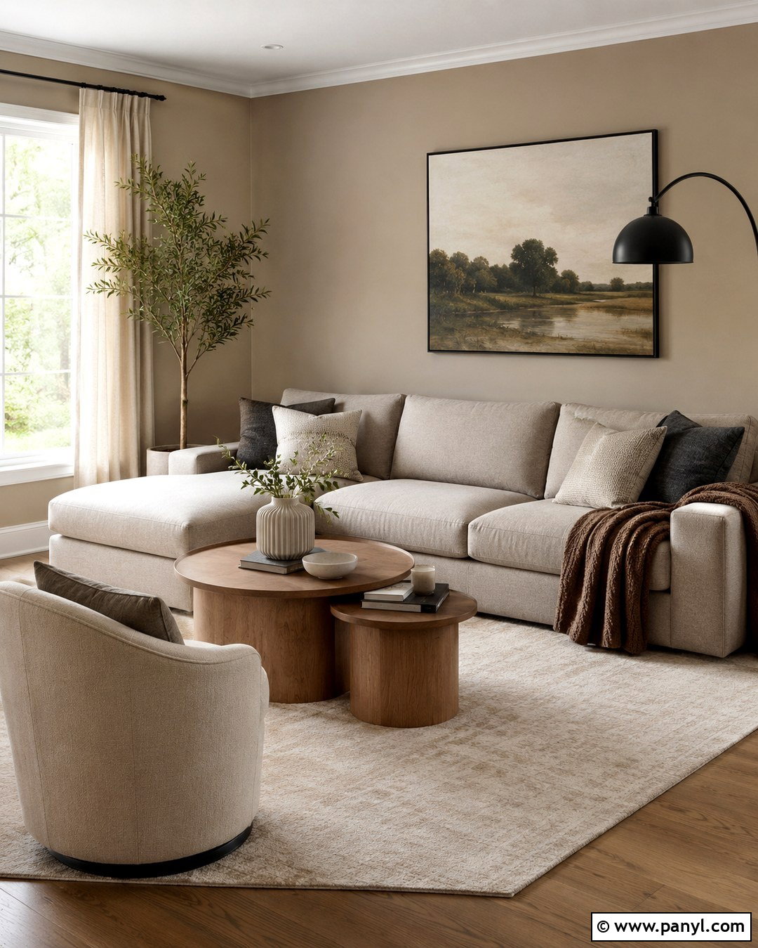
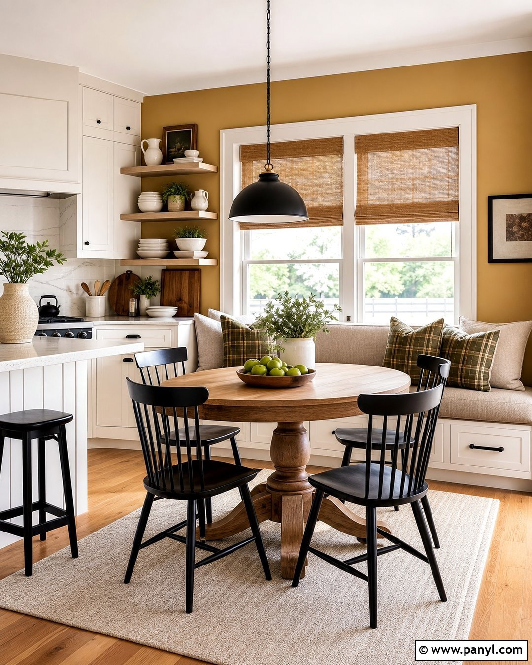
Warm stone paint can ground a kitchen without competing with cabinetry, counters, or backsplash materials. Apply it to the wall surrounding a breakfast nook or open shelving, where its mineral-inspired beige-gray tone becomes part of the architecture. Pair the feature wall with creamy cabinets, pale quartz countertops, and medium oak flooring. A round wood table and woven dining chairs create an inviting place for casual meals. Use aged brass hardware and simple black pendant lights to balance warmth with definition. Off-white ceramic dishes and stoneware accessories complete the natural palette. If the kitchen receives limited daylight, choose a lighter stone color so the wall does not appear muddy. Washable eggshell paint makes the finish easier to maintain around busy eating areas.
9. Muted Sage Accent Wall
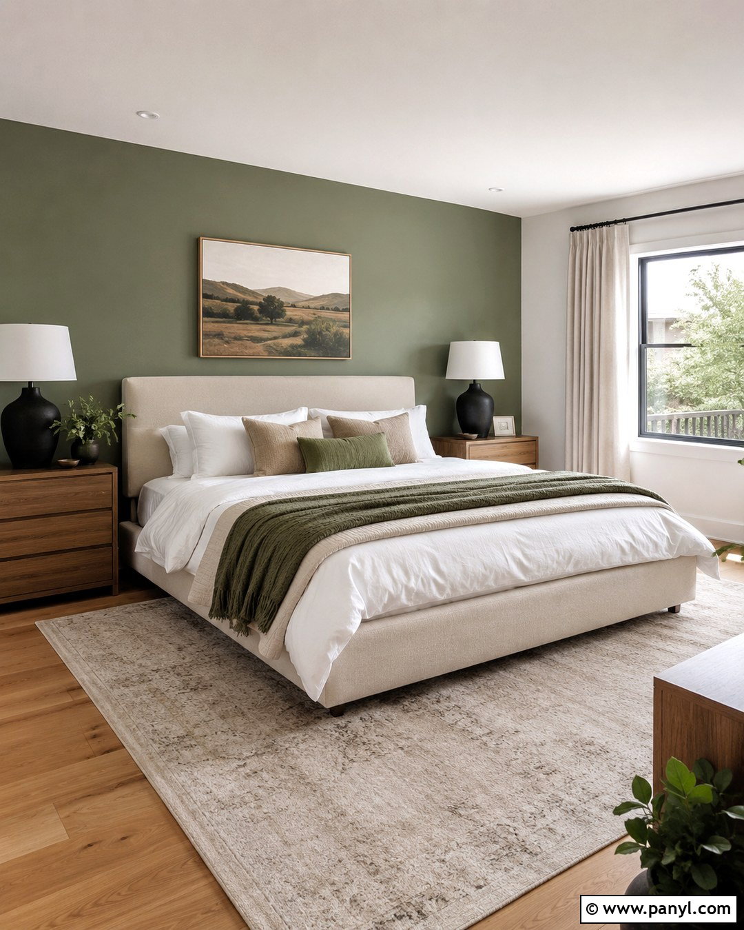
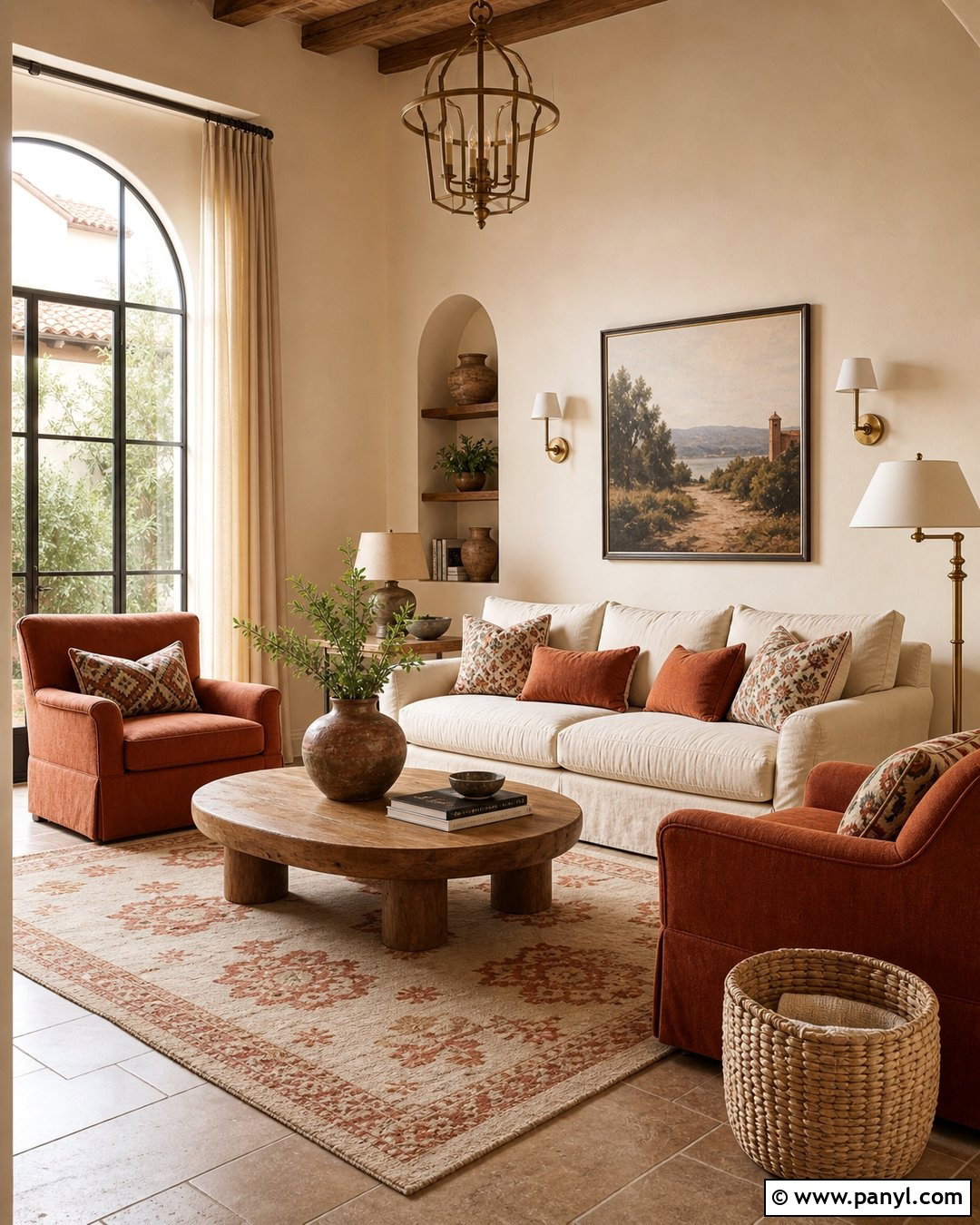
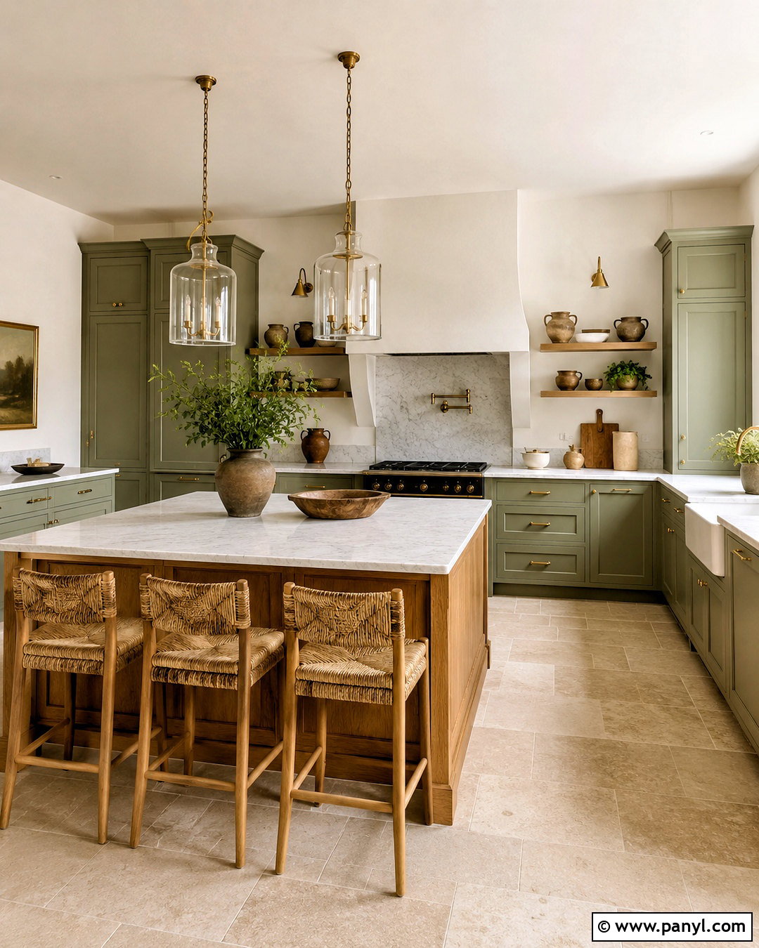
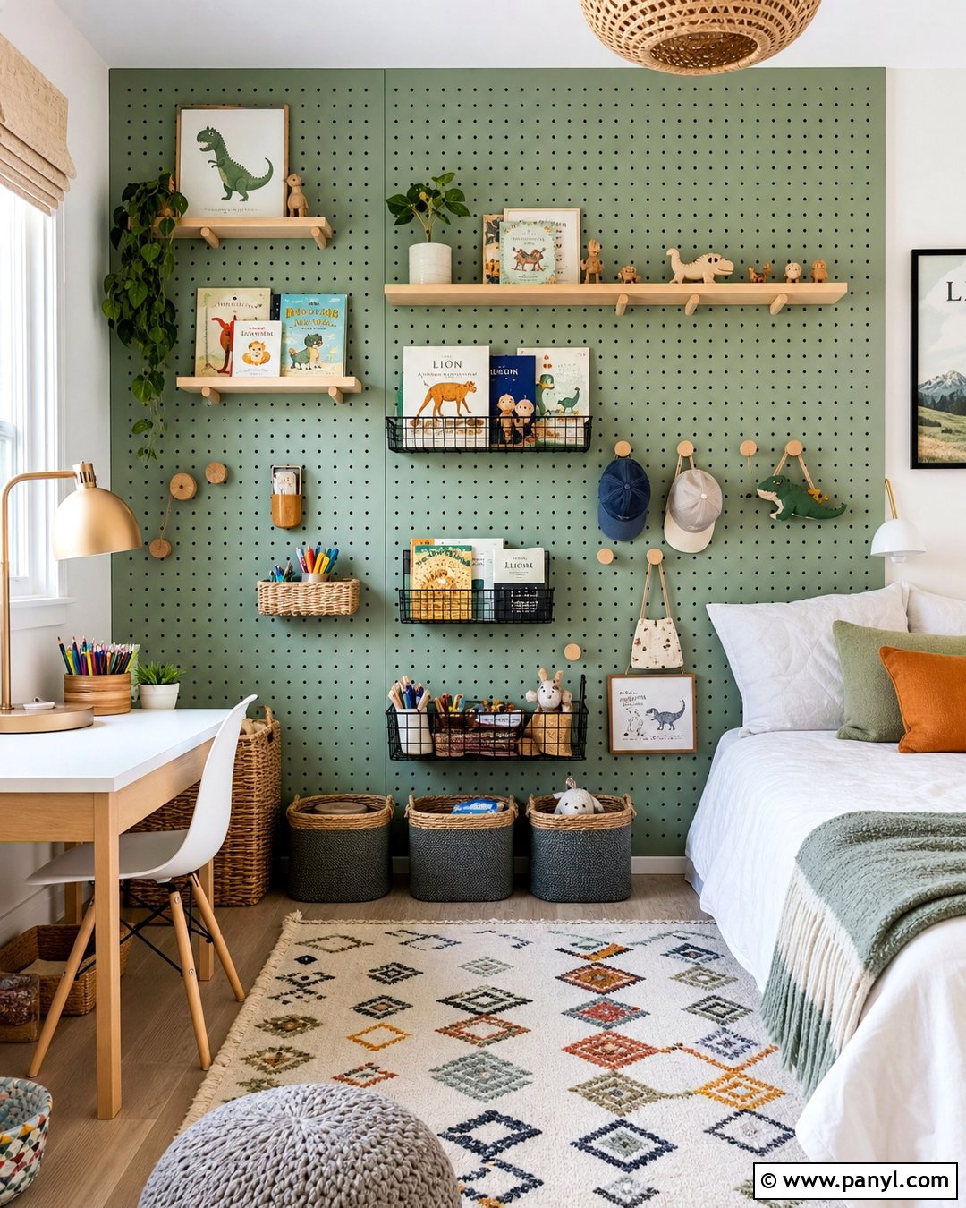
Muted sage can function like a neutral when it contains enough gray to remain quiet and adaptable. Use it behind a guest room bed, paired with warm white walls and natural oak flooring. Choose a simple wood or cream upholstered headboard, then layer white bedding with oatmeal, olive, and soft tan textiles. A woven pendant and linen curtains continue the organic mood, while black nightstand lamps add a clean outline. Keep plants minimal so the room does not become overly green. Instead, include landscape artwork with cream and brown details to connect the wall to the wider palette. Sage works especially well with whites, tans, beiges, greiges, and warm woods, creating a calm scheme with subtle natural character. ()
10. Olive Gray Accent Wall
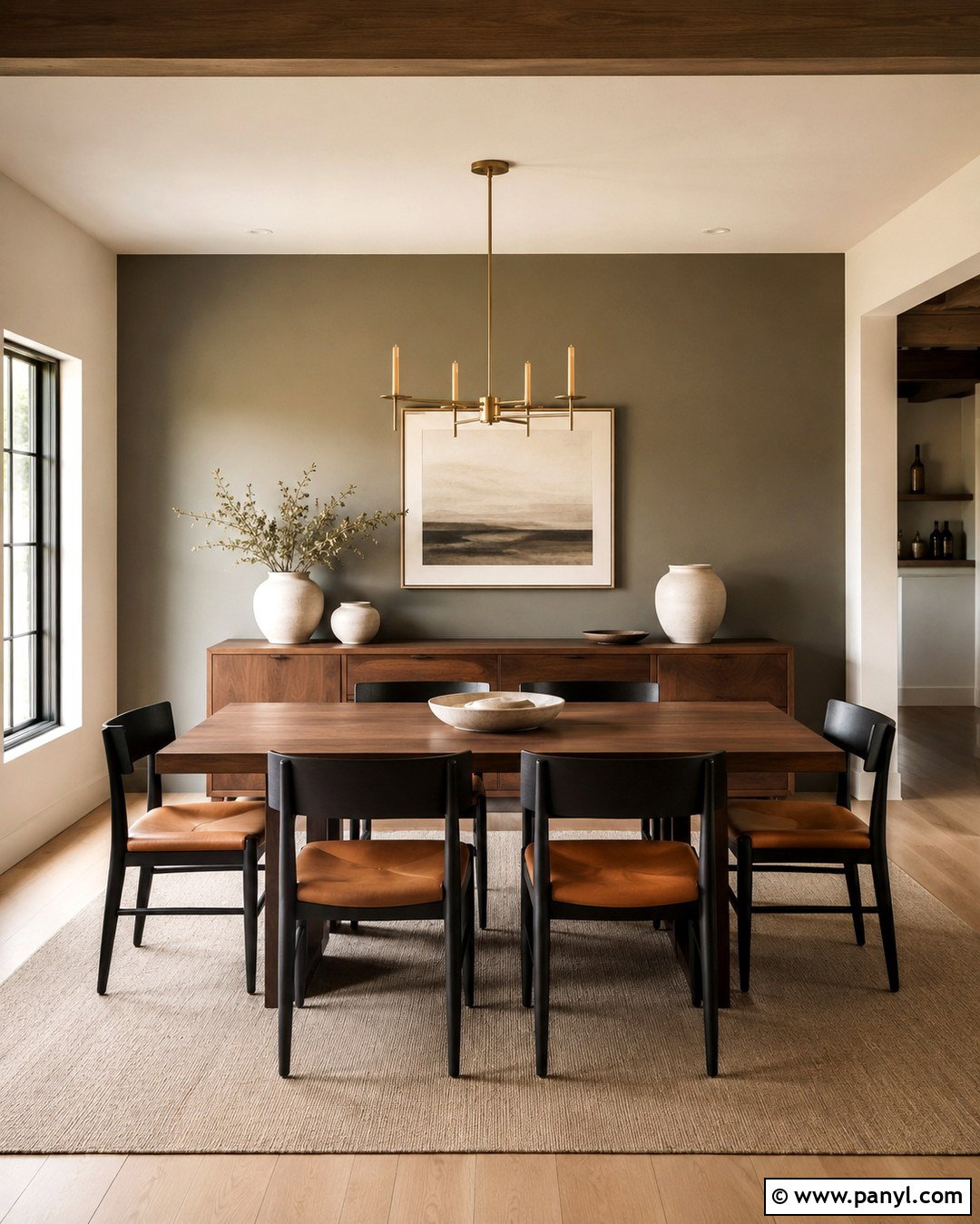
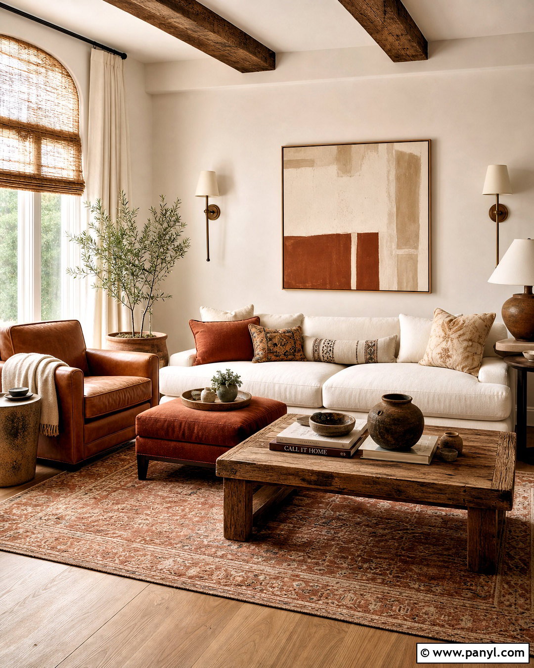
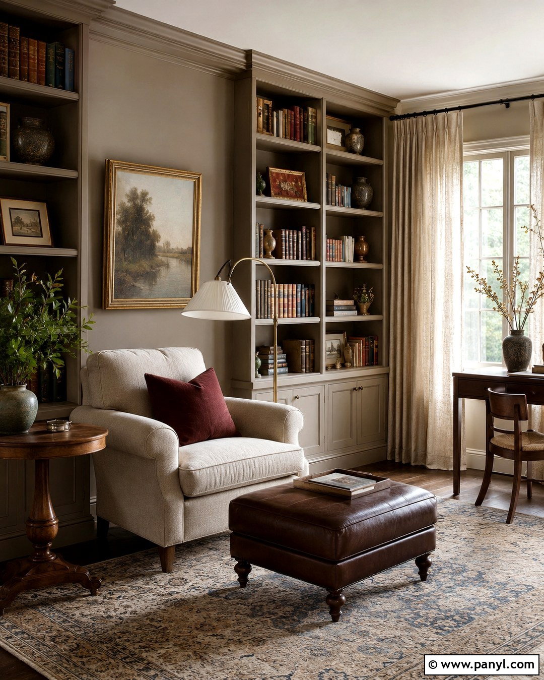
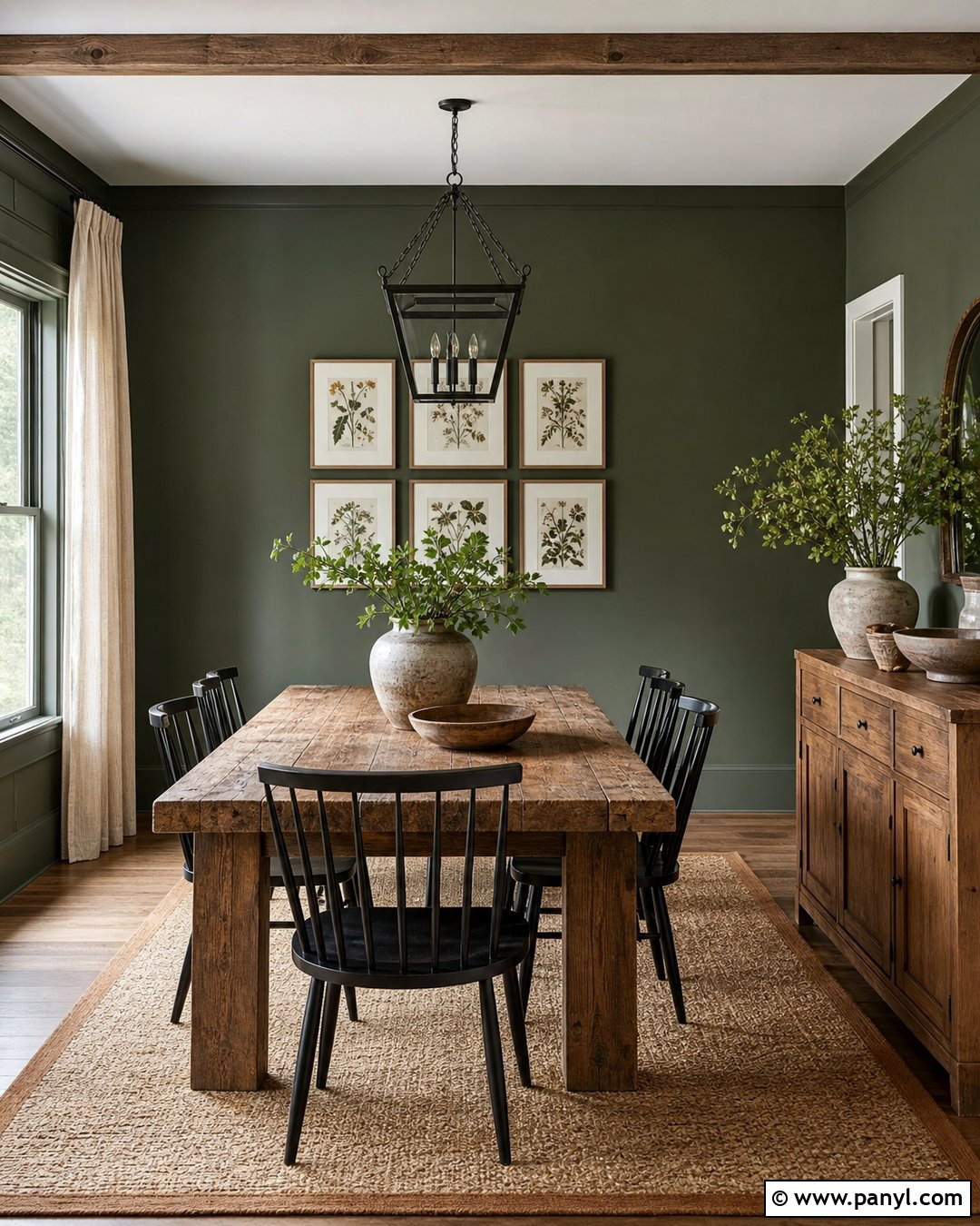
An olive gray accent wall gives a dining room earthy depth without the intensity of a true green. Paint the wall behind the dining table or buffet, allowing the color to create a grounded backdrop for meals and gatherings. Pair it with warm cream surrounding walls, walnut furniture, and a beige wool rug. Black dining chairs can introduce structure, while tan leather seat cushions keep the arrangement comfortable. Add an aged brass chandelier and simple pottery in ivory, brown, and muted green. Natural linen drapes soften the windows and reinforce the understated palette. Olive gray is strongest when its green undertone appears in a few supporting details. Avoid bright emerald accessories, which can make the wall look duller than intended.
11. Clay Beige Accent Wall
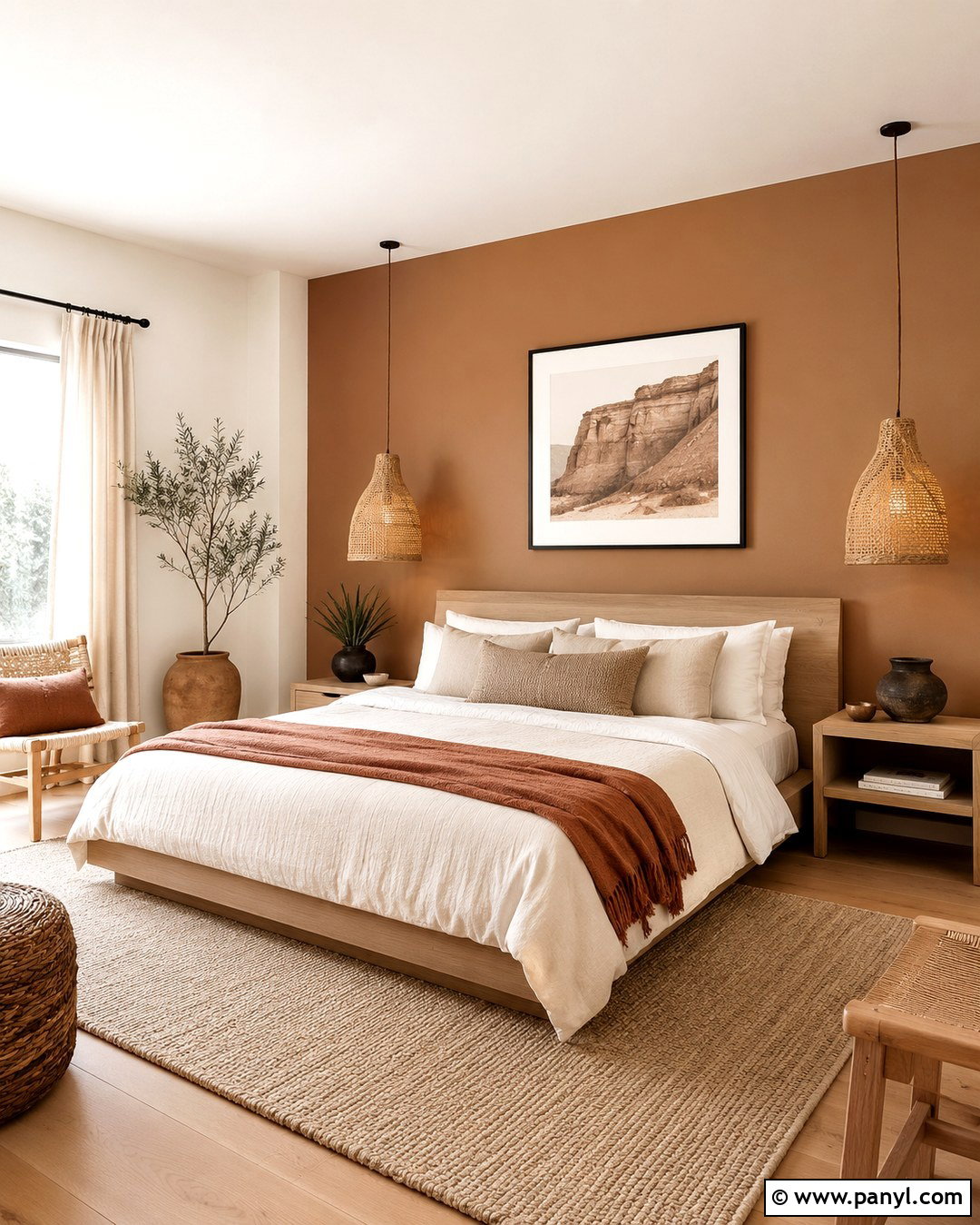
Clay beige introduces warmth to a bedroom while remaining soft enough for daily living. Choose a muted beige with a restrained terracotta undertone and apply it behind a low wood bed. Keep the other walls creamy white so the accent feels warm rather than heavy. Dress the bed with ivory linen, sand-colored pillows, and one dusty rust throw. Pale oak nightstands and woven lamps bring in natural texture, while a light beige rug creates a comfortable foundation. Use simple black frames or dark bronze hardware to sharpen the palette. The wall should resemble sun-baked earth, not bright orange. Testing is important because pink undertones may become stronger beside red-toned flooring. Balanced correctly, clay beige produces a welcoming, relaxed room with quiet Southwestern influence.
12. Cocoa Brown Accent Wall
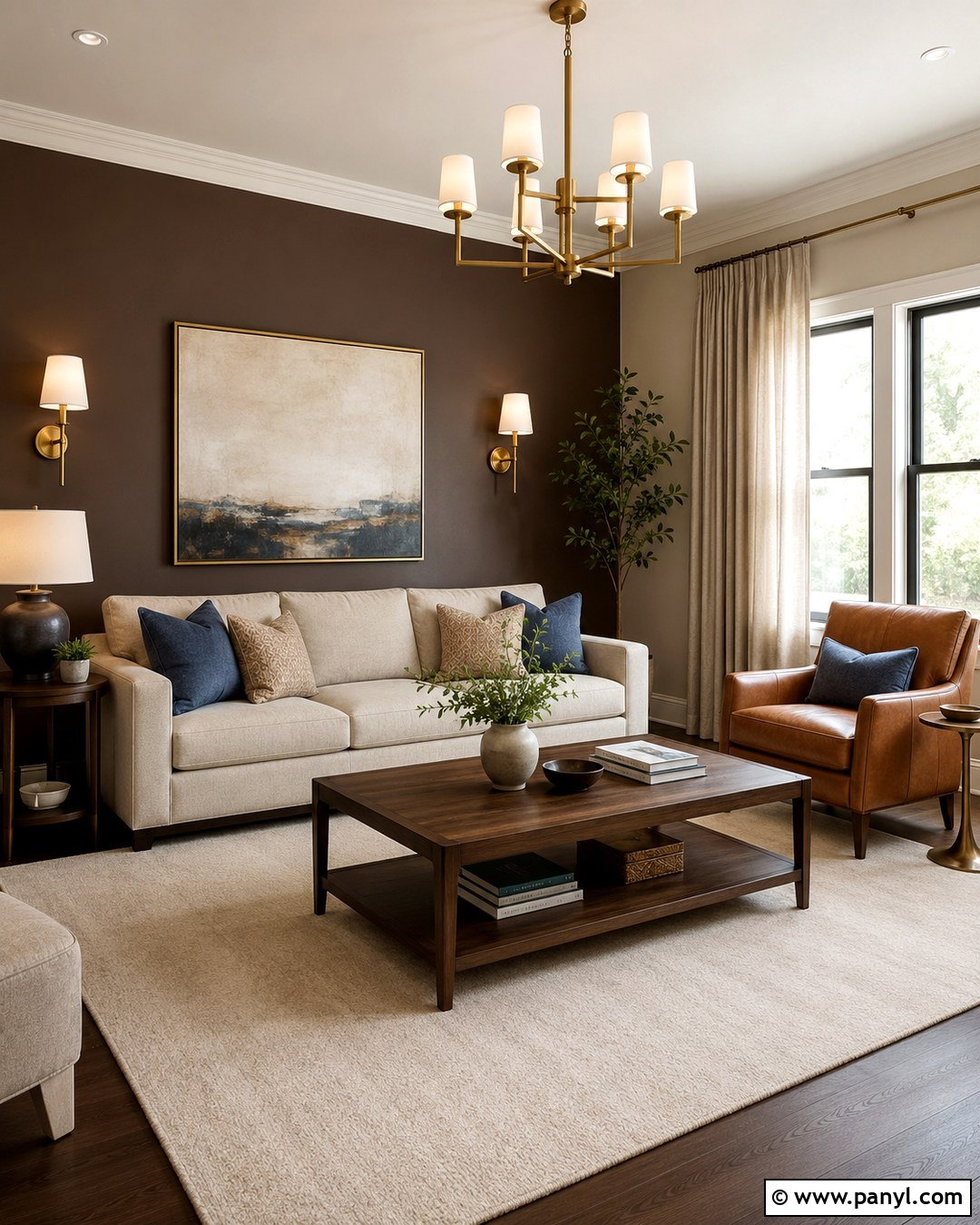
Cocoa brown creates a rich living room focal point that feels softer and more approachable than black. Use it on the wall behind a light sofa, built-in bookcase, or large piece of artwork. Surround the feature with warm cream walls and a white ceiling to maintain brightness. A flax linen sofa, walnut coffee table, and camel leather chair will repeat the wall’s warmth at different depths. Add an ivory wool rug and oatmeal curtains for contrast. Brushed brass lighting gives the brown a polished finish, while muted blue or sage pillows provide gentle relief. Keep bulky furniture away from the darkest section of the wall when possible. This allows part of the cocoa surface to remain visible and prevents the complete arrangement from feeling crowded.
13. Linen White Accent Wall
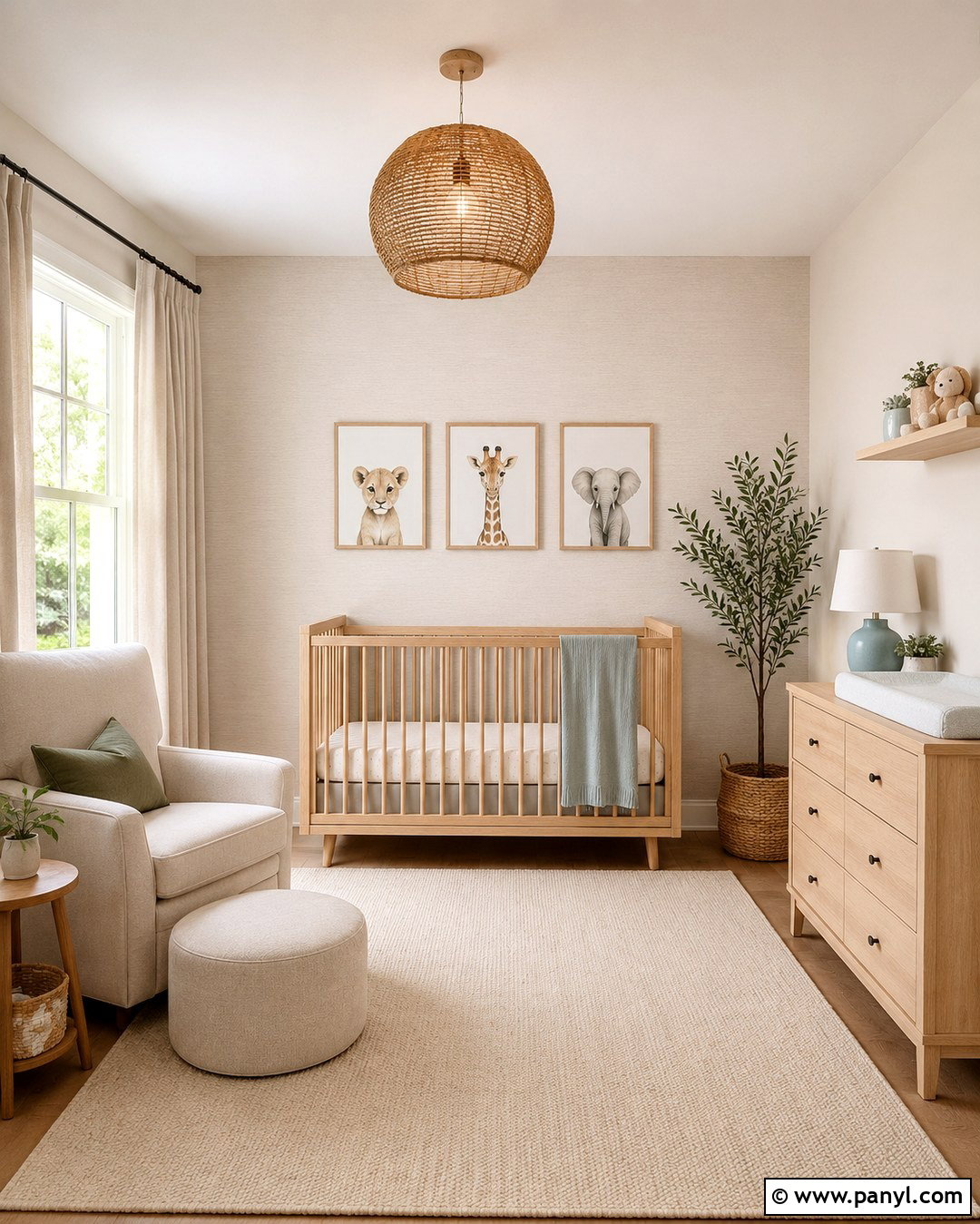
A linen white accent wall is ideal when you want gentle definition in a nursery without introducing a bold feature color. Select a warm, fabric-inspired off-white that is one or two shades deeper than the remaining walls. Place it behind a natural wood crib, then add an ivory rug, oatmeal curtains, and a light oak dresser. Soft sage, beige, and dusty blue accessories can bring quiet color into the design while keeping the room adaptable. Use framed animal illustrations or abstract shapes in slim natural wood frames. A woven ceiling fixture contributes texture without lowering the visual height. Make sure the crib wall remains uncluttered and practical. The finished room should feel bright, calm, and coordinated rather than stark or overly themed.
14. Pale Pewter Accent Wall
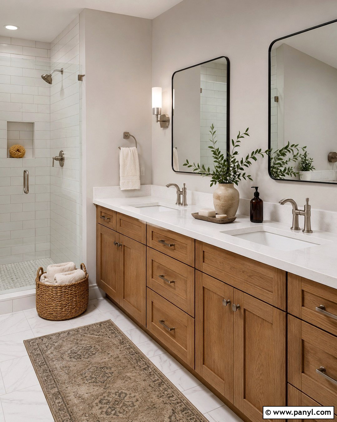
Pale pewter gives a bathroom subtle contrast while supporting both warm and cool finishes. Paint the vanity wall in a light gray with a softened, slightly warm undertone. Pair it with white tile, a white quartz counter, and a medium oak vanity to prevent the scheme from looking clinical. Brushed nickel fixtures create a quiet connection to the gray, while black-framed mirrors give the wall a clearer focal point. Add towels in cream and taupe, then bring in texture with a woven basket and a small vintage-style rug. Use moisture-resistant satin or eggshell paint for better durability. Since bathrooms often have limited natural light, examine the color under the actual vanity fixtures before committing. Avoid blue pewter if the tile already appears cool.
15. Driftwood Gray Accent Wall
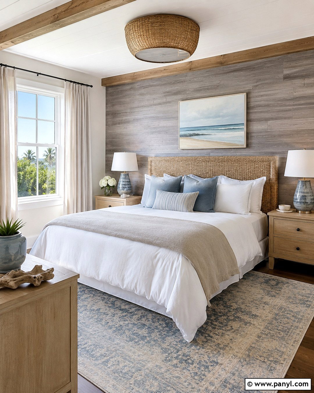
Driftwood gray creates an easy coastal bedroom without requiring decorative shells or strong nautical colors. Select a medium gray with beige undertones and use it behind a white oak or woven headboard. Paint the remaining walls a warm off-white to create a light, gradual contrast. Layer the bed with crisp white bedding, a flax duvet, and dusty blue pillows. A faded blue-and-beige rug can connect the wall to the textiles, while pale wood nightstands reinforce the weathered look. Choose simple ceramic lamps and white linen curtains rather than shiny finishes. Driftwood gray should feel sun-softened, not industrial. Finish the room with one oversized coastal landscape or abstract canvas so the accent wall remains visible and the overall design stays uncluttered.
16. Camel Tan Accent Wall
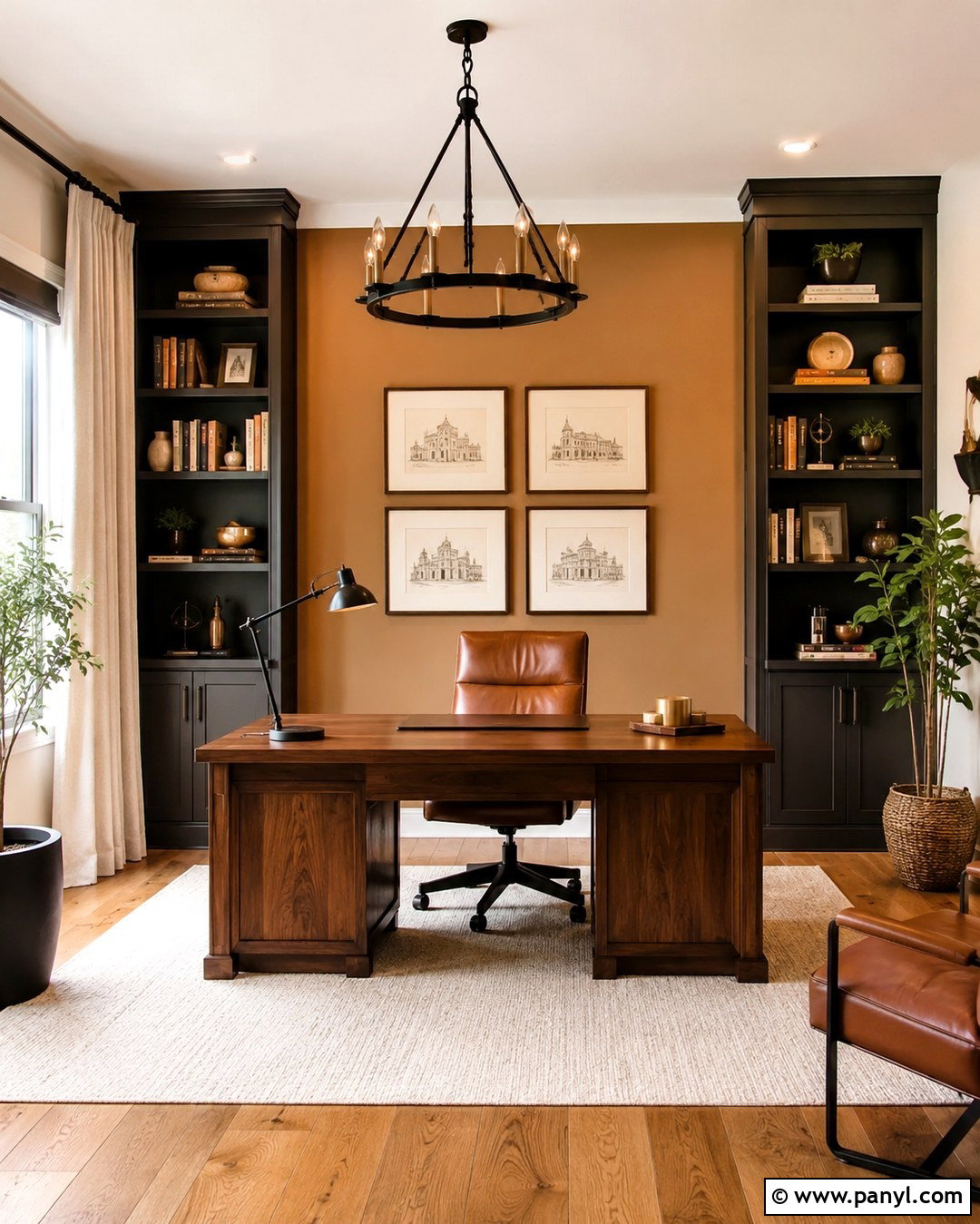
Camel tan brings a comfortable, tailored look to a home office or reading room. Use it behind dark built-in shelves or a streamlined desk, then keep adjacent walls creamy white. A walnut desk, cognac leather chair, and warm oak floor will create a layered brown palette with clear variations in value. Add an ivory area rug and natural linen curtains to keep the room bright. Black metal lighting provides a modern edge, while framed sketches and muted green books add personality. Camel tan usually appears best when paired with strong light and pale trim. In a small office, paint only the focal wall rather than wrapping the entire room. This preserves openness while giving the workspace enough visual weight to feel finished and purposeful.
17. Dusty Blue Gray Accent Wall
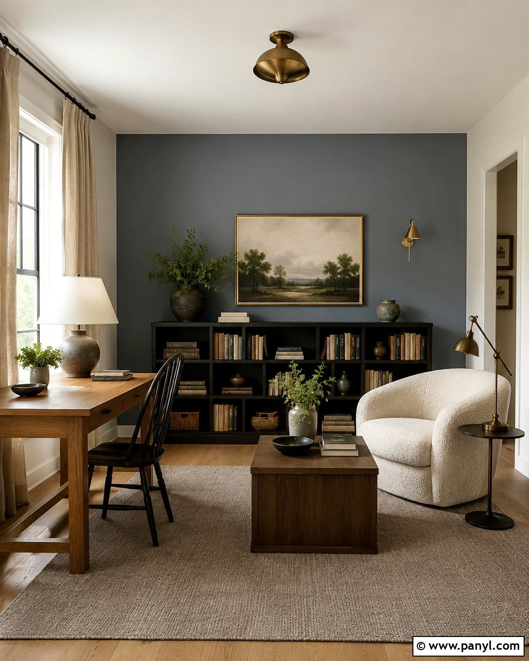
Dusty blue-gray offers subtle color while maintaining the restful quality of a neutral. Use it in a reading room or quiet bedroom, ideally on the wall behind a bookcase, daybed, or upholstered headboard. Pair it with warm white surrounding walls so the blue does not become icy. Choose a cream chair or bed, medium oak tables, and a taupe wool rug. Antique brass lighting brings warmth, while charcoal details create definition. Repeat the blue-gray in only one or two textiles to avoid an overly coordinated result. Linen, boucle, and woven materials will make the palette feel more relaxed. In north-facing rooms, select a shade with a touch of green or beige, which can soften the cooler quality of limited natural light.
18. Blush Beige Accent Wall
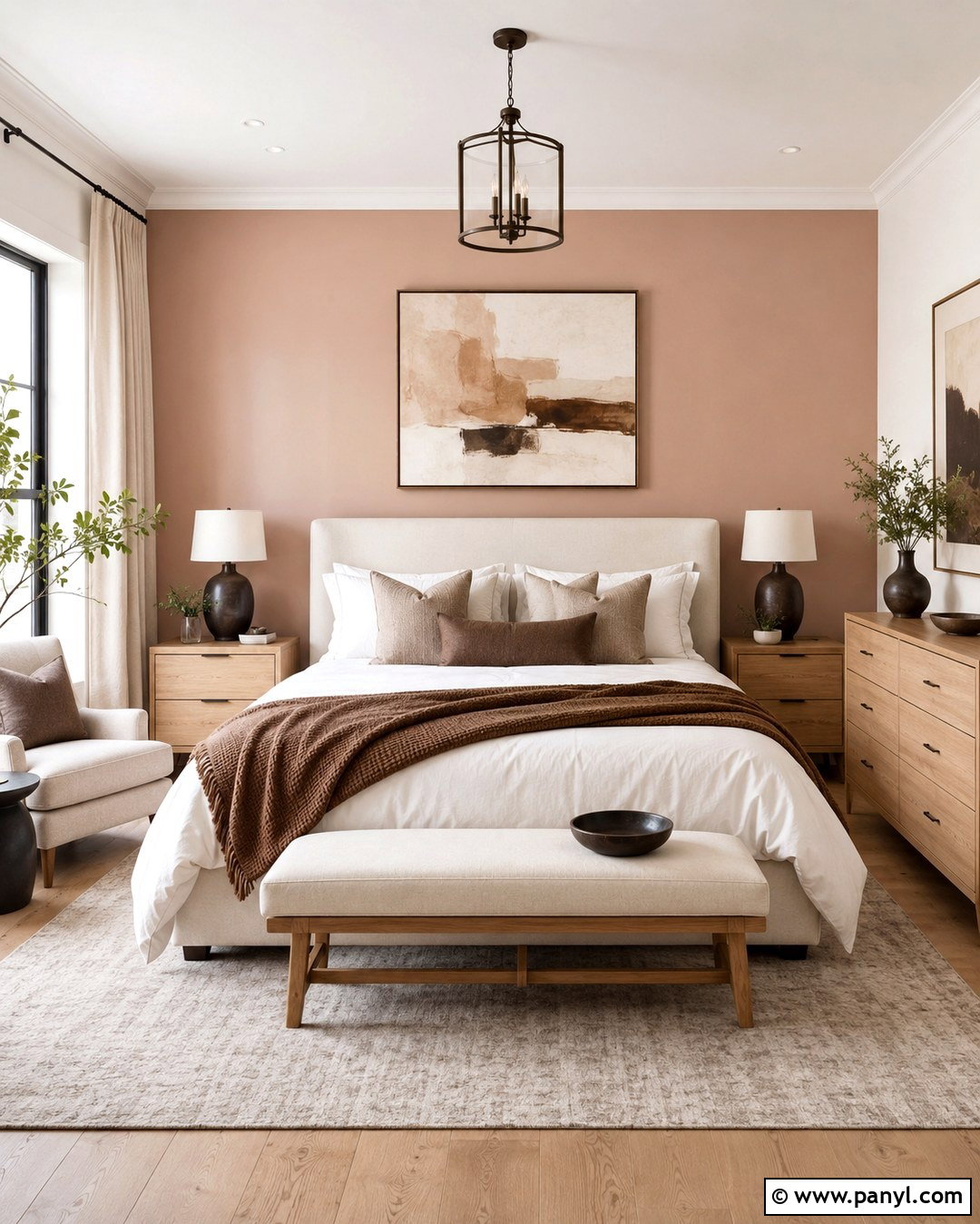
Blush beige delivers gentle warmth to a bedroom without reading as bright pink. Look for a dusty beige with subtle rose or clay undertones, then paint the wall behind the bed. Keep the other walls ivory and choose a light oak bed frame or cream upholstered headboard. Layer white bedding with taupe pillows, a cocoa throw, and one muted blush cushion. A beige rug and linen curtains create a calm foundation, while dark bronze lamps prevent the palette from feeling overly delicate. Artwork featuring abstract earth tones can repeat the wall color naturally. Avoid pairing blush beige with cool blue-white trim because it may make the wall appear peachier. Warm white trim and natural materials produce a more balanced, grown-up result.
19. Espresso Brown Accent Wall
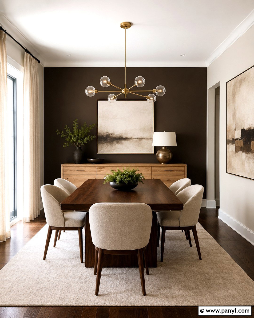
Espresso brown can transform a dining room into an intimate, polished space while remaining firmly within a neutral palette. Apply it behind a light oak sideboard or across the wall that frames the dining table. Use cream on the remaining walls and ceiling to maintain strong contrast. A rectangular walnut table, oatmeal upholstered chairs, and a large ivory rug will lighten the lower half of the room. Add a sculptural brass chandelier and oversized artwork with cream, tan, and black details. Sheer linen curtains help daylight move across the dark surface. Choose an espresso with visible brown warmth rather than a nearly black shade. Repeating the color through thin frames or chair legs will make the accent wall feel connected instead of isolated.
20. Blackened Bronze Accent Wall
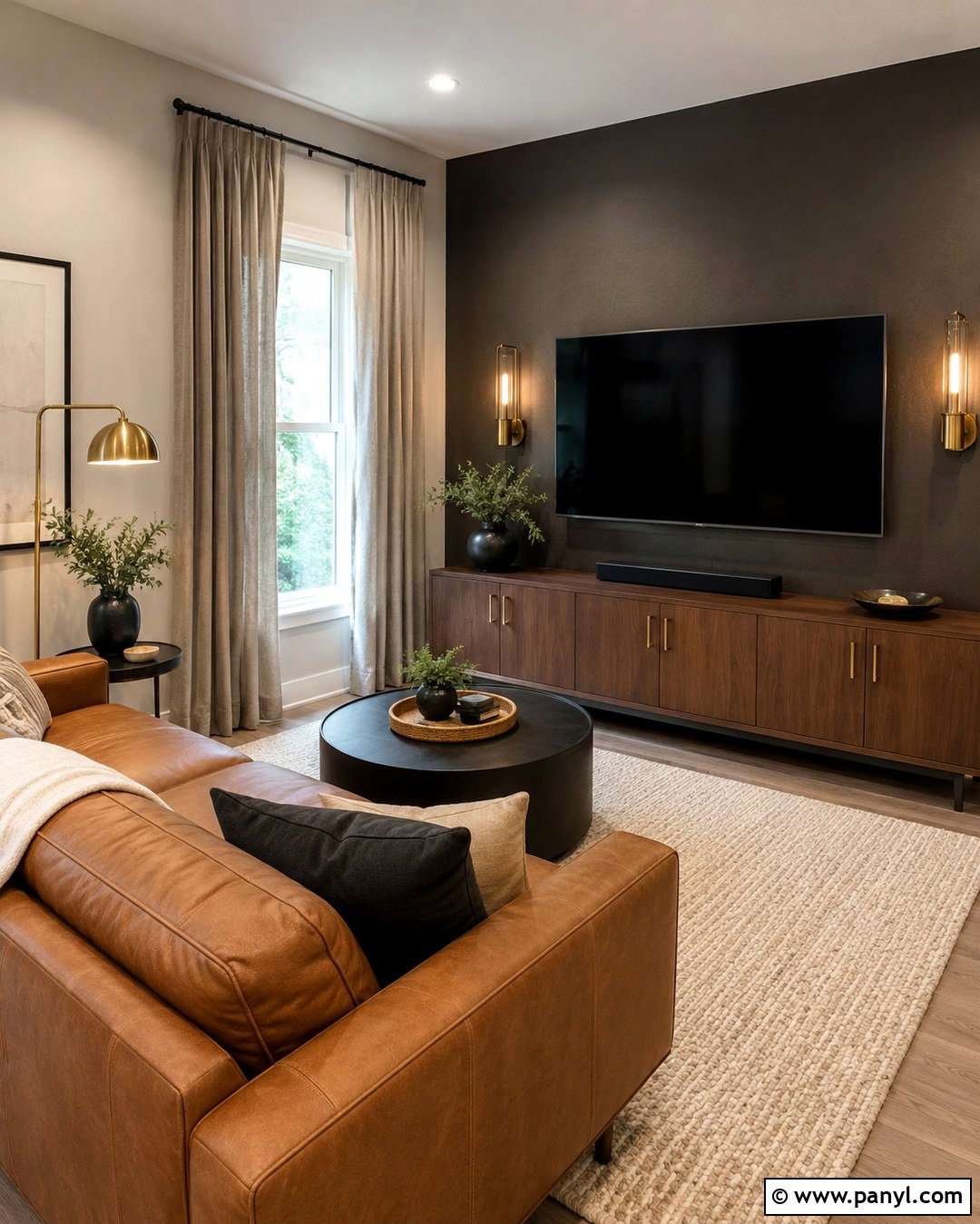
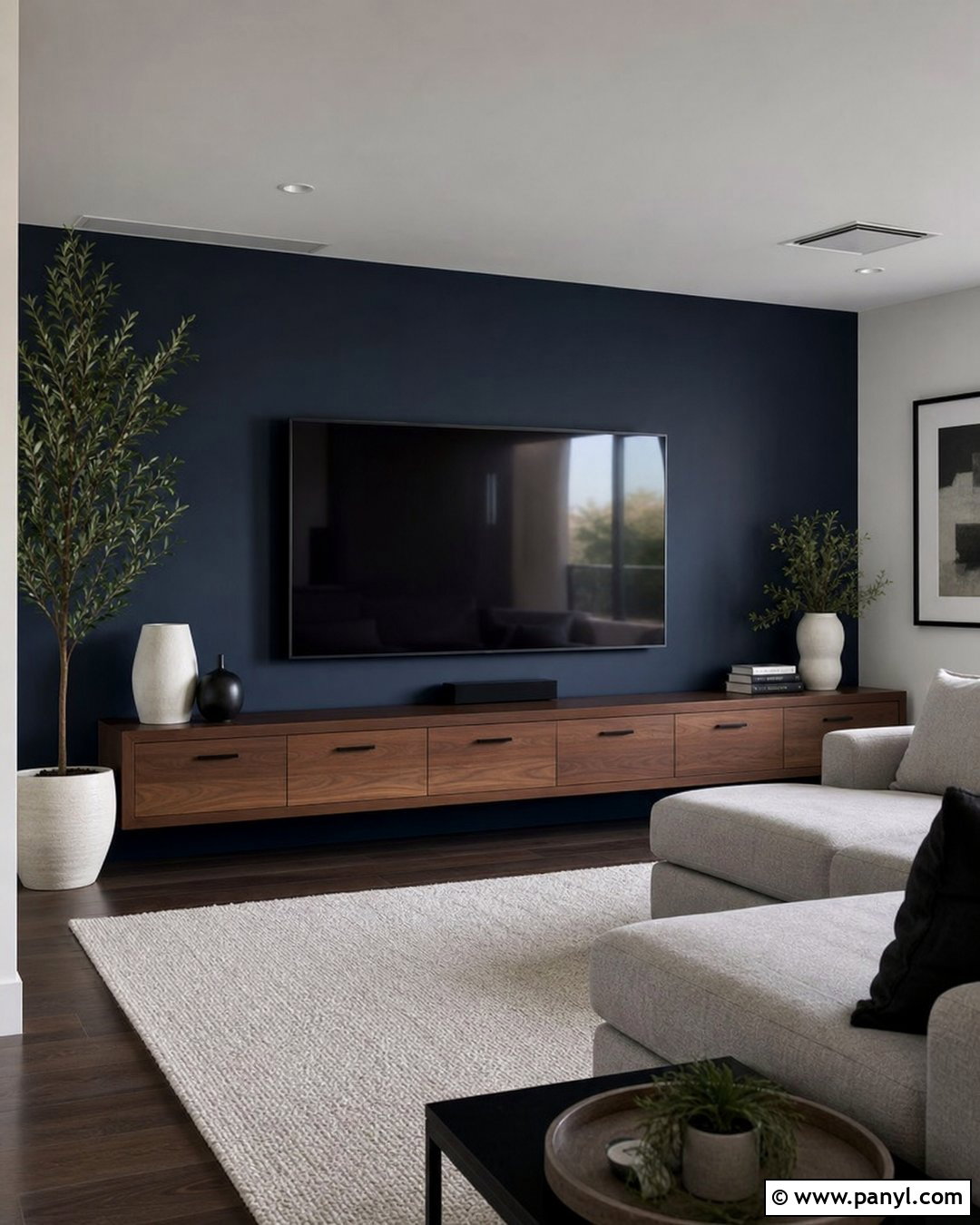
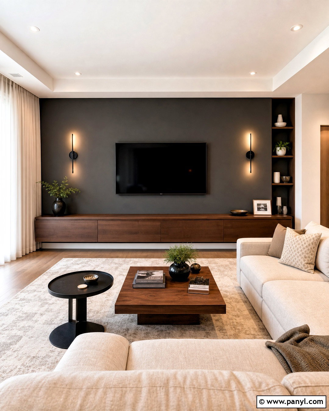
For maximum depth, consider a blackened bronze accent wall in a media room or modern den. This dark neutral combines charcoal, brown, and a subtle earthy undertone, creating drama without the sharpness of pure black. Use it behind the television and a low walnut media cabinet so dark electronics blend into the composition. Keep the surrounding walls warm white or light greige. Add a camel leather sofa, an ivory textured rug, and taupe curtains to balance the dark focal point. Brushed brass lamps and bronze hardware will reveal the wall’s warmer side. Include layered ceiling, floor, and table lighting for comfortable use. A matte finish reduces glare and helps the entertainment wall appear smooth, cohesive, and intentionally integrated.
Conclusion:
The best neutral feature walls combine purposeful color placement with a complete, coordinated room design. Warm greige, mushroom, taupe, and stone create quiet dimension, while charcoal, cocoa, espresso, and blackened bronze deliver stronger contrast. Muted sage, olive gray, dusty blue-gray, and blush beige offer restrained color that still feels versatile. Before painting, compare the sample with your flooring, furniture, trim, and lighting at several times of day. Then repeat the wall’s undertone through wood, textiles, metals, and artwork. This simple approach makes the accent look connected rather than random. Whether your home feels traditional, modern, coastal, or organic, these **20 Neutral Accent Wall Color Ideas** provide an adaptable starting point.

Related Ideas and Inspiration:
Leave a Reply