
Wall paint can completely change how a room feels, even when the furniture stays the same. The right shade can brighten a small space, soften strong architecture, highlight natural materials, or make everyday decor look more intentional. Rather than relying only on familiar white and gray, consider earthy greens, atmospheric blues, warm neutrals, and expressive accent colors. Each option works best as part of a complete room palette that includes flooring, furniture, lighting, textiles, and trim. Always test large painted samples at different times of day because natural and artificial light can shift undertones. Whether you prefer peaceful bedrooms or dramatic dining spaces, the complete room looks below offer practical inspiration through 20 Interesting Wall Colors.

1. Warm Sage Green Wall Color
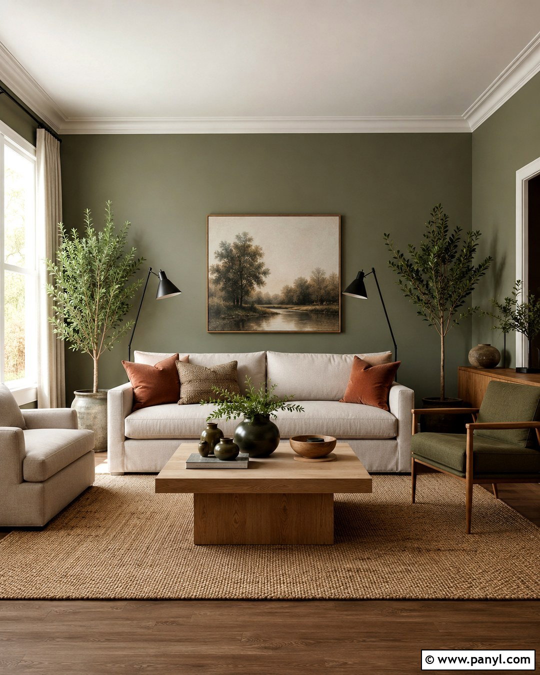
Warm sage green creates a peaceful living room that feels connected to nature without becoming overly rustic. Paint all four walls in a soft sage with subtle gray undertones, then use creamy white on the ceiling and trim for gentle contrast. A light oak coffee table, oatmeal linen sofa, and woven jute rug strengthen the natural palette. Add muted terracotta pillows, olive ceramics, and a few leafy plants for depth. Black metal floor lamps provide enough definition to keep the room from looking washed out. This color works especially well with medium or bright natural light. Choose warm bulbs in the evening so the green remains welcoming instead of turning cool or dull.
2. Deep Navy Blue Wall Color
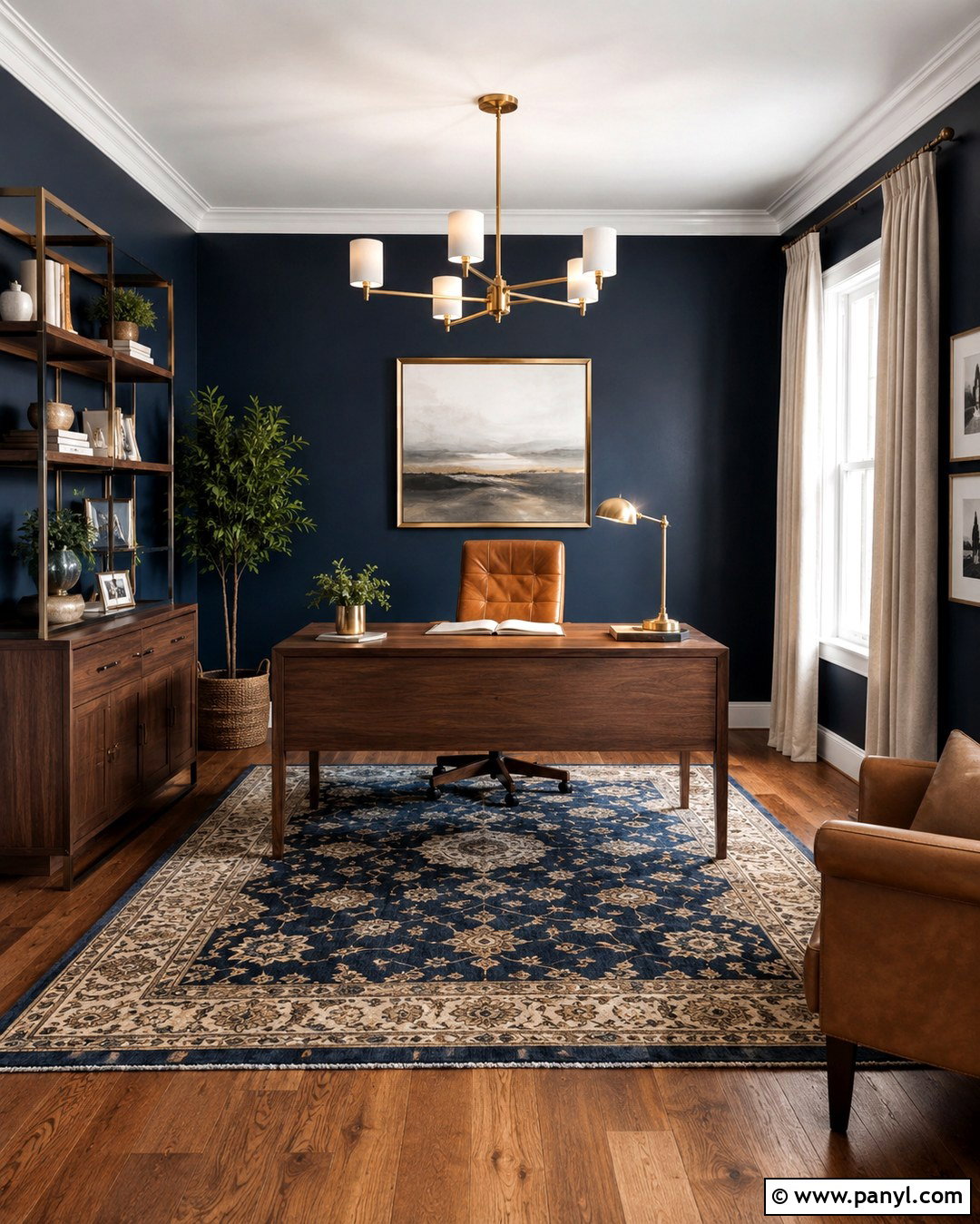
Deep navy blue gives a home office a focused, polished atmosphere while making pale furniture stand out. Use the color across every wall for a cohesive effect, pairing it with a crisp white ceiling and warm oak flooring. Place a walnut desk near the window and add a cognac leather chair for rich contrast. Brushed brass lighting, cream curtains, and framed artwork with white matting prevent the dark walls from feeling heavy. A low-pile rug in navy, tan, and ivory connects the entire palette. For smaller offices, keep shelves and storage streamlined. Strong task lighting and natural daylight are important because they reveal the blue undertones and preserve the room’s comfortable, usable character.
3. Soft Terracotta Wall Color
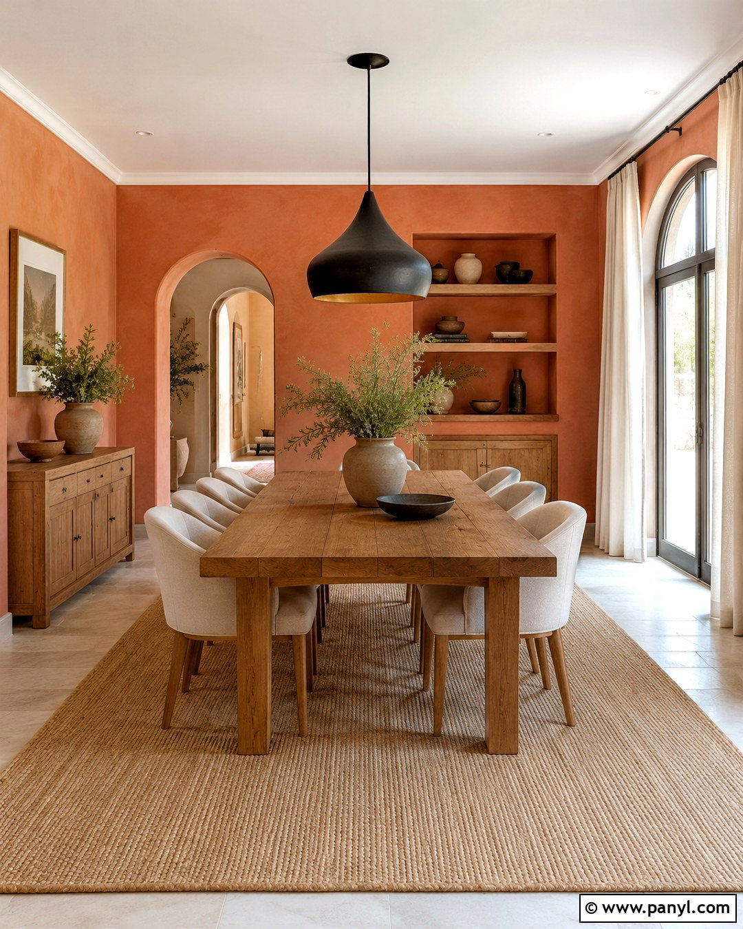
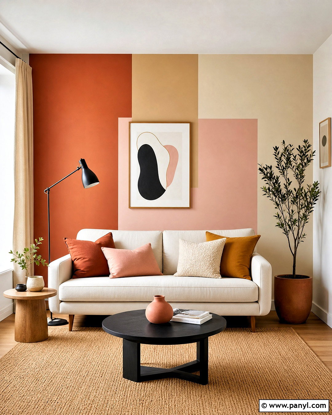
Soft terracotta walls can make a dining room feel warm, social, and pleasantly grounded. Select a dusty clay shade rather than a bright orange, then combine it with warm white trim and medium-toned wood flooring. A substantial oak dining table becomes the natural centerpiece, surrounded by woven-seat chairs or simple cream upholstered seating. Hang a sculptural black pendant above the table for clean contrast. Linen curtains, handmade pottery, and a textured neutral rug soften the earthy scheme. Small accents of muted green work beautifully through plants, artwork, or table linens. Keep the ceiling light and uncluttered so the room feels open. The completed look suits Southwestern, Mediterranean, organic modern, and relaxed transitional homes.
4. Dusty Blue Wall Color
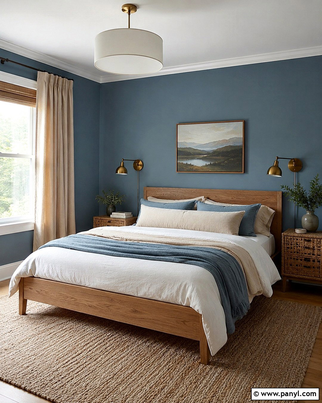
Imagine waking up in a bedroom that feels clear, quiet, and softly illuminated. Dusty blue walls deliver that effect when paired with warm materials that balance the shade’s cool character. Paint the walls in a muted medium-light blue and keep the ceiling creamy white. Choose a natural oak bed with layered white, oatmeal, and faded blue bedding. Warm beige curtains, a wool rug, and woven bedside tables add comfort without distracting from the wall color. Use antique brass sconces instead of cool silver fixtures to introduce warmth. A small landscape print above the bed can repeat the blue and tan palette. This complete arrangement feels restful, timeless, and more personal than a standard pale gray bedroom.
5. Muted Mustard Yellow Wall Color
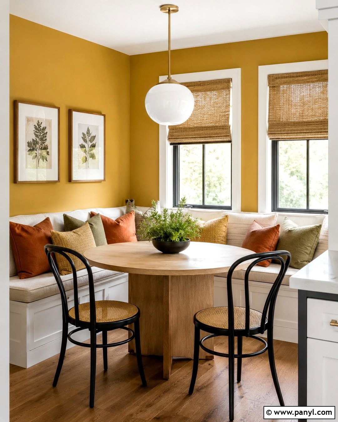
Muted mustard yellow brings energy to a breakfast nook without creating the sharp intensity of brighter yellows. Use a warm, slightly earthy shade on the walls and balance it with off-white trim, light wood flooring, and simple furnishings. A round white oak table with curved black chairs gives the room a modern foundation. Add a built-in bench with cream cushions and patterned pillows in rust, olive, and mustard. A white globe pendant keeps the design light, while natural woven shades filter strong morning sun. Display a few ceramic pieces or botanical prints rather than filling every surface. The finished nook feels cheerful and comfortable, making it suitable for casual meals, homework, and relaxed weekend gatherings.
6. Rich Olive Green Wall Color
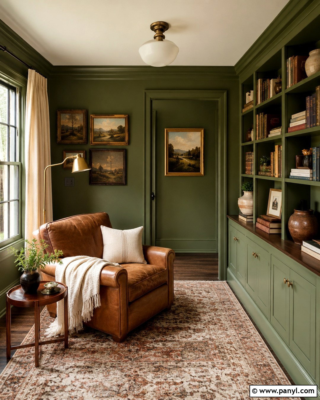
Rich olive green can turn an ordinary reading room into a layered retreat. Cover the walls, built-in bookcases, and trim in the same muted olive for a seamless color-drenched effect. A camel leather armchair and matching footstool add warmth, while a walnut side table supports the earthy palette. Place a vintage-inspired rug in faded red, tan, and green beneath the seating area. A brass floor lamp, cream throw, and linen window panels keep the darker room from feeling severe. Books, pottery, and framed artwork should be arranged with breathing room between pieces. The result is cozy but refined. This look works particularly well in rooms with architectural molding, bookcases, or a compact footprint that benefits from visual continuity.
7. Pale Blush Pink Wall Color
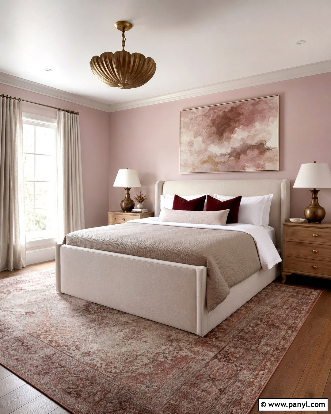
Pale blush pink creates a sophisticated guest bedroom when it is treated as a soft neutral rather than a sugary theme. Choose a dusty pink with beige or gray undertones and pair it with warm white trim. Center a cream upholstered bed against the main wall, then layer it with white linens, a taupe coverlet, and muted burgundy pillows. Light oak nightstands and aged brass lamps provide gentle warmth. Ground the room with a vintage-patterned rug containing faded pink, brown, and ivory. Add simple linen curtains and one oversized abstract print instead of numerous small decorations. The balanced palette makes the pink walls feel mature, calm, and versatile enough to complement contemporary, traditional, or romantic furnishings.
8. Charcoal Gray Wall Color
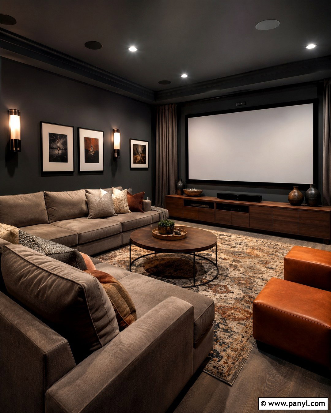
Charcoal gray gives a media room an enveloping appearance while helping the screen blend naturally into its surroundings. Paint the walls and ceiling in a deep charcoal with a soft neutral undertone, using a matte finish to reduce distracting reflections. Anchor the room with a large sectional in medium gray or warm taupe. Add a low walnut media console, black fixtures, and closed storage to maintain a clean layout. Textured pillows, thick curtains, and a patterned wool rug introduce softness and improve comfort. Use dimmable wall sconces and concealed accent lighting rather than one harsh ceiling fixture. Small touches of caramel leather and cream prevent the scheme from becoming flat. The final room feels cinematic, practical, and welcoming.
9. Warm Khaki Wall Color
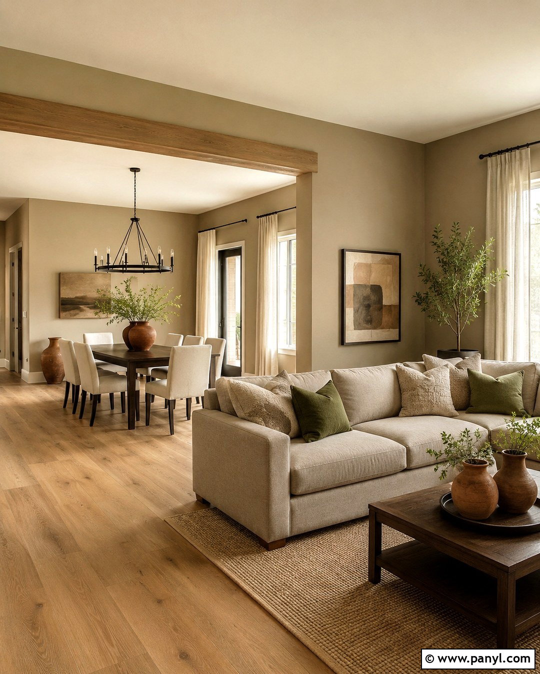
Warm khaki walls provide more character than beige while remaining easy to coordinate across an open living and dining space. Select a balanced tan with subtle green undertones and repeat it consistently throughout the connected areas. Use creamy trim, medium oak floors, and warm white upholstery to create a relaxed base. A dark wood dining table visually anchors one side, while a taupe sectional defines the living zone. Add black metal lighting, olive pillows, natural linen curtains, and pottery in rust or brown. Keep large furniture simple so the wall color can unify the different functions. This scheme is especially effective for homes filled with natural fibers and wood. It feels earthy, practical, and current without depending on short-lived decorative accessories.
10. Teal Blue Wall Color
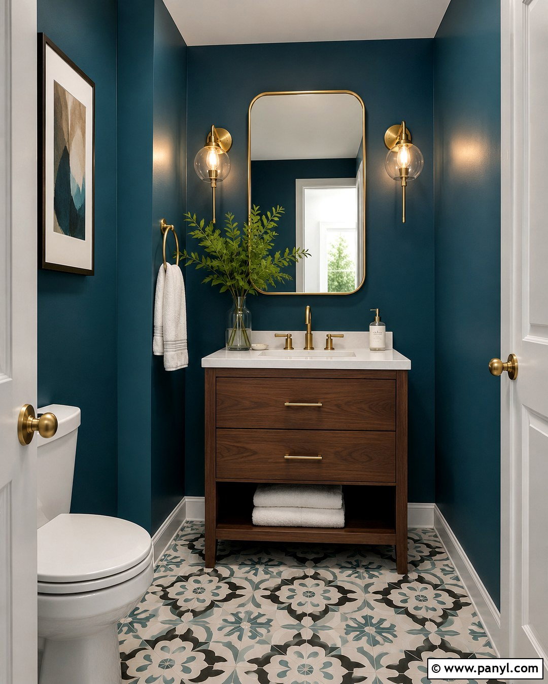
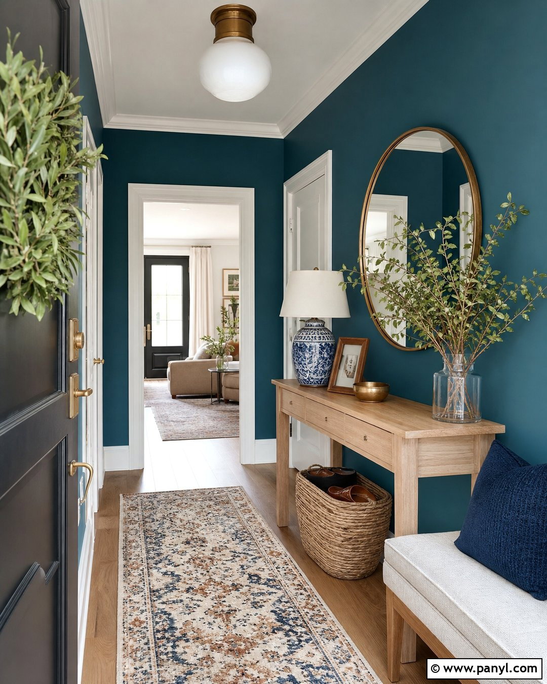
Teal blue can make a powder room feel memorable without requiring a large decorating budget. Wrap the walls in a deep blue-green shade and use clean white paint on the ceiling to maintain brightness. A compact walnut vanity with a white stone top brings warmth to the saturated color. Install a rounded brass mirror, matching faucet, and two simple glass sconces for polished contrast. Patterned floor tile in cream, teal, and charcoal can connect the room from top to bottom. Keep accessories limited to white towels, a small ceramic tray, and one leafy branch. Because powder rooms are used briefly, they can support stronger color than many shared spaces. The finished design feels jewel-like, balanced, and intentionally complete rather than merely bold.
11. Warm Mahogany Wall Color
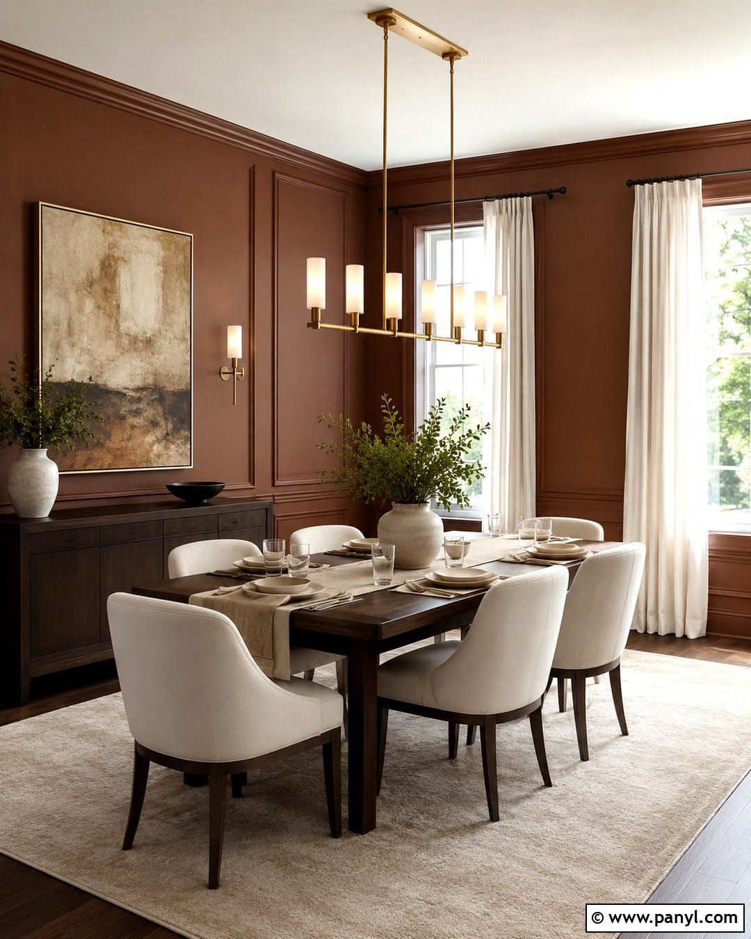
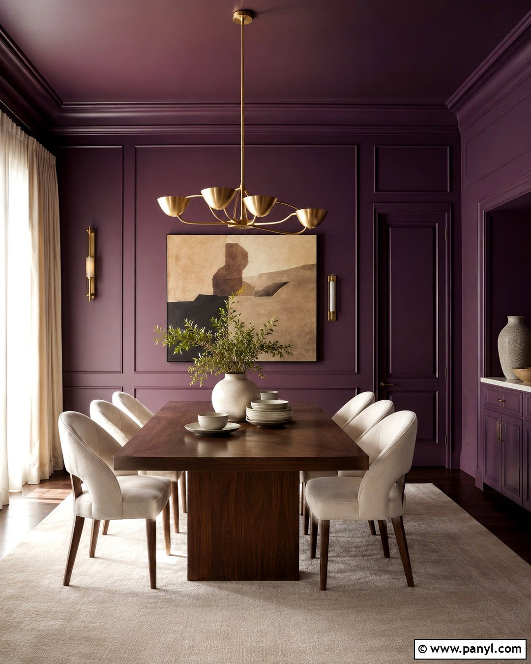
Warm mahogany walls create an intimate dining room with greater softness than a true red. Look for a deep reddish brown with earthy undertones, then continue it across the walls and molding for a unified backdrop. Introduce a dark walnut table, cream upholstered chairs, and a large neutral rug to balance the depth. A linear brass chandelier adds a warm reflective finish without overwhelming the room. Use ivory curtains to frame the windows and brighten the wall edges. Artwork featuring rust, tan, black, and muted green can connect the palette. Keep the table setting simple with stoneware and natural linen. This complete scheme feels formal enough for entertaining yet comfortable enough for regular family meals, especially under layered, adjustable lighting.
12. Powder Blue Wall Color
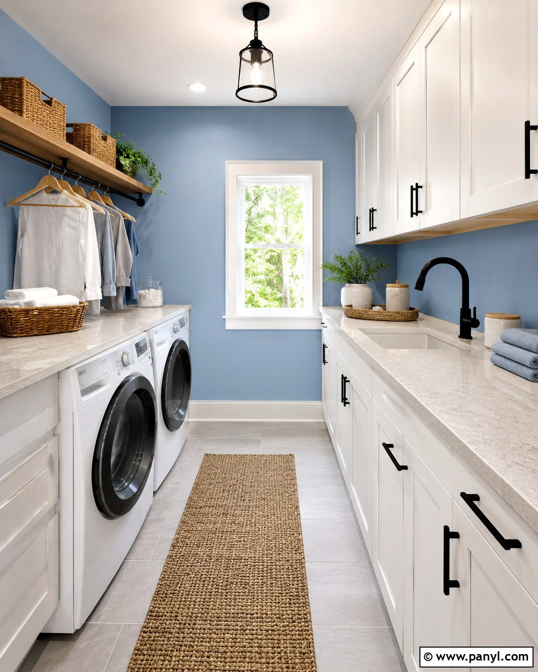
Powder blue gives a laundry room a fresh appearance while making practical finishes feel less utilitarian. Paint the walls in a clean, airy blue and pair them with white cabinetry, pale quartz counters, and light gray floor tile. Add a warm oak shelf above the counter to display labeled baskets, folded towels, and simple ceramic containers. Matte black cabinet hardware provides crisp definition, while a woven runner adds texture underfoot. If space allows, include a hanging rail and a narrow folding station to improve everyday function. Use bright ceiling lighting with a neutral white temperature so the wall color remains clear. The finished laundry room feels organized, cheerful, and visually connected, proving that a hardworking area can still have a complete decorative identity.
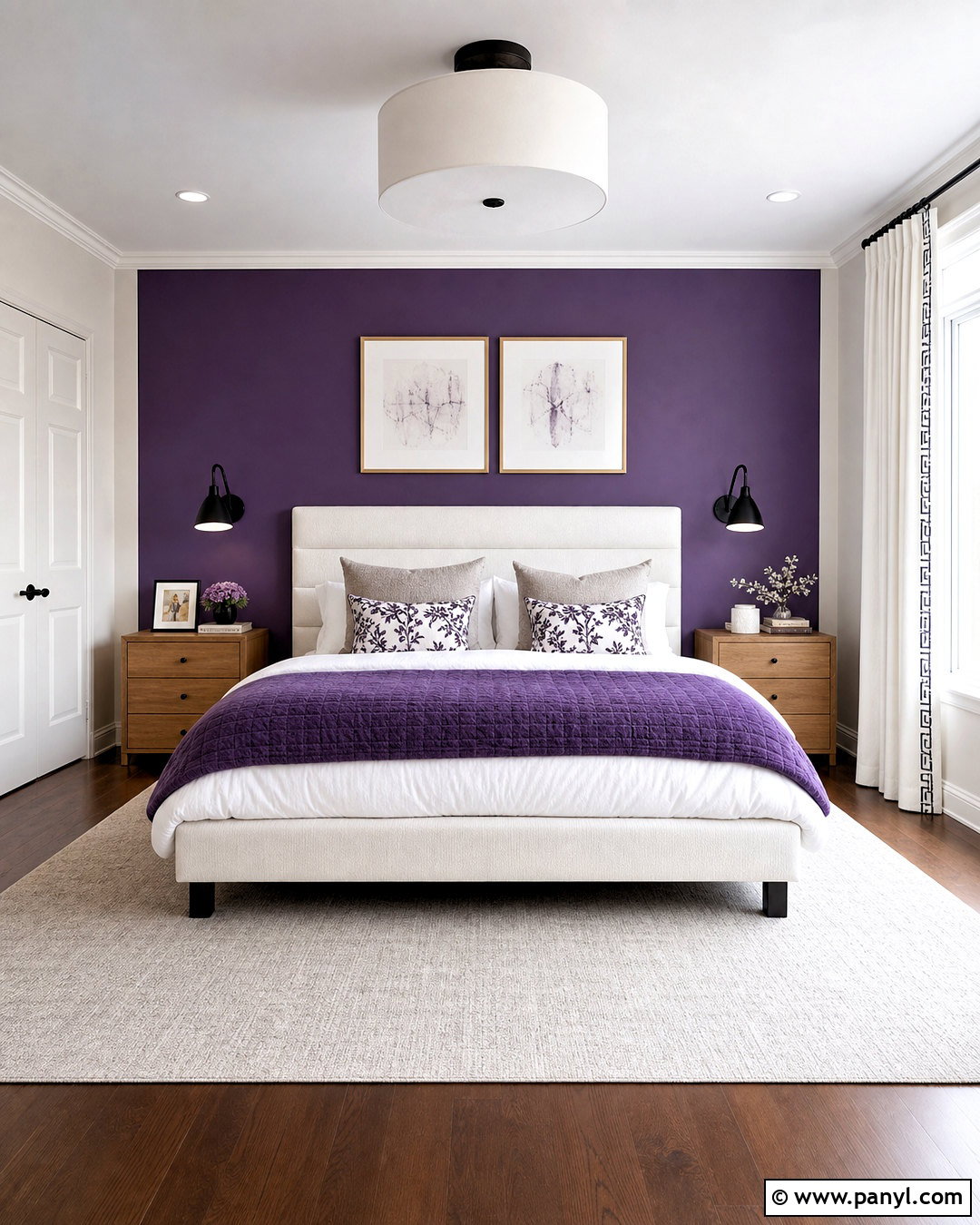
13. Plum Purple Wall Color
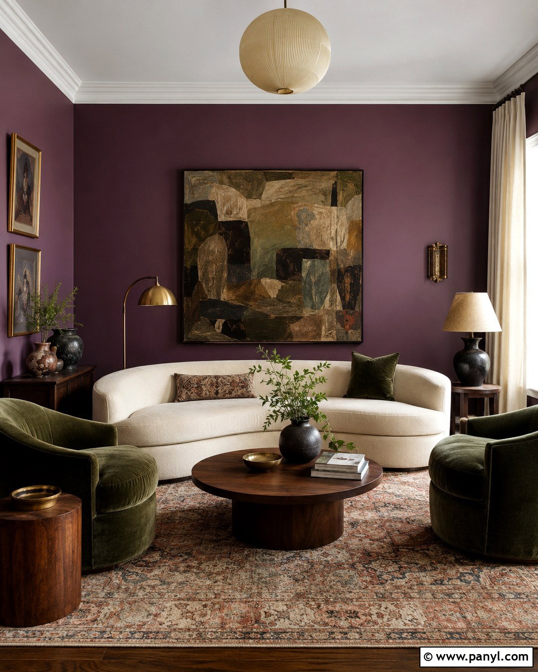
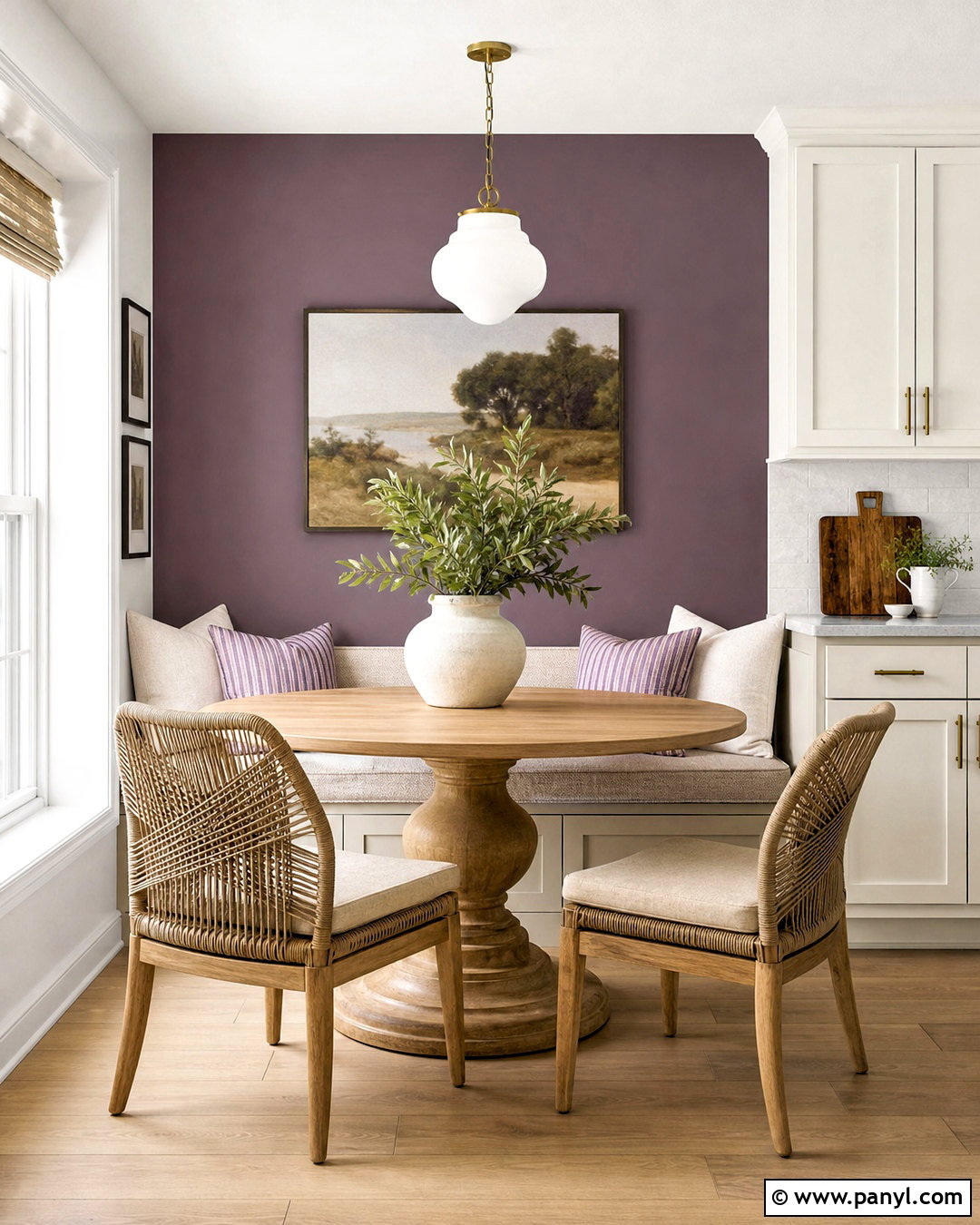
Plum purple can transform a formal sitting room into a comfortable, expressive space when balanced with understated furnishings. Choose a muted plum with brown or gray undertones and apply it to every wall. Pair the color with a curved cream sofa, walnut side tables, and a faded Persian-style rug. Olive green velvet chairs create an interesting contrast while remaining grounded in the room’s earthy palette. Add aged brass lamps, off-white curtains, and artwork that combines plum, rust, olive, and beige. Avoid filling the room with shiny accessories because matte and tactile finishes make the color easier to live with. The complete design feels distinctive without becoming theatrical, offering an inviting setting for conversation, reading, or quiet evening relaxation.
14. Burnt Orange Wall Color
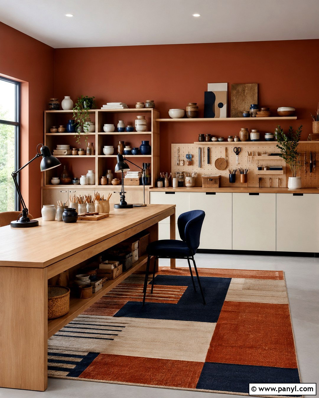
Burnt orange walls bring warmth and personality to a creative studio or craft room. Select a sophisticated orange with brown and clay undertones, then pair it with white upper walls or a pale ceiling to preserve visual breathing room. Use a long light oak worktable, open shelving, and closed cream cabinets to support an efficient layout. Black task lamps and hardware sharpen the palette. A washable flat-weave rug with rust, navy, and beige adds pattern without competing with supplies. Organize tools in matching baskets and ceramic containers so the room remains visually calm. Add one navy chair or cabinet for a cool counterpoint. This full design encourages creativity while keeping storage, work surfaces, lighting, and color carefully coordinated.
15. Forest Green Wall Color
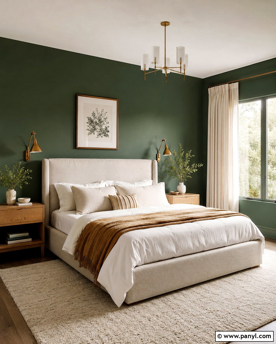
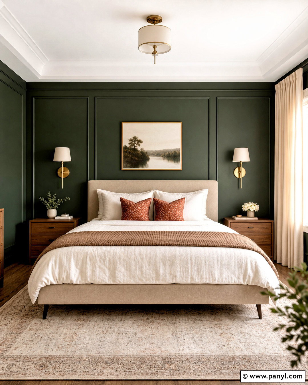
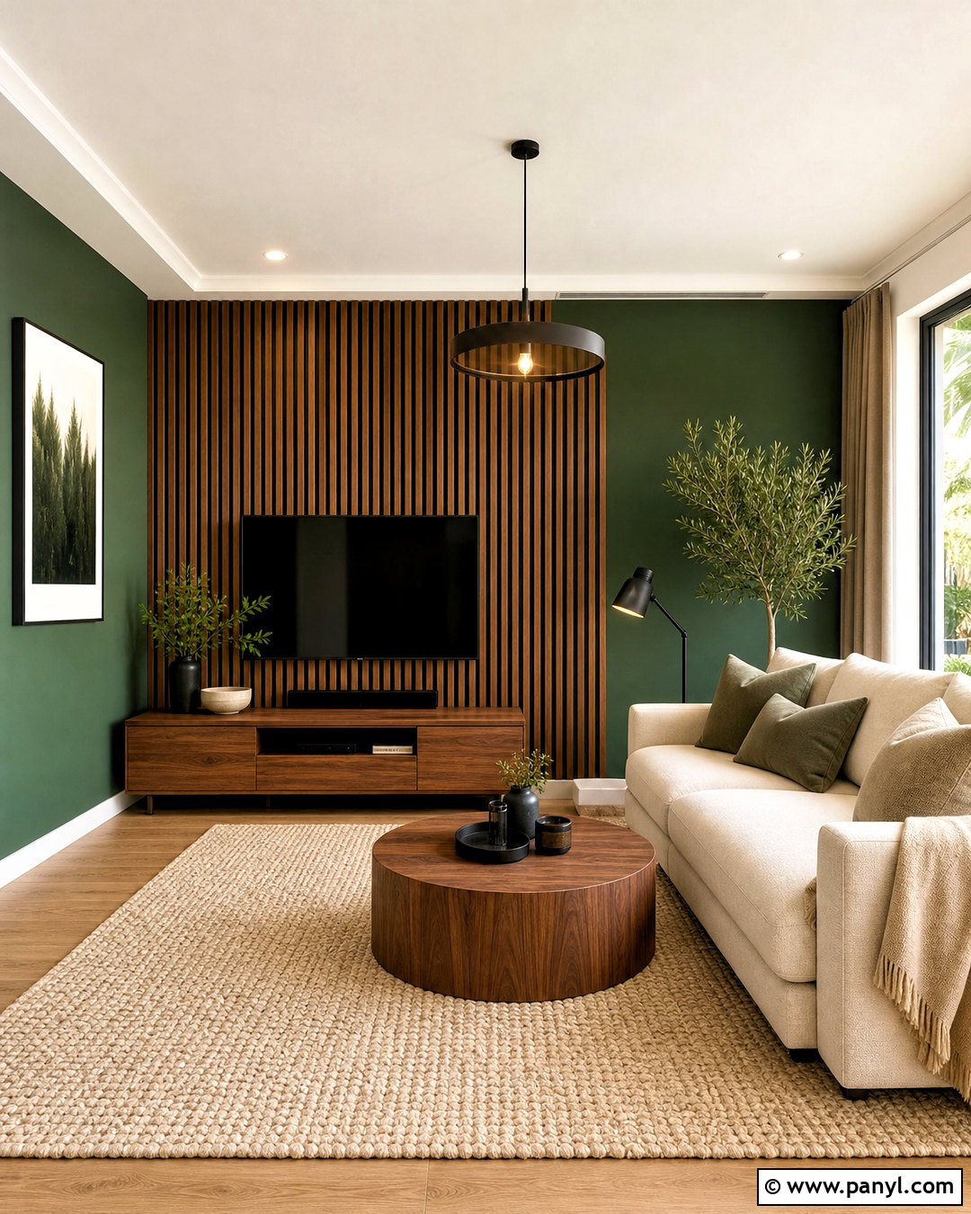
Forest green creates a dramatic bedroom that feels restful when it is layered with lighter natural textures. Paint the wall behind the bed and the remaining walls in the same deep green for a finished, immersive appearance. Keep the ceiling warm white to reflect light overhead. Choose a tall oatmeal upholstered bed, white linen bedding, and a camel-colored throw. Medium oak nightstands and brass reading lights complement the green without adding unnecessary color. Ground the furniture with an ivory and tan wool rug. Sheer curtains beneath heavier cream drapes provide flexible light control. Minimal botanical artwork can repeat the wall tone subtly. The resulting bedroom is rich and cocooning, yet the pale textiles and warm wood prevent it from feeling closed in.
16. Lavender Gray Wall Color
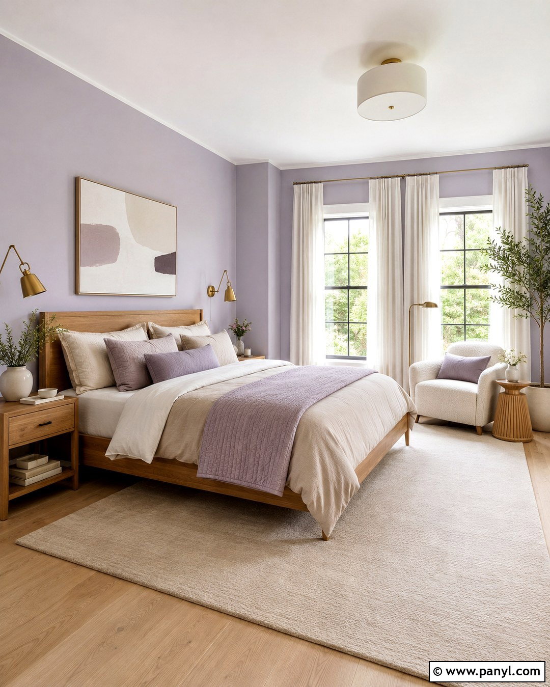
Lavender gray offers a gentle alternative to standard cool gray in a quiet bedroom, nursery, or meditation space. Choose a light, subdued lavender that reads almost neutral during the day. Pair it with soft white trim, pale oak flooring, and an ivory textured rug. A simple white or natural wood bed keeps the room airy, while bedding in cream, mushroom, and dusty lilac builds subtle layers. Add brushed nickel or soft brass lighting, depending on the surrounding finishes. Light-filtering linen curtains allow daylight to reveal the wall color without creating glare. A small upholstered chair and minimal abstract artwork complete the design. The finished palette feels serene and flexible, with enough color to appear interesting but not visually demanding.
17. Earthy Taupe Wall Color
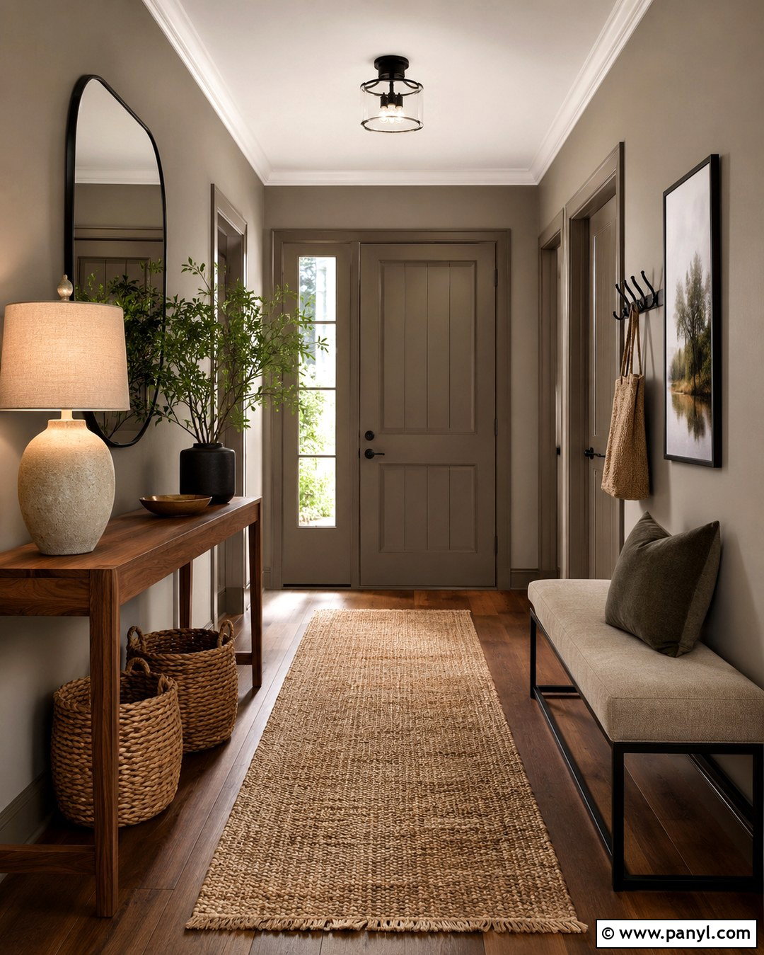
Earthy taupe makes an entryway feel warm and established while hiding everyday marks better than a very pale neutral. Select a medium taupe with balanced brown and gray undertones, then paint the walls and interior doors for visual continuity. Keep the trim slightly lighter rather than bright white. Place a slim walnut console against one wall with a rounded black mirror above it. Add a woven runner, lidded storage baskets, and a simple upholstered bench for practical comfort. A ceramic lamp and one leafy plant soften the functional pieces. Black hooks or a narrow wall-mounted rail can organize coats without cluttering the floor. This coordinated entry design creates an inviting transition into the home and works with both modern and traditional furnishings.
18. Sky Blue Wall Color
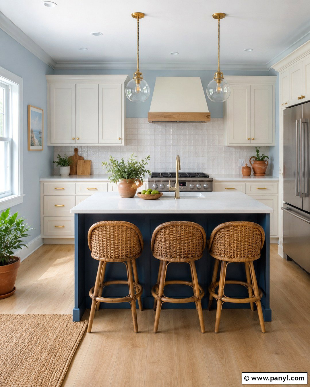
Sky blue walls can make a compact kitchen feel open, light, and pleasantly colorful. Use a soft but clear blue on the upper walls, pairing it with creamy white cabinets and a backsplash of warm white handmade tile. Light oak flooring and butcher-block accents prevent the palette from feeling cold. Choose brushed brass hardware, white quartz countertops, and simple glass pendants for a bright finish. A small island painted in deeper slate blue adds structure without interrupting the airy effect. Include natural woven stools and a few terracotta planters to introduce warmth. Keep countertops mostly clear so the room’s colors and materials remain visible. The completed kitchen feels cheerful, approachable, and carefully coordinated rather than overly themed.
19. Soft Peach Wall Color
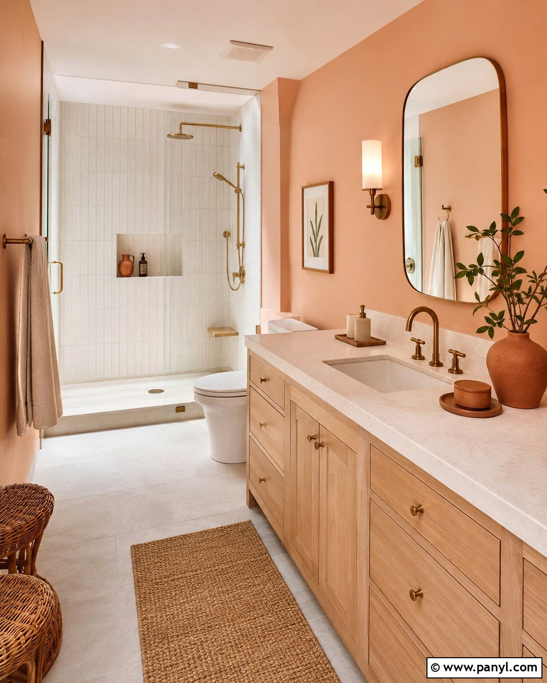
Soft peach brings flattering warmth to a bathroom while feeling lighter and more modern than strong coral. Paint the walls in a pale peach with muted beige undertones, then use warm white for the ceiling and trim. Pair the color with a light oak vanity, creamy stone counter, and off-white vertical tile around the shower. Brushed brass fixtures add definition, while a rounded mirror softens the clean lines. Use ivory towels, a small woven stool, and terracotta accessories to reinforce the warm palette. Pale gray floor tile provides enough cool contrast to keep the room balanced. With bright, even lighting, the finished bathroom feels fresh and welcoming. It also creates a gentle transition between natural wood, stone, metal, and painted surfaces.
20. Warm Black Wall Color
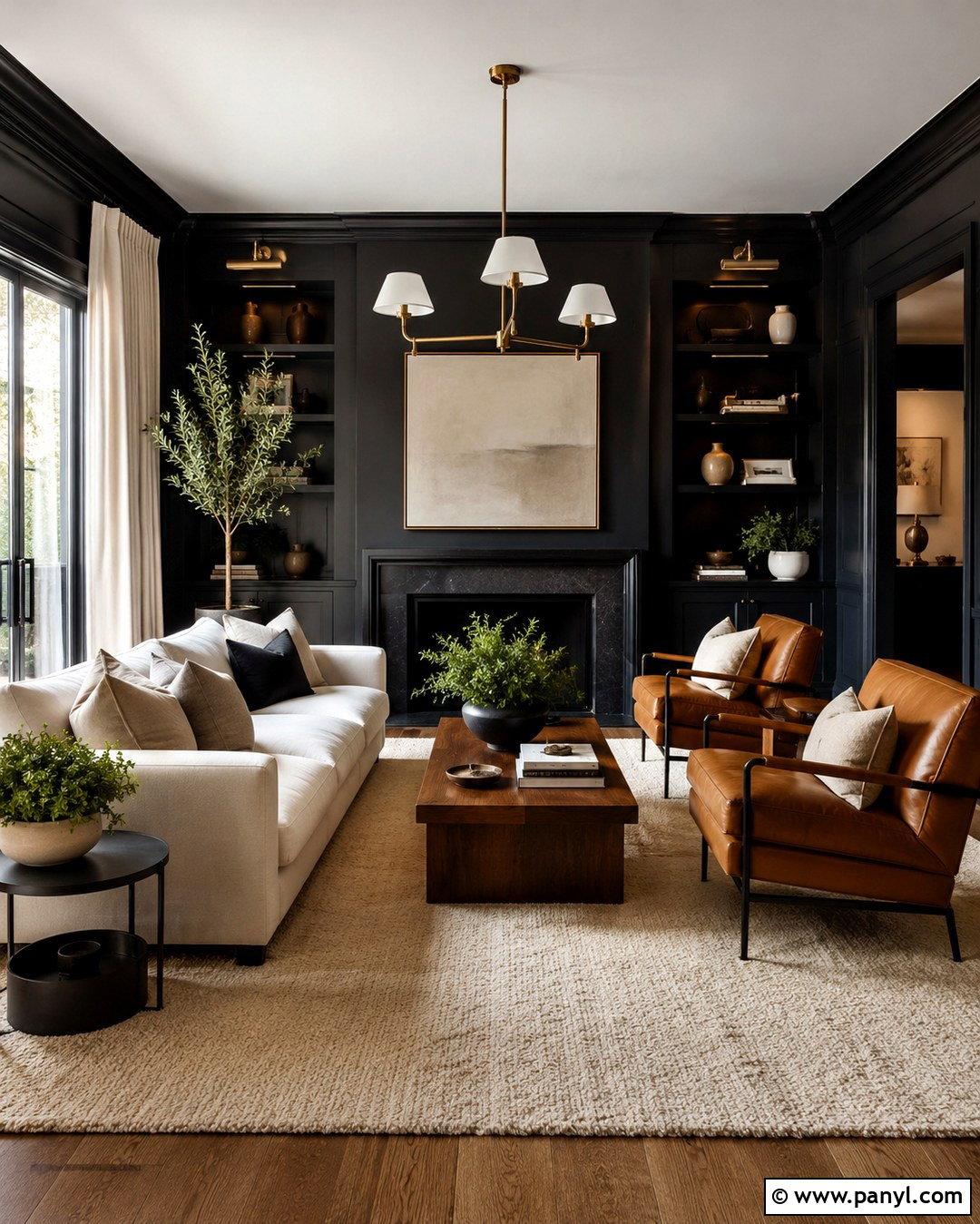
Warm black creates a striking living room when it is softened with pale upholstery, natural wood, and generous lighting. Choose a near-black shade with brown undertones and carry it across the walls, trim, and built-in shelving for a seamless result. Position a large ivory sofa against the dark backdrop and add two caramel leather chairs for warmth. A substantial oak coffee table and cream wool rug lighten the center of the room. Use linen curtains, oversized neutral artwork, and sculptural brass lighting to add contrast without clutter. Green plants can provide one fresh accent. This complete scheme works best with multiple windows or layered artificial lighting. The result feels sophisticated and comfortable rather than stark, cold, or overly formal.
Conclusion:
Choosing wall paint becomes easier when you consider the entire room instead of viewing a color by itself. Flooring, trim, furniture, natural light, and metal finishes can all change how a shade appears. Before committing, paint large sample areas on more than one wall and observe them from morning through evening. Warm neutrals offer flexibility, while saturated greens, blues, reds, and purples create stronger atmosphere. Lighter textiles and reflective finishes can balance dark walls, while wood and woven materials soften brighter colors. Most importantly, select a palette that supports how the room is actually used. These complete schemes from 20 Interesting Wall Colors provide practical starting points for creating a distinctive, coordinated home.

Related Ideas and Inspiration:
Leave a Reply