
Dark gold walls bring warmth, depth, and character to rooms that need more personality than beige can offer. These rich shades range from muted ochre and antique brass to earthy mustard and golden amber. The key is treating the color as part of a complete palette. Cream trim keeps it fresh, dark wood adds sophistication, and blue, green, or charcoal accents create balance. Lighting also matters because deep yellow undertones can look brighter in direct sun and browner in shadow. Always test large samples beside your flooring and furnishings before choosing a finish. The following complete room schemes show practical ways to decorate with **20 Dark Gold Paint Colors For Walls**.

1. Benjamin Moore Venetian Gold Living Room
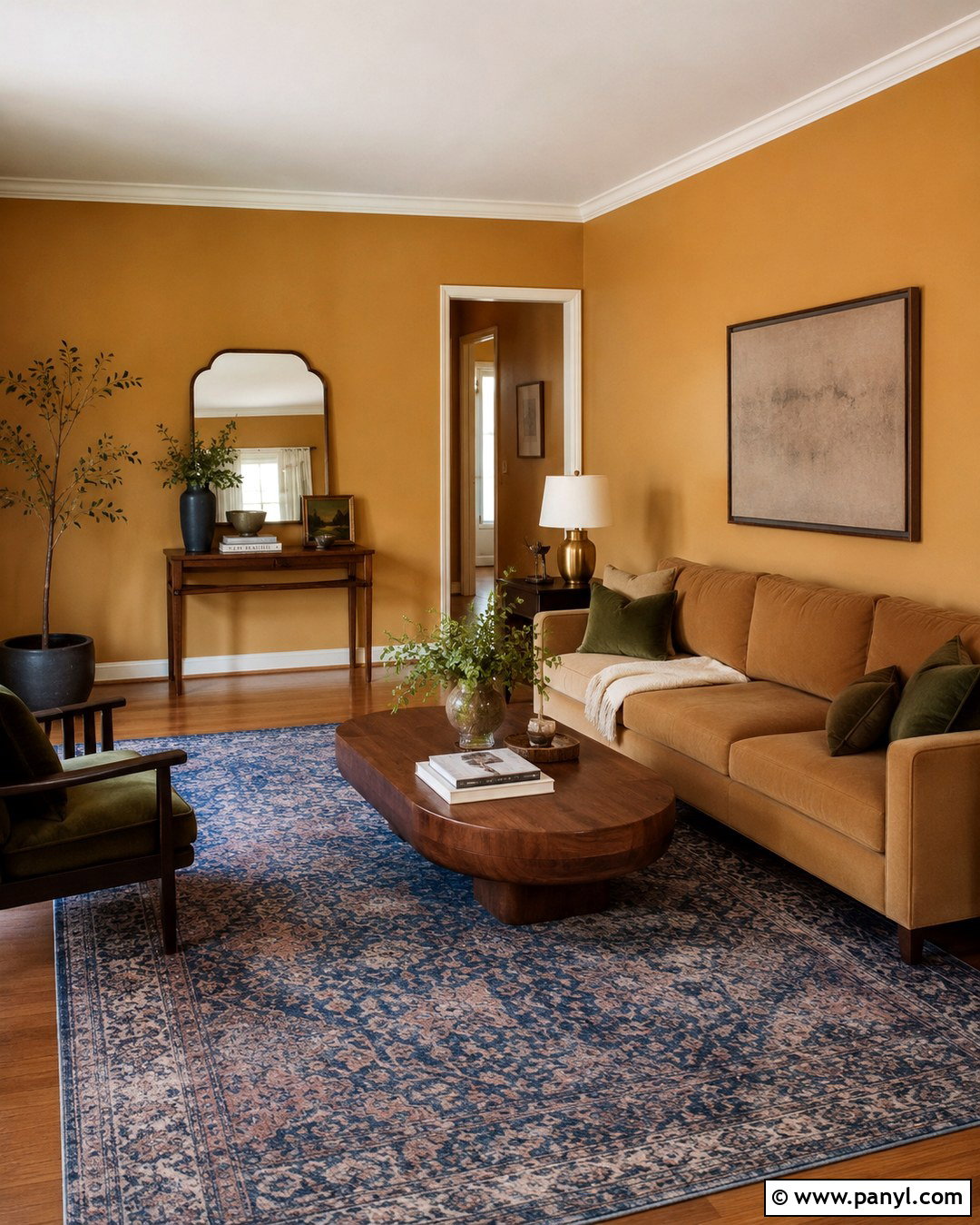
Benjamin Moore Venetian Gold 2158-20 is a golden amber with substantial warmth and an elegant, traditional quality. () Use it throughout a living room with creamy white trim rather than stark white, which can make the color appear overly orange. A camel-colored sofa, walnut coffee table, and faded navy rug create a grounded palette. Bring in aged brass lamps, linen curtains, and olive green pillows for softer contrast. Medium oak flooring supports the earthy undertones without making the room too dark. Choose warm white bulbs in simple ceramic or metal fixtures. This complete scheme feels polished and welcoming, especially in a room receiving balanced northern or eastern light.
2. Benjamin Moore Gold Mine Dining Room
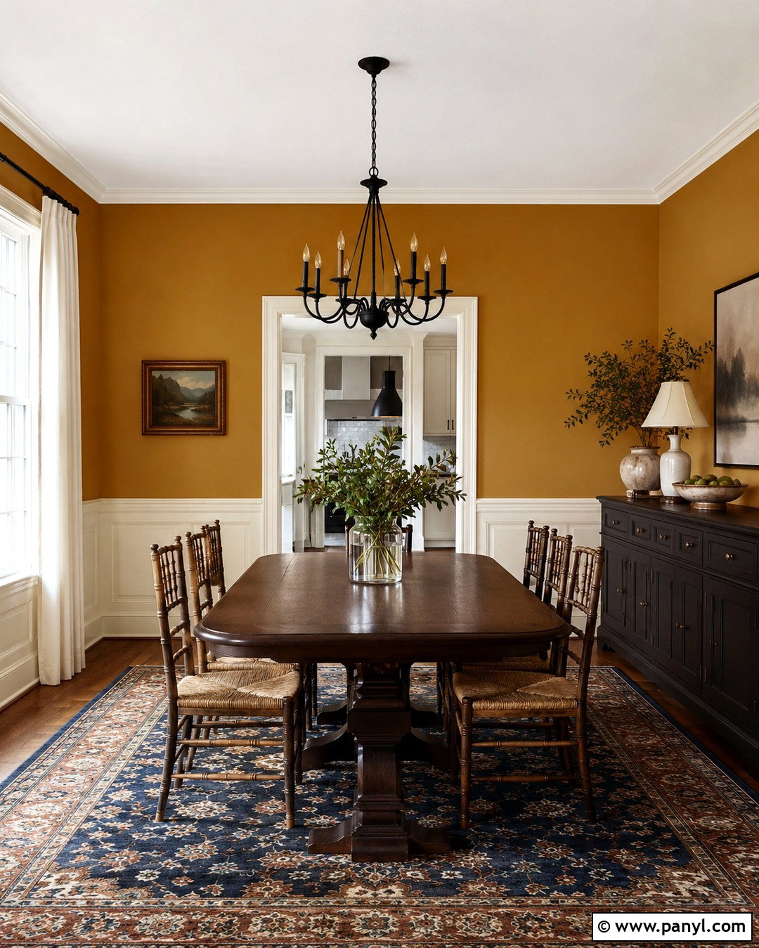
Gold Mine 2155-20 combines strong yellow, orange, and amber notes, creating a saturated wall color with an LRV of 33.84. () Let it transform a dining room by painting the walls above creamy white wainscoting. Add a long dark walnut table, woven rush chairs, and a charcoal sideboard to control the brightness. A vintage-style rug featuring navy, rust, and ivory will connect the room’s warm and cool tones. Use a simple black chandelier instead of an elaborate gold fixture so the walls remain the main feature. White linen curtains and pale ceramic accessories provide breathing room. This layered scheme gives Gold Mine a refined appearance rather than a bright, playful yellow effect.
3. Benjamin Moore Dried Mustard Bedroom
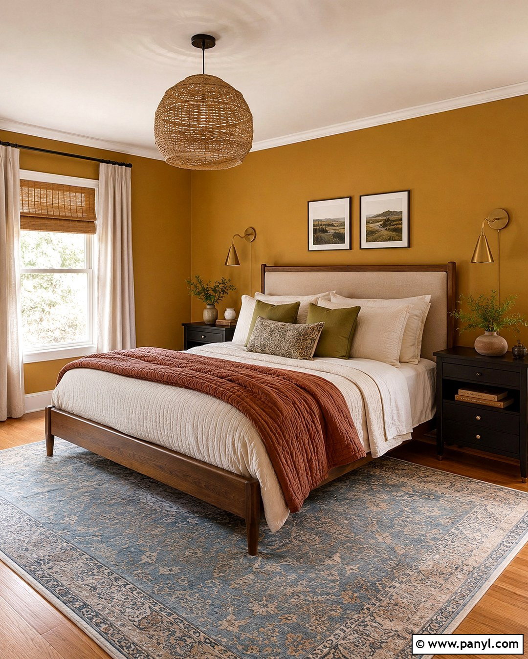
Want a bedroom that feels cozy without relying on brown or gray? Benjamin Moore Dried Mustard 2158-10 creates a deep ochre backdrop that works beautifully with natural textures. Paint all four walls for an enveloping effect, then use a soft ivory ceiling and matching trim to frame the color. Choose a low walnut bed with an oatmeal upholstered headboard, crisp cream bedding, and a rust-colored quilt. Black nightstands and simple brass sconces sharpen the palette. Finish the room with a faded blue area rug, woven shades, and a few olive green accents. The result feels collected and restful. In a small bedroom, keep the floor, curtains, and largest textiles light to prevent the gold walls from feeling heavy.
4. Benjamin Moore Dash Of Curry Home Office
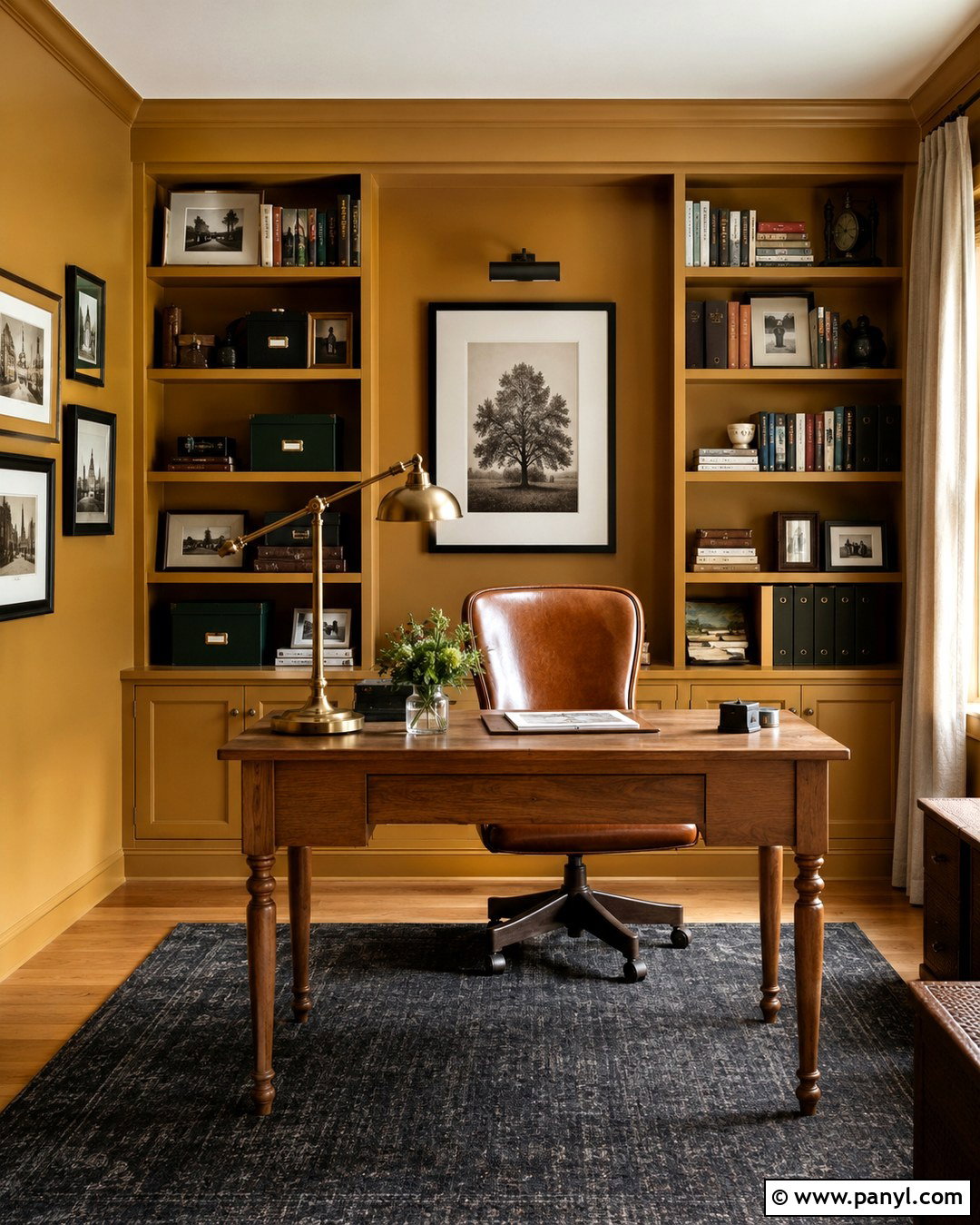
Benjamin Moore Dash of Curry 2159-10 brings spicy brown undertones to a dark gold office palette. Cover the walls and built-in shelving in the same eggshell color for a cohesive, color-drenched look. Keep the ceiling warm white to reflect useful light over the workspace. A substantial oak desk, cognac leather chair, and flat-woven charcoal rug create a professional foundation. Add black picture frames, antique brass task lighting, and dark green storage boxes for strong contrast. Natural linen curtains will soften the saturated walls without hiding them. This design works especially well in a study with afternoon light, which emphasizes the color’s warm character. Use minimal artwork so the shelves, books, and wood finishes remain visually organized.
5. Benjamin Moore Gilded Ballroom Entryway
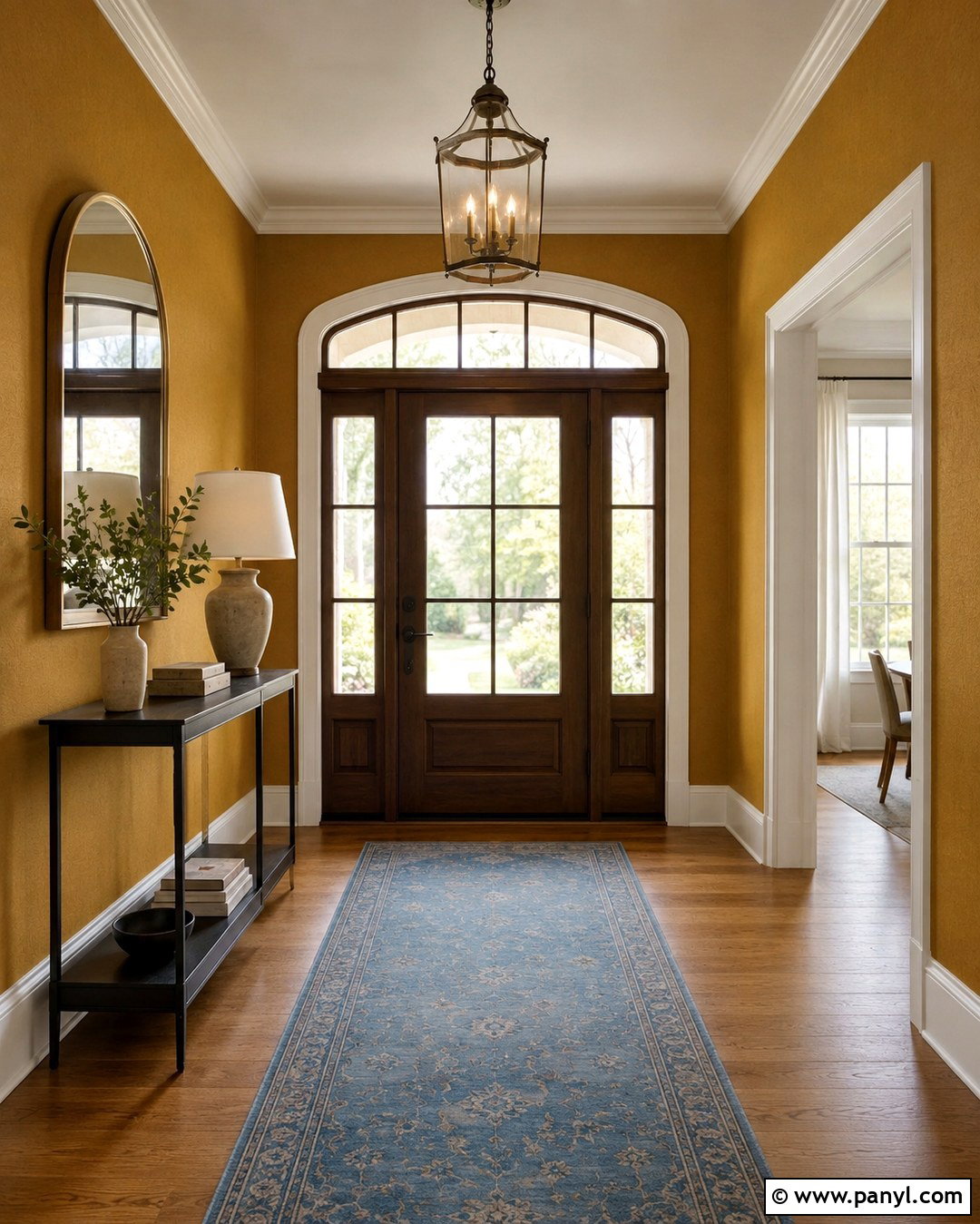
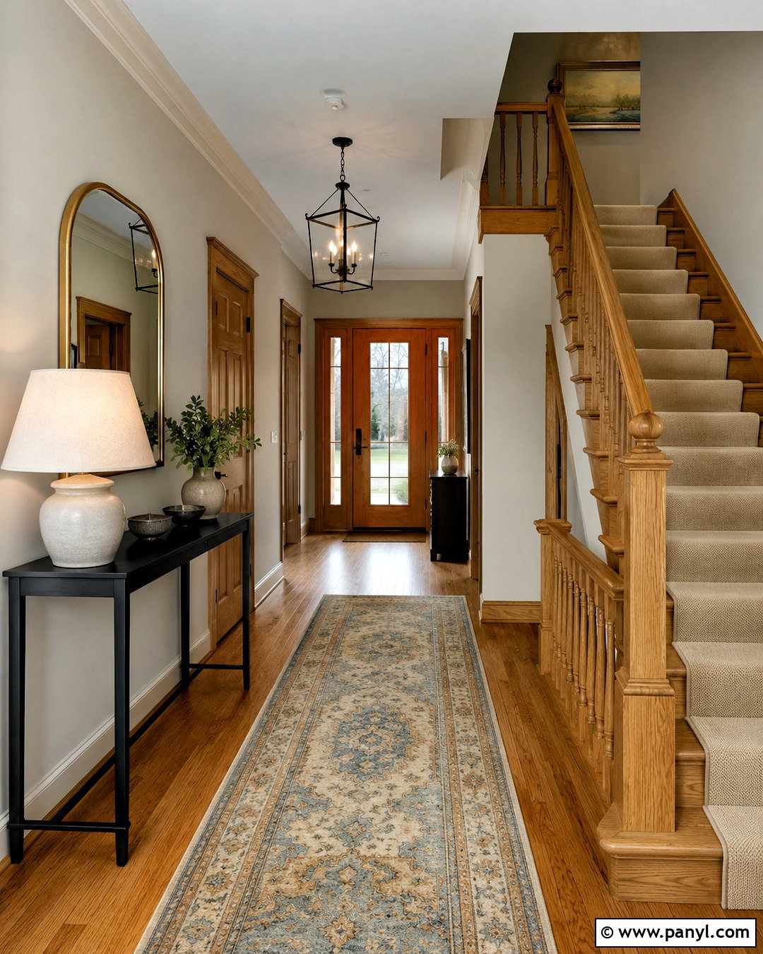
A small entryway can handle a strong paint color when the surrounding details remain simple. Benjamin Moore Gilded Ballroom CSP-980 provides a sophisticated gold backdrop for a traditional or transitional entrance. Pair the walls with warm white baseboards, medium-toned oak flooring, and a slim black console. An arched mirror with an aged brass frame will reflect light and repeat the golden tones without looking overly coordinated. Add a muted blue runner, a ceramic table lamp, and one leafy plant in a dark pot. If the entry connects to neutral rooms, continue the same cream trim through each doorway. This complete look makes the transition feel intentional. Choose an eggshell finish that is easier to clean in this busy area.
6. Benjamin Moore Citrine Guest Room
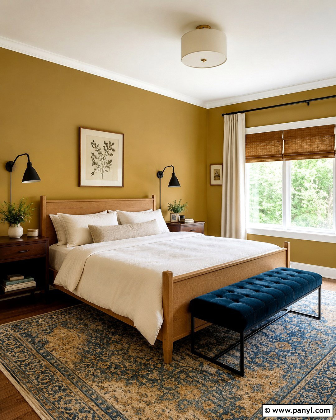
Benjamin Moore Citrine AF-370 offers a muted, mineral-like gold that feels softer than a clear mustard yellow. Use it in a guest room with a natural oak bed, ivory bedding, and a deep teal upholstered bench. The blue-green accent cools the palette while allowing the walls to remain warm and prominent. Install woven bamboo shades beneath simple off-white curtain panels for privacy and texture. A patterned rug combining faded gold, slate blue, and cream will connect every element. Add matte black reading lights and small walnut nightstands for definition. Keep artwork understated, using botanical prints or abstract pieces with generous white space. This comfortable design feels colorful and layered, yet calm enough to help visiting friends and family settle in.
7. Benjamin Moore Spicy Mustard Kitchen
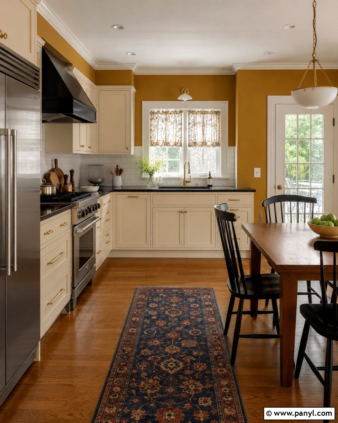
Spicy Mustard 2154-20 can give an ordinary kitchen the character of a warm, established gathering space. Apply it to the walls surrounding cream cabinets, leaving the cabinetry light to preserve an open feeling. Choose honed black granite counters, a simple white tile backsplash, and medium oak flooring for balanced contrast. A small walnut breakfast table with black spindle chairs adds traditional structure. Repeat the wall color subtly through patterned café curtains or a washable runner containing mustard, rust, and navy. Brushed brass cabinet hardware complements the gold without creating an overly shiny finish. Use bright white under-cabinet lighting to keep work surfaces clear. The finished kitchen feels cheerful, grounded, and practical rather than aggressively yellow.
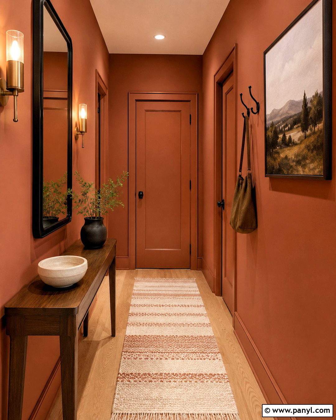
8. Benjamin Moore Metallic Gold Powder Room
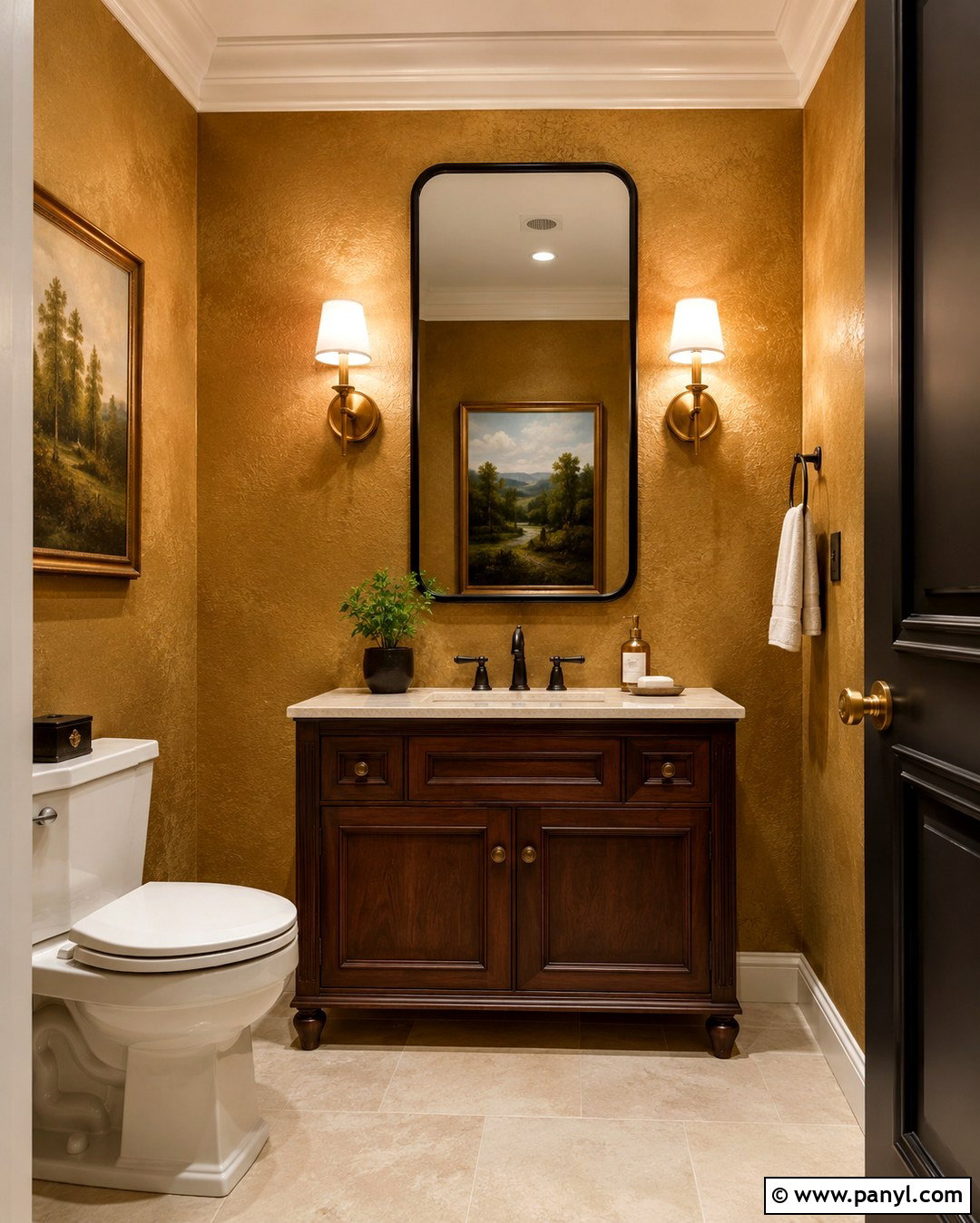
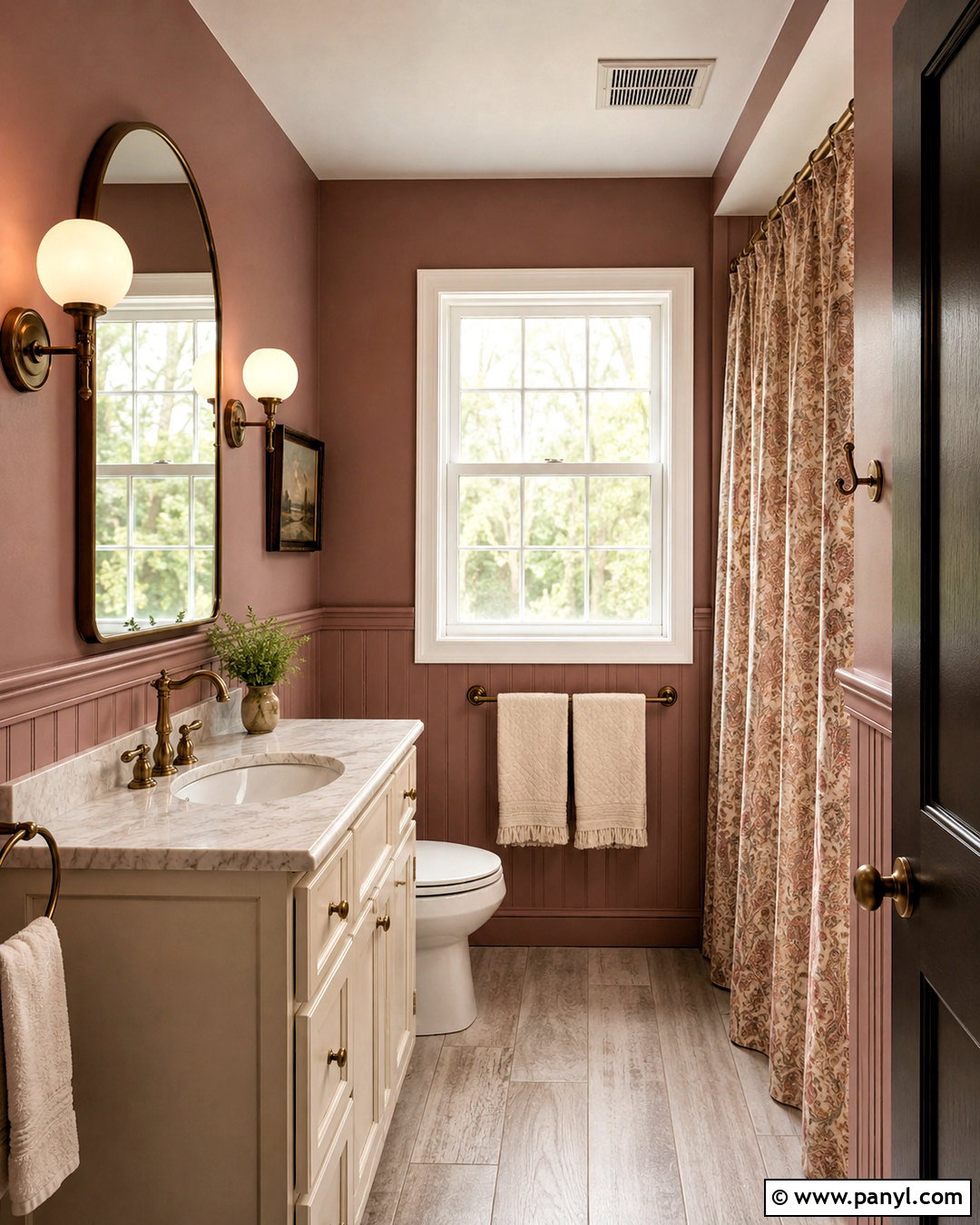
Despite its name, Benjamin Moore Metallic Gold 2163-40 can be used as a rich wall color rather than a literal sparkling metallic finish. Create a dramatic powder room by pairing it with a dark walnut vanity, creamy stone countertop, and warm white ceiling. A black-framed mirror and black faucet give the compact room clean definition. Add unlacquered brass sconces for a gentle material connection to the walls. Small-format ivory floor tile keeps the space bright, while a framed landscape introduces muted green and blue. Because powder rooms are experienced in short visits, they can carry stronger color than larger everyday spaces. Test the paint near artificial lighting first, since bulb temperature can significantly change how its golden undertones appear.
9. Sherwin-Williams Bakelite Gold Family Room
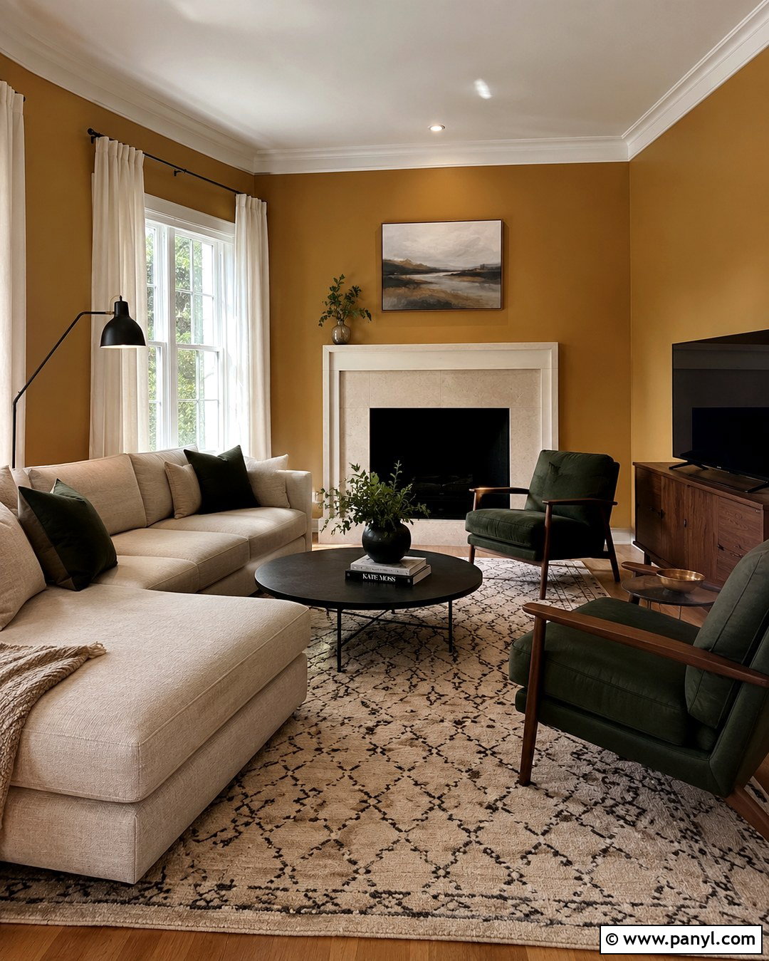
Sherwin-Williams Bakelite Gold SW 6368 has a tawny character that bridges modern and nostalgic interiors. () Use it across a family room with an oatmeal sectional, walnut media cabinet, and large cream-and-charcoal rug. A pair of dark olive armchairs will add contrast while preserving the earthy palette. Hang natural linen curtains from simple black rods, then repeat black through picture frames and a streamlined ceiling fan. Rust, camel, and forest green pillows make the seating feel layered without introducing unrelated colors. Keep the ceiling and fireplace surround a gentle off-white. This complete room works best with several light sources, including a floor lamp, table lamps, and overhead lighting, so the dark gold walls remain warm after sunset.
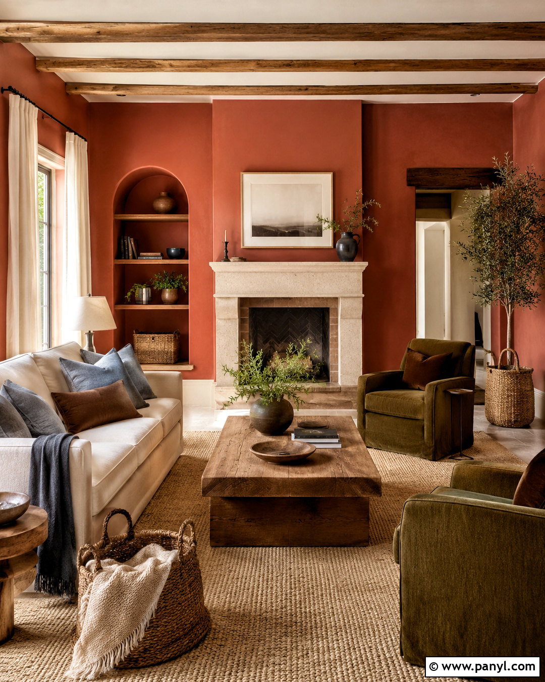
10. Sherwin-Williams Vintage Gold Dining Nook
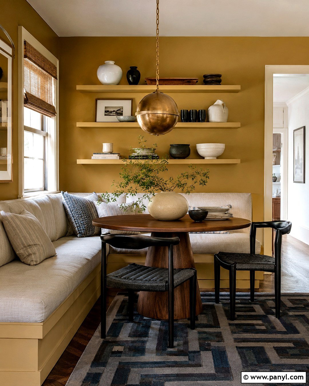
Sherwin-Williams Vintage Gold SW 9024 is a warm yellow-family color with a softened, slightly neutral quality. () Build a comfortable dining nook around it with an L-shaped cream upholstered bench, a round walnut pedestal table, and black wood chairs. Add a globe pendant with an aged brass fitting to create focused lighting over the table. A small geometric rug in charcoal, ivory, and faded blue will visually anchor the arrangement. Use warm white trim and simple woven shades to keep the look casual. Open shelving painted the same gold can hold white ceramics and dark wood serving pieces. The result feels intimate and thoughtfully designed, making it suitable for breakfast areas, apartment dining corners, and smaller eat-in kitchens.
11. Sherwin-Williams Restrained Gold Hallway
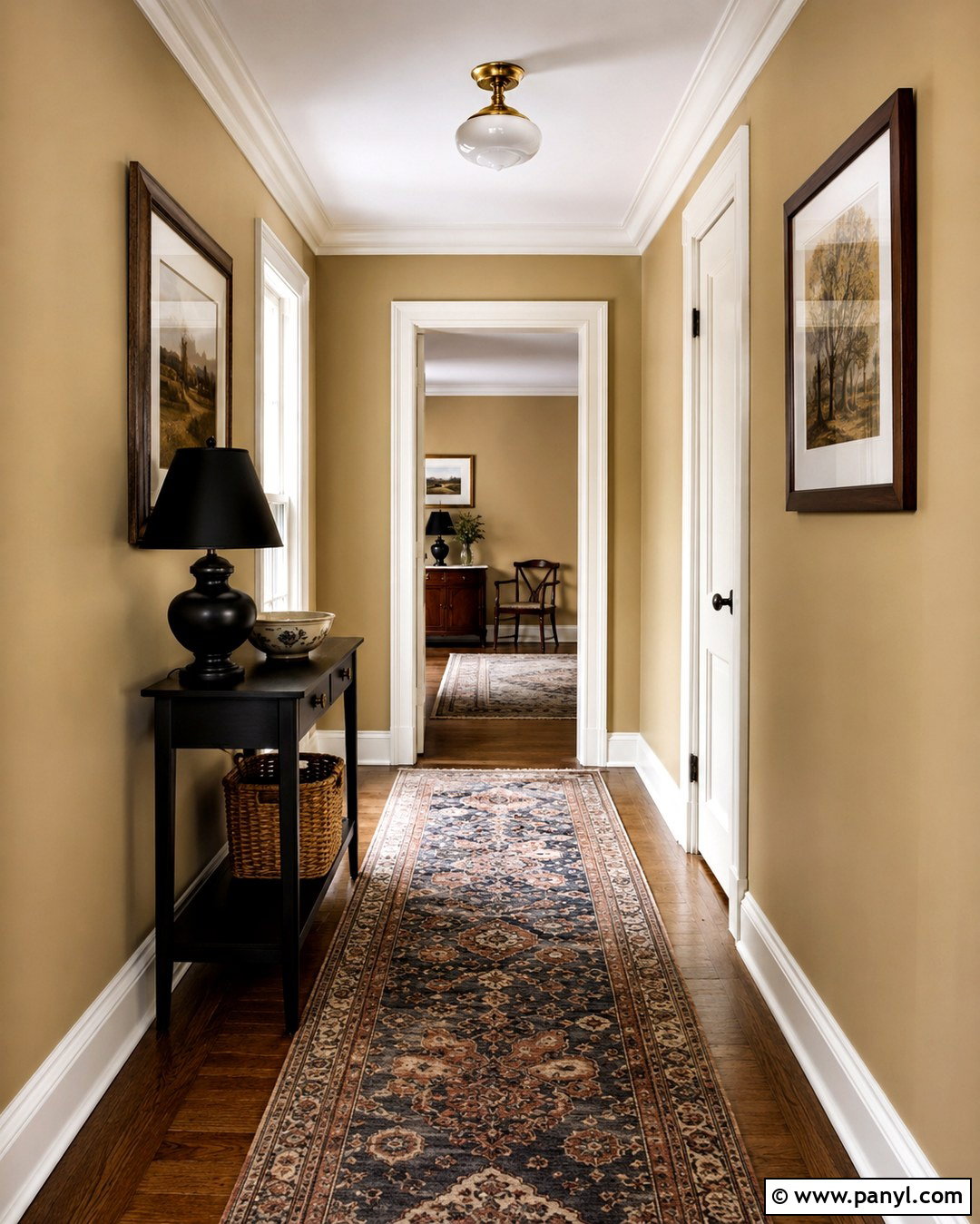
Sherwin-Williams Restrained Gold SW 6129 is a softened, brown-leaning gold that suits hallways where brighter mustard colors might feel overwhelming. Paint the walls in a washable eggshell finish and keep the doors, ceiling, and trim a creamy off-white. A long vintage-style runner featuring dusty navy, rust, and beige will introduce pattern while disguising everyday wear. Use a narrow oak console where space permits, topped with a black lamp and simple ceramic bowl. Hang evenly spaced artwork in walnut or matte black frames to create an organized view down the hall. A warm brass ceiling fixture adds gentle polish. This complete scheme makes a pass-through space feel connected to the home while remaining calm enough to complement neighboring neutral rooms.
12. Sherwin-Williams Mannered Gold Library
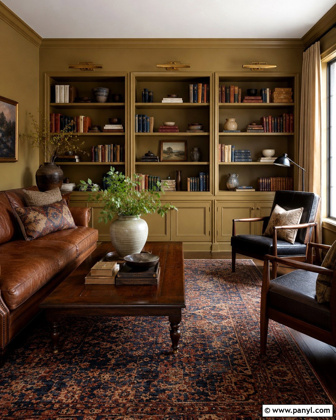
Books, leather, and deep golden walls create a naturally inviting library. Sherwin-Williams Mannered Gold SW 6130 has enough earthy depth to support a traditional reading space without becoming as dark as brown. Paint the walls and bookcases alike, using satin on the shelving for subtle contrast. Add a tobacco leather sofa, dark walnut side tables, and a large faded Persian-style rug containing navy and brick red. Cream linen shades and an ivory ceiling prevent the room from feeling enclosed. Use aged brass picture lights above the shelves and a black reading lamp beside the sofa. Keep decorative objects limited to pottery, framed photographs, and a few sculptural pieces. The completed room feels comfortable, practical, and pleasantly established.
13. Sherwin-Williams Different Gold Bedroom
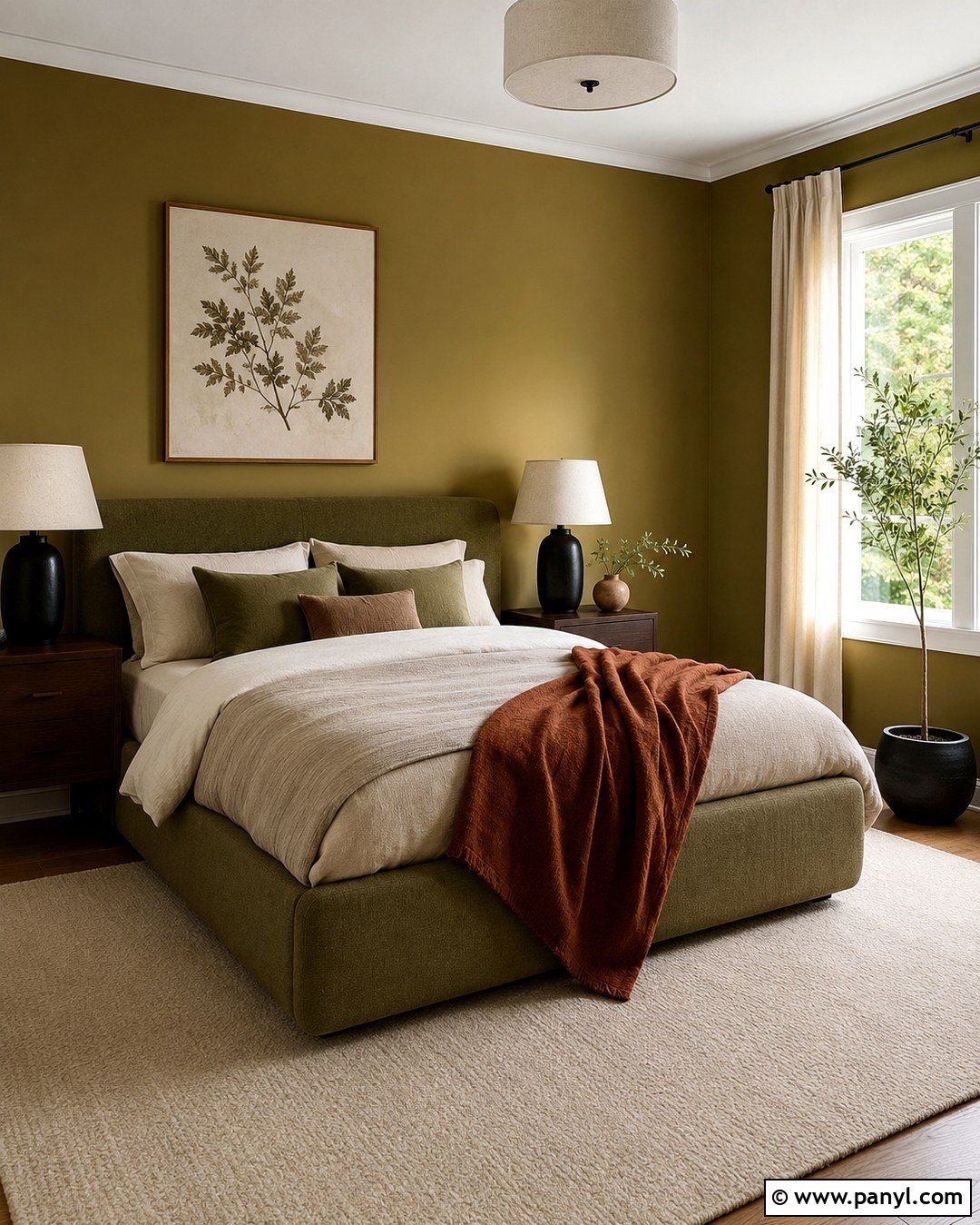
Different Gold SW 6396 is described by Sherwin-Williams as a deep yellow with a cool green undertone, giving it an unusual earthy quality. () Use it in a bedroom with an olive upholstered bed, natural linen bedding, and dark oak nightstands. The related green tones create a quiet, tonal palette rather than a sharp contrast. Introduce cream through the ceiling, curtains, and a wool area rug to keep the design balanced. Black ceramic lamps and simple iron curtain rods add crisp outlines. A rust throw at the foot of the bed provides one warmer accent. This scheme works particularly well with botanical artwork and natural materials. Avoid bright yellow accessories, which can make the nuanced wall color appear muddy by comparison.
14. Sherwin-Williams Brassy Breakfast Room
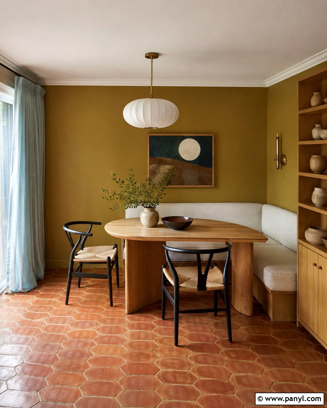
Sherwin-Williams Brassy SW 6410 belongs to the yellow family and offers a deep green-gold appearance that feels both retro and grounded. () Cover the walls of a breakfast room, then pair them with a white oak table and curved black chairs. A built-in bench upholstered in cream performance fabric makes the space comfortable for daily use. Add a simple pendant with an opal glass shade and dark bronze hardware. Terracotta floor tile emphasizes the warmth, while pale blue-gray curtains introduce a cooler counterpoint. Display cream pottery and clear glassware on a narrow oak shelf. This finished look has a relaxed midcentury influence, but the natural materials keep it approachable. Use a matte or eggshell finish to preserve the color’s earthy quality.
15. Sherwin-Williams Edgy Gold Mudroom
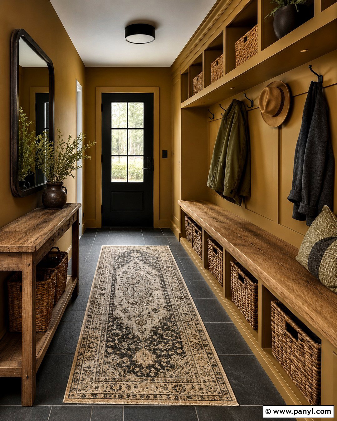
A hardworking mudroom becomes much more inviting with Sherwin-Williams Edgy Gold SW 6409 on the walls and built-in lockers. Use satin paint on the cabinetry for durability, then choose warm white for the ceiling and interior door. A charcoal slate floor will hide dirt and create strong contrast beneath the golden surfaces. Install a thick oak bench, black hooks, and woven baskets for practical storage. A washable striped runner containing cream, olive, and charcoal can soften the hard flooring. Finish the room with a black-framed mirror and a simple flush-mount light. The palette feels energetic without becoming childish. Keeping the storage, seating, lighting, and decorative details coordinated turns a typically cluttered passage into a complete and organized design.
16. Sherwin-Williams Golden Rule Dining Room
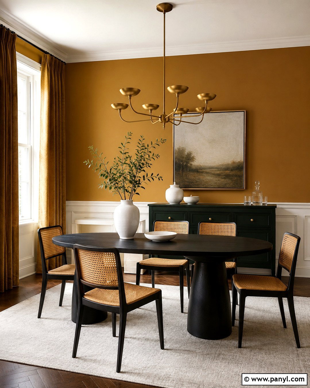
Sherwin-Williams Golden Rule SW 6383 sits in the orange color family, making it a warm choice for a lively dining room. () Use the color above tall cream panel molding to break up its intensity and give the walls architectural structure. A black oval dining table, natural cane chairs, and a large ivory rug provide clear contrast. Introduce deep green through velvet curtains or a painted sideboard. A sculptural brass chandelier will echo the warmth without disappearing against the walls. White ceramics and clear glass keep the tabletop fresh. This scheme works in both traditional and contemporary homes because it mixes classic paneling with clean furniture. Sample the shade in evening light, when its orange undertone may become more noticeable.
17. Sherwin-Williams Cut The Mustard Kitchen
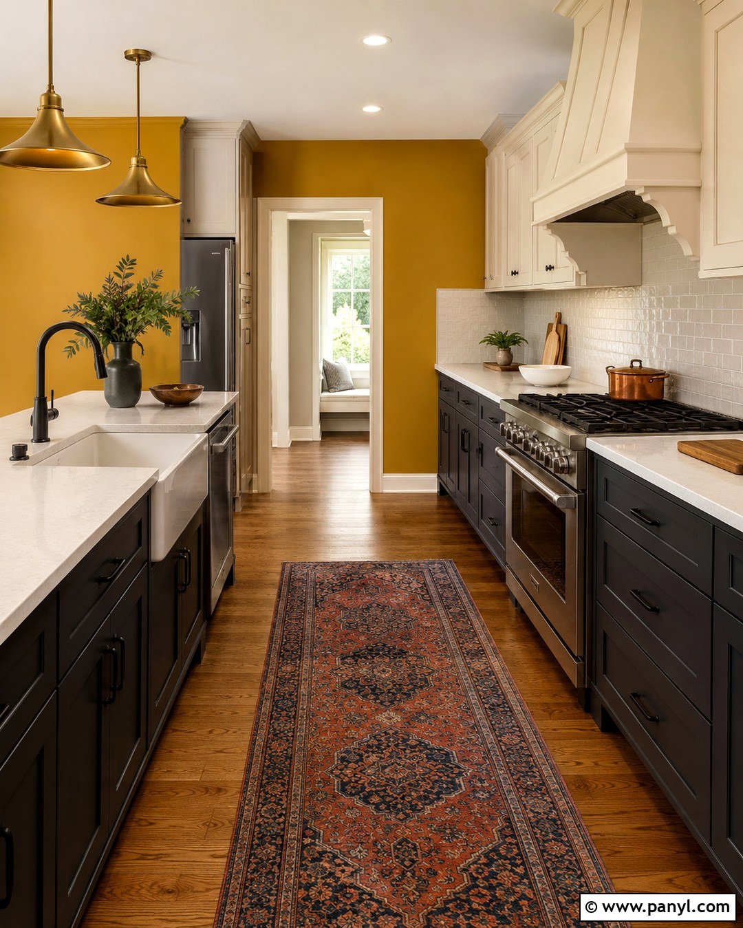
Cut the Mustard SW 6384 is a warm Sherwin-Williams orange-family color that coordinates naturally with soft white and dark gray. () Apply it to kitchen walls surrounding lower cabinets painted a deep charcoal gray. Use cream upper cabinets to prevent the two darker colors from enclosing the room. White quartz counters, handmade ivory backsplash tile, and medium oak flooring will brighten the practical surfaces. Add black hardware and simple brass pendants for a controlled mixture of metals. A narrow runner in faded red, blue, and beige introduces softness and pattern. Keep countertop accessories mostly wood, white ceramic, or clear glass. This complete kitchen palette makes the strong gold feel intentional, sophisticated, and suitable for everyday family life.
18. Behr Turmeric Home Office
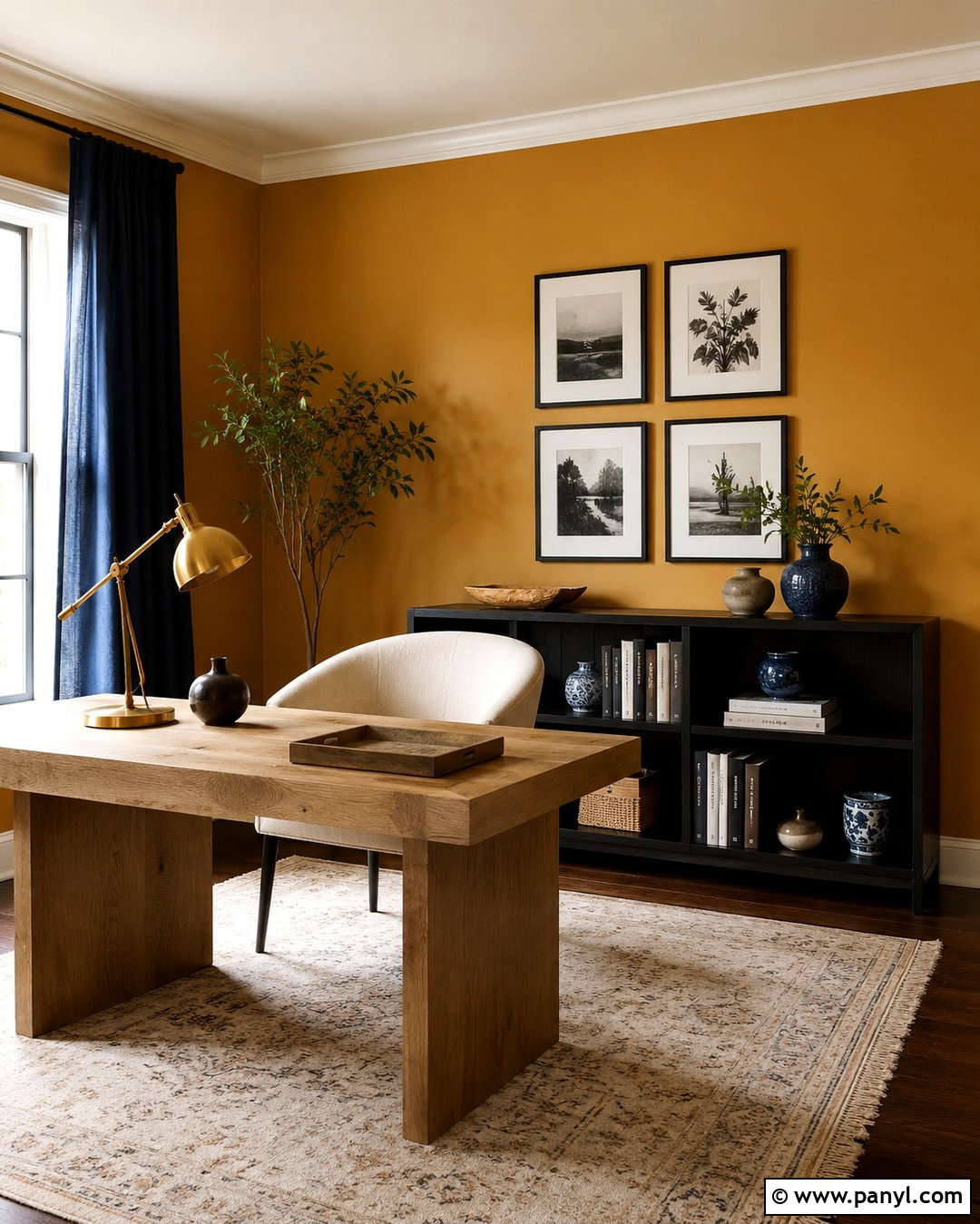
Behr Turmeric M290-7 is a deep, spicy yellow with a bold golden presence. () Use it on all four office walls, then balance the saturation with a large pale oak desk and cream upholstered chair. A low black bookcase provides storage while creating a strong horizontal anchor. Add navy curtains, a faded ivory rug, and a few blue ceramic accessories to cool the palette. Brass task lighting will blend gently with the walls, while black picture frames give artwork sharper definition. Keep the ceiling bright warm white and include several direct work lights. This design creates an energetic background for creative work, but the neutral furniture and controlled accessories prevent the room from feeling visually busy or overly themed.
19. Behr Mustard Field Reading Room
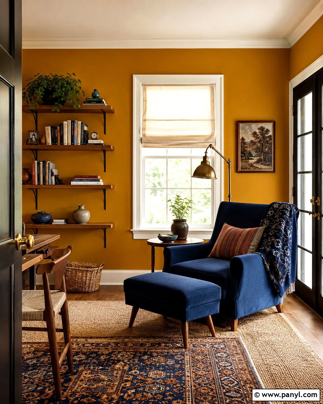
Behr Mustard Field HDC-AC-08 creates an intense, earthy mustard backdrop that works well in a compact reading room. Cover the walls while leaving the ceiling, window trim, and baseboards soft cream. Place a deep blue upholstered chair near the window with a small walnut table and antique brass reading lamp. A natural jute rug layered beneath a smaller patterned rug adds warmth and texture. Install oak floating shelves for books and use black metal brackets to connect with dark picture frames. An ivory Roman shade will filter daylight without adding another competing color. The finished space feels enclosed in a comfortable way. Limiting the palette to mustard, navy, cream, walnut, and black gives the tiny room a clear visual identity.
20. Farrow And Ball India Yellow Living Room
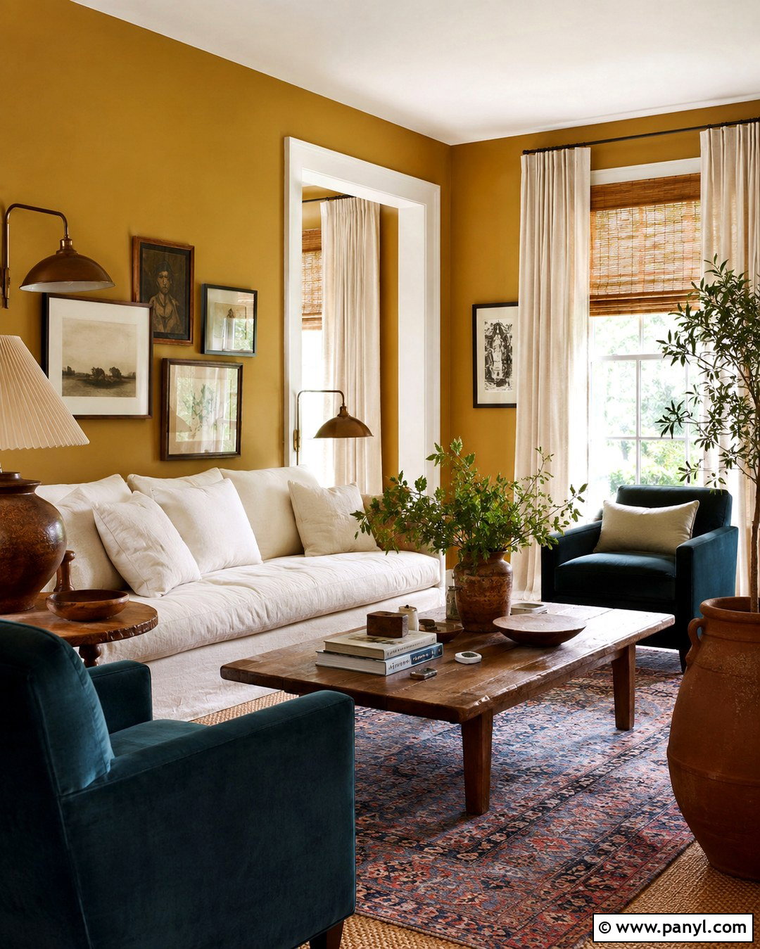
Farrow & Ball India Yellow No. 66 is an earthy ochre that brings warmth to both traditional and globally influenced rooms. Paint every wall while keeping the ceiling and detailed trim a soft chalky white. Choose a relaxed cream sofa, two dark teal armchairs, and a substantial reclaimed oak coffee table. A patterned rug containing faded red, indigo, ivory, and gold will connect the seating area. Use woven bamboo blinds beneath plain linen curtains for layered window treatment. Aged brass lamps and black-framed artwork add definition without making the room formal. Terracotta pottery and a few leafy plants complete the natural palette. This full design allows the dark gold walls to feel rich, collected, and comfortable rather than loud or overly ornate.
Conclusion:
The best dark gold wall color should feel rich and earthy rather than sharply yellow. Consider the room’s natural light, floor color, trim, furniture, and permanent finishes before making a final decision. Cream, ivory, walnut, charcoal, navy, and muted green are dependable partners because they balance gold’s warmth. Use lighter textiles in small rooms and stronger contrasting furniture in larger spaces. Most importantly, test generous samples on different walls and observe them throughout the day. Undertones may shift from mustard to amber, brown, orange, or green as lighting changes. With thoughtful coordination, these **20 Dark Gold Paint Colors For Walls** can create rooms that feel warm, distinctive, and beautifully complete.

Related Ideas and Inspiration:
Leave a Reply