
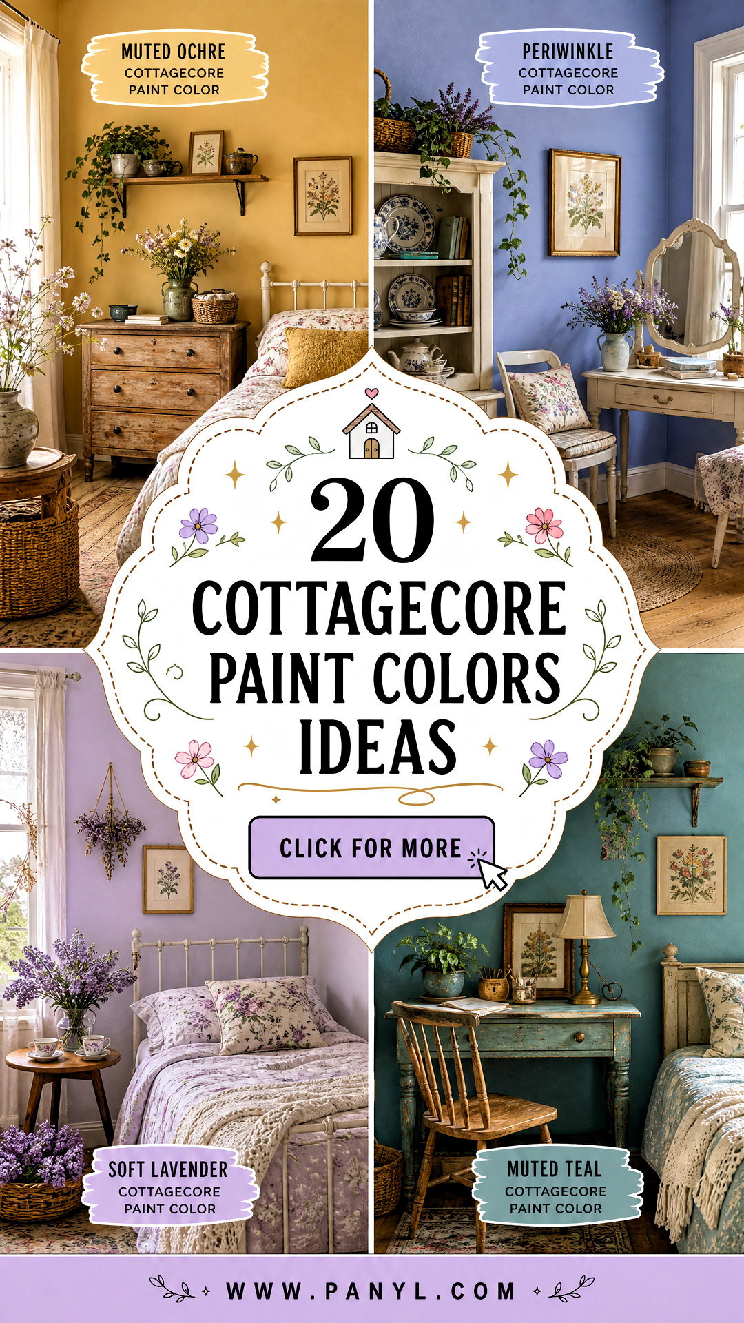
Cottagecore interiors feel warm, nostalgic, and closely connected to nature. The best 20 cottagecore paint colors capture that mood through softened greens, faded florals, earthy browns, creamy neutrals, and gentle countryside blues. Rather than relying on bright white or highly saturated shades, this aesthetic favors colors that appear naturally aged and easy to live with. These muted tones also complement vintage furniture, botanical prints, handmade textiles, warm wood, and collected decor. () Each color below creates a complete room look, including coordinating finishes, furnishings, and accents. Always test large paint samples in morning and evening light before making your final choice. Here are 20 cottagecore paint colors for creating a cozy, storybook-inspired home.
1. Creamy White Cottagecore Paint Color
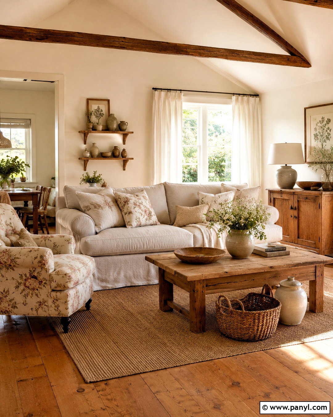
Creamy white walls create a soft foundation for a bright cottagecore living room without making the space feel cold or unfinished. Choose an off-white with subtle yellow or beige undertones, then repeat it across the trim and ceiling in slightly different finishes. Add a relaxed linen sofa, a faded floral armchair, and an antique pine coffee table. Honey-toned floors and woven baskets deepen the warmth. Complete the arrangement with botanical artwork, cotton curtains, handmade pottery, and a small wooden side table holding garden flowers. This color works especially well in smaller rooms because it reflects daylight while supporting layered vintage details. Avoid stark blue-white accents, which can interrupt the room’s gentle, naturally aged appearance.
2. Oatmeal Beige Cottagecore Paint Color
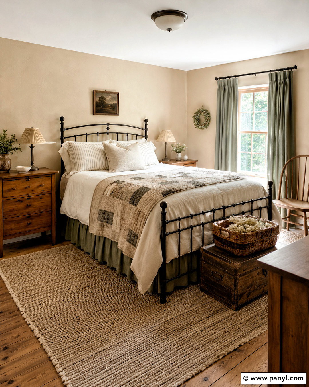
Oatmeal beige offers more depth than cream while remaining light, quiet, and versatile. Use it in a cottagecore bedroom where warm walls can surround an iron bed dressed in ivory linen, ticking-stripe sheets, and a faded patchwork quilt. Natural oak nightstands, pleated fabric lampshades, and a woven wool rug give the room a simple countryside character. Paint the trim a soft warm white to create definition without sharp contrast. Dusty green curtains and small burgundy floral accents add restrained color. Oatmeal also works beautifully with exposed beams, wicker storage, and antique brass hardware. The finished bedroom should feel comfortable and collected, with enough open space to keep the neutral scheme from appearing heavy or overly rustic.
3. Mushroom Taupe Cottagecore Paint Color
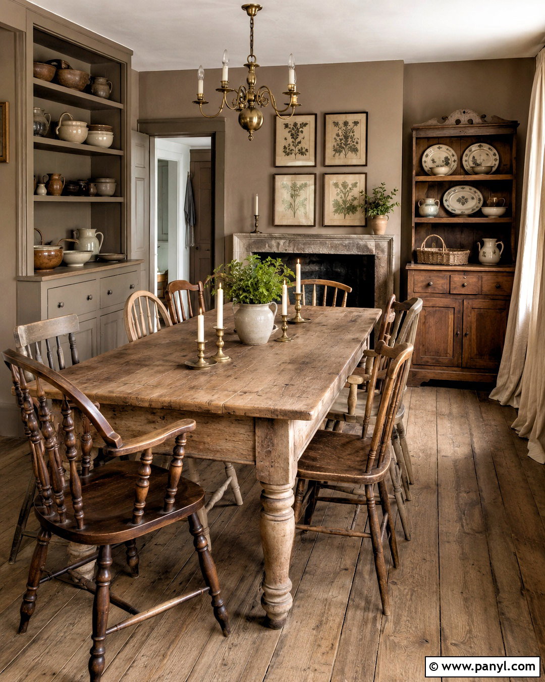
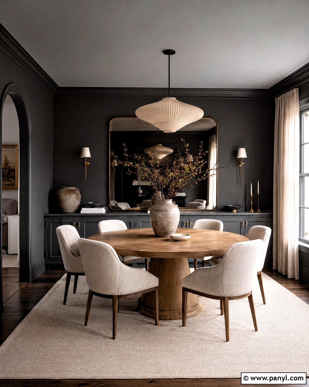
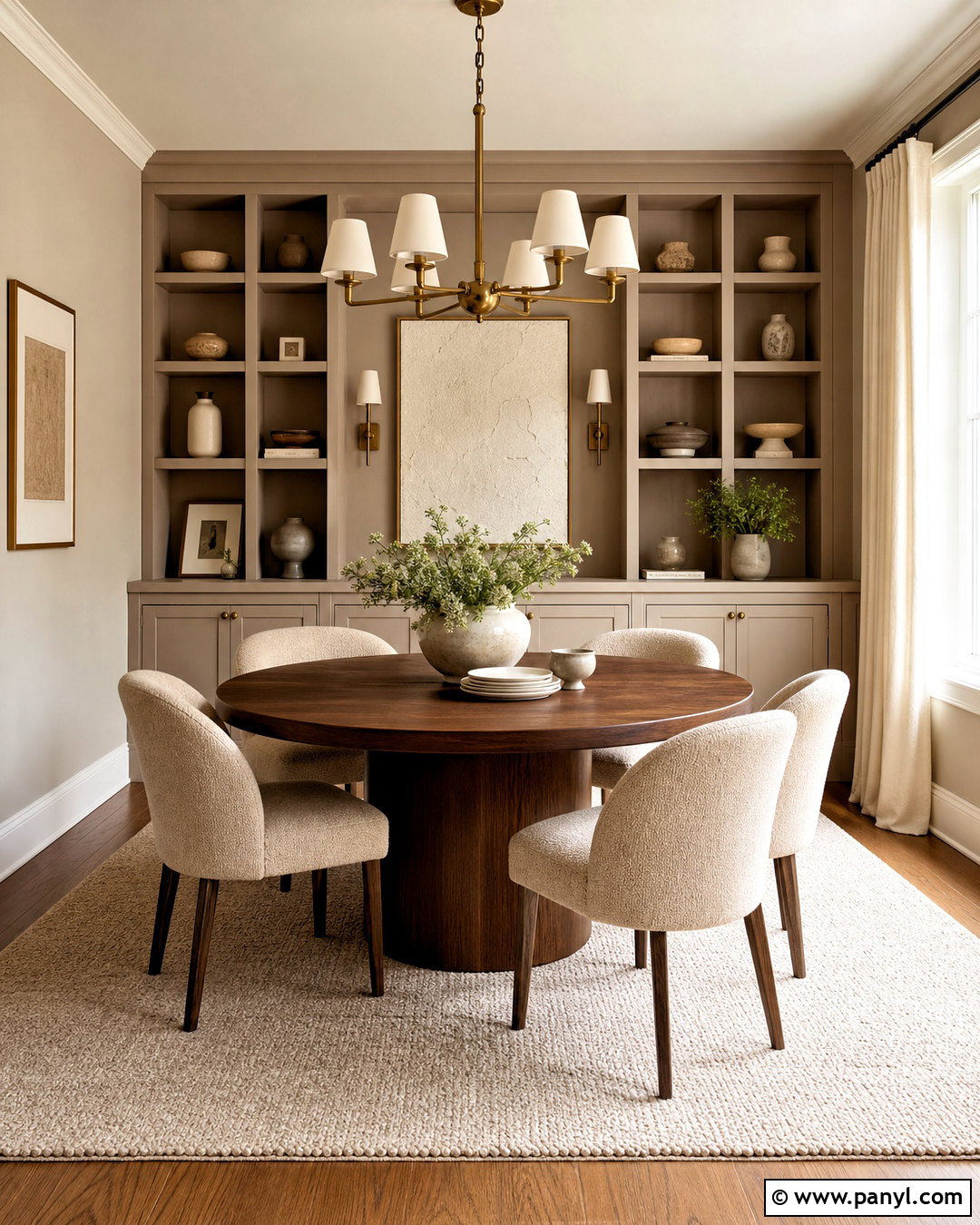
Mushroom taupe creates a grounded cottagecore dining room that feels elegant but never formal. Look for a balanced brown-gray shade with warm undertones rather than a cool, silvery greige. Paint the walls and built-in shelving the same color for a calm, enveloping effect. A scrubbed oak table, mismatched spindle chairs, and a vintage hutch bring natural variation to the room. Layer in cream linen curtains, aged brass candleholders, stoneware dishes, and muted botanical prints. Soft sage seat cushions introduce a subtle link to the outdoors. Keep the ceiling creamy white and choose a simple woven pendant overhead. This complete palette works well in rooms with strong daylight because the taupe develops greater warmth as the light changes.
4. Soft Sage Green Cottagecore Paint Color
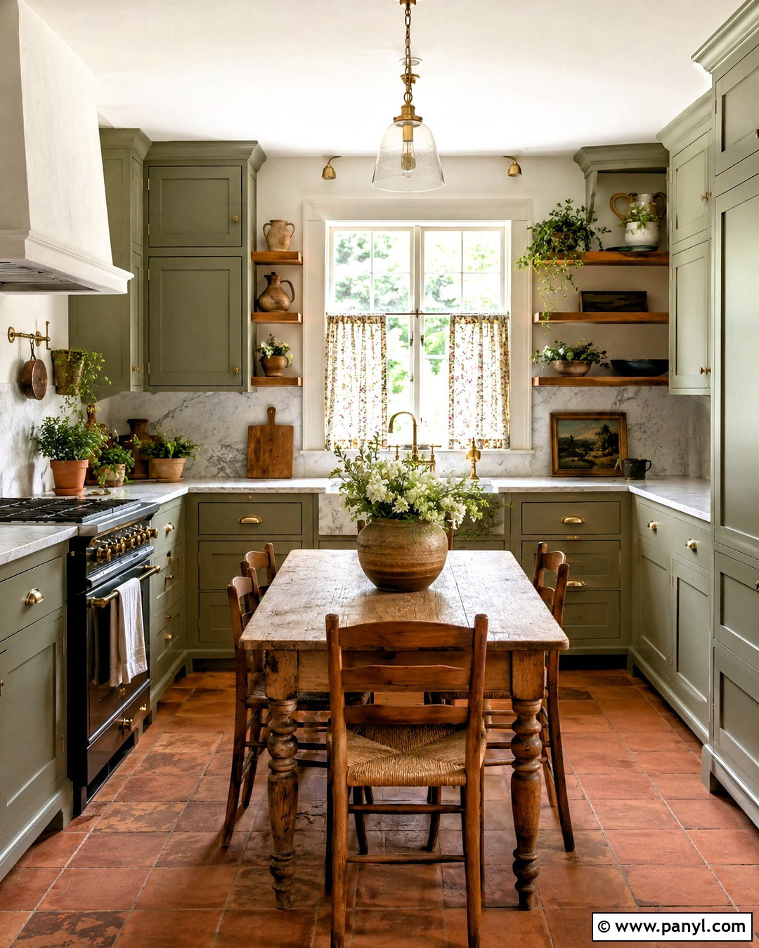
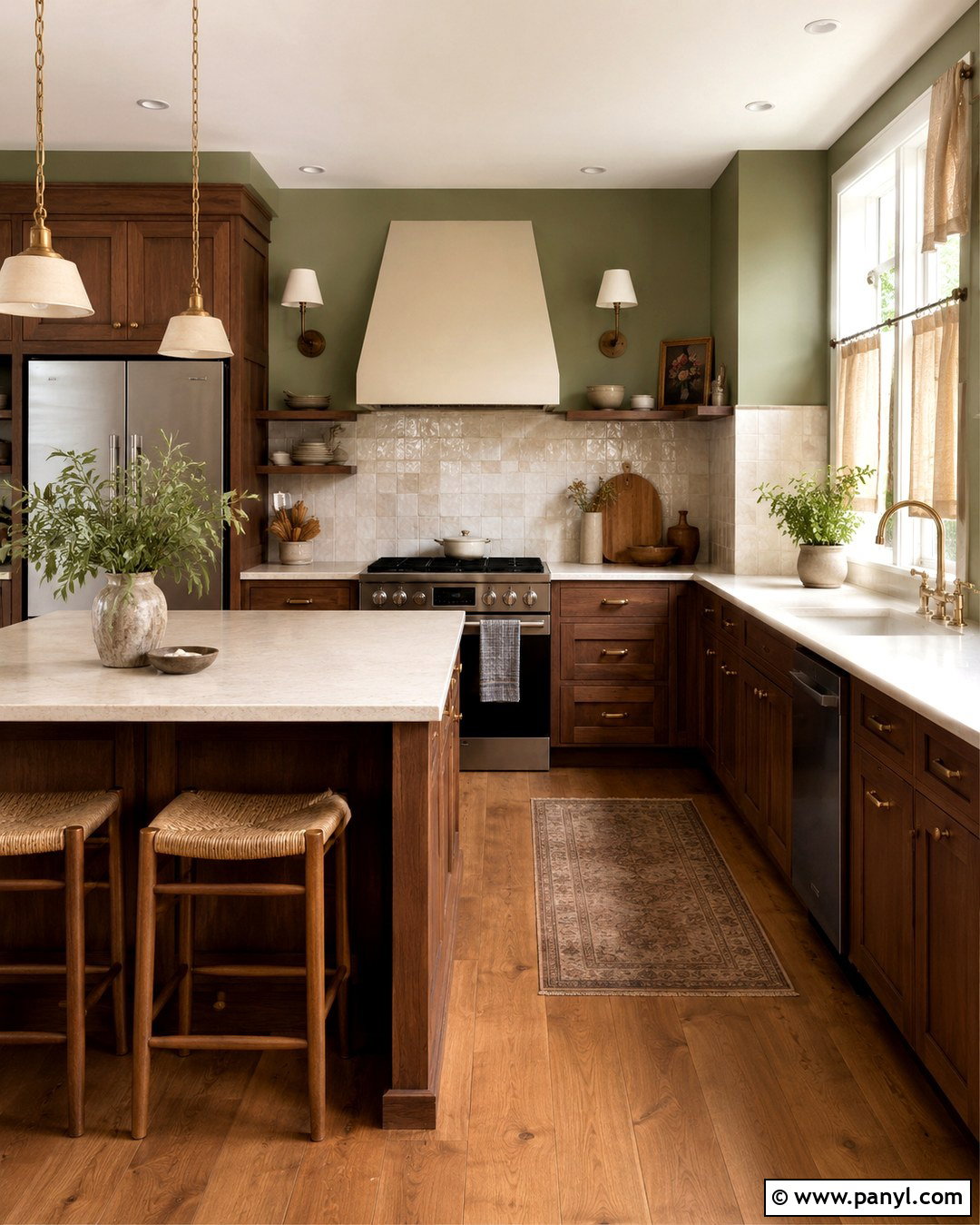
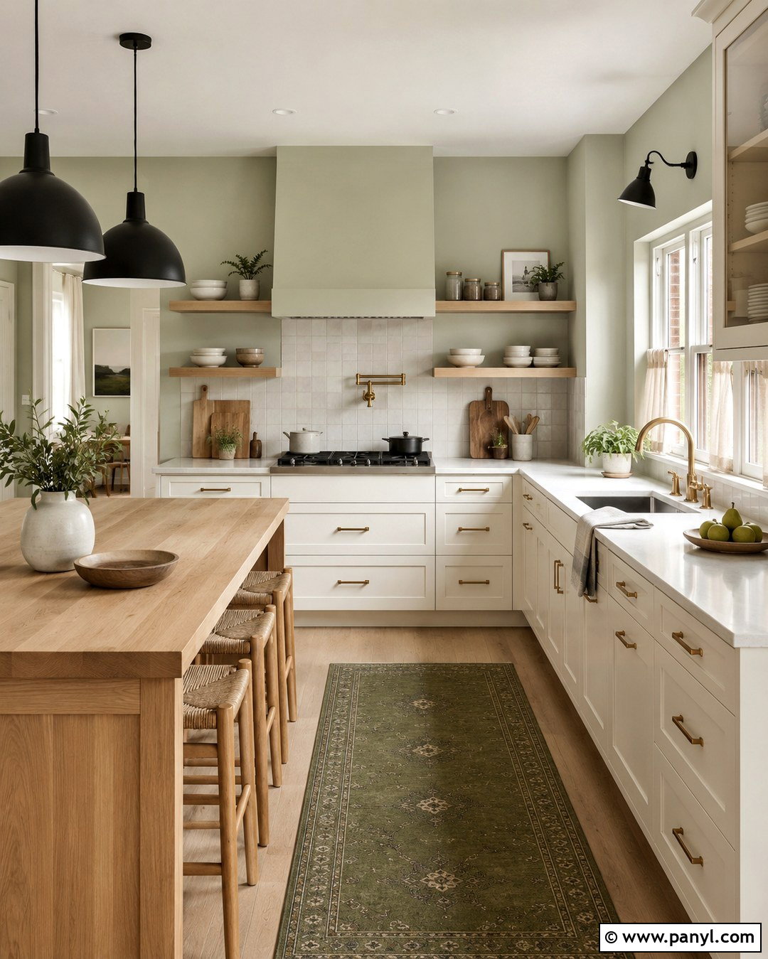
Soft sage green is one of the easiest colors for creating a fresh cottagecore kitchen. Its muted gray undertone keeps the green calm, while natural wood and creamy surfaces prevent the space from feeling overly cool. Apply sage to Shaker cabinets, then pair it with warm white walls, unlacquered brass knobs, and lightly veined stone counters. Open oak shelves can display pottery, glass jars, and everyday serving pieces. Add a farmhouse table, rush-seat chairs, and a small floral café curtain at the window. Terracotta floor tiles bring earthy contrast underfoot. This combination feels practical, welcoming, and connected to a kitchen garden. Keep appliances simple and avoid too many glossy finishes so the room maintains its handcrafted cottage character.
5. Muted Olive Green Cottagecore Paint Color
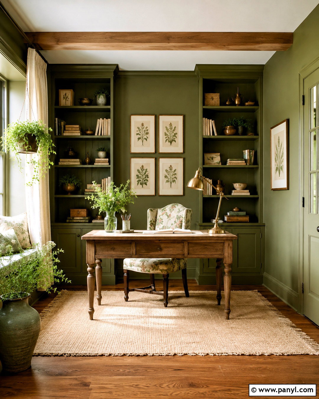
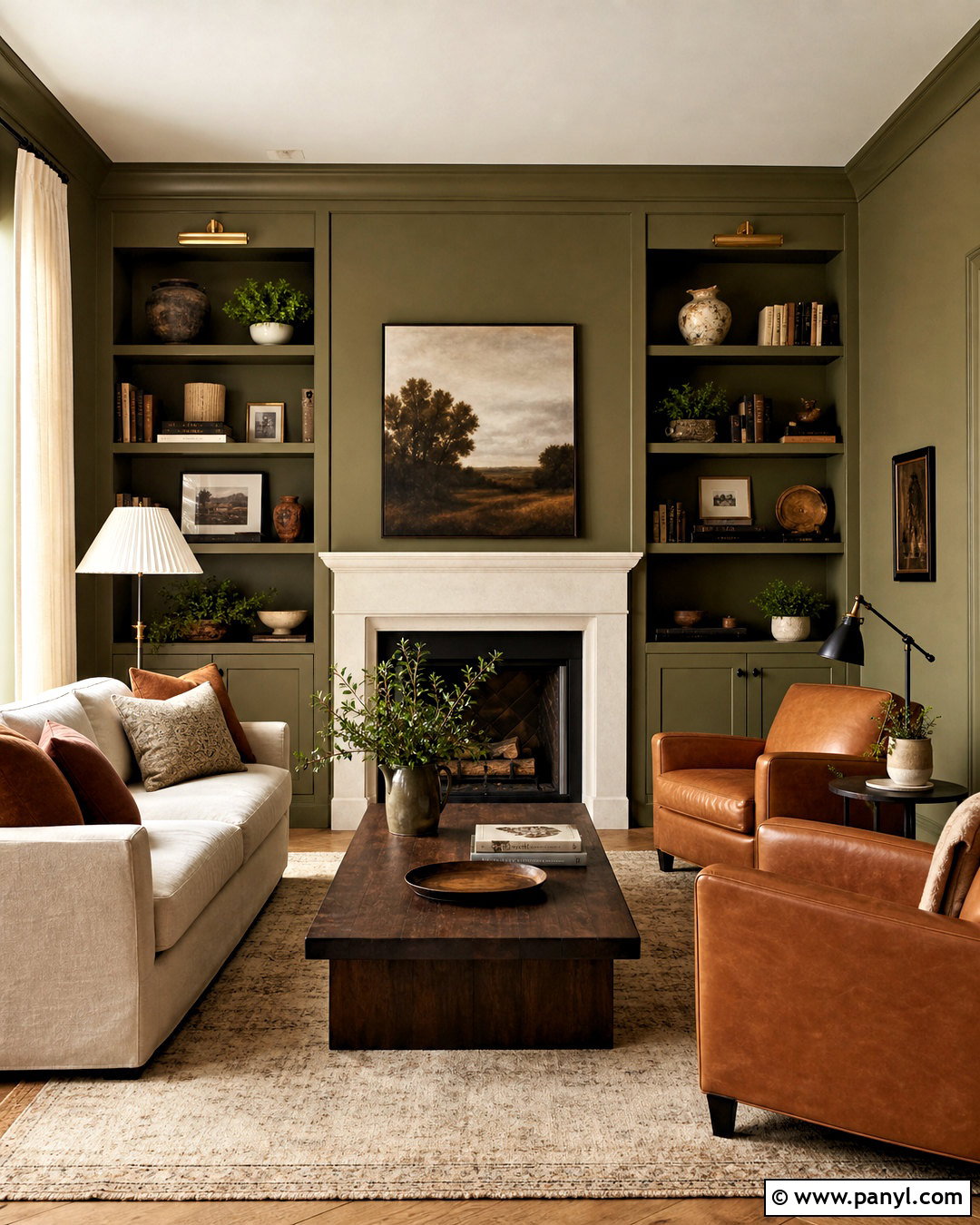
Muted olive green brings depth to a cottagecore home office while still feeling natural and restful. Cover the walls, trim, and built-in bookcases in the same dusty olive shade to create a cozy color-drenched effect. Place a weathered oak writing desk near the window and pair it with a vintage wooden chair upholstered in a small floral fabric. An antique brass task lamp, woven storage boxes, and framed pressed botanicals complete the workspace. Use a warm ivory rug and linen curtains to balance the darker walls. Rust, mustard, and brown accents can appear in books and pottery without overwhelming the palette. The finished office should feel like a quiet garden study, organized enough for work but filled with personal character.
6. Moss Green Cottagecore Paint Color
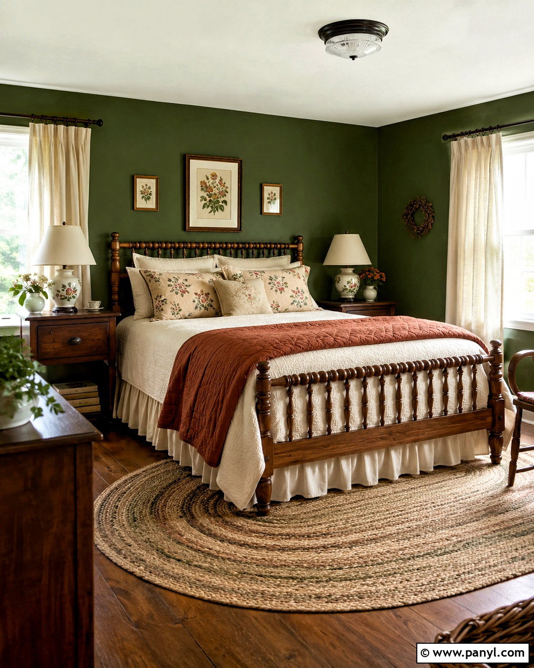
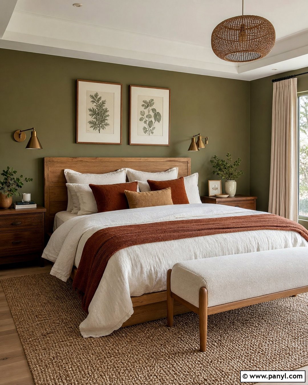
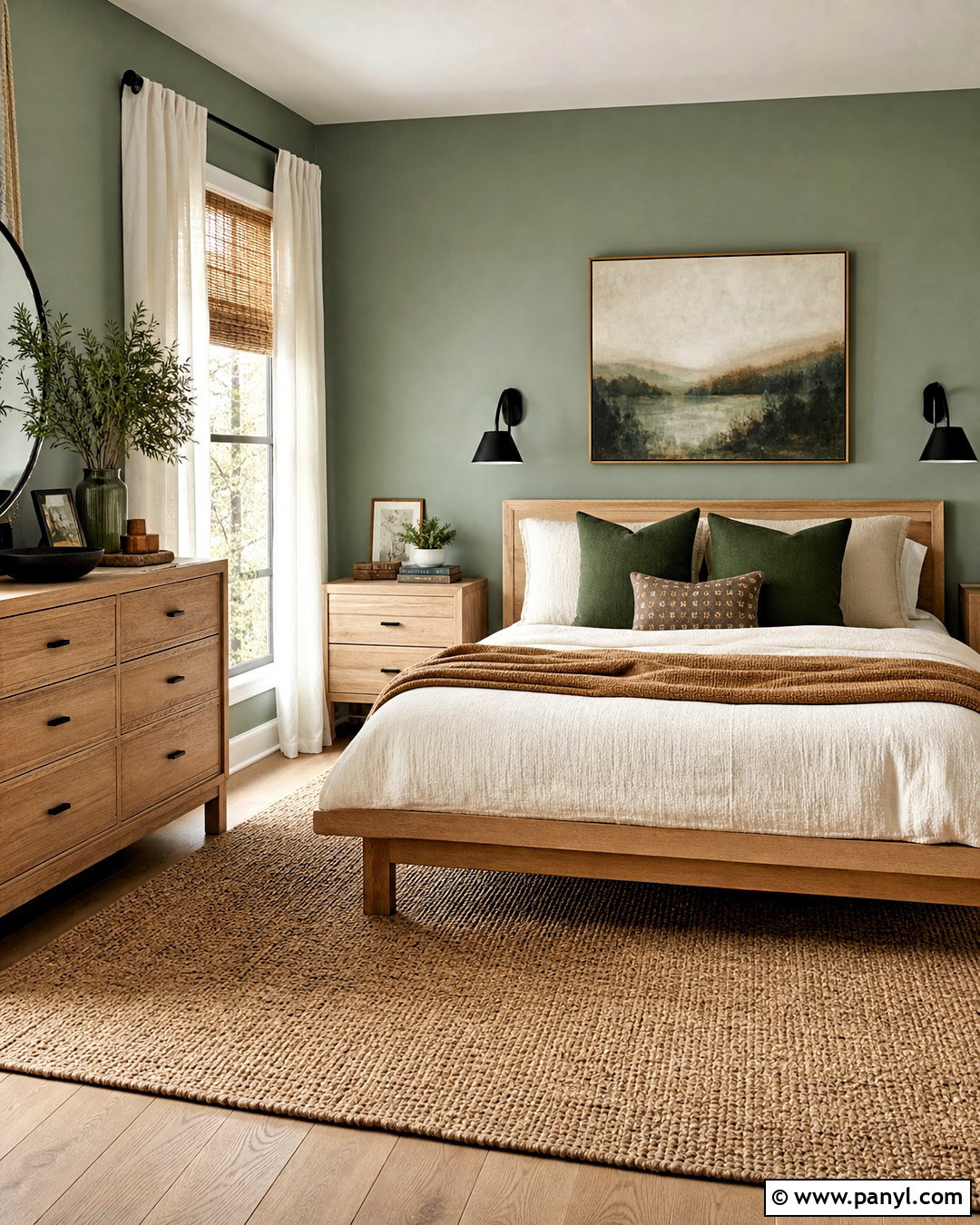
Moss green creates a richer, woodland-inspired cottagecore bedroom with a comforting sense of enclosure. Use the color behind a wooden spindle bed or carry it around all four walls for a more immersive look. Cream bedding, a rust-colored quilt, and small-scale floral pillows soften the darker background. Choose medium or dark oak furniture so the room feels intentionally layered rather than sharply contrasted. A braided wool rug, ceramic bedside lamps, and gathered linen curtains add texture. Paint the ceiling warm white to maintain brightness, especially in a compact room. Small touches of antique gold can highlight picture frames and hardware. This full scheme suits bedrooms with plenty of natural light and creates an especially cozy effect during cooler seasons.
7. Celadon Green Cottagecore Paint Color

Celadon green has a pale, misty quality that makes a cottagecore bathroom feel clean without relying on plain white walls. Use the color on beadboard paneling or a traditional vanity, then combine it with creamy upper walls and small ivory floor tiles. A marble or light stone counter adds subtle movement, while aged brass faucets contribute warmth. Hang a wooden framed mirror above the sink and add a simple linen shower curtain with a delicate botanical pattern. Woven baskets, white towels, and small potted ferns complete the room. Celadon pairs especially well with medium oak and bamboo accessories. The resulting bathroom feels fresh, gentle, and slightly vintage, with practical surfaces that still support the romantic cottagecore aesthetic.
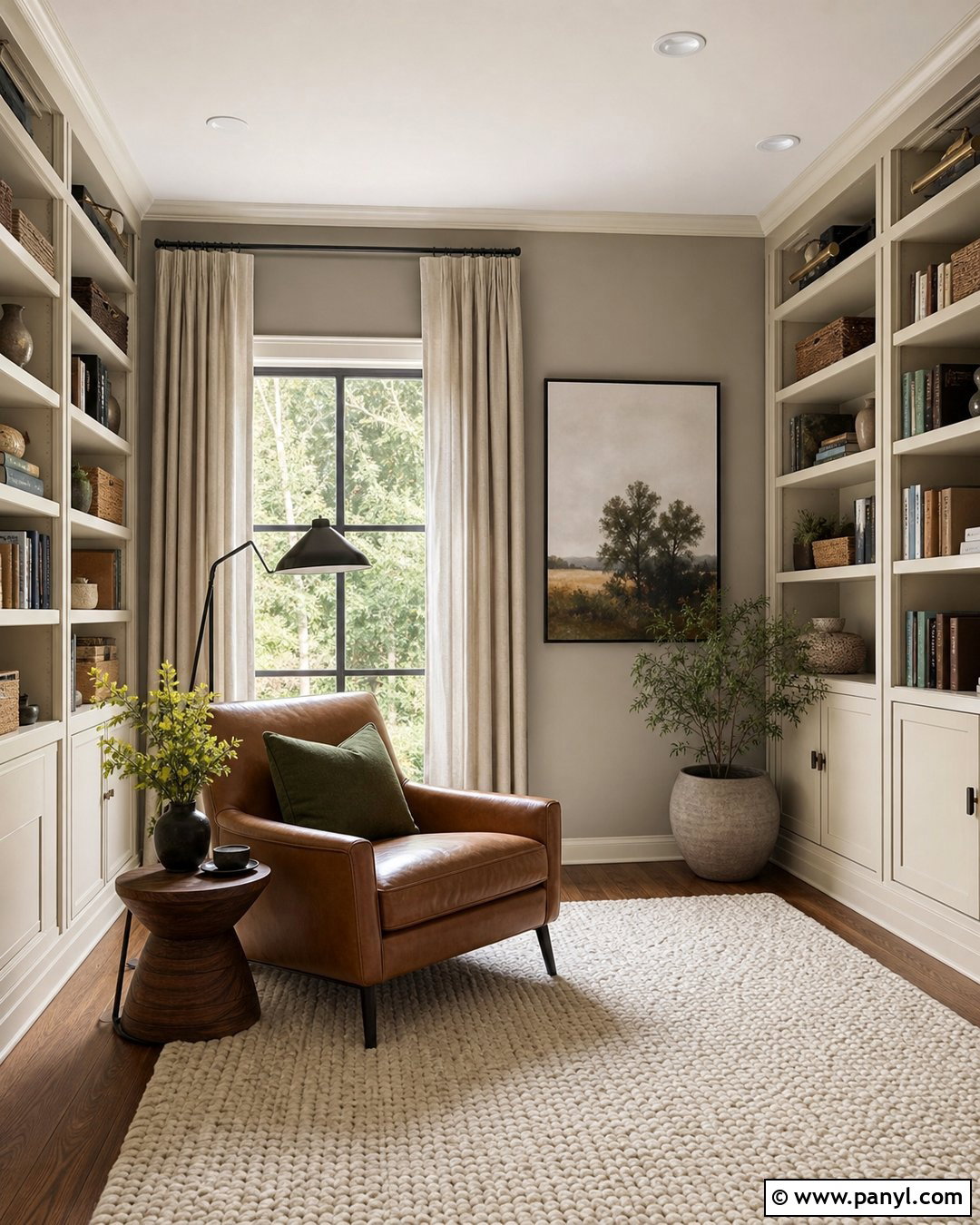
8. Butter Yellow Cottagecore Paint Color
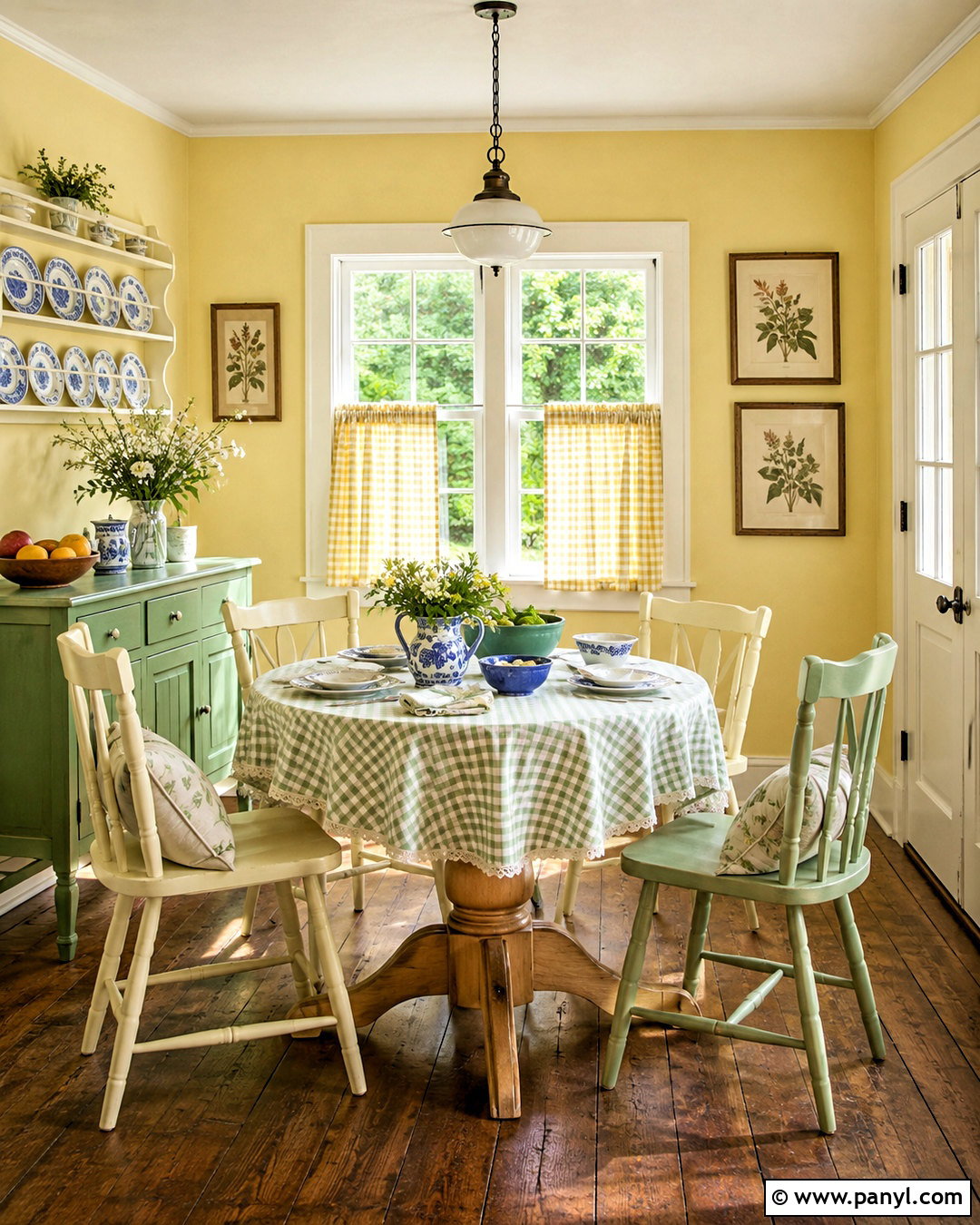
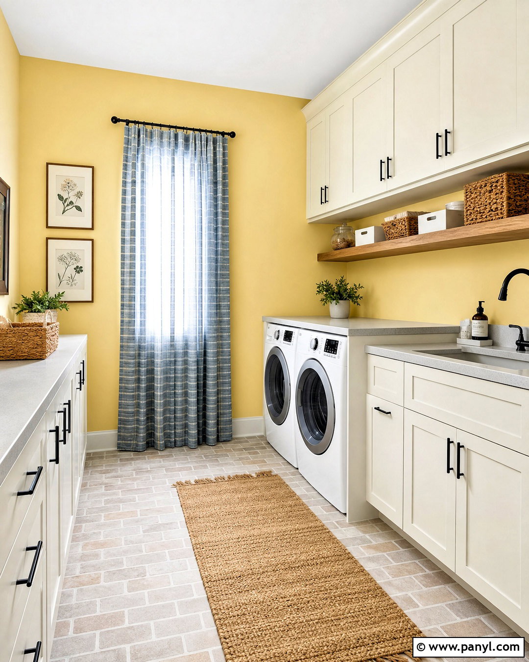
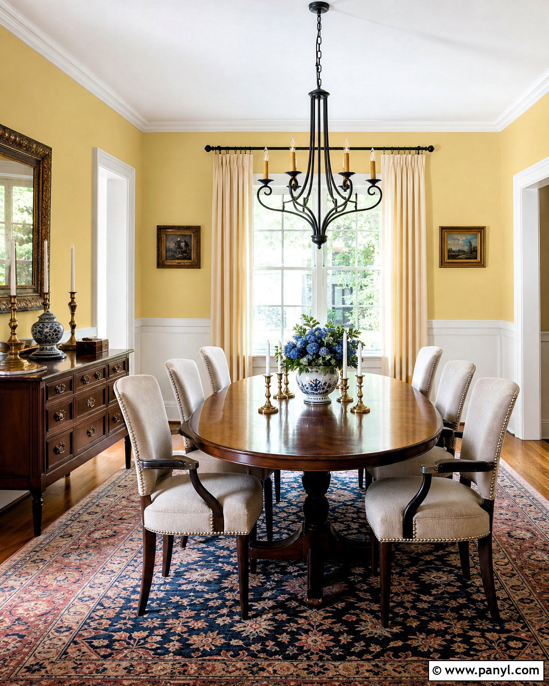
Butter yellow fills a cottagecore breakfast room with the cheerful warmth of morning sunlight. Choose a softened yellow with creamy undertones instead of a bright lemon shade. Paint the walls yellow and keep the trim warm white for a clean but gentle frame. Place a round pine pedestal table in the center with mismatched painted chairs in cream and faded green. A simple checked tablecloth, blue-and-white dishes, and a vase of fresh garden stems add relaxed pattern. Use natural woven shades or lightweight café curtains at the windows. A vintage pendant and framed fruit or botanical artwork finish the design. This room should feel sunny even on cloudy days, yet muted enough to remain comfortable throughout every season.
9. Muted Ochre Cottagecore Paint Color
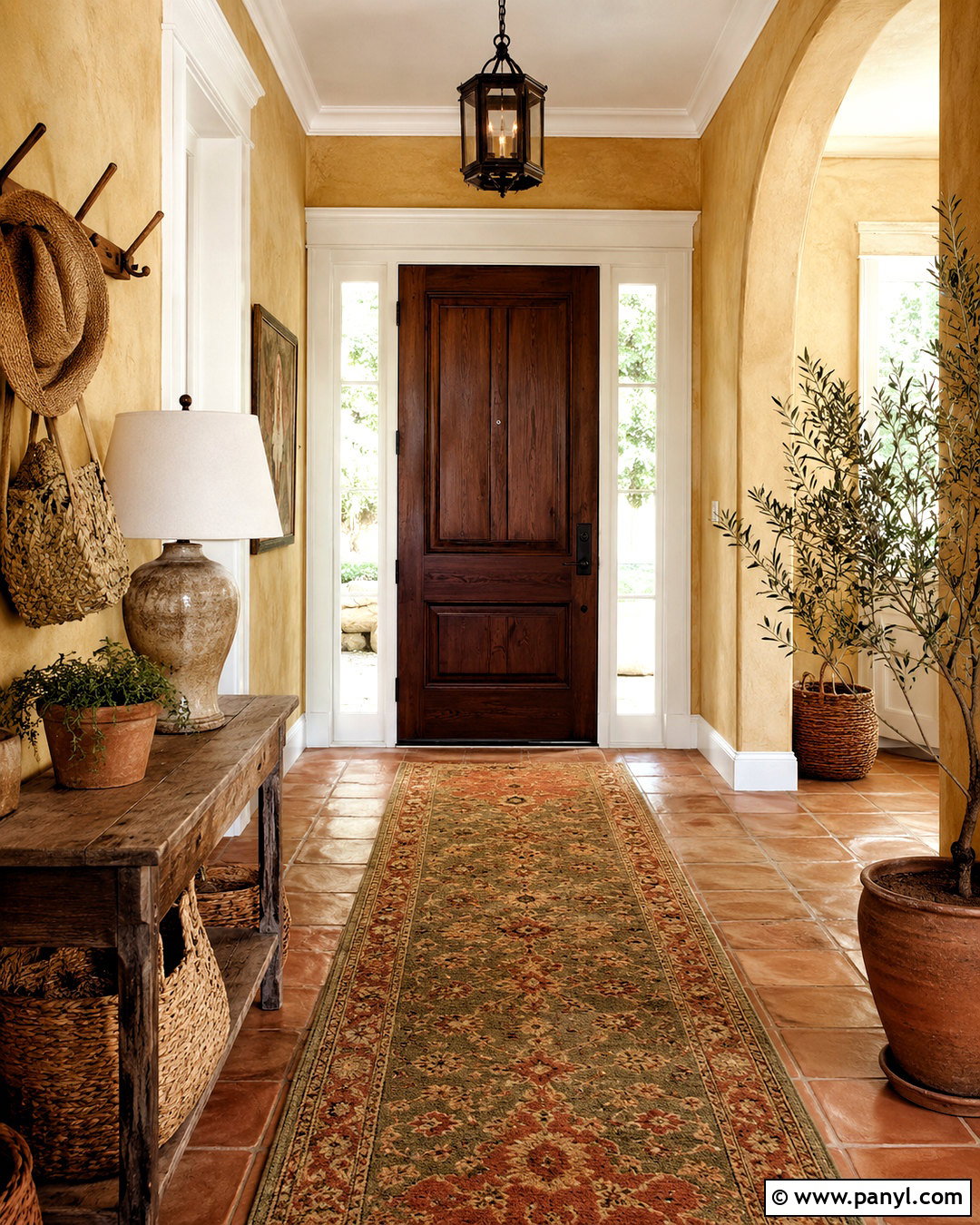
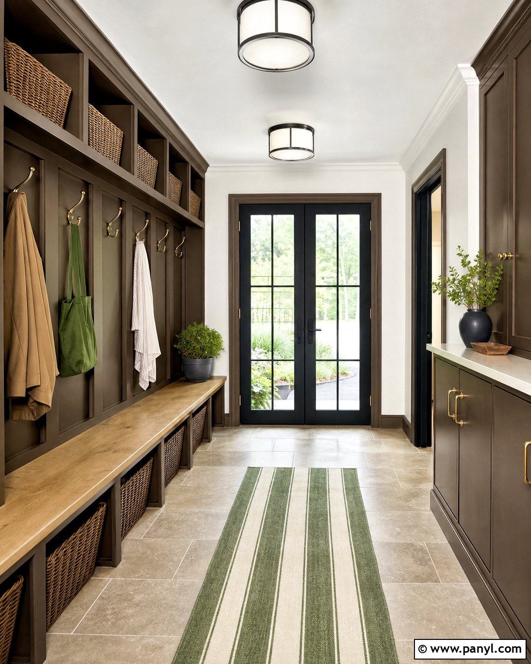
Muted ochre gives a cottagecore entryway a warm, earthy welcome that feels more established than pastel yellow. Use it across plaster walls and pair it with creamy trim, dark wood doors, and traditional brick or terracotta flooring. A narrow antique console provides space for a ceramic lamp, a shallow catchall bowl, and gathered branches. Install wooden pegs for baskets, hats, and lightweight outerwear. A faded runner featuring olive, rust, and beige tones ties the palette together. Black iron hardware can add definition in small amounts. Because ochre changes noticeably throughout the day, test it beside existing flooring before painting. The completed entry should feel practical and sun-warmed, with a naturally imperfect finish that supports everyday cottage living.
10. Dusty Rose Cottagecore Paint Color
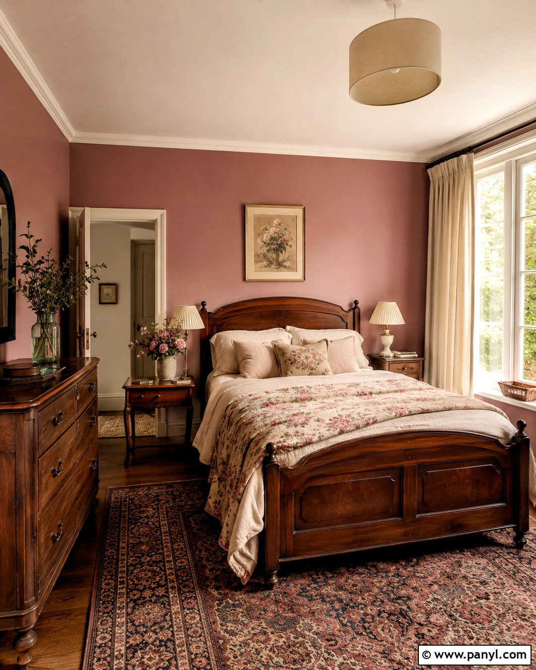
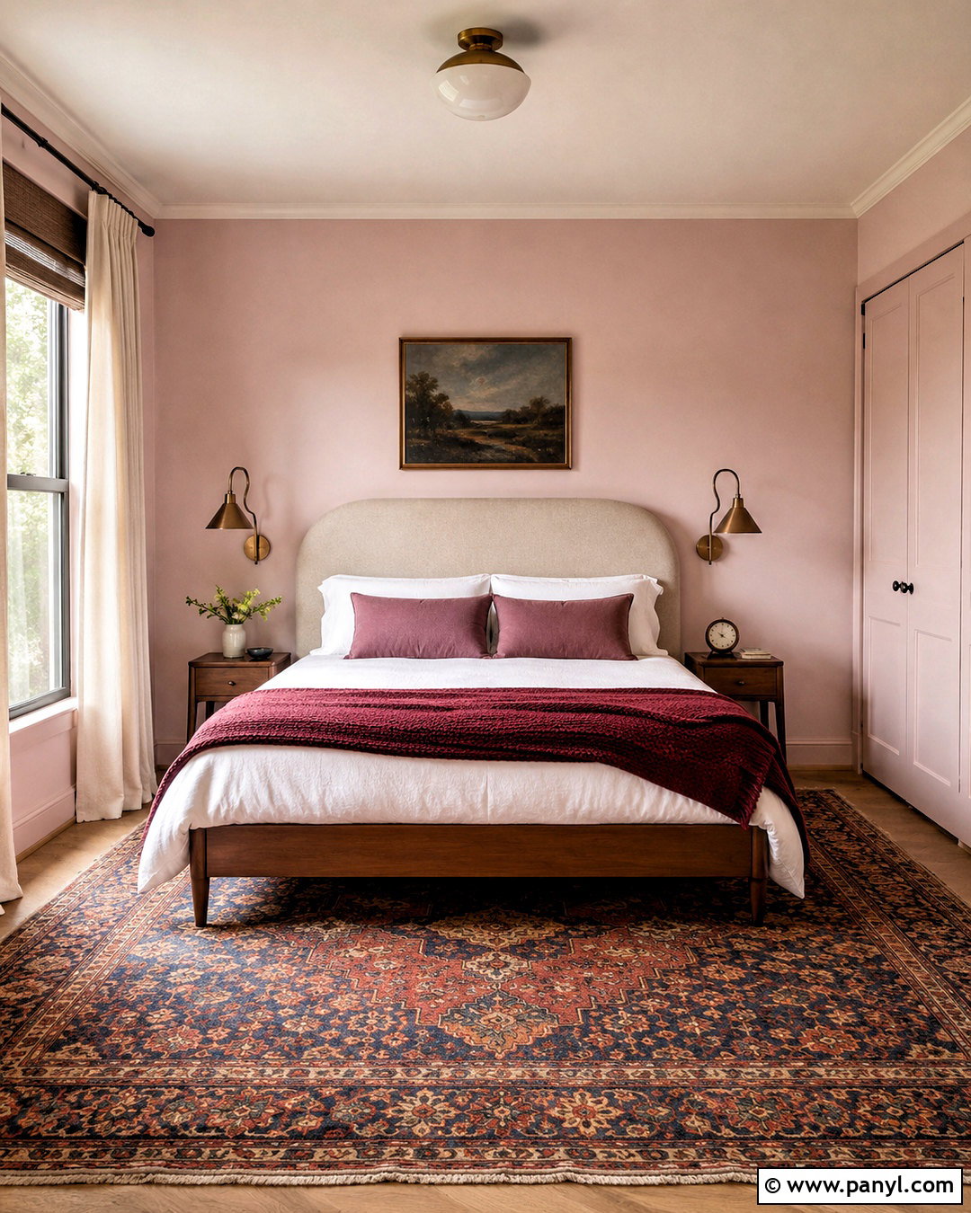
Dusty rose creates a romantic cottagecore bedroom that feels mature when balanced with earthy furniture and restrained pattern. Select a muted pink containing a small amount of brown or gray, rather than a sweet bubblegum tone. Use it on the walls with creamy white trim and a softly painted ceiling. Anchor the room with an antique walnut bed, oatmeal linen bedding, and a faded floral quilt in rose, sage, and ivory. Add a small wooden dresser, pleated lampshades, and a worn Persian-style rug. Natural linen curtains keep the window treatment relaxed. A few framed landscapes prevent the floral theme from becoming repetitive. This complete combination feels nostalgic and welcoming while remaining calm enough for an everyday sleeping space.
11. Pale Blush Cottagecore Paint Color
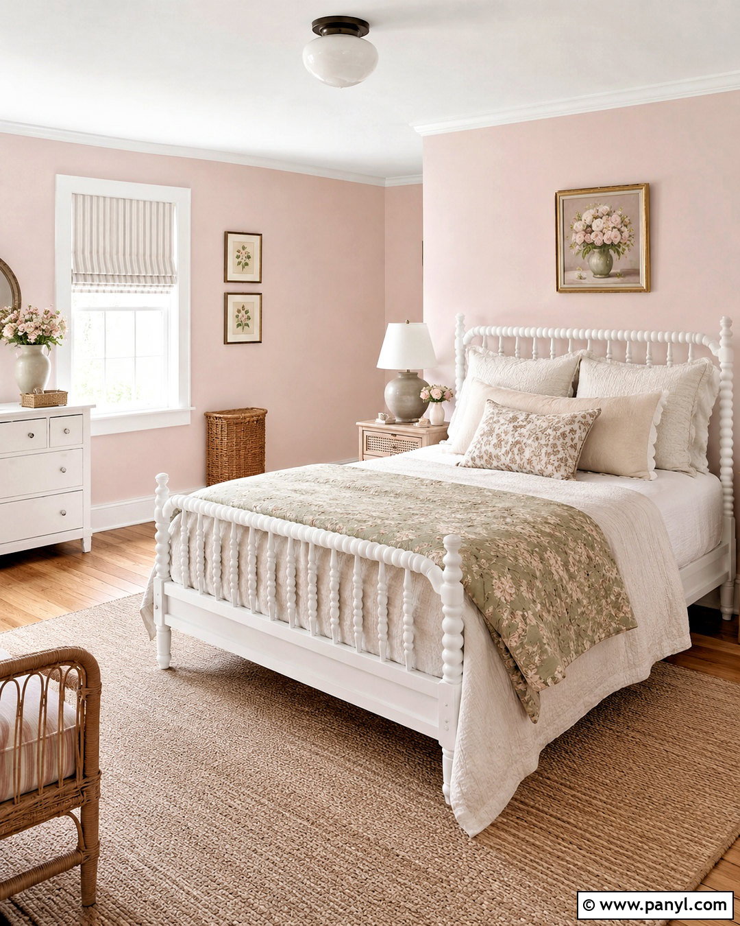
Pale blush brings gentle warmth to a cottagecore nursery or guest room without dominating the space. Paint the walls a powdery pink-beige and pair them with an ivory ceiling, natural oak flooring, and simple white-painted furniture. For a guest room, use a spindle bed with scalloped linen pillows, a cream coverlet, and a small green floral throw. Add a cane-front nightstand and a vintage-style ceramic lamp. Soft blue artwork and muted sage curtains provide enough contrast to keep the palette balanced. A woven rug and lidded baskets introduce useful storage and natural texture. Keep decorative objects limited to a few handmade or inherited pieces. The finished room feels airy, restful, and personal rather than overly themed.
12. Terracotta Cottagecore Paint Color
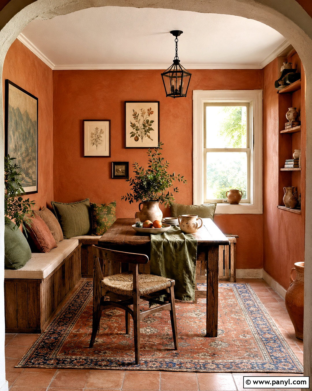
Terracotta paint transforms a cottagecore dining nook into a warm, Mediterranean-influenced retreat. Choose a clay-based orange with softened brown undertones and use it on the walls or built-in banquette. Pair it with chalky cream trim, aged oak furniture, and woven seat cushions. Olive green linen, hand-thrown pottery, and botanical artwork reinforce the natural palette. Underfoot, a vintage rug with faded rust and blue details keeps the room comfortable and visually layered. Add a simple iron or aged brass pendant above the table. Plenty of creamy fabric and pale wood will prevent the terracotta from becoming overpowering. This finished look works especially well in north-facing rooms where a warm wall color can counterbalance cooler daylight.
13. Powder Blue Cottagecore Paint Color
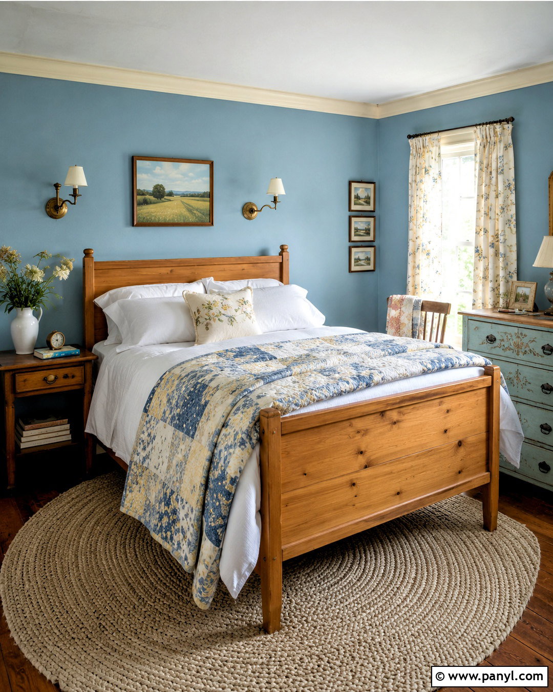
Powder blue creates a light cottagecore bedroom inspired by clear skies and faded vintage textiles. Select a blue with a soft gray undertone so it remains restful rather than looking bright or coastal. Paint the walls blue, use warm white on the trim, and introduce a natural pine bed for contrast. Layer white linen sheets with a patchwork quilt in blue, butter yellow, and dusty rose. A small painted dresser, floral curtains, and a braided cream rug complete the comfortable arrangement. Add antique brass sconces and framed countryside artwork for subtle age. Powder blue works beautifully in sunny bedrooms because natural light reveals its softness. Keep other large surfaces warm to ensure the complete scheme feels cozy instead of crisp.
14. Duck Egg Blue Cottagecore Paint Color
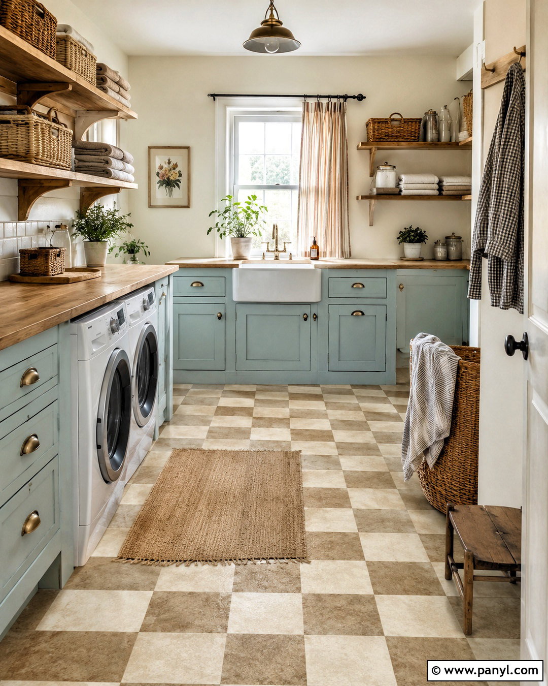
Duck egg blue combines blue and green in a beautifully faded tone that suits a cottagecore kitchen or utility room. Paint lower cabinets in this soft color while keeping walls creamy white and counters pale stone or butcher block. Add unlacquered brass pulls, an apron-front sink, and a simple bridge faucet for traditional character. Checkerboard flooring in warm white and muted beige creates practical pattern without becoming too bold. Wooden shelves can hold baskets, folded linens, and everyday ceramics. Introduce soft rust through a washable runner or striped curtain. The complete room should feel hardworking, cheerful, and gently aged. Duck egg blue is particularly effective when repeated in small accessories throughout nearby spaces for an easy sense of continuity.
15. Periwinkle Cottagecore Paint Color
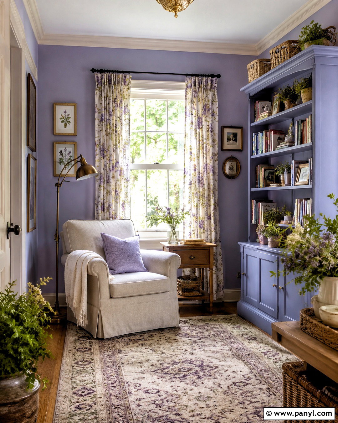
Periwinkle adds a playful floral note to a cottagecore reading room while remaining softer than saturated purple. Choose a dusty blue-violet paint and apply it to the walls, leaving the ceiling and trim creamy white. Arrange a comfortable oatmeal armchair beside a painted bookcase filled with books, pottery, and small framed pictures. A floral curtain containing lavender, sage, and pale yellow will connect the wall color to the rest of the palette. Add a warm oak side table, an antique brass floor lamp, and a faded wool rug. Natural baskets can store blankets and magazines. Keep the furniture neutral so periwinkle remains the room’s defining feature. The resulting retreat feels imaginative, comfortable, and suitable for everyday use.
16. Soft Lavender Cottagecore Paint Color
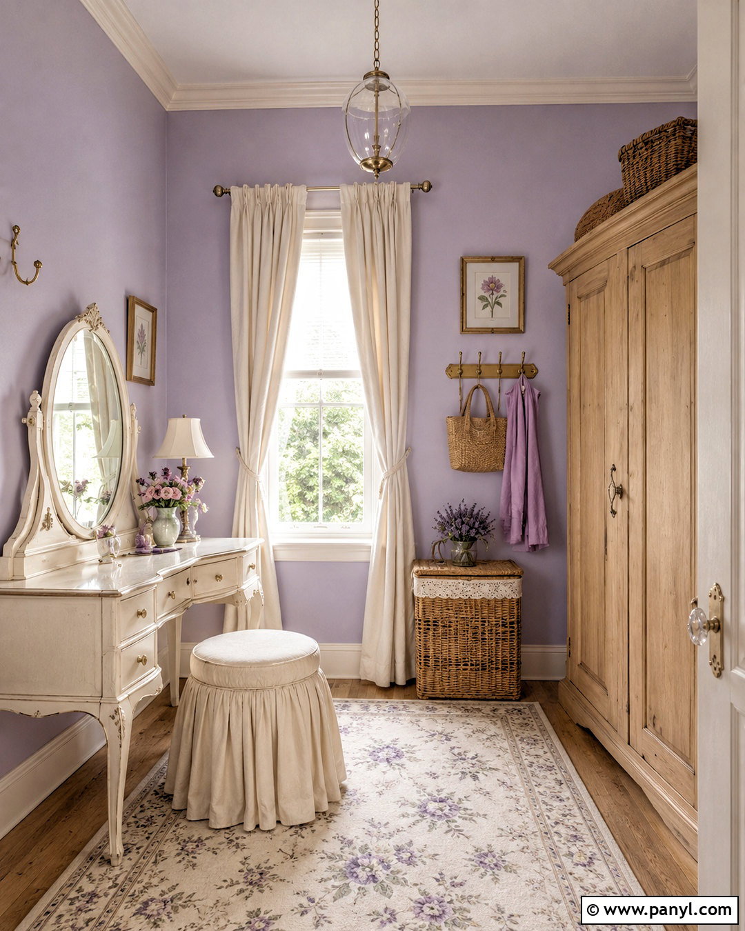
Soft lavender gives a cottagecore dressing room or bedroom a delicate garden-inspired atmosphere. Select a grayed lavender that feels faded rather than sugary, then pair it with warm ivory millwork and pale oak furniture. A vintage vanity with an oval mirror creates a useful focal point. Add a skirted stool, a small floral rug, and linen curtains in cream or muted green. Brass hooks and glass knobs introduce quiet sparkle without making the room feel glamorous. Wicker baskets and a freestanding wooden wardrobe support practical storage. Use warm white bulbs in fabric-shaded lamps so the lavender does not turn blue after sunset. This complete look feels romantic and nostalgic while staying uncluttered, functional, and easy to personalize.
17. Muted Teal Cottagecore Paint Color
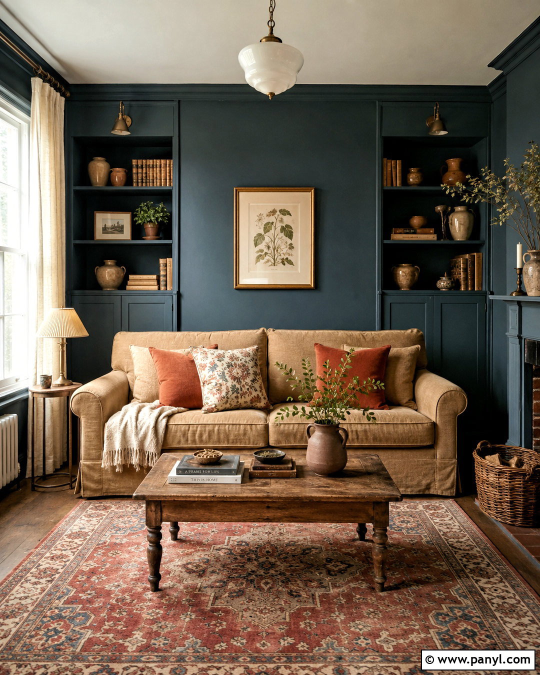
Muted teal introduces stronger color into a cottagecore living room while maintaining an earthy, heritage-inspired mood. Use a deep blue-green on built-in shelves, the fireplace wall, or every wall in a well-lit space. Balance it with a camel linen sofa, an antique wood coffee table, and cream curtains. Rust-colored cushions, botanical prints, and warm brass lighting draw out the teal’s green undertones. A patterned rug containing faded red, beige, and blue helps unify the room. Display books and pottery loosely rather than filling every shelf. If the room is small, keep the ceiling light and choose furniture with visible legs. The finished living room feels intimate and collected, offering a moodier alternative to pale cottagecore palettes.
18. Warm Clay Brown Cottagecore Paint Color
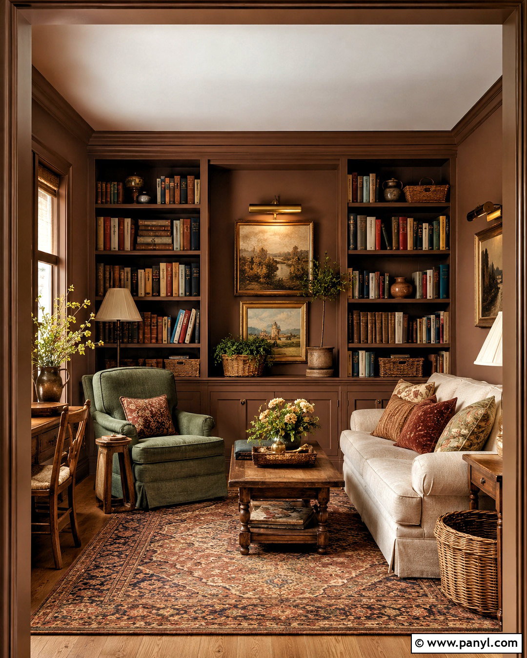
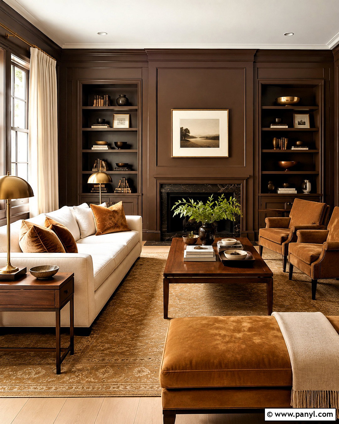
Warm clay brown creates a cocooning cottagecore library or snug that celebrates wood, leather-free natural textiles, and earthy color. Choose a midtone brown with red or orange undertones, then use it on walls and trim for a seamless effect. Add a deep cream sofa, a dark oak bookcase, and an upholstered armchair in muted green linen. A vintage wool rug and patterned cushions bring in rust, gold, and faded blue. Use aged brass picture lights to illuminate artwork and shelving. Cream lampshades keep the room bright enough for reading. The final space should feel layered but orderly, with baskets and lidded boxes controlling clutter. This palette works best when several lighter textiles break up the rich painted surfaces.
19. Faded Coral Cottagecore Paint Color
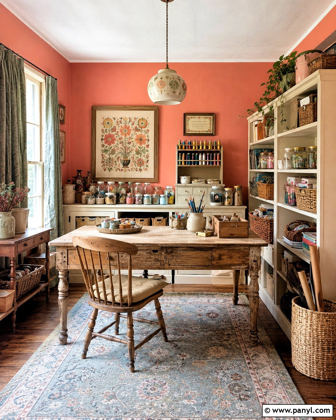
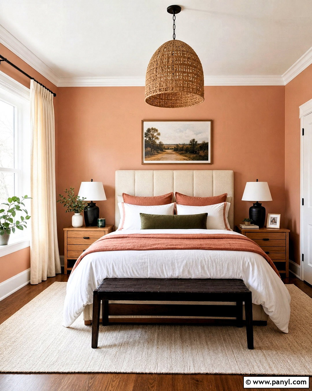
Faded coral creates an inviting cottagecore craft room with more energy than blush but less intensity than orange. Choose a sun-washed coral containing warm pink and earthy peach undertones. Paint the walls coral and use creamy white on shelving, trim, and the ceiling. Place a large worn-wood worktable in the center with a simple spindle chair. Store fabric, paper, and tools in woven baskets, glass jars, and labeled-looking drawer units without overcrowding open surfaces. Sage green curtains and a faded blue rug cool the warm palette. A ceramic pendant and framed folk-inspired artwork complete the creative setting. The finished room should feel cheerful and handmade, providing a practical workspace that still fits naturally within a cottagecore home.
20. Deep Forest Green Cottagecore Paint Color
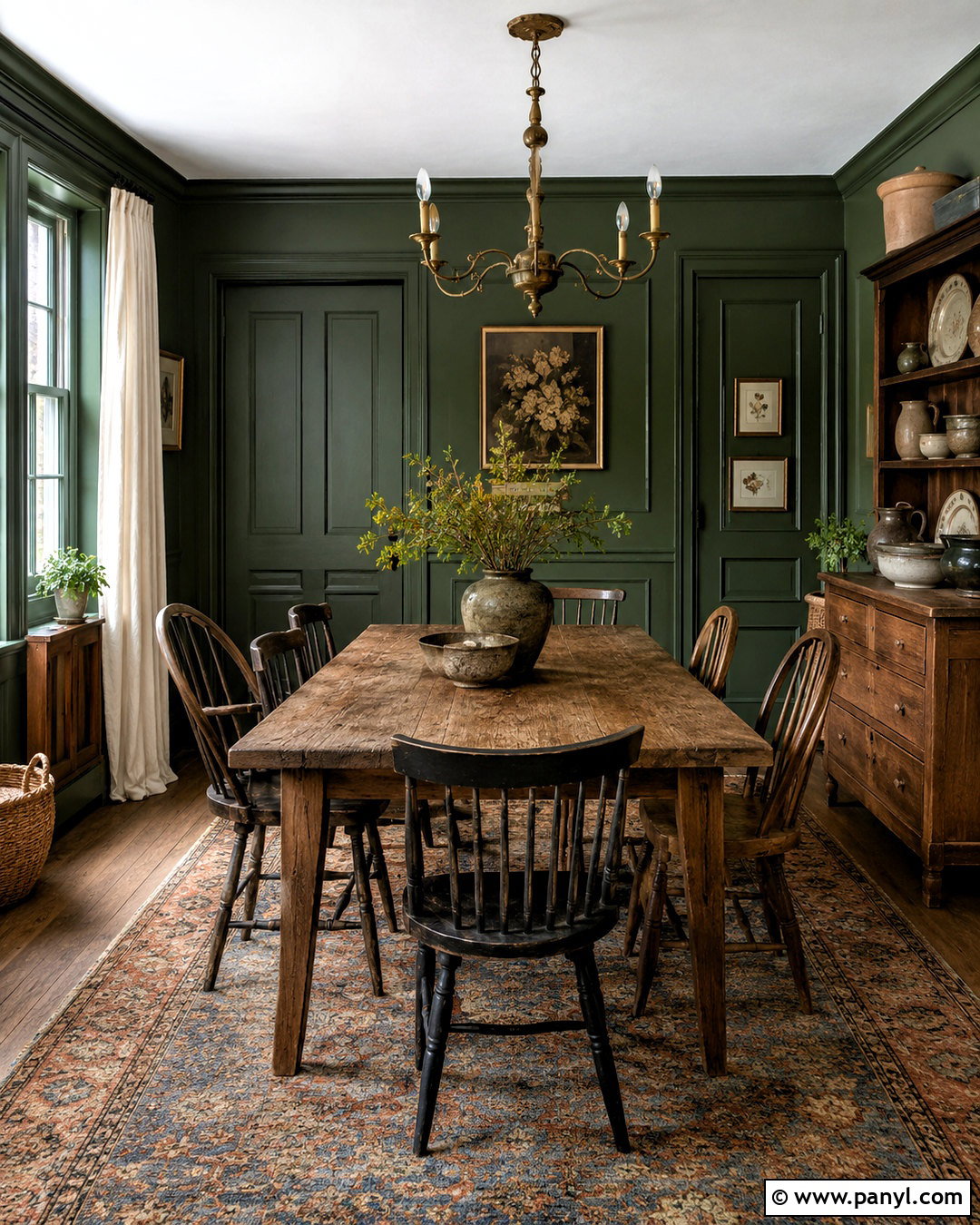
Deep forest green delivers a dramatic cottagecore dining room inspired by shaded gardens and traditional country houses. Paint the walls and trim in a rich, slightly muted green, then keep the ceiling creamy white to preserve visual height. Center the room around a long reclaimed oak table with mixed wooden chairs. Add an aged brass chandelier, ivory linen curtains, and a worn rug featuring rust, gold, and faded blue. Botanical paintings and simple stoneware reinforce the connection to nature. Use a light-colored sideboard if the space needs additional brightness. Forest green works especially well in rooms used during the evening because it creates a comfortable sense of enclosure. The complete design feels historic, grounded, and welcoming rather than overly formal.
Conclusion:
The most successful 20 cottagecore paint colors feel softened by nature, time, and everyday living. Creamy neutrals provide flexible foundations, while sage, moss, blue, lavender, and dusty floral shades bring quiet personality. Richer tones such as terracotta, clay brown, teal, and forest green can create depth in dining rooms, libraries, and cozy bedrooms. Whichever color you choose, build the entire room around it with warm wood, natural textiles, vintage furniture, simple patterns, and practical handmade details. Avoid relying on paint alone to establish the aesthetic. Test samples beside your flooring and furniture, observe them throughout the day, and select the shade that makes your space feel relaxed, personal, and genuinely welcoming.

Related Ideas and Inspiration:
Leave a Reply